The Analysis of Biological Data [3 ed.] 9781319226299
The Analysis of Biological Data is a new approach to teaching introductory statistics to biology students. To reach this
8,966 1,772 68MB
English Pages 2306 Year 2020
Halftitle Page
Title Page
Copyright Page
Dedication
Contents in brief
Contents
Preface
About the authors
Acknowledgments
SaplingPlus for Statistics: Course Resources
Online Resources for Students
Chapter 1 Statistics and samples
1.1 What is statistics?
1.2 Sampling Populations
Populations and samples
Properties of good samples
Random sampling
How to take a random sample
The sample of convenience
Volunteer bias
Data in the real world
1.3 Types of Data and Variables
Categorical and numerical variables
Explanatory and response variables
1.4 Frequency distributions and probability distributions
1.5 Types of studies
1.6 Summary
Chapter 1 Problems
Practice problems
Assignment problems
Interleaf 1 Correlation does not require causation
Chapter 2 Displaying data
2.1 Guidelines for effective graphs
How to draw a bad graph
How to draw a good graph
2.2 Showing data for one variable
Showing categorical data: frequency table and bar graph
Making a good bar graph
A bar graph is usually better than a pie chart
Showing numerical data: frequency table and histogram
Describing the shape of a histogram
How to draw a good histogram
Other graphs for numerical data
2.3 Showing association between two variables and differences between groups
Showing association between categorical variables
Showing association between numerical variables: scatter plot
Showing association between a numerical and a categorical variable
2.4 Showing trends in time and space
2.5 How to make good tables
Follow similar principles for display tables
2.6 How to make data files
2.7 Summary
Chapter 2 Problems
Practice problems
Assignment problems
Chapter 3 Describing data
3.1 Arithmetic mean and standard deviation
The sample mean
Variance and standard deviation
Rounding means, standard deviations, and other quantities
Coefficient of variation
Calculating mean and standard deviation from a frequency table
Effect of changing measurement scale
3.2 Median and interquartile range
The median
The interquartile range
The box plot
3.3 How measures of location and spread compare
Mean versus median
Standard deviation versus interquartile range
3.4 Cumulative frequency distribution
Percentiles and quantiles
Displaying cumulative relative frequencies
3.5 Proportions
Calculating a proportion
The proportion is like a sample mean
3.6 Summary
3.7 Quick formula summary
Table of formulas for descriptive statistics
Chapter 3 Problems
Practice problems
Assignment problems
Chapter 4 Estimating with uncertainty
4.1 The sampling distribution of an estimate
Estimating mean gene length with a random sample
The sampling distribution of Y¯
4.2 Measuring the uncertainty of an estimate
Standard error
The standard error of Y¯
The standard error of Y¯ from data
4.3 Confidence intervals
The 2SE rule of thumb
4.4 Error bars
4.5 Summary
4.6 Quick formula summary
Standard error of the mean
Chapter 4 Problems
Practice problems
Assignment problems
Interleaf 2 Pseudoreplication
Chapter 5 Probability
5.1 The probability of an event
5.2 Venn diagrams
5.3 Mutually exclusive events
5.4 Probability distributions
Discrete probability distributions
Continuous probability distributions
5.5 Either this or that: adding probabilities
The addition rule
The probabilities of all possible mutually exclusive outcomes add to one
The general addition rule
5.6 Independence and the multiplication rule
Multiplication rule
“And” versus “or”
Independence of more than two events
5.7 Probability trees
5.8 Dependent events
5.9 Conditional probability and Bayes’ theorem
Conditional probability
The general multiplication rule
Sampling without replacement
Bayes’ theorem
5.10 Summary
Chapter 5 Problems
Practice problems
Assignment problems
Chapter 6 Hypothesis testing
6.1 Making and using statistical hypotheses
Null hypothesis
Alternative hypothesis
To reject or not to reject
6.2 Hypothesis testing: an example
Stating the hypotheses
The test statistic
The null distribution
Quantifying uncertainty: the P-value
Draw the appropriate conclusion
Reporting the results
6.3 Errors in hypothesis testing
Type I and Type II errors
6.4 When the null hypothesis is not rejected
The test
Interpreting a nonsignificant result
6.5 One-sided tests
6.6 Hypothesis testing versus confidence intervals
6.7 Summary
Chapter 6 Problems
Practice problems
Assignment problems
Interleaf 3 Why statistical significance is not the same as biological importance
Chapter 7 Analyzing proportions
7.1 The binomial distribution
Formula for the binomial distribution
Number of successes in a random sample
Sampling distribution of the proportion
7.2 Testing a proportion: the binomial test
Approximations for the binomial test
7.3 Estimating proportions
Estimating the standard error of a proportion
Confidence intervals for proportions—the Agresti–Coull method
Confidence intervals for proportions—the Wald method
7.4 Deriving the binomial distribution
7.5 Summary
7.6 Quick formula summary
Binomial distribution
Proportion
Agresti–Coull 95% confidence interval for a proportion
Binomial test
Chapter 7 Problems
Practice problems
Assignment problems
Interleaf 4 Biology and the history of statistics
Chapter 8 Fitting probability models to frequency data
8.1 χ2 Goodness-of-fit test: the proportional model
Null and alternative hypotheses
Observed and expected frequencies
The χ2 test statistic
The sampling distribution of χ2 under the null hypothesis
Calculating the P-value
Critical values for the χ2 distribution
8.2 Assumptions of the χ2 goodness-of-fit test
8.3 Goodness-of-fit tests when there are only two categories
8.4 Random in space or time: the Poisson distribution
Formula for the Poisson distribution
Testing randomness with the Poisson distribution
Comparing the variance to the mean
8.5 Summary
8.6 Quick formula summary
χ2 Goodness-of-fit test
Test statistic: χ2
Poisson distribution
Chapter 8 Problems
Practice problems
Assignment problems
Interleaf 5 Making a plan
Chapter 9 Contingency analysis: Associations between categorical variables
9.1 Associating two categorical variables
9.2 Estimating association in 2×2 tables: relative risk
Relative risk
Reduction in risk
9.3 Estimating association in 2×2 tables: the odds ratio
Odds
Odds ratio
Standard error and confidence interval for odds ratio
Odds ratio vs. relative risk
9.4 The χ2 contingency test
Hypotheses
Expected frequencies assuming independence
The χ2 statistic
Degrees of freedom
P-value and conclusion
A shortcut for calculating the expected frequencies
The χ2 contingency test is a special case of the χ2 goodness-of-fit test
Assumptions of the χ2 contingency test
Correction for continuity
9.5 Fisher’s exact test
9.6 Summary
9.7 Quick formula summary
Confidence interval for relative risk
Confidence interval for odds ratio
The χ2 contingency test
Fisher’s exact test
Chapter 9 Problems
Practice problems
Assignment problems
Review Problems 1
Chapter 10 The normal distribution
10.1 Bell-shaped curves and the normal distribution
10.2 The formula for the normal distribution
10.3 Properties of the normal distribution
10.4 The standard normal distribution and statistical tables
Using the standard normal table
Using the standard normal to describe any normal distribution
10.5 The normal distribution of sample means
Calculating probabilities of sample means
10.6 Central limit theorem
10.7 Normal approximation to the binomial distribution
10.8 Summary
10.9 Quick formula summary
Z-standardization
Normal approximation to the binomial distribution
Chapter 10 Problems
Practice problems
Assignment problems
Interleaf 6 Controls in medical studies
Chapter 11 Inference for a normal population
11.1 The t-distribution for sample means
Student’s t-distribution
Finding critical values of the t-distribution
11.2 The confidence interval for the mean of a normal distribution
The 95% confidence interval for the mean
The 99% confidence interval for the mean
11.3 The one-sample t-test
The effects of larger sample size: body temperature revisited
11.4 Assumptions of the one-sample t-test
11.5 Estimating the standard deviation and variance of a normal population
Confidence limits for the variance
Confidence limits for the standard deviation
Assumptions
11.6 Summary
11.7 Quick formula summary
Confidence interval for a mean
One-sample t-test
Confidence interval for variance
Chapter 11 Problems
Practice problems
Assignment problems
Chapter 12 Comparing two means
12.1 Paired sample versus two independent samples
12.2 Paired comparison of means
Estimating mean difference from paired data
Paired t-test
Assumptions
12.3 Two-sample comparison of means
Confidence interval for the difference between two means
Two-sample t-test
Assumptions
Welch’s t-test
12.4 Using the correct sampling units
12.5 The fallacy of indirect comparison
12.6 Interpreting overlap of confidence intervals
12.7 Comparing variances
The F-test of equal variances
Levene’s test for homogeneity of variances
12.8 Summary
12.9 Quick formula summary
Confidence interval for the mean difference (paired data)
Paired t-test
Standard error of difference between two means
Confidence interval for the difference between two means (two samples)
Two-sample t-test
Welch’s confidence interval for the difference between two means
Welch’s approximate t-test
F-test
Levene’s test
Chapter 12 Problems
Practice problems
Assignment problems
Interleaf 7 Which test should I use?
Chapter 13 Handling violations of assumptions
13.1 Detecting deviations from normality
Graphical methods
Formal test of normality
13.2 When to ignore violations of assumptions
Violations of normality
Unequal standard deviations
13.3 Data transformations
Log transformation
Other transformations
Confidence intervals with transformations
Avoid multiple testing with transformations
13.4 Nonparametric alternatives to one-sample and paired t-tests
Sign test
The Wilcoxon signed-rank test
13.5 Comparing two groups: the Mann–Whitney U-test
Tied ranks
Large samples and the normal approximation
13.6 Assumptions of nonparametric tests
13.7 Type I and Type II error rates of nonparametric methods
13.8 Permutation tests
Assumptions of permutation tests
13.9 Summary
13.10 Quick formula summary
Transformations
Back-transformations
Sign test
Mann–Whitney U-test
Chapter 13 Problems
Practice problems
Assignment problems
Review Problems 2
Chapter 14 Designing experiments
14.1 Lessons from clinical trials
Design components
14.2 How to reduce bias
Simultaneous control group
Randomization
Blinding
14.3 How to reduce the influence of sampling error
Replication
Balance
Blocking
Extreme treatments
14.4 Experiments with more than one factor
14.5 What if you can’t do experiments?
Match and adjust
14.6 Choosing a sample size
Plan for precision
Plan for power
Plan for data loss
14.7 Summary
14.8 Quick formula summary
Planning for precision
Planning for power
Chapter 14 Problems
Practice problems
Assignment problems
Interleaf 8 Data dredging
Chapter 15 Comparing means of more than two groups
15.1 The analysis of variance
Hypotheses
ANOVA in a nutshell
ANOVA tables
Partitioning the sum of squares
Calculating the mean squares
The variance ratio, F
Variation explained: R^2
ANOVA with two groups
15.2 Assumptions and alternatives
The robustness of ANOVA
Data transformations
Nonparametric alternatives to ANOVA
15.3 Planned comparisons
Planned comparison between two means
15.4 Unplanned comparisons
Testing all pairs of means using the Tukey–Kramer method
Assumptions
15.5 Fixed and random effects
15.6 ANOVA with randomly chosen groups
ANOVA calculations
Variance components
Repeatability
Assumptions
15.7 Summary
15.8 Quick formula summary
Analysis of variance (ANOVA)
Kruskal–Wallis test
Planned confidence interval for the difference between two of k means
Planned test of the difference between two of k means
Tukey–Kramer test of all pairs of means
Repeatability and variance components
Chapter 15 Problems
Practice problems
Assignment problems
Interleaf 9 Experimental and statistical mistakes
Chapter 16 Correlation between numerical variables
16.1 Estimating a linear correlation coefficient
The correlation coefficient
Standard error
Approximate confidence interval
16.2 Testing the null hypothesis of zero correlation
16.3 Assumptions
16.4 The correlation coefficient depends on the range
16.5 Spearman’s rank correlation
Procedure for large n
Assumptions of Spearman’s correlation
16.6 The effects of measurement error on correlation
16.7 Summary
16.8 Quick formula summary
Shortcuts
Covariance
Correlation coefficient
Confidence interval (approximate) for a population correlation
The t-test of zero linear correlation
Spearman’s rank correlation
Spearman’s rank correlation test
Correlation corrected for measurement error
Chapter 16 Problems
Practice problems
Assignment problems
Interleaf 10 Publication bias
Chapter 17 Regression
17.1 Linear regression
The method of least squares
Formula for the line
Calculating the slope and intercept
Populations and samples
Predicted values
Residuals
Standard error of slope
Confidence interval for the slope
17.2 Confidence in predictions
Confidence intervals for predictions
Extrapolation
17.3 Testing hypotheses about a slope
The t-test of regression slope
The ANOVA approach
17.4 Regression toward the mean
17.5 Assumptions of regression
Outliers
Detecting nonlinearity
Detecting non-normality and unequal variance
17.6 Transformations
17.7 The effects of measurement error on regression
17.8 Regression with nonlinear relationships
A curve with an asymptote
Quadratic curves
Formula-free curve fitting
17.9 Logistic regression: fitting a binary response variable
17.10 Summary
17.11 Quick formula summary
Shortcuts
Regression slope
Regression intercept
Confidence interval for the regression slope
Confidence interval for the predicted mean Y at a given X (confidence bands)
Confidence interval for the predicted individual Y at a given X (prediction intervals)
The t-test of a regression slope
The ANOVA method for testing zero slope
Chapter 17 Problems
Practice problems
Assignment problems
Interleaf 11 Meta-analysis
Review Problems 3
Chapter 18 Analyzing multiple factors
18.1 ANOVA and linear regression are linear models
Modeling with linear regression
Generalizing linear regression
Linear models
18.2 Analyzing experiments with blocking
Analyzing data from a randomized block design
Model formula
Fitting the model to data
18.3 Analyzing factorial designs
Model formula
Testing the factors
The importance of distinguishing fixed and random factors
18.4 Adjusting for the effects of a covariate
Testing interaction
Fitting a model without an interaction term
18.5 Assumptions of linear models
18.6 Summary
Chapter 18 Problems
Practice problems
Assignment problems
Interleaf 12 Using species as data points
Chapter 19 Computer-intensive methods
19.1 Hypothesis testing using simulation
19.2 Bootstrap standard errors and confidence intervals
Bootstrap standard error
Confidence intervals by bootstrapping
Bootstrapping with multiple groups
Assumptions and limitations of the bootstrap
19.3 Summary
Chapter 19 Problems
Practice problems
Assignment problems
Chapter 20 Likelihood
20.1 What is likelihood?
20.2 Two uses of likelihood in biology
Phylogeny estimation
Gene mapping
20.3 Maximum likelihood estimation
Probability model
The likelihood formula
The maximum likelihood estimate
Likelihood-based confidence intervals
20.4 Versatility of maximum likelihood estimation
Probability model
The likelihood formula
The maximum likelihood estimate
Bias
20.5 Log-likelihood ratio test
Likelihood ratio test statistic
Testing a population proportion
20.6 Summary
20.7 Quick formula summary
Likelihood
Likelihood-based confidence interval for a single parameter
Log-likelihood ratio test for a single parameter
Chapter 20 Problems
Practice problems
Assignment problems
Chapter 21 Survival analysis
21.1 Survival curves
Calculation summary
Confidence intervals
Median survival time
Assumptions
21.2 Compare survival curves
Hazard ratio
Hazard ratio calculation
Logrank test
Assumptions
21.3 Summary
21.4 Quick formula summary
Hazard ratio
95% Confidence interval for the hazard ratio
Logrank test
Chapter 21 Problems
Practice problems
Assignment problems
Notes
Statistical tables
Using statistical tables
Statistical Table A: The χ^2 distribution
Statistical Table B: The standard normal (Z) distribution
Statistical Table C: Student’s t-distribution
Statistical Table D: The F-distribution
Statistical Table E: Mann–Whitney U-distribution
Statistical Table F: Tukey–Kramer q-distribution
Statistical Table G: Critical values for the Spearman’s rank correlation
Literature cited
Answers to practice problems
Chapter 1
Chapter 2
Chapter 3
Chapter 4
Chapter 5
Chapter 6
Chapter 7
Chapter 8
Chapter 9
Chapter 10
Chapter 11
Chapter 12
Chapter 13
Chapter 14
Chapter 15
Chapter 16
Chapter 17
Chapter 18
Chapter 19
Chapter 20
Chapter 21
Index
Recommend Papers

![The Analysis of Biological Data: Solutions Manual [First ed.]
9780981519401](https://ebin.pub/img/200x200/the-analysis-of-biological-data-solutions-manual-firstnbsped-9780981519401.jpg)
![The Analysis of Biological Data [2, 1 ed.]
0981519407, 9780981519401](https://ebin.pub/img/200x200/the-analysis-of-biological-data-2-1nbsped-0981519407-9780981519401.jpg)


![The Analysis of Biological Data [3 ed.]
9781319226299](https://ebin.pub/img/200x200/the-analysis-of-biological-data-3nbsped-9781319226299.jpg)
File loading please wait...
Citation preview
The Analysis of Biological Data
Description -
1
2
The Analysis of Biological Data Third Edition Michael C. Whitlock and Dolph Schluter
Austin • Boston • New York • Plymouth
3
Vice President, STEM: Daryl Fox Program Director: Andrew Dunaway Director, Development: Lisa Samols Senior Program Manager: Jennifer Edwards Executive Development Editor: Katrina Mangold Editorial Project Manager: Michele Mangelli Assistant Editor: Justin Jones Editorial Assistant: Nathan Livingston Senior Marketing Manager: Nancy Bradshaw Marketing Assistant: Maddie Inskeep Director of Content: Daniel Lauve Lead Content Developer: Aaron Gladish Content Development Manager: Ava Cas Executive Media Editor: Catriona Kaplan Associate Media Editor: Doug Newman Director, Content Management Enhancement: Tracey Kuehn Senior Managing Editor: Lisa Kinne Content Project Manager: Elizabeth Dziubela Project Manager: Linda DeMasi, Lumina Datamatics, Ltd. Director of Digital Production: Keri DeManigold Senior Media Project Manager: Elton Carter Permissions Manager: Jennifer MacMillan Executive Permissions Editor: Robin Fadool Photo Researcher and Lumina Project Manager: Brittani Morgan Director of Design, Content Management: Diana Blume Design Services Manager: Natasha A. S. Wolfe
4
Interior Text Designer: Lumina Datamatics, Ltd. Cover Designer: John Callahan Art Manager: Matthew McAdams Senior Content Workflow Manager: Paul Rohloff Production Supervisor: Robert Cherry Composition: Lumina Datamatics, Ltd. Cover Photo: ©2019 Christopher Marley, www.christophermarley.com Title page photo credits from left to right: Alfred Pasieka/Science Source; Courtesy of Richard Watherwax/watherwax.com; David Mack/Science Source; dennisvdw/Getty Images; Suzanne L. & Joseph T. Collins/Science Source; © photo courtesy of Lawrence Harder; © Stephen S. Nagy, M.D., Dordogne, France / Bridgeman Images. Author photo credit: Courtesy of Sylvia Heredia Library of Congress Control Number: 2019948174 ©2020, 2015 by W.H. Freeman and Company. All rights reserved. ISBN-13: 978-1-319-22629-9 (epub) Macmillan Learning One New York Plaza Suite 4600 New York, NY 10004-1562 www.macmillanlearning.com 5
In 1946, William Freeman founded W. H. Freeman and Company and published Linus Pauling's General Chemistry, which revolutionized the chemistry curriculum and established the prototype for a Freeman text. W. H. Freeman quickly became a publishing house where leading researchers can make significant contributions to mathematics and science. In 1996, W. H. Freeman joined Macmillan and we have since proudly continued the legacy of providing revolutionary, quality educational tools for teaching and learning in STEM.
6
To Sally and Wilson, Andrea and Maggie
7
Contents in brief Preface About the authors Acknowledgments SaplingPlus for statistics Online resources for students PART 1 INTRODUCTION TO STATISTICS 1. Statistics and samples INTERLEAF 1 Correlation does not require causation 2. Displaying data 3. Describing data 4. Estimating with uncertainty INTERLEAF 2 Pseudoreplication 5. Probability 6. Hypothesis testing INTERLEAF 3 Why statistical significance is not the same as biological importance PART 2 PROPORTIONS AND FREQUENCIES 7. Analyzing proportions INTERLEAF 4 Biology and the history of statistics 8. Fitting probability models to frequency data INTERLEAF 5 Making a plan
8
9. Contingency analysis: Associations between categorical variables Review Problems 1 PART 3 COMPARING NUMERICAL VALUES 10. The normal distribution INTERLEAF 6 Controls in medical studies 11. Inference for a normal population 12. Comparing two means INTERLEAF 7 Which test should I use? 13. Handling violations of assumptions Review Problems 2 14. Designing experiments INTERLEAF 8 Data dredging 15. Comparing means of more than two groups INTERLEAF 9 Experimental and statistical mistakes PART 4 REGRESSION AND CORRELATION 16. Correlation between numerical variables INTERLEAF 10 Publication bias 17. Regression INTERLEAF 11 Meta-analysis Review Problems 3 PART 5 MODERN STATISTICAL METHODS 18. Analyzing multiple factors INTERLEAF 12 Using species as data points 19. Computer-intensive methods 9
20. Likelihood 21. Survival analysis Statistical tables Literature cited Answers to practice problems Index
10
Contents Preface About the authors Acknowledgments SaplingPlus for statistics Online resources for students PART 1 INTRODUCTION TO STATISTICS 1. Statistics and samples 1.1 What is statistics? 1.2 Sampling populations Example 1.2: Raining cats 1.3 Types of data and variables 1.4 Frequency distributions and probability distributions 1.5 Types of studies 1.6 Summary Practice problems Assignment problems INTERLEAF 1 Correlation does not require causation 2. Displaying data 2.1 Guidelines for effective graphs 2.2 Showing data for one variable Example 2.2A: Crouching tiger
11
Example 2.2B: Effects of Zika virus infection on fetuses 2.3 Showing association between two variables and differences between groups Example 2.3A: Reproductive effort and avian malaria Example 2.3B: Blood responses to high elevation 2.4 Showing trends in time and space 2.5 How to make good tables 2.6 How to make data files 2.7 Summary Practice problems Assignment problems 3. Describing data 3.1 Arithmetic mean and standard deviation Example 3.1: Gliding snakes 3.2 Median and interquartile range Example 3.2: I’d give my right arm for a female 3.3 How measures of location and spread compare Example 3.3: Disarming fish 3.4 Cumulative frequency distribution 3.5 Proportions 3.6 Summary 3.7 Quick formula summary Practice problems 12
Assignment problems 4. Estimating with uncertainty 4.1 The sampling distribution of an estimate Example 4.1: The length of human genes 4.2 Measuring the uncertainty of an estimate 4.3 Confidence intervals 4.4 Error bars 4.5 Summary 4.6 Quick formula summary Practice problems Assignment problems INTERLEAF 2 Pseudoreplication 5. Probability 5.1 The probability of an event 5.2 Venn diagrams 5.3 Mutually exclusive events 5.4 Probability distributions 5.5 Either this or that: adding probabilities 5.6 Independence and the multiplication rule Example 5.6A: Smoking and high blood pressure Example 5.6B: Mendel’s peas 5.7 Probability trees Example 5.7: Sex and birth order 5.8 Dependent events
13
Example 5.8: Is this meat taken? 5.9 Conditional probability and Bayes’ theorem Example 5.9: Detection of Down syndrome 5.10 Summary Practice problems Assignment problems 6. Hypothesis testing 6.1 Making and using statistical hypotheses 6.2 Hypothesis testing: an example Example 6.2: The right hand of toad 6.3 Errors in hypothesis testing 6.4 When the null hypothesis is not rejected Example 6.4: The genetics of mirror-image flowers 6.5 One-sided tests 6.6 Hypothesis testing versus confidence intervals 6.7 Summary Practice problems Assignment problems INTERLEAF 3 Why statistical significance is not the same as biological importance PART 2 PROPORTIONS AND FREQUENCIES 7. Analyzing proportions 7.1 The binomial distribution
14
7.2 Testing a proportion: the binomial test Example 7.2: Sex and the X 7.3 Estimating proportions Example 7.3: She-turtles 7.4 Deriving the binomial distribution 7.5 Summary 7.6 Quick formula summary Practice problems Assignment problems INTERLEAF 4 Biology and the history of statistics 8. Fitting probability models to frequency data 8.1 χ2
Goodness-of-fit test: the proportional model
Example 8.1: No weekend getaway 8.2 Assumptions of the χ2
goodness-of-fit test
8.3 Goodness-of-fit tests when there are only two categories Example 8.3: Gene content of the human X chromosome 8.4 Random in space or time: the Poisson distribution Example 8.4: Mass extinctions 8.5 Summary 8.6 Quick formula summary Practice problems Assignment problems 15
INTERLEAF 5 Making a plan 9. Contingency analysis: Associations between categorical variables 9.1 Associating two categorical variables 9.2 Estimating association in 2×2
tables: relative
risk Example 9.2: Take two aspirin and call me in the morning? 9.3 Estimating association in 2×2
tables: the odds
ratio Example 9.3: Your litter box and your brain 9.4 The χ2
contingency test
Example 9.4: The gnarly worm gets the bird 9.5 Fisher’s exact test Example 9.5: The feeding habits of vampire bats 9.6 Summary 9.7 Quick formula summary Practice problems Assignment problems Review Problems 1 PART 3 COMPARING NUMERICAL VALUES 10. The normal distribution 10.1 Bell-shaped curves and the normal distribution 10.2 The formula for the normal distribution 16
10.3 Properties of the normal distribution 10.4 The standard normal distribution and statistical tables Example 10.4: One small step for man? 10.5 The normal distribution of sample means 10.6 Central limit theorem Example 10.6: Young adults and the Spanish flu 10.7 Normal approximation to the binomial distribution Example 10.7: The only good bug is a dead bug 10.8 Summary 10.9 Quick formula summary Practice problems Assignment problems INTERLEAF 6 Controls in medical studies 11. Inference for a normal population 11.1 The t-distribution
for sample means
11.2 The confidence interval for the mean of a normal distribution Example 11.2: Eye to eye 11.3 The one-sample t-test Example 11.3: Human body temperature 11.4 Assumptions of the one-sample t-test
17
11.5 Estimating the standard deviation and variance of a normal population 11.6 Summary 11.7 Quick formula summary Practice problems Assignment problems 12. Comparing two means 12.1 Paired sample versus two independent samples 12.2 Paired comparison of means Example 12.2: So macho it makes you sick? 12.3 Two-sample comparison of means Example 12.3: Spike or be spiked 12.4 Using the correct sampling units Example 12.4: So long; thanks to all the fish 12.5 The fallacy of indirect comparison Example 12.5: Mommy’s baby, Daddy’s maybe 12.6 Interpreting overlap of confidence intervals 12.7 Comparing variances 12.8 Summary 12.9 Quick formula summary Practice problems Assignment problems INTERLEAF 7 Which test should I use? 13. Handling violations of assumptions
18
13.1 Detecting deviations from normality Example 13.1: The benefits of marine reserves 13.2 When to ignore violations of assumptions 13.3 Data transformations 13.4 Nonparametric alternatives to one-sample and paired t-tests Example 13.4: Sexual conflict and the origin of new species 13.5 Comparing two groups: the Mann–Whitney Utest Example 13.5: Sexual cannibalism in sagebrush crickets 13.6 Assumptions of nonparametric tests 13.7 Type I and Type II error rates of nonparametric methods 13.8 Permutation tests 13.9 Summary 13.10 Quick formula summary Practice problems Assignment problems Review Problems 2 14. Designing experiments 14.1 Lessons from clinical trials Example 14.1: Reducing HIV transmission
19
14.2 How to reduce bias 14.3 How to reduce the influence of sampling error Example 14.3A: Holey waters Example 14.3B: Plastic hormones 14.4 Experiments with more than one factor Example 14.4: Lethal combination 14.5 What if you can’t do experiments? 14.6 Choosing a sample size 14.7 Summary 14.8 Quick formula summary Practice problems Assignment problems INTERLEAF 8 Data dredging 15. Comparing means of more than two groups 15.1 The analysis of variance Example 15.1: The knees who say night 15.2 Assumptions and alternatives 15.3 Planned comparisons 15.4 Unplanned comparisons Example 15.4: Wood wide web 15.5 Fixed and random effects 15.6 ANOVA with randomly chosen groups Example 15.6: Walking-stick limbs 15.7 Summary
20
15.8 Quick formula summary Practice problems Assignment problems INTERLEAF 9 Experimental and statistical mistakes PART 4 REGRESSION AND CORRELATION 16. Correlation between numerical variables 16.1 Estimating a linear correlation coefficient Example 16.1: Flipping the bird 16.2 Testing the null hypothesis of zero correlation Example 16.2: What big inbreeding coefficients you have 16.3 Assumptions 16.4 The correlation coefficient depends on the range 16.5 Spearman’s rank correlation Example 16.5: The miracles of memory 16.6 The effects of measurement error on correlation 16.7 Summary 16.8 Quick formula summary Practice problems Assignment problems INTERLEAF 10 Publication bias 17. Regression 17.1 Linear regression Example 17.1: The lion’s nose
21
17.2 Confidence in predictions 17.3 Testing hypotheses about a slope Example 17.3: Prairie Home Campion 17.4 Regression toward the mean 17.5 Assumptions of regression 17.6 Transformations 17.7 The effects of measurement error on regression 17.8 Regression with nonlinear relationships Example 17.8: The incredible shrinking seal 17.9 Logistic regression: fitting a binary response variable 17.10 Summary 17.11 Quick formula summary Practice problems Assignment problems INTERLEAF 11 Meta-analysis Review Problems 3 PART 5 MODERN STATISTICAL METHODS 18. Analyzing multiple factors 18.1 ANOVA and linear regression are linear models 18.2 Analyzing experiments with blocking Example 18.2: Zooplankton depredation 18.3 Analyzing factorial designs Example 18.3: Interaction zone
22
18.4 Adjusting for the effects of a covariate Example 18.4: Mole-rat layabouts 18.5 Assumptions of linear models 18.6 Summary Practice problems Assignment problems INTERLEAF 12 Using species as data points 19. Computer-intensive methods 19.1 Hypothesis testing using simulation Example 19.1: How did he know? The nonrandomness of haphazard choice 19.2 Bootstrap standard errors and confidence intervals Example 19.2: The language center in chimps’ brains 19.3 Summary Practice problems Assignment problems 20. Likelihood 20.1 What is likelihood? 20.2 Two uses of likelihood in biology 20.3 Maximum likelihood estimation Example 20.3: Unruly passengers 20.4 Versatility of maximum likelihood estimation Example 20.4: Conservation scoop 23
20.5 Log-likelihood ratio test 20.6 Summary 20.7 Quick formula summary Practice problems Assignment problems 21. Survival analysis 21.1 Survival curves Example 21.1: Ebola outbreak 21.2 Compare survival curves Example 21.2: Tumor genetics 21.3 Summary 21.4 Quick formula summary Practice problems Assignment problems Statistical tables Using statistical tables Statistical Table A: The χ2
distribution
Statistical Table B: The standard normal (Z)
distribution
Statistical Table C: Student’s t-distribution Statistical Table D: The F-distribution Statistical Table E: Mann–Whitney U-distribution
24
Statistical Table F: Tukey–Kramer q-distribution
Statistical Table G: Critical values for the Spearman’s rank correlation Literature cited Answers to practice problems Index
25
Preface Modern biologists need the powerful tools of data analysis. As a result, an increasing number of universities offer, or even require, a basic data analysis course for all their biology and premedical students. We have been teaching such a course at the University of British Columbia for the last three decades. Over this period, we have sought a textbook that covered the material we needed in an introductory course at just the right level. We found that most texts were too technical and encyclopedic, or else they didn’t go far enough, missing methods that were crucial to the practice of modern biology and medicine. We wanted a book that had a strong emphasis on intuitive understanding to convey meaning, rather than an overreliance on formulas. We wanted to teach by example, and the examples needed to be interesting. Most importantly, we needed a biology book, addressing topics important to biologists and health care providers handling real data. We couldn’t find the book that we needed, so we decided to write this one to fill the gap. We include several unusual features that we have discovered to be helpful for effectively reaching our audience:
Interesting biology examples and exercise sets. Our teaching has shown us that biology students learn data analysis best in the context of interesting examples drawn from the medical and biological literature. Statistics is a means to an end, a tool to learn about the human and natural world. By emphasizing what we 26
can learn about the science, the power and value of statistics becomes plain. Plus, it’s just more fun for everyone concerned. Every chapter has several biological or medical examples of key concepts, and each example is prefaced by a substantial description of the biological setting. The examples are illustrated with photos of the real organisms, so that students can look at what they’re learning about. The emphasis on real and interesting examples carries into the problem sets; each chapter has many questions based on real data about biological and medical issues. These include Calculation Practice Problems that take the student step-by-step through the important procedures described in the chapter. Two or three such problems are at the start of most of the chapter problem sets. We include three sections of review problems (after Chapters 9, 13, and 17) to allow cumulative review of the important concepts up to that point in the book. In this third edition, we have added dozens of new problems.
Intuitive explanations of key concepts. Statistical reasoning requires a lot of new ways of thinking. Students can get lost in the barrage of new jargon and multitudinous tests. We have found that starting from an intuitive foundation, away from all the details, is extremely valuable. We take an intuitive approach to basic questions: What’s a good sample? What’s a confidence interval? Why do an experiment? The first several chapters establish this basic knowledge, and the rest of the book builds on it.
27
Practical data analysis. As its title suggests, this book focuses on data rather than the mathematical foundations of statistics. We teach how to make good graphical displays, and we emphasize that a good graph is the beginning point of any good data analysis. We give equal time to estimation and hypothesis testing, and we avoid treating the P-value as an end in itself. The book does not demand a knowledge of mathematics beyond simple algebra. We focus on practicality over nuance, on biological usefulness over theoretical hand wringing. We not only teach the “right” way of doing something but also highlight some of the pitfalls that might be encountered. We demonstrate how to carry out the calculations for most methods so that the steps are not mysterious to students. At the same time, we know that a computer will be available for most calculations. Hence, we focus on the concepts of biological data analysis and how statistics can help extract scientific insight from data. With the power of modern computers at hand, the challenge in analyzing data becomes knowing what method to use and why.1 We imagine and hope that every course using this book will have a component encouraging students to use computer statistical packages. The diversity of such packages is immense, and so we have not tied the book to any particular program. Nevertheless, many biologists and users of this book analyze data with the R statistical computing package. Accordingly, we provide R scripts for all the examples in this book at the book’s web site (whitlockschluter3e.zoology.ubc.ca). This site also includes a series of self-guided labs to teach students
28
the basics of using R at a reasonable pace, and in an order that matches the presentation of the concepts in the book.
Practical experimental design. A biologist cannot do good statistics—or good science—without a practical understanding of experimental design. Unlike most books, our book covers basic topics in experimental design, such as controls, randomization, pseudoreplication, and blocking, and we do it in a practical, intuitive way.
Coverage of modern topics. Modern biology uses a larger toolkit than the one available a generation ago. In this book, we go beyond most introductory books by establishing the conceptual principles of important topics such as likelihood, non-linear regression, permutation tests, survival analysis, and the bootstrap.
Useful summaries. Near the end of each chapter is a short, clear summary of the key concepts, and most chapters end with Quick Formula Summaries that put most equations in one easy-to-find place.
Interleaves. Between chapters are short essays that we call interleaves. These interleaves cover a variety of conceptual topics in a nontechnical way—ideas that are nevertheless crucial for the interpretation of statistical results in scientific research. Several of them focus on
29
common mistakes in the analysis and interpretation of biological data and how to avoid them. Although the interleaves are pressed between the chapters, they complement the material in the core chapters in important ways. We believe that the interleaves discuss some of the most important topics of the book, such as the difference between correlation and causation (Interleaf 1), the meaning of statistical significance (Interleaf 3), why control treatments are necessary (Interleaf 6), and the distortions caused by publication bias (Interleaf 10). Interleaf 7 summarizes what statistical test should be used and when, and it is a good place to start when reviewing for exams. We think The Analysis of Biological Data provides a good background in data analysis for biologists and medical practitioners, covering a broad range of topics in a practical and intuitive way. It works for our classes; we hope that it works for yours, too.
Organization of the book The Analysis of Biological Data is divided into five parts, each with a handful of chapters as indicated in the table of contents. We recommend starting with the first part, because it introduces many basic concepts that are used throughout the book, such as sampling, drawing a good graph, describing data, estimating, hypothesis testing, and concepts in probability. These early chapters are meant to be read in their entirety. After the first block, most chapters progress from the most general topics at the start to more specialized topics by the end. Each chapter 30
is structured so that a basic understanding of the topic may be obtained from the earliest sections. For example, in the chapter on analysis of variance (Chapter 15), the basics are taught in the first two sections; reading Sections 15.1 and 15.2 gives roughly the same material that most introductory statistics texts provide about this method. Sections 15.3–15.6 explain additional twists and other interesting applications. The last block of chapters (Chapters 18–21) is mainly for the adventurous and the curious. These chapters introduce topics, such as likelihood, bootstrapping, and a brand-new chapter on survival analysis (Chapter 21), that are commonly encountered in the biological and medical literature but not often mentioned in an introductory course. These chapters introduce the basic principles of each topic, discuss how the methods work, and point to where you might look to find out more. A basic course could be taught by using only Chapters 1–17 and, within this subset of chapters, by stopping after Sections 5.8, 7.3, 8.4, 9.4, 12.6, 13.6, 15.2, 16.4, and 17.6 in their respective chapters. We suggest that all courses highlight specific topics covered only in the interleaves. Each chapter ends with a series of problems that are designed to test students’ understanding of the concepts and the practical application of statistics. The problems are divided into Practice Problems and Assignment Problems. Short answers to all Practice Problems and Review Problems are provided in the back of the book; answers to 31
the Assignment Problems are available to instructors only from the publisher. For a copy, please send an email to [email protected]. Other teaching resources for the book are available online at whitlockschluter3e.zoology.ubc.ca.
A word about the data The data used in this book are real, with a few well-marked exceptions. For the most part, these data were obtained directly from published papers. In some cases, we contacted the authors of articles who generously provided the raw data for our use. Often, when raw data were not provided in the original paper, we resorted to obtaining data points by digitizing graphical depictions, such as scatter plots and histograms. Inevitably, the numbers we extracted differ slightly from the original numbers because of measurement error. In rare cases, we generated data by computer that matched the statistical summaries in the paper. In all cases, the results we present are consistent with the conclusions of the original papers. Most of the data sets are available online at whitlockschluter3e.zoology.ubc.ca.
32
About the authors Michael Whitlock is an evolutionary biologist and population geneticist. He is a professor of zoology at the University of British Columbia, where he has taught statistics to biology students since 1995. Whitlock is known for his work on the spatial structure of biological populations, genetic drift, and the genetics of adaptation. He has worked with fungus beetles, rhinos, and fruit flies; mathematical theory; and statistical genetics. He is a member of the American Academy of Arts and Sciences and a Fellow of the Royal Society of Canada. He has been editor-in-chief of The American Naturalist and on the editorial boards of nine scientific journals. Dolph Schluter is a professor and Canada Research Chair in the Zoology Department and Biodiversity Research Center at the University of British Columbia. He is known for his research on the ecology and evolution of Galapagos finches and threespine stickleback, and on the evolution of large-scale biodiversity gradients. He is a Fellow of the Royal Societies of Canada and London and a foreign member of the U.S. National Academy of Sciences.
33
Description -
34
35
Acknowledgments This book would not have happened had the two of us had been left to do it by ourselves. Many people contributed in substantial ways, and we are forever grateful. The clarity and accuracy of its contents were improved by the careful attention of a lot of generous readers, including Anwar Ahmad, Arianne Albert, Sulekha Anand, Corey Devin Anderson, Brad Anholt, Cécile Ané, Eric Baack, Mitchell Baker, Brandon Barton, Arthur Berg, Kelly Bodwin, Eline Boghaert, Yaniv Brandvain, Chad Brassil, James Bryant, Martin Buntinas, Mark Butler, Brett C. Byram, Chao Cai, Ashley J.R. Carter, Carrie Case, C. Ray Chandler, Laurel Chiappetta, Mark Clemens, Bradley Cosentino, Erika Crispo, Perry de Valpine, Flo Débarre, Tony Desmond, Eric Dewar, Abby Drake, Christiana Drake, Joseph E. Duchamp, Jonathan Dushoff, K. M. Flanagan, Matthias W. Foellmer, Demba Fofana, Steven George, Aleeza Gerstein, George Gilchrist, Brett Goodwin, Steven Green, B.E. Hagerty, Amanda Hale, Tim Hanson, R.N. Hartnett, Mike Hickerson, Lisa Hines, Eric S. Ho, Heather J. Hoffman, Dominique Ingato, Darren Irwin, Nusrat Jahan, Philip Johns, Roger Johnson, John Kalbfleisch, Istvan Karsai, Karry Kazial, Robert Keen, John Kelly, Rex Kenner, Ben Kerr, Yoon G. Kim, Jamie Kneitel, Laura Kubatko, Joseph G. Kunkel, Terri Lacourse, Robert Laird, Bret Larget, Theo Light, Todd Livdahl, Heather J. Lynch, Rene Malenfant, Mike Marin, Michelle Marvier, Virginia Matzek, Brian C. McCarthy, Kevin Middleton, Eli Minkoff, Robert Montgomerie, Panagis Moschopoulos, Spencer Muse, Courtney Murren, Claudia Neuhauser, Liam O’Brien, Maria Orive, Sally Otto, Iain Pardoe, Elise Pasles, Patrick C. Phillips, Jay
36
Pitocchelli, Danielle Presgraves, Angelica Pytel, Nathan Rank, Bruce Rannala, Diann Reischman, Mark Rizzardi, James Robinson, Simon Robson, Michael Rosenberg, Noah Rosenberg, Anirudh V. S. Ruhil, Colin Rundel, Michael Russell, Ronald W. Russell, Paul Sajda, Johnny Sellers, Andrew Schaffner, Andrea Schluter, Aimee Schwab-McCoy, James Scott, Ye Shen, Joel Shore, Andrew Skelton, John Soghigian, Drew M. Talley, William Thomas, Andrew Tierman, Michael Travisano, Thomas Valone, Christopher Vitek, Bruce Walsh, Claus Wilke, David H. Wise, Melissa Wuellner, Michael Wunder, Grace A. Wyngaard, George Yanev, Sam Yeaman, and Amanda Zellmer. Many of these good people read multiple chapters, and we thank all for their invaluable aid and considerate forebearance. Sally Otto, Allan Stewart-Oaten, and Maria Orive earned our undying gratitude by reading and commenting on the entire book. Of course, any errors that remain are our own fault; we didn’t always take everyone’s advice, even perhaps when we should have. If we have forgotten anyone, you have our thanks even if our memories are poor. We owe a debt to the students of BIOL 300 at the University of British Columbia, who class-tested this book over the last several years. The book also benefited by class testing at several colleges and universities. George Gilchrist and his students gave us a very detailed and extremely helpful set of comments at a crucial stage of the book. Many students and faculty from UBC and other institutions uncovered errors in earlier versions of the book; we thank them by 37
name at whitlockschluter3e.zoology.ubc.ca/acknowledgments.html. We send special thanks to Nick Cox, who graciously read a previous printing of this book with extraordinary care. The book has benefited enormously from the efforts of a large team of able people in the first two editions: John Murdzek, Gunder Hefta, Kathi Townes, Tom Webster, Lori Heckelman, Mark Ong, and Kristina Elliott all helped the book look and feel as nice as it does. We are grateful to the team at Lumina for keeping the standards high. Eric Baack, Holly Kindsvater, and Laura Melissa Guzman all carefully checked answers to the Practice and Assignment Problems. Steven Green pointed out several improvements to the answer key and reviewed the answers to the review problem sets. For this third edition, we are very grateful to the team at Macmillan, who made this edition and the online media resources possible; thanks to Jennifer Edwards (Program Manager), Andrew Dunaway (Program Director), Elizabeth Dziubela (Content Project Manager), Natasha Wolfe (Design Services Manager), Daniel Lauve (Director of Content), Doug Newman (Associate Media Editor), and Justin Jones (Assistant Editor). Our special thanks to Ms. Fabulous, Michele Mangelli, who kept us on schedule and on point. Finally, Ben Roberts has our thanks for all of his support and vision for the first editions of this book and especially Clause 24. The book was started while MCW was supported by the Peter Wall Institute for Advanced Studies at UBC as a Distinguished-Scholarin-Residence, and the majority of the final stages of the book were written while he was a Sabbatical Scholar at the National 38
Evolutionary Synthesis Center in North Carolina (NSF #EF0423641). DS began working on the book while a visiting professor in Developmental Biology at Stanford University. The second edition was aided by a sabbatical leave at the University of Texas (MCW) and a Canada Council Senior Killam Fellowship (DS), which included a wonderful stay at La Selva Biological Station. The University of British Columbia has been a wonderful academic home through all three editions. The scholarly support and environment provided by each of these institutions were exceptional —and greatly appreciated. Finally, we would like to give great thanks to all of the people that have taught us the most over the years. MCW would like to thank Dave McCauley, Mike Wade, Nick Barton, Ben Pierce, Kevin Fowler, Patrick Phillips, Sally Otto, and Betty Whitlock. Nancy Heckman and Don Ludwig enlightened DS on many things about data and the theory and practice of statistics.
39
for Statistics: Course Resources The Analysis of Biological Data, Third Edition, is accompanied by a media and supplements package that facilitates student learning and enhances the teaching experience. Fully loaded with our interactive ebook and all student and instructor resources, SaplingPlus is organized around a set of pre-built units available for each chapter.
Formative Assessment SaplingPlus provides online questions, including select assignment problems, for every chapter and on every important learning objective in the book. For select questions, students’ incorrect answers receive error-specific feedback based on common misconceptions about the topics.
40
Description This is a sample content for Long ALT text
41
LearningCurve 42
Put “testing to learn” into action. Based on educational research, LearningCurve really works: Game-like quizzing motivates students and adapts to their needs based on their performance. It is the perfect tool to get students to engage before class and review after class. Additional reporting tools and metrics help instructors get a handle on what their class knows and doesn’t know. Available in SaplingPlus.
Analytics Through our heatmap dashboard, instructors can get a quick visual representation of student performance on a given question. Instructors can also evaluate an aggregate view of their class’s performance on a problem.
Description This is a sample content for Long ALT text
43
Test Bank, Clicker Questions, and Lecture Slides
44
For every chapter in the book, instructors are provided with a test bank of relevant questions, clicker questions that address all key concepts, and lecture PowerPoint presentations. All of these materials have been prepared by a team of statistical education specialists.
45
Online Resources for Students Many online resources are available to help students learn each of the key concepts and skills in the book. These are located on the authors’ website at whitlockschluter3e.zoology.ubc.ca and via www.saplinglearning.com. A link to a web page listing all resources available for each chapter is provided near the summary section of each chapter in the book.
Description This is a sample content for Long ALT text
46
Interactive e-book With the e-book, students can search, highlight, and bookmark specific information, making it easier to study and access key content. Media assets
47
such as data sets and glossary terms are linked within the e-book in SaplingPlus.
R Code for all Examples in the Book R code is provided to reproduce the complete analysis of all examples presented in the main text of the book. This resource enables students to learn R further by example. The code is available online at whitlockschluter3e.zoology.ubc.ca.
Labs Using R A series of self-guided labs directs students through a week-by-week set of activities to reinforce key concepts and introduce the powerful free statistics package R. These labs are available online at whitlockschluter3e.zoology.ubc.ca.
Visualizations A series of interactive web visualizations allow active learning of many of the key difficult concepts in introductory statistics. These resources are available online at whitlockschluter3e.zoology.ubc.ca.
48
Description This is a sample content for Long ALT text
49
Data sets All data used in the book is real, and the data sets are available in electronic form at whitlockschluter3e.zoology.ubc.ca and in SaplingPlus.
50
Chapter 1 Statistics and samples
Leafcutter ant
Description -
51
52
1.1 What is statistics? Biologists study the properties of living things. Measuring these properties is a challenge, though, because no two individuals from the same biological population are ever exactly alike. We can’t measure everyone in the population, either, so we are constrained by time and funding to limit our measurements to a sample of individuals drawn from the population. Sampling brings uncertainty to the project because, by chance, properties of the sample are not the same as the true values in the population. Thus, measurements made from a sample are affected by who happened to get sampled and who did not. Statistics is the study of methods to describe and measure aspects of nature from samples. Crucially, statistics gives us tools to quantify the uncertainty of these measures—that is, statistics makes it possible to determine the likely magnitude of a measure’s departure from the truth. Statistics is about estimation, the process of inferring an unknown quantity of a target population using sample data. Properly applied, the tools for estimation allow us to approximate almost everything about populations using only samples. Examples range from the average flying speed of bumblebees, to the risks of exposure to cell phones, to the variation in beak size of finches on a remote island of the Galápagos. We can estimate the proportion of people with a particular disease who die per year and the fraction who recover when treated.
53
Most importantly, we can assess differences among groups and relationships between variables. For example, we can estimate the effects of different medical drugs on the possibility of recovery from illness; we can measure the association between the lengths of horns on male antelopes and their success at attracting mates; and we can determine by how much the survival of women and children during shipwrecks differs from that of men.
Estimation is the process of inferring an unknown quantity of a population using sample data.
All of these quantities describing populations—namely, averages, proportions, measures of variation, and measures of relationship— are called parameters. Statistical methods tell us how best to estimate these parameters using our measurements of a sample. The parameter is the truth, and an estimate (also known as the statistic) is an approximation of the truth, subject to error. If we were able to measure every possible member of the population, we could determine the parameter without error, but this is rarely possible. Instead, we use estimates based on incomplete data to approximate this true value. With the right statistical tools, we can determine just how good our approximations are.
A parameter is a quantity describing a population, whereas an estimate or a statistic is a related quantity calculated from a sample.
54
Statistics is also about hypothesis testing. A statistical hypothesis is a specific claim regarding a population parameter. Hypothesis testing uses data to evaluate evidence for or against statistical hypotheses. Examples of hypotheses are “The mean effect of this new drug is not different from that of its predecessor,” and “Inhibition of the Tbx4 gene changes the rate of limb development in chick embryos.” Biological data usually get more interesting and informative if they resolve competing claims about a population parameter. Statistical methods have become essential in almost every area of biology—as indispensable as the PCR machine, the genome sequencer, binoculars, and the microscope. This book presents the ideas and methods needed to use statistics effectively, so that we can improve our understanding of nature. Chapter 1 begins with an overview of samples—how they should be gathered and the conclusions that can be drawn from them. We also discuss the types of variables that can be measured from samples, and we introduce terms that will be used throughout the book.
55
1.2 Sampling populations Our ability to obtain reliable measures of population characteristics—and to assess the uncertainty of these measures—depends critically on how we sample populations. It is often at this early step in an investigation that the fate of a study is sealed, for better or worse, as Example 1.2 demonstrates.
EXAMPLE 1.2: Raining cats In an article published in the Journal of the American Veterinary Medical Association, Whitney and Mehlhaff (1987) presented results on the injury rates of cats that had plummeted from buildings in New York City, according to the number of floors they had fallen. Fear not: no experimental scientist tossed cats from different altitudes to obtain the data for this study. Rather, the cats had fallen (or jumped) of their own accord. The researchers were merely recording the fates of the sample of cats that ended up at a veterinary hospital for repair. The damage caused by such falls was dubbed feline high-rise syndrome (FHRS).1
Description -
56
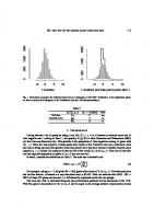
Not surprisingly, cats that fell five floors fared worse than those dropping only two, and those falling seven or eight floors tended to suffer even more (see Figure 1.2-1). But the astonishing result was that things got better after that. On average, the number of injuries was reduced in cats
57
that fell more than nine floors. This was true in every injury category. Their injury rates approached that of cats that had fallen only two floors! One cat fell 32 floors and walked away with only a chipped tooth.
FIGURE 1.2-1 A graph plotting the average number of injuries sustained per cat according to the number of stories fallen. Numbers in parentheses indicate number of cats. Data from Diamond (1988).
Description The horizontal axis is labeled Number of stories fallen with points 1(0), 2(8), 3(14), 4(27), 5(34), 6(21), 7-8(9), 9-32(13).The vertical axis is labeled Number of injuries per cat, ranging from 0 to 2 point 5 with increments of 0 point 5. 7 points are plotted, and a concave downward curve is drawn through the points. The approximate data are as follows. 2, zero point seven five; 3, 1;
58
4, one point eight; 5, 2; 6, two point two five; 7-8, two point four; and 9-32, 1.
This effect cannot be attributed to the ability of cats to right themselves so as to land on their feet—a cat needs less than one story to do that. The authors of the article put forth a more surprising explanation. They proposed that after a cat attains terminal velocity, which happens after it has dropped six or seven floors, the falling cat relaxes, and this change to its muscles cushions the impact when the cat finally meets the pavement.
59
Remarkable as these results seem, aspects of the sampling procedure raise questions. A clue to the problem is provided by the number of cats that fell a particular number of floors, indicated along the horizontal axis of Figure 1.2-1. No cats fell just one floor, and the number of cats falling increases with each floor from the second floor to the fifth. Yet, surely, every building in New York that has a fifth floor has a fourth floor, too, with open windows no less inviting. What can explain this curious trend? To answer this, keep in mind that the data are a sample of cats. The study was not carried out on the whole population of cats that fell from New York buildings. Our strong suspicion is that the sample is biased. Not all fallen cats were taken to the vet, and the chance of a cat making it to the vet might have been affected by the number of stories it had fallen. Perhaps most cats that tumble out of a first- or second-floor window suffer only indignity, which is untreatable. Any cat appearing to suffer no physical damage from a fall of even a few stories may likewise skip a trip to the vet. At the other extreme, a cat fatally plunging 20 stories might also avoid a trip to the vet, heading to the nearest pet cemetery instead. This example illustrates the kinds of questions of interpretation that arise if samples are biased. If the sample of cats delivered to the vet clinic is, as we suspect, a distorted subset of all the cats that fell, then the measures of injury rate and injury severity will also be distorted. We cannot say whether this bias is enough to cause the surprising downturn in injuries at a high number of stories fallen. At the very least, though, we can say that if the chances of a cat making it to the vet depend on the number of stories fallen, the relationship between injury rate and number of floors fallen will be distorted.
60
Good samples are a foundation of good science. In the rest of this section, we give an overview of the concept of sampling, what we are trying to accomplish when we take a sample, and the inferences that are possible when researchers get it right.
Populations and samples The first step in collecting any biological data is to decide on the target population. A population is the entire collection of individual units that a researcher is interested in. Ordinarily, a population is composed of a large number of individuals—so many that it is not possible to measure them all. Examples of populations include all cats that have fallen from buildings in New York City, all the genes in the human genome, all individuals of voting age in Australia, all paradise flying snakes in Borneo, and all children in Vancouver, Canada, suffering from asthma. A sample is a much smaller set of individuals selected from the population.2 The researcher uses this sample to draw conclusions that, hopefully, apply to the whole population. Examples include the fallen cats brought to one veterinary clinic in New York City, a selection of 20 human genes, all voters in an Australian pub, eight paradise flying snakes caught by researchers in Borneo, and a selection of 50 children in Vancouver, Canada, suffering from asthma.
A population is all the individual units of interest, whereas a sample is a subset of units taken from the population.
61
In most of the preceding examples, the basic unit of sampling is literally a single individual. However, in one example, the sampling unit was a single gene. Sometimes the basic unit of sampling is a group of individuals, in which case a sample consists of a set of such groups. Examples of units that are groups of individuals include a single family, a colony of microbes, a plot of ground in a field, an aquarium of fish, and a cage of mice. Scientists use several terms to indicate the sampling unit, such as “unit,” “individual,” “subject,” or “replicate.”
Properties of good samples Estimates based on samples are doomed to depart somewhat from the true population characteristics simply by chance. This chance difference from the truth is called sampling error. The spread of estimates resulting from sampling error indicates the precision of an estimate. The lower the sampling error, the higher the precision. Larger samples are less affected by chance, and so, all else being equal, larger samples will have lower sampling error and higher precision than smaller samples.
Sampling error is the chance difference between an estimate and the population parameter being estimated caused by sampling.
Ideally, our estimate is accurate (or unbiased), meaning that the average of all estimates that we might obtain is centered on the true population value. If the sampling process favors some outcomes over others, measurements made on the resulting samples might systematically underestimate (or overestimate) the population parameter. This is a second kind of error called bias. For example, estimates of the proportion of females in an urban rat population based on trap results would be biased if
62
individuals of one sex are more likely to enter traps than individuals of the other.
Bias is a systematic discrepancy between the estimates we would obtain, if we could sample a population again and again, and the true population characteristic.
Other sources of bias besides sampling can also lead to systematic discrepancies. The measurement process can lead to bias. For example, if the body lengths of insect specimens are measured using linear distances on photographs taken with a digital camera, curvature of the visual field caused by the lens can distort length measurements and lead to bias. Estimates can also be biased if an inadequate mathematical formula is used to calculate them from the data. For example, a simple count of the number of HIV strains detected in a sample of infected individuals is likely to underestimate the total number of strains in the population because inevitably some of the rarest strains will not be represented. The major goal of sampling is to minimize sampling error and bias in estimates. Figure 1.2-2 illustrates these goals by analogy with shooting at a target. Each point represents an estimate of the population bull’s-eye (i.e., of the true characteristic). Multiple points represent different estimates that we might obtain if we could sample the population repeatedly. Ideally, all the estimates we might obtain are tightly grouped, indicating low sampling error, and they are centered on the bull’s-eye, indicating low bias. Estimates are precise if the values we might obtain are tightly grouped and highly repeatable, with different samples giving similar answers. Estimates are accurate if they are centered on the bull’seye. Estimates are imprecise, on the other hand, if they are spread out, and they are biased (inaccurate) if they are displaced systematically to one side
63
of the bull’s-eye. The shots (estimates) on the upper right-hand target in Figure 1.2-2 are widely spread out but centered on the bull’s-eye, so we say that the estimates are accurate but imprecise. The shots on the lower left-hand target are tightly grouped but not near the bull’s-eye, so we say that they are precise but inaccurate. Both precision and accuracy are important, because a lack of either means that an estimate is likely to differ greatly from the truth.
FIGURE 1.2-2 Analogy between estimation and target shooting. An accurate estimate is centered around the bull’s-eye, whereas a precise estimate has low spread.
Description
64
The shots on the top left target are centered on the bull’s eye, so the shootings are precise and accurate. The shots on the top right target are scattered around the bull’s eye with only one shot on the bull’s eye, so they are imprecise and accurate. The shots on the bottom left target are clustered at a point away from the bull’s eye, so the shootings are precise and inaccurate. The shots on the bottom right target are scattered and away from the bull’s eye, so they are imprecise and inaccurate.
65
With sampling, we also want to be able to quantify the precision of an estimate. There are several quantities available to measure precision, which we discuss in Chapter 4. The sample of cats in Example 1.2 falls short in achieving some of these goals. If uninjured and dead cats do not make it to the pet hospital, then estimates of injury rate are biased. Injury rates for cats falling only two or three floors are likely to be overestimated, whereas injury rates for cats falling many stories might be underestimated.
Random sampling The common requirement of the statistical methods presented in this book is that the data come from a random sample. A random sample is a sample from a population that fulfills two criteria. First, every unit in the population must have an equal chance of being included in the sample. This is not as easy as it sounds. A botanist estimating plant growth might be more likely to find the taller individual plants or to collect those closer to the road. Some members of animal or human populations may be difficult to collect because they are shy of traps, never answer the phone, ignore questionnaires, or live at greater depths or distances than other members. These hard-to-sample individuals might differ in their characteristics from the rest of the population, so underrepresenting them in samples would lead to bias. Second, the selection of units must be independent. In other words, the selection of any one member of the population must in no way influence the selection of any other member.3 This, too, is not easy to ensure. Imagine, for example, that a sample of adults is chosen for a survey of
66
consumer preferences. Because of the effort required to contact and visit each household to conduct an interview, the lazy researcher is tempted to record the preferences of multiple adults in each household and add their responses to those of other adults in the sample. This approach violates the criterion of independence, because the selection of one individual has increased the probability that another individual from the same household will also be selected. This will distort the sampling error in the data if individuals from the same household have preferences more similar to one another than would individuals randomly chosen from the population at large. With non-independent sampling, our sample size is effectively smaller than we think. This, in turn, will cause us to miscalculate the precision of the estimates.
In a random sample, each member of a population has an equal and independent chance of being selected.
In general, the surest way to minimize bias and allow sampling error to be quantified is to obtain a random sample.4
Random sampling minimizes bias and makes it possible to measure the amount of sampling error.
How to take a random sample Obtaining a random sample is easy in principle but can be challenging in practice. A random sample can be obtained by using the following procedure: 1. Create a list of every unit in the population of interest, and give each unit a number between one and the total population size.
67
2. Decide on the number of units to be sampled (call this number n ). 3. Using a random-number generator,5 generate n random integers between one and the total number of units in the population. 4. Sample the units whose numbers match those produced by the random-number generator. An example of this process is shown in Figure 1.2-3. In both panels of the figure, we’ve drawn the locations of all 5699 trees present in 2001 in a carefully mapped tract of Harvard Forest in Massachusetts (Barker-Plotkin et al. 2006). Every tree in this population has a unique number between 1 and 5699 to identify it. We used a computerized random-number generator to pick n=20
random integers between 1 and 5699, where 20 is the
desired sample size. The 20 random integers, after sorting, are as follows: 156,
167, 2084,
3103,
232,
246,
2222,
3739,
826,
2223,
4315,
1106,
2284,
4978,
1476, 2790,
5258,
1968, 2898,
5500
These 20 randomly chosen trees are identified by red dots in the left panel of Figure 1.2-3.
68
FIGURE 1.2-3 The locations of all 5699 trees present in the Prospect Hill Tract of Harvard Forest in 2001 (green circles). The red dots in the left panel are a random sample of 20 trees. The squares in the right panel are a random sample of 20 quadrats (each 20 feet on a side).
Description The horizontal axes for both the scatterplots represent East-west position (feet), ranging from negative 600 to 200 with increments of 200. The vertical axes represent North-south position (feet), ranging from negative 800 to 0 with increments of 200. The approximate data in the first graph are as follows. The cluster of points is most dense between (negative 300, negative 650) and (100, negative 200). The approximate data in the second graph are as follows. The cluster of points is most dense between (negative 500, negative 350) and (50, negative 400).
69
How realistic are the requirements of a random sample? Creating a numbered list of every individual member of a population might be feasible for patients recorded in a hospital database, for children registered in an elementary school system, or for some other populations for which a registry has been built. The feat is impractical for most plant populations, however, and unimaginable for most populations of animals or microbes. What can be done in such cases? One answer is that the basic unit of sampling doesn’t have to be a single individual—it can be a group, instead. For example, it is easier to use a map to divide a forest tract into many equal-sized blocks or plots and then to create a numbered list of these plots than it is to produce a numbered list of every tree in the forest. To illustrate this second approach, we divided the Harvard Forest tract into 836 plots of 400 square feet each.
70
With the aid of a random-number generator, we then identified a random sample of 20 plots, which are identified by the squares in the right panel of Figure 1.2-3. The trees contained within a random sample of plots do not constitute a random sample of trees, for the same reason that all of the adults inhabiting a random sample of households do not constitute a random sample of adults. Trees in the same plot are not sampled independently; this can cause problems if trees growing next to one another in the same plot are more similar (or more different) in their traits than trees chosen randomly from the forest. The data in this case must be handled carefully. A simple technique is to take the average of the measurements of all of the individuals within a unit as the single independent observation for that unit. Random numbers should always be generated with the aid of a computer. Haphazard numbers made up by the researcher are not likely to be random (see Example 19.1). Most computer spreadsheet programs and statistical software packages include random-number generators.
The sample of convenience One undesirable alternative to the random sample is the sample of convenience, a sample based on individuals that are easily available to the researcher. The researchers must assume (i.e., dream) that a sample of convenience is unbiased and independent like a random sample, but there is no way to guarantee it.
A sample of convenience is a collection of individuals that are easily available to the researcher.
71
The main problem with the sample of convenience is bias, as the following examples illustrate: If the only cats measured are those brought to a veterinary clinic, then the injury rate of cats that have fallen from high-rise buildings is likely to be underestimated. Uninjured and fatally injured cats are less likely to make it to the vet and into the sample. The spectacular collapse of the North Atlantic cod fishery in the last century was caused in part by overestimating cod densities in the sea, which led to excessive allowable catches by fishing boats (Walters and Maguire 1996). Density estimates were too high because they relied heavily on the rates at which the fishing boats were observed to capture cod. However, the fishing boats tended to concentrate in the few remaining areas where cod were still numerous, and they did not randomly sample the entire fishing area (Rose and Kulka 1999). A sample of convenience might also violate the assumption of independence if individuals in the sample are more similar to one another in their characteristics than individuals chosen randomly from the whole population. This is likely if, for example, the sample includes a disproportionate number of individuals who are friends or who are related to one another.
Volunteer bias Human studies in particular must deal with the possibility of volunteer bias, which is a bias resulting from a systematic difference between the pool of volunteers (the volunteer sample) and the population to which they belong. The problem arises when the behavior of the subjects affects their chance of being sampled.
72
In a large experiment to test the benefits of a polio vaccine, for example, participating schoolchildren were randomly chosen to receive either the vaccine or a saline solution (serving as the control). The vaccine proved effective, but the rate at which children in the saline group contracted polio was found to be higher than in the general population. Perhaps parents of children who had not been exposed to polio prior to the study, and therefore had no immunity, were more likely to volunteer their children for the study than parents of kids who had been exposed (Bland 2000; Brownlee 1955). Compared with the rest of the population, volunteers might be more health conscious and more proactive; low-income (if volunteers are paid); more ill, particularly if the therapy involves risk, because individuals who are dying anyway might try anything; more likely to have time on their hands (e.g., retirees and the unemployed are more likely to answer telephone surveys); more angry, because people who are upset are sometimes more likely to speak up; or less prudish, because people with liberal opinions about sex are more likely to speak to surveyors about sex. Such differences can cause substantial bias in the results of studies. Bias can be minimized, however, by careful handling of the volunteer sample, but the resulting sample is still inferior to a random sample.
Data in the real world In this book, we use real data, hard-won from observational or experimental studies in the lab and field and published in the literature. Do
73
the samples on which the studies are based conform to the ideals outlined earlier? Alas, the answer is often no. Random samples are desired but often not achieved by researchers working in the trenches. Sometimes, the only data available are a sample of convenience or a volunteer sample, as the falling cats in Example 1.2 demonstrate. Scientists deal with this problem by taking every possible step to obtain random samples. If random sampling is impossible, then it is important to acknowledge that the problem exists and to point out where biases might arise in their studies.6 Ultimately, further studies should be carried out that attempt to control for any sampling problems evident in earlier work.
74
1.3 Types of data and variables With a sample in hand, we can begin to measure variables. A variable is any characteristic or measurement that differs from individual to individual. Examples include running speed, reproductive rate, and genotype. Estimates (e.g., the average running speed of a random sample of 10 lizards) are also variables, because they differ by chance from sample to sample. Data are the measurements of one or more variables made on a sample of individuals.
Variables are characteristics that differ among individuals or other sampling units.
Categorical and numerical variables Variables can be categorical or numerical. Categorical variables describe membership in a category or group. They describe qualitative characteristics of individuals that do not correspond to a degree of difference on a numerical scale. Categorical variables are also called attribute or qualitative variables. Examples of categorical variables include survival (alive or dead), sex chromosome genotype (e.g., XX, XY, XO, XXY, or XYY), method of disease transmission (e.g., water, air, animal vector, or direct contact),
75
predominant language spoken (e.g., English, Mandarin, Spanish, Indonesian, etc.), life stage (e.g., egg, larva, juvenile, subadult, or adult), snakebite severity score (e.g., minimal severity, moderate severity, or very severe), and size class (e.g., small, medium, or large). A categorical variable is nominal if the different categories have no inherent order. Nominal means “name.” Sex chromosome genotype, method of disease transmission, and predominant language spoken are nominal variables. In contrast, the values of an ordinal categorical variable can be ordered. Unlike numerical data, the magnitude of the difference between consecutive values is not known. Ordinal means “having an order.” Life stage, snakebite severity score, and size class are ordinal categorical variables.
Categorical data are qualitative characteristics of individuals that do not have magnitude on a numerical scale.
A variable is numerical when measurements of individuals are quantitative and have magnitude. These variables are numbers. Measurements that are counts, dimensions, angles, rates, and percentages are numerical. Examples of numerical variables include core body temperature (e.g., degrees Celsius [°C]), territory size (e.g., hectares), cigarette consumption rate (e.g., average number per day), age at death (e.g., years),
76
number of mates, and number of amino acids in a protein.
Numerical data are quantitative measurements that have magnitude on a numerical scale.
Numerical data are either continuous or discrete. Continuous numerical data can take on any real-number value within some range. Between any two values of a continuous variable, an infinite number of other values are possible. In practice, continuous data are rounded to a predetermined number of digits, set for convenience or by the limitations of the instrument used to take the measurements. Core body temperature, territory size, and cigarette consumption rate are continuous variables. In contrast, discrete numerical data come in indivisible units. The number of amino acids in a protein and the numerical rating of a statistics professor in a student evaluation are discrete numerical measurements. Number of cigarettes consumed on a specific day is a discrete variable, but the rate of cigarette consumption is a continuous variable when calculated as an average number per day over a large number of days. In practice, discrete numerical variables are often analyzed as though they were continuous, if there is a large number of possible values. Just because a variable is indexed by a number does not mean it is a numerical variable. Numbers might also be used to name categories
77
(e.g., family 1, family 2, etc.). Numerical data can be reduced to categorical data by grouping, though the result contains less information (e.g., “above average” and “below average”).
Explanatory and response variables One major use of statistics is to relate one variable to another by examining associations between variables and differences between groups. Measuring an association is equivalent to measuring a difference, statistically speaking. Showing that “the proportion of survivors differs between treatment categories” is the same as showing that the variables “survival” and “treatment” are associated. Often, when association between two variables is investigated, a goal is to assess how well one of the variables (deemed the explanatory variable) predicts or affects the other variable (called the response variable). When conducting an experiment, the treatment variable (the one manipulated by the researcher) is the explanatory variable, and the measured effect of the treatment is the response variable. For example, the administered dose of a toxin in a toxicology experiment would be the explanatory variable, and organism survival would be the response variable. When neither variable is manipulated by the researcher, their association might nevertheless be described by the “effect” of one of the variables (the explanatory) on the other (the response), even though the association itself is not direct evidence for causation. For example, when exploring the possibility that high blood pressure affects the risk of
78
stroke in a sample of people, blood pressure is the explanatory variable and incidence of strokes is the response variable. When natural groups of organisms, such as populations or species, are compared in some measurement, such as body mass, the group variable (population or species) is typically the explanatory variable and the measurement is the response variable. In more complicated studies involving more than two variables, there may be more than one explanatory or response variable. Sometimes you will hear variables referred to as “independent variable” and “dependent variable.” These are the same as explanatory and response variables, respectively. Strictly speaking, if one variable depends on the other, then neither is independent, so we prefer to use “explanatory” and “response” throughout this book.
79
1.4 Frequency distributions and probability distributions Different individuals in a sample will have different measurements. We can see this variability with a frequency distribution. The frequency of a specific measurement in a sample is the number of observations having a particular value of the measurement.7 The frequency distribution shows how often each value of the variable occurs in the sample.
The frequency distribution describes the number of times each value of a variable occurs in a sample.
Figure 1.4-1 shows the frequency distribution for the measured beak depths of a sample of 100 finches from a Galápagos island population.8
FIGURE 1.4-1
80
The frequency distribution of beak depths in a sample of 100 finches from a Galápagos island population (Boag and Grant 1984). The vertical axis indicates the frequency, the number of observations in each 0.5-mm interval of beak depth.
Description The approximate data are as follows. Six point five to 7 millimeters, frequency 2; 7 to seven point five, 1; seven point five to 8, 4; 8 to eight point five, 7; eight point five to 9, 14; 9 to nine point five, 11; nine point five to 10, 23; 10 to ten point five, 17; ten point five to 11, 15; 11 to eleven point five, 1; eleven point five to 12, 4; 12 to twelve point five, 1; thirteen point five to 14, 1.
81
We use the frequency distribution of a sample to inform us about the distribution of the variable (beak depth) in the population from which it came. Looking at a frequency distribution gives us an intuitive understanding of the variable. For example, we can see which values of beak depth are common and which are rare, we can get an idea of the average beak depth, and we can start to understand how much variation in beak depth is present among the finches living on the island. The distribution of a variable in the whole population is called its probability distribution. The real probability distribution of a population in nature is almost never known. Researchers typically use theoretical probability distributions to approximate the real probability distribution. For a continuous variable like beak depth, the distribution in the population is often approximated by a theoretical probability distribution known as the normal distribution. The normal distribution drawn in Figure 1.4-2, for example, approximates the probability distribution of beak depths in the finch population from which the sample of 100 birds was drawn.
82
FIGURE 1.4-2 A normal distribution. This probability distribution is often used to approximate the distribution of a variable in the population from which a sample has been drawn.
Description The horizontal axis is labeled beak depth in millimeters with points ranging from 6 to 14 with increments of 2. The vertical axis is labeled probability density with points ranging from zero point one to zero point five with increments of zero point one. The curve is concave down and is is bilaterally symmetrical. It starts from the horizontal axis before 6, rises up, peaks at about 10, slides down, and ends at after 14.
83
The normal distribution is the familiar “bell curve.” It is the most important probability distribution in all of statistics. You’ll learn a lot more about it in Chapter 10. Most of the methods presented in this book for analyzing data depend on the normal distribution in some way.
84
1.5 Types of studies Data in biology are obtained from either an experimental study or an observational study. In an experimental study, the researcher assigns different treatment groups or values of an explanatory variable randomly to the individual units of study. There must be at least two treatments in an experimental study. A classic example is the clinical trial, where different treatments (for example, different drugs) are assigned randomly to patients in order to compare responses. In an observational study, on the other hand, the researcher has no control over which units fall into which groups.
A study is experimental if the researcher assigns treatments randomly to individuals, whereas a study is observational if the assignment of treatments is not made by the researcher.
The crucial advantage of experiments derives from the random assignment of treatments to units. Random assignment, also called randomization, minimizes the influence of confounding variables, allowing the experimenter to isolate the effects of the treatment variable. The result is that experimental studies can determine causeand-effect relationships between variables, whereas observational studies can only point to associations. For example, Huey and Eguskitza (2000) observed that between 1978 and 1999, 40 of 1173 climbers have died while attempting to scale Mount Everest or its neighbor, K2. The risk of death was lowest for those individuals who used supplemental oxygen during 85
the climb, compared with climbers who did not use supplemental oxygen. It is tempting to conclude therefore that supplemental oxygen reduces the risk of dying. But another possibility is that supplemental oxygen has no effect at all on risk of mortality. The two variables might be associated only because other variables affect both supplemental oxygen and mortality risk at the same time. Perhaps the use of supplemental oxygen is just a benign indicator of a greater overall preparedness of the climbers who use it, and greater preparedness rather than oxygen use is the real cause of reduced mortality among those who climb. Variables (like preparedness) that distort the causal relationship between the measured variables of interest (oxygen use and survival) are called “confounding variables.” (Interleaf 1, following this chapter, provides other examples of confounding variables.)
A confounding variable is a variable that masks or distorts the causal relationship between measured variables in a study.
Confounding variables bias the estimate of the causal relationship between measured explanatory and response variables, sometimes even reversing the apparent effect of one on the other. For example, observational studies have indicated that breast-fed babies have lower weight at 6 and 12 months of age compared with formula-fed infants. This has been interpreted as evidence that breast-feeding causes slow growth, but the truth turns out to be the reverse. Babies who grow rapidly are more likely to feed more, to be more demanding, and to be moved off the breast onto formula to give the
86
poor mothers a break. An experimental study that randomly assigned treatments to mothers found that mean infant weight was actually higher in breast-fed babies at 6 months of age and was not less than that in formula-fed babies at 12 months (Kramer et al. 2002). The observed relationship between breast-feeding and infant growth was confounded by unmeasured variables such as the socioeconomic status of the parents. With an experiment, random assignment of treatments to participants allows researchers to tease apart the effects of the explanatory variable from those of confounding variables. With random assignment, no confounding variables will be associated with treatment except by chance. If a researcher could randomly assign supplemental oxygen/no-oxygen treatments to Everest climbers, this would break the association between oxygen and degree of preparedness. Random assignment wouldn’t eliminate variation in preparedness, but it would approximately equalize the preparedness levels of the two oxygen treatment groups. In this case, any resulting difference between groups in mortality must be caused by oxygen treatment. Observational studies can suggest the possibility of cause-and-effect relationships between variables. For example, studies of the health consequences of voluntary cigarette smoking in people are all observational studies, because it is ethically impossible to assign smoking and nonsmoking treatments to people to assess the effects of smoking. But experimental studies of the health consequences of smoking have been carried out on nonhuman subjects, such as mice, 87
where researchers were able to assign smoking and nonsmoking treatments randomly to individuals. The health hazards of smoking in nonhuman animals have helped make the case that cigarette smoking is dangerous to human health. But experimental studies are not always possible, even on animals. Smoking in humans, for example, is also associated with a higher suicide rate (Hemmingsson and Kriebel 2003). Perhaps this association is caused by the effects of smoking, but it might be caused instead by the effects of a confounding variable such as mental health. Just because a study was carried out in the laboratory does not mean that the study is an experimental study in the sense described here. A complex laboratory apparatus and careful conditions may be necessary to obtain measurements of interest, but such a study is still observational if the assignment of treatments is out of the control of the researcher.
88
1.6 Summary Statistics is the study of methods for measuring aspects of populations from samples and for quantifying the uncertainty of the measurements. Much of statistics is about estimation, which infers an unknown quantity of a population using sample data. Statistics also allows hypothesis testing, a method to determine how well hypotheses about a population parameter fit the sample data. Sampling error is the chance difference between an estimate describing a sample and the corresponding parameter of the whole population. Bias is a systematic discrepancy between an estimate and the population quantity. The goals of sampling are to increase the accuracy and precision of estimates and to ensure that it is possible to quantify precision. In a random sample, every individual in a population has the same chance of being selected, and the selection of individuals is independent. A sample of convenience is a collection of individuals easily available to a researcher, but it is not usually a random sample. Volunteer bias is a systematic discrepancy in a quantity between the pool of volunteers and the population. Variables are measurements that differ among individuals. Variables are either categorical or numerical. A categorical variable describes which category an individual belongs to, whereas a numerical variable is expressed as a number.
89
The frequency distribution describes the number of times each value of a variable occurs in a sample. A probability distribution describes the number of times each value occurs in a population. Probability distributions in populations can often be approximated by a normal distribution. In studies of association between two variables, one variable is typically used to predict the value of another variable and is designated as the explanatory variable. The other variable is designated as the response variable. In experimental studies, the researcher is able to assign treatments randomly to subjects, limiting the influence of confounding variables on the association between treatment and response variables. For this reason, experimental studies can identify cause-and-effect relationships between treatment and response variables. In observational studies, the assignment of treatments to individuals is not controlled by the researcher. Observational studies can suggest the possibility of cause-and-effect relationships between variables that might later be tested with experiments.
Online resources Learning resources associated with this chapter are online at https://whitlockschluter3e.zoology.ubc.ca/chapter01.html.
90
Chapter 1 Problems
Answers to the Practice Problems are provided in the Answers Appendix at the back of the book. 1. Which of the following numerical variables are continuous? Which are discrete? a. Number of injuries sustained in a fall b. Fraction of birds in a large sample infected with avian flu virus c. Number of crimes committed by a randomly sampled individual d. Logarithm of body mass 2. The peppered moth (Biston betularia) occurs in two types: peppered (speckled black and white) and melanic (black). A researcher wished to measure the proportion of melanic individuals in the peppered moth population in England, to examine how this proportion changed from year to year in the past. To accomplish this, she photographed all the peppered moth specimens available in museums and large private collections and grouped them by the year in which they had been collected. Based on this sample, she calculated the proportion of melanic individuals in every year. The people who collected the specimens, she knew, would prefer to collect whichever type was rarest in any given year, since those would be the most valuable. a. Can the specimens from any given year be considered a random sample from the moth population? b. If not a random sample, what type of sample is it? c. What type of error might be introduced by the sampling method when estimating the proportion of melanic moths?
91
Description -
92
3. What feature of an estimate—precision or accuracy—is most strongly affected when individuals differing in the variable of interest do not have an equal chance of being selected? 4. In a study of stress levels in U.S. Army recruits stationed in Iraq, researchers obtained a complete list of the names of recruits in Iraq at the time of the study. They listed the recruits alphabetically and then numbered them consecutively. One hundred random numbers between one and the total number of recruits were then generated using a random-number generator on a computer. The 100 recruits whose numbers corresponded to those generated by the computer were interviewed for the study. a. What is the population of interest in this study? b. The 100 recruits interviewed were randomly sampled as described. Is the sample affected by sampling error? Explain. c. What are the main advantages of random sampling in this example? d. What effect would a larger sample size have had on sampling error?
93
5. An important quantity in conservation biology is the number of plant and animal species inhabiting a given area. To survey the community of small mammals inhabiting Kruger National Park in South Africa, a large series of live traps were placed randomly throughout the park for one week in the main dry season of 2014. Traps were set each evening and checked the following morning. Individuals caught were identified, tagged (so that new captures could be distinguished from recaptures), and released. At the end of the survey, the total number of small mammal species in the park was estimated by the total number of species captured in the survey. a. What is the parameter being estimated in the survey? b. Is the sample of individuals captured in the traps likely to be a random sample? Why or why not? In your answer, address the two criteria that define a sample as random. c. Is the number of species in the sample likely to be an unbiased estimate of the total number of small mammal species in the park? Why or why not? 6. In a recent study, researchers took electrophysiological measurements from the brains of two rhesus macaques (monkeys). Forty neurons were tested in each monkey, yielding a total of 80 measurements. a. Do the 80 neurons constitute a random sample? Why or why not? b. If the 80 measurements were analyzed as though they constituted a random sample, what consequences would this have for the estimate of the measurement in the monkey population? 7. Identify which of the following variables are discrete and which are continuous: a. Number of warts on a toad b. Survival time after poisoning c. Temperature of porridge d. Number of bread crumbs in 10 meters of trail
94
e. Length of wolves’ canines 8. A study was carried out in women to determine whether the psychological consequences of having an abortion differ from those experienced by women who have lost their fetuses by other causes at the same stage of pregnancy. a. Which is the explanatory variable in this study, and which is the response variable? b. Was this an observational study or an experimental study? Explain. 9. For each of the following studies, say which is the explanatory variable and which is the response variable. Also, say whether the study is observational or experimental. a. Forestry researchers wanted to compare the growth rates of trees growing at high altitude to those of trees growing at low altitude. They measured growth rates using the space between tree rings in a set of trees harvested from a natural forest. b. Researchers randomly divided a sample of diabetes patients into two groups. Patients in the first group were assigned to receive a new drug, taspoglutide, whereas patients in the other group receive standard treatment without the new drug. The researchers compared the rates of insulin release in the two groups. c. Psychologists tested whether the frequency of illegal drug use differs between people suffering from schizophrenia and those not having the disease. They measured drug use in a group of schizophrenia patients and compared it with that in a similar-sized group of randomly chosen people. d. Spinner Hansen et al. (2008) studied a species of spider whose females often eat males that are trying to mate with them. The researchers removed a leg from each male spider in one group (to make them weaker and more vulnerable to being eaten) and left the males in another group undamaged. They studied whether survival of males in the two groups differed during courtship.
95
e. Bowen et al. (2012) studied the effects of advanced communication therapy on patients whose communication skills had been affected by previous strokes. They randomly assigned two therapies to stroke patients. One group received advanced communication therapy, and the other received only social visits without formal therapy. Both groups otherwise received normal, best-practice care. After six months, the communication ability (as measured by a standardized quantitative test score) was measured on all patients. 10. Each of the examples (a–e) in Problem 9 involves estimating or testing an association between two variables. For each of the examples, list the two variables, and state whether each is categorical or numerical. 11. Imagine that an effect was detected in every study listed in Problem 9 (a– e). In which of the studies would the researchers be justified in concluding that the effect was caused by the explanatory variable (treatment) of interest? In which cases would such a conclusion not be justified? Why or why not? 12. A random sample of 500 households was identified in a major North American city using the municipal voter registration list. Five hundred questionnaires went out, directed at one adult in each household, surveying respondents about attitudes regarding the municipal recycling program. Eighty of the 500 surveys were filled out and returned to the researchers. a. Can the 80 households that returned questionnaires be regarded as a random sample of households? Explain. b. What type of bias might affect the survey outcome? 13. State whether the following represent cases of estimation or hypothesis testing. a. A random sample of quadrats in Olympic National Forest is taken to determine the average density of Ensatina salamanders. b. A study to determine whether there is extrasensory perception (ESP) is carried out by counting the number of cards guessed correctly by a subject isolated from a second person who is drawing cards randomly
96
from a normal card deck. The number of correct guesses is compared with the number we would expect by chance if there were no such thing as ESP. c. A trapping study measures the rate of fruit fall in forest clear-cuts. d. An experiment is conducted to calculate the optimal number of calories per day to feed captive sugar gliders (Petaurus breviceps) to maintain normal body mass and good health. e. A clinical trial is carried out to determine whether taking large doses of vitamin C benefits the health of advanced cancer patients. f. An observational study is carried out to determine whether hospital emergency room admissions increase during nights with a full moon compared with other nights. 14. A researcher dissected the retinas of 20 randomly sampled fish belonging to each of two subspecies of guppy in Venezuela. Using a sophisticated laboratory apparatus, he measured the two groups of fish to find the wavelengths of visible light to which the cones of the retina were most sensitive. The goal was to explore whether fish from the two subspecies differed in the wavelength of light that they were most sensitive to. a. What are the two variables being associated in this study? b. Which is the explanatory variable and which is the response variable? c. Is this an experimental study or an observational study? Why?
Answers to all Assignment Problems are available for instructors, by contacting [email protected]. 15. Identify whether the following variables are numerical or categorical. If numerical, state whether the variable is discrete or continuous. If
97
categorical, state whether the categories have a natural order (ordinal) or not (nominal). a. Number of sexual partners in a year b. Petal area of rose flowers c. Heartbeats per minute of a Tour de France cyclist, averaged over the duration of the race d. Birth weight e. Stage of fruit ripeness (e.g., underripe, ripe, or overripe) f. Angle of flower orientation relative to position of the sun g. Tree species h. Year of birth i. Gender 16. In the vermilion flycatcher, the males are brightly colored and sing frequently and prominently. Females are more dull colored and make less sound. In a field study of this bird, a researcher attempted to estimate the fraction of individuals of each sex in the population. She based her estimate on the number of individuals of each sex detected while walking through suitable habitat. Is her sample of birds detected likely to be a random sample? Why or why not?
98
Description -
99
17. Not all telephone polls carried out to estimate voter or consumer preferences make calls to cell phones. One reason is that in the United States, automated calls (“robocalls”) to cell phones are not permitted and interviews conducted by humans are more costly. a. How might the strategy of leaving out cell phones affect the goal of obtaining a random sample of voters or consumers? b. Which criterion of random sampling is most likely to be violated by the problems you identified in part (a): equal chance of being selected or the independence of the selection of individuals? c. Which attribute of estimated consumer preference is most affected by the problem you identified in (a): accuracy or precision? 18. The average age of piñon pine trees in the coast ranges of California was investigated by placing 500 10-hectare plots randomly on a distribution map of the species using a computer. Researchers then found the location of each random plot in the field, and they measured the age of every piñon pine tree within each of the 10-hectare plots. The average age within the
100
plot was used as the unit measurement. These unit measurements were then used to estimate the average age of California piñon pines. a. What is the population of interest in this study? b. Why did the researchers take an average of the ages of trees within each plot as their unit measurement, rather than combine into a single sample the ages of all the trees from all the plots? 19. Refer to Problem 18. a. Is the estimate of age based on 500 plots influenced by sampling error? Why? b. How would the sampling error of the estimate of mean age change if the investigators had used a sample of only 100 plots? 20. In each of the following examples, indicate which variable is the explanatory variable and which is the response variable. a. The anticoagulant warfarin is often used as a pesticide against house mice, Mus musculus. Some populations of the house mouse have acquired a mutation in the vkorc1 gene from hybridizing with the Algerian mouse, M. spretus (Song et al. 2011). In the Algerian mice, this gene confers resistance to warfarin. In a hypothetical follow-up study, researchers collected a sample of house mice to determine whether presence of the vkorc1 mutation is associated with warfarin resistance in house mice as well. They fed warfarin to all the mice in a sample and compared survival between the individuals possessing the mutation and those not possessing the mutation. b. Cooley et al. (2009) randomly assigned either of two treatments, naturopathic care (diet counseling, breathing techniques, vitamins, and an herbal medicine) or standardized psychotherapy (psychotherapy with breathing techniques and a placebo added), to 81 individuals having moderate to severe anxiety. Anxiety scores decreased an average of 57% in the naturopathic group and 31% in the psychotherapy group.
101
c. Individuals highly sensitive to rewards tend to experience more food cravings and are more likely to be overweight or develop eating disorders than other people. Beaver et al. (2006) recruited 14 healthy volunteers and scored their reward sensitivity using a questionnaire (they were asked to answer yes or no to questions like “I’m always willing to try something new if I think it will be fun”). The subjects were then presented with images of appetizing foods (e.g., chocolate cake, pizza) while activity of their fronto-striatal–amygdala–midbrain was measured using functional magnetic resonance imaging (fMRI). Reward sensitivity of subjects was found to correlate with brain activity in response to the images. d. Endostatin is a naturally occurring protein in humans and mice that inhibits the growth of blood vessels. O’Reilly et al. (1997) investigated its effects on growth of cancer tumors, whose growth and spread require blood vessel proliferation. Mice having lung carcinoma tumors were randomly divided into groups that were treated with doses of 0, 2.5, 10, or 20 mg/kg of endostatin injected once daily. They found that higher doses of endostatin led to inhibition of tumor growth. 21. For each of the studies presented in Problem 20, indicate whether the study is an experimental or observational study. 22. In a study of heart rate in ocean-diving birds, researchers harnessed 10 randomly sampled, wild-caught cormorants to a laboratory contraption that monitored vital signs. Each cormorant was subjected to six artificial “dives” over the following week (one dive per day). A dive consisted of rapidly immersing the head of the bird in water by tipping the harness. In this way, a sample of 60 measurements of heart rate in diving birds was obtained. Do these 60 measurements represent a random sample? Why or why not? 23. Researchers sent out a survey to U.S. war veterans that asked a series of questions, including whether individuals surveyed were smokers or nonsmokers (Seltzer et al. 1974). They found that nonsmokers were 27% more likely than smokers to respond to the survey within 30 days (based on the much larger number of smokers and nonsmokers who eventually
102
responded). Hypothetically, if the study had ended after 30 days, what effect would this have on the estimate of the proportion of veterans who smoke? (Use terminology you learned in this chapter to describe the effect.) 24. During World War II, the British Royal Air Force estimated the density of bullet holes on different sections of planes returning to base from aerial sorties. Their goal was to use this information to determine which plane sections most needed additional protective shields. (It was not possible to reinforce the whole plane, because it would weigh too much.) They found that the density of holes was highest on the wings and lowest on the engines and near the cockpit, where the pilot sits (their initial conclusion, that therefore the wings should be reinforced, was later shown to be mistaken). What is the main problem with the sample: bias or large sampling error? What part of the plane should have been reinforced?
Description -
103
25. In a study of diet preferences in leafcutter ants, a researcher presented 20 randomly chosen ant colonies with leaves from the two most common tree species in the surrounding forest. The leaves were placed in piles of 100, one pile for each tree species, close to colony entrances. Leaves were cut so that each was small enough to be carried by a single ant. After 24 hours, the researcher returned and counted the number of leaves remaining of the original 100 of each species. Some of the results are shown in the following table.
104
Tree species
Number of leaves removed
Spondius mombin
1561
Sapium thelocarpum
851
Total
2412
Using these results, the researcher estimated the proportion of Spondius mombin leaves taken as 0.65 and concluded that the ants have a preference for leaves of this species. a. Identify the two variables whose association is displayed in the table. Which is the explanatory variable and which is the response variable? Are they numeric or categorical? b. Why do the 2412 leaves used in the calculation of the proportion not represent a random sample? c. Would treating the 2412 leaves as a random sample most likely affect the accuracy of the estimate of diet preference or the precision of the estimate? d. If not the leaves, what units were randomly sampled in the study? 26. Garaci et al. (2012) examined a sample of people with and without multiple sclerosis (MS) to test the controversial idea that the disease is caused by blood flow restriction resulting from a vein condition known as chronic cerebrospinal venous insufficiency (CCSVI). Of 39 randomly sampled patients with MS, 25 were found to have CCSVI and 14 were not. Of 26 healthy control subjects, 14 were found to have CCSVI and 12 were not. The researchers found an association between CCSVI and MS. a. What is the explanatory variable, and what is the response variable? b. Is this an experimental study or an observational study? c. Where might hypothesis testing have been used in the study? 27. Refer to Problem 26. If the occurrence of CCSVI was found to be highest in the subjects with MS, would the authors be justified in concluding that
105
CCSVI is a cause of MS? Why or why not? 28. CERN is a European organization based in Switzerland that uses particle accelerators for high-energy physics research. In 2011, researchers at CERN measured the speed of a subatomic particle called a muon neutrino at just over the speed of light. Modern physics was confident that nothing can exceed the speed of light, yet the measurements were repeated multiple times with the same result. Because the result was so surprising, the experimental apparatus and protocol were also checked, and they eventually discovered that a fiber-optic cable connecting a receiver to a computer was loose. After replacing the cable, the measurements of the speed of neutrinos were indistinguishable from the speed of light. In the jargon described in this chapter, what word would describe the type of deviation from the truth demonstrated by the original measurements of the speed of neutrinos at CERN? 29. A medical researcher wants to know how well a particular drug works at prolonging the lives of patients after diagnosis with Type I diabetes. He decides he needs 50 patients for his study. He realizes that he already has 50 patients who he has been treating for this disease over the past decade. He decides to base his study on these patients because he has ready access to their records and a long-standing relationship with them that will make them more likely to participate fully in the trial. a. What is the technical name for this type of sample? b. How would this sampling strategy affect the researcher’s estimate of the life-extension effect associated with this drug?
106
1 Correlation does not require causation Science is aimed at understanding how the world works. Identifying the causes of events is a key part of the process of science. A first step in that process is the discovery of patterns, which usually involves noticing associations between events. When two events are associated, the possibility is raised that one is the cause of the other. For example, our ancestors noticed that chewing on willow bark made sufferers of headaches and fevers feel better. We now know that the association between bark-chewing and pain relief is explained by the presence of salicylic acid in the bark. The acid blocks the release of prostaglandins in the body, which mediate pain and inflammation. This association led to the invention of aspirin. An association (or correlation) between variables is a powerful clue that there may be a causal relationship between those variables. Smoking is associated with lung cancer; drinking is associated with fatal automobile accidents; taking streptomycin is associated with reduced bacterial infection. These associations exist because one thing causes the other, and the causal relationship was eventually discovered because someone first noticed their correlation. The problem is that two variables can be correlated without one being the cause of the other. A correlation between two variables can result instead from a common cause. For example, the number of violent crimes tends to increase when ice cream sales increase. Does this 107
mean that violence instills a deep need for ice cream? Or does it mean that squabbles over who ate the last of the Chunky Monkey® escalate to violence? Perhaps, but the more likely explanation for this association is that they share a common cause: hot weather encourages both ice cream consumption and bad behavior. Ice cream sales and violence are correlated, but this doesn’t mean that one causes the other.
Description -
108
If we plot the mean life expectancy of the people of a country against the number of televisions per person in that country, we see quite a strong relationship (Rossman 1994):
109
Description The horizontal axis ranges from 0 to 0.8 televisions per person in intervals of 0.1. The vertical axis is life expectancy in years ranging from 50 to 80 in intervals of 5. Data point density is highest between 0 and 0 point 2 televisions and less than 65 years. There are fewer data points between 0 point 2 and 0 point 5 televisions, and between 65 and 75 years. The fewest data points are between 0 point 6 and 0 point 8 televisions, and between 75 and 80 years. A fit curve through the data points shows a positive relation between the number of televisions per person and increased life expectancy.
110
But the magical healing powers of the TV have yet to be demonstrated. Instead, it is likely that both televisions per capita and life expectancy have a common cause in the overall wealth of the citizens of the country. These examples demonstrate the problems posed by confounding variables. A confounding variable is an unmeasured variable that changes in tandem with one or more of the measured variables; this gives the false appearance of a causal relationship between the measured variables. The apparent relationship between violence and ice cream sales is probably the result of the confounding variable temperature. Overall wealth, or something related to it, is probably
111
the confounding variable in the correlation between the number of televisions and life expectancy. These examples demonstrate the limitations of observational studies, which illuminate patterns but are unable to fully disentangle the effects of measured explanatory variables and unmeasured confounding variables. The main purpose of experimental studies is to disentangle such effects. In an experiment, the researcher is able to assign treatment groups randomly to different participants. Random assignment breaks the association between the confounding variable and the explanatory variable, allowing the causal relationship between treatment and response variables to be assessed. Sir Ronald Fisher, the inventor of many of the methods in this book (see Interleaf 4), never believed that smoking caused lung cancer. Instead, he thought that smoking may be caused by a genetic predisposition and that this genetic effect might also predispose one to cancer.1 In other words, he thought that the genotype of an individual was a confounding factor. Fisher invented experimental design, which would make it possible to test his claim. In theory, one could assign smoking and nonsmoking treatments randomly to participants and any underlying correlation with genetics would be broken, because on average, equally as many participants genetically predisposed to cancer would be assigned to both treatments. If Fisher’s hypothesis were correct, the smokers would not have an increased cancer rate. Such an experiment is not ethically possible with humans, but it has been done with other mammal species.
112
Finding correlations and associations between variables can be a crucial step in developing a scientific hypothesis. However, determining whether these relationships are causal or coincidental requires careful experimentation. Experiments themselves might inadvertently create artificial conditions that distort cause and effect. An experimental artifact is a bias in a measurement produced by unintended consequences of experimental procedures. For example, experiments conducted on dive responses of aquatic birds have shown that their heart rates drop sharply when they are forcibly submerged in water compared with control individuals remaining above water. The drop in heart rate has been interpreted as an oxygen-saving response to diving. Later studies using improved technology showed that voluntary dives do not produce such a large drop in heart rate (Kanwisher et al. 1981). This finding suggested that a component of the heart rate response in forced dives was induced by the stress of being forcibly dunked underwater, rather than the dive itself. The experimental conditions introduced an artifact that for a while went unrecognized. Experiments should be designed to minimize artifacts. To prevent artifacts, experimental studies should be conducted under conditions that are as natural as possible. A potential drawback is that more natural conditions might introduce more sources of variation, reducing power and precision. Observational studies can provide important insight into what is the best setting for an experiment and can help to decide what scientific questions are the most interesting. Experiments, if done properly, allow us to untangle cause and effect.
113
Chapter 2 Displaying data
114
Description Data from the chart is as follows: April 18 54: All deaths are caused by other causes. May: Some deaths are caused by infectious disease and majority of deaths are caused by other causes. June: Some deaths are caused by other causes and majority of deaths are caused by infectious disease. July: Some deaths are caused by other causes and majority of deaths are caused by infectious disease. August: Some deaths are caused by other causes and majority of deaths are caused by infectious disease. September: Majority of deaths is caused by infectious disease, some are caused by wounds, and few are caused by other causes. October: Majority of deaths is caused by infectious disease, some are caused by wounds, and a few are caused by other causes. November: A few deaths are caused by other causes and almost equal deaths are caused by infectious disease and wounds. December: Majority of deaths is caused by infectious disease, some are caused by wounds, and few are caused by other causes. January 18 55: Majority of deaths is caused by infectious disease, followed by other causes, and then by wounds. February: Majority of deaths is caused by infectious disease, followed by other causes, and then by wounds.
115
March: Majority of deathspattern is caused by infectious followed by The human eye is a natural detector, adeptdisease, at spotting trends other causes,inand then displays. by wounds. and exceptions visual For this reason, biologists spend
hours creating and examining visual summaries of their data—graphs January 18 55 shows the highest number of deaths and April 18 54 and
and, June to a lesser extent, 18 54 show thetables. lowest Effective number of graphs deaths. enable visual
comparisons of measurements between groups, and they expose relationships between different variables. They are also the principal means of communicating results to a wider audience. Florence Nightingale (1858) was one of the first to put graphs to good use. In her famous wedge diagrams, redrawn in the figure above, she visualized the causes of death of British troops during the Crimean War. The number of cases is indicated by the area of a wedge and the cause of death by color. The diagrams showed convincingly that disease was the main cause of soldier deaths during the wars, not wounds or other causes. With these vivid graphs, she successfully campaigned for military and public health measures that saved many lives. Effective graphs are a prerequisite for good data analysis, revealing general patterns in the data that bare numbers cannot show. Therefore, the first step in any data analysis or statistical procedure is to graph the data and look at it. Humans are a visual species, with brains evolved to process visual information. Take advantage of millions of years of evolution, and look at visual representations of your data before doing anything else. We’ll follow this prescription throughout the book.
116
In this chapter, we explain how to produce effective graphical displays of data and how to avoid common pitfalls. We then review which types of graphs best show the data. The top choices will depend on the type of data, numerical or categorical, and whether the goal is to show measurements of one variable or the association between two variables. There is often more than one way to show the same pattern in data, and we will compare and evaluate successful and unsuccessful approaches. We will also mention a few tips for constructing tables, whose layouts should also be optimized to show patterns in the data.
117
2.1 Guidelines for effective graphs Graphs are vital tools for analyzing data. They are also used to communicate patterns in data to a wider audience in the form of reports, slide shows, and web content. These two purposes, analysis and presentation, are largely coincident because the most revealing displays will be the best for both identifying patterns in the data and communicating these patterns to others. Both purposes require displays that are clear, honest, and efficient. To motivate principles of effective graphs, let’s highlight some common ways in which researchers might get it wrong.
How to draw a bad graph Figure 2.1-1 shows the results of an experiment in which maize plants were grown in pots under three nitrogen regimes and two soil water contents. Height of bars represents the average maize yield (dry weight per plant) at the end of the experiment under the six combinations of water and nitrogen. The data are real (Quaye et al. 2009), but we made the graph intentionally bad to highlight four common defects. Examine the graph before reading farther and try to recognize some of the errors. Many graphics packages on the computer make it easy to produce flawed graphs like this one, which is probably why we still encounter them so often.
118
FIGURE 2.1-1 An example of a defective graph showing mean plant height of maize grown in pots under different nitrogen and water treatments.
Description The horizontal axis is labeled Nitrogen in kilogram per hectare, with points 0, 40, and 80. The vertical axis is labeled Maize yield in gram per plant, with points ranging from 2 to 9 with increment of 1. Another horizontal axis is labeled Soil water content, with qualitative data low and high. 6 rectangular bars in 2 rows of low and high are plotted. The approximate data are as follows. 0 kilogram per hectare nitrogen, 3 gram per plant maize yield, low soil water content; 40, 4, low; 80, 5, low; 0, 6, high; 40, six point five, high; 80, 9, high.
119
Mistake #1: The graph hides the data. Each bar in Figure 2.1-1 represents average yield of four plant pots assigned to that nitrogen and water treatment. The data points—yields of all the experimental units (pots)— are nowhere to be seen. As a result, we are unable to see the variation in yield between pots and compare it with the magnitude of differences between treatments. It means that any unusual observations that might distort the calculation of average yield remain hidden. It would be a challenge to add the data points to this particular style of graph because the bars are in the way. We’ll say more later about when bars are appropriate and when they are not. Mistake #2: Patterns in the data are difficult to see. The three dimensions and angled perspective make it difficult to judge bar height by eye, which
120
means that average plant growth is difficult to compare between treatments. In his classic book on information graphics, Tufte (1983) referred to 3-D and other visual embellishments as “chartjunk.” Chartjunk adds clutter that dilutes information and interferes with the ability of the eye and brain to “see” patterns in data. Mistake #3: Magnitudes are distorted. The vertical axis on the graph, plant yield, ranges from 2 to 9 g/plant rather than 0 to 9, which means that bar height is out of proportion to actual magnitudes. Mistake #4: Graphical elements are unclear. Text and other figure elements are too small to read easily.
How to draw a good graph A few straightforward principles will help to ensure that your graphs do not end up with the kind of problems illustrated in Figure 2.1-1. We follow these four rules ourselves in the remainder of the book. Show the data. Make patterns in the data easy to see. Represent magnitudes honestly. Draw graphical elements clearly. Show the data, first and foremost (Tufte 1983). In other words, show the individual data points or a frequency distribution to show their shape. A good graph allows you to see the data to help the eye detect patterns. Showing the data makes it possible to evaluate the shape of the distribution of data points and to compare measurements between groups. It helps you to spot potential problems, such as skew and outliers, which will be useful as you decide the next step of your data analysis.
121
Figure 2.1-2 gives an example of what it means to show the data. The study examined the role of the neurotransmitter serotonin1 in bringing about a transition in social behavior, from solitary to gregarious, in a desert locust (Anstey et al. 2009). This behavior change is a critical point in the production of huge locust swarms that blacken skies and ravage crops in many parts of the world. Each data point is the serotonin level of one of 30 locusts experimentally caged at high density for 0, 1, or 2 hours, with 0 representing the control. The panel on the left of Figure 2.1-2 shows the data (this type of graph is called a strip chart or dot plot). The panel on the right of Figure 2.1-2 hides the data, using bars to show only treatment averages.
FIGURE 2.1-2 A graph that shows the data (left) and a graph that hides the same data (right). Points are serotonin levels in the central nervous system of desert locusts, Schistocerca gregaria, that were experimentally crowded for 0 (the control group), 1, and 2 hours. The data points in the left panel were perturbed a small amount to the left or right to minimize overlap and make each point easier to see. The horizontal bars in the left panel indicate the mean (average) serotonin level in each group. The graph on the right shows only the mean serotonin level in each treatment (indicated by bar height). Note that the vertical axis does not have the same scale in the two graphs.
122
Description The horizontal axis is labeled Treatment time in hours, with points 0, 1, and 2. The vertical axis is labeled Serotonin in pmoles, with points 0, 5, 10, 15, and 20. The approximate data in the scatter plot are as follows. The clusters of points are most dense between (0, 3) and (0, 5) when treatment time is 0; (1, 3) and (1, 7) when treatment time is 1; (2, 5) and (2, 10) when treatment time is 2. The approximate data in the bar chart are as follows. 0 treatment hours, 6 serotonin (pmoles); 1, 8; 2, 11.
123
In the left panel of Figure 2.1-2, we can see lots of scatter in the data in each treatment group and plenty of overlap between groups. We see that most points fall below the treatment average, and that each group has a few extreme observations. Nevertheless, we can see a clear shift in serotonin levels of locusts between treatments. All of this information is missing from the right panel of Figure 2.1-2, which uses more ink yet shows only the averages of each treatment group. Make patterns easy to see. Try displaying your data in different ways, possibly with different types of graphs, to communicate the findings most clearly. Is the main pattern in the data recognizable right away? If not, try again with a different method. Stay away from 3-D effects and chartjunk, which tend to obscure the patterns in the data. In the rest of this chapter, we’ll compare alternative ways of graphing the same data sets to test their effectiveness. Avoid putting too much information into one graph. Remember the purpose of a graph: to communicate essential patterns to eyes and brains. The purpose is not to cram as much data as possible into each graph. Think about getting the main point across with one or two key graphs in the main body of your presentation. Put the remainder into an appendix or online supplement if it is important to show the details to a subset of your audience. Represent magnitudes honestly. This sounds easy, but misleading graphics are common in the scientific literature. One of the most important decisions concerns the smallest value on the vertical axis of a graph (the “baseline”). A bar graph must always have a baseline at zero, because the eye instinctively reads bar height and area as proportional to magnitude. The upper bar graph in Figure 2.1-3, depicting government spending on
124
education each year since 1998 in British Columbia, shows an example. The area of each bar is not proportional to the magnitude of the value displayed. As a result, the graph exaggerates the differences. The figure falsely suggests that spending increased twenty-fold over time, but the real increase is less than 20%. It is more honest to plot the bars with a baseline of zero, as in the lower graph in Figure 2.1-3 (the revised graph also removed the 3-D effects and the numbers above the bars to make the pattern easier to see).
125
FIGURE 2.1-3 Upper graph: A bar graph, taken from data from a British Columbia government brochure, indicating spending per student in different years. Lower graph: A revised presentation of the same data, in which the magnitude of the spending is proportional to the height and area of bars. This revision also removed the 3-D effects and the numbers above the bars
126
to make the pattern easier to see. The upper graph is modified from data from British Columbia Ministry of Education (2004).
Description The first bar chart shows the horizontal axis with years 98-99, 99-00, 00-01, 01-02, 02-03, 03-04, 04-05. The vertical axis is labeled Education spending in dollars per student, with points 5800, 6200, 6600, and 7000. The data in the first bar chart are as follows. 98-99 year, 5844 dollars; 99-00, 5983; 00-01, 6216; 01-02, 6328; 02-03, 6455; 03-04, 6529; 04-05, 6748. The second bar chart shows the horizontal axis with years 1998, 1999, 2000, 2001, 2002, 2003, 2004. The vertical axis is labeled Education spending in dollars per student, with points ranging from 0 to 8000 with increments of 2000. The data in the second bar chart are as follows. 1998 year, 5844 dollars; 1999, 5983; 2000, 6216; 2001, 6328; 2002, 6455; 2003, 6529; 2004, 6748.
127
Graphs without bars, such as strip charts, don’t always need a zero baseline if the main goal is to show differences between treatments rather than proportional magnitudes. Draw graphical elements clearly. Clearly label the axes and choose unadorned, simple typefaces and colors. Text should be legible even after the graph is shrunk to fit the final document. Always provide the units of measurement in the axis label. Use clearly distinguishable graphical symbols if you plot with more than one kind. Don’t always accept the default output of statistical or spreadsheet programs. Up to a tenth of your male audience is red-green color-blind, so choose colors that differ in intensity and apply redundant coding to distinguish groups (for example, use distinctive shapes or patterns as well as different colors).2 A good graph is like a good paragraph. It conveys information clearly, concisely, and without distortion. A good graph requires careful editing. Just as in writing, the first draft is rarely as good as the final product. Next, we show graphical methods for the most common types of biological data and show how specific features can ensure that they meet these four principles of good graph design. Typically, more than one graph type is available for displaying a frequency distribution or showing an association between variables. Try more than one, and decide which is best according to which shows the pattern most clearly.
128
2.2 Showing data for one variable To visualize data for a single variable, show its frequency distribution. Recall from Chapter 1 that the frequency of occurrence of a specific measurement in a sample is the number of observations having that particular measurement. The frequency distribution of a variable gives the number of occurrences for all values in the data. Relative frequency is the proportion of observations having a given measurement, calculated as the frequency divided by the total number of observations. The relative frequency distribution is the proportion of occurrences of each value in the data set.
The relative frequency distribution describes the fraction of occurrences of each value of a variable.
Showing categorical data: frequency table and bar graph Let’s start with displays for a categorical variable. A frequency table is a text display of the number of occurrences of each category in the data set. A bar graph uses the height of rectangular bars to visualize the frequency (or relative frequency) of occurrence of each category.
A bar graph uses the height of rectangular bars to display the frequency distribution (or relative frequency distribution) of a categorical variable.
Example 2.2A illustrates both kinds of displays.
129
EXAMPLE 2.2A: Crouching tiger
Description -
130
Conflict between humans and tigers threatens tiger populations, kills people, and reduces public support for conservation. Gurung et al. (2008) investigated causes of human deaths by tigers near the protected area of Chitwan National Park, Nepal. Eighty-eight people were killed by 36 individual tigers between 1979 and 2006, mainly within 1 km of the park edge. Table 2.2-1 lists the main activities of people at the time they were killed. Such information may be helpful to identify activities that increase vulnerability to attack.
TABLE 2.2-1 Frequency table showing the activities of 88 people at the time they were attacked and killed by tigers near Chitwan National Park, Nepal, from 1979 to 2006. Activity
Frequency (number
131
of people) Collecting grass or fodder for livestock
44
Collecting non-timber forest products
11
Fishing
8
Herding livestock
7
Disturbing tiger at its kill
5
Collecting fuelwood or timber
5
Sleeping in a house
3
Walking in forest
3
Using an outside toilet
2
Total
88
Table 2.1-1 is a frequency table showing the number of deaths associated with each activity. Here, alternative values of the variable “activity” are listed in a single column, and frequencies of occurrence are listed next to them in a second column. The categories have no intrinsic order, but comparing the frequencies of each activity is made easier by arranging the categories in order of their importance, from the most frequent at the top to the least frequent at the bottom. The table shows that more people were killed while collecting grass and fodder for their livestock than when doing any other activity. The number of deaths under this activity was four times that of the next category of activity (collecting non-timber forest products) and is related to the amount of time people spent carrying out these activities. The differences in frequency stand out even more vividly in the bar graph shown in Figure 2.2-1. In a bar graph, frequency is depicted by the height of rectangular bars. Unlike a frequency table, a bar graph does not usually present the actual numbers. Instead, the graph gives a clear picture of how
132
steeply the numbers drop between categories. Some activities are much more common than others, and we don’t need the actual numbers to see this.
FIGURE 2.2-1 Bar graph showing the activities of people at the time they were attacked and killed by tigers near Chitwan National Park, Nepal, between 1979 and 2006. Total number of deaths: n=88.
The frequencies are taken from Table
2.2-1, which also gives more detailed labels of activities.
Description The horizontal axis is labeled Activity, with data Grass or fodder, Forest products, Fishing, Herding, Disturbing tiger kill, Fuelwood of timber, Sleeping
133
in house, Walking, and Toilet. The vertical axis is labeled Frequency, n number of people, ranging from 0 to 50 with increments of 10. The approximate data are as follows. Grass/fodder, 44; Forest products, 11; Fishing, 8; Herding, 7; Disturbing tiger kill, 5; Fuelwood/timber, 5; Sleeping in house, 3; Walking, 3; Toilet, 2.
Making a good bar graph 134
A bar graph shows the data by illustrating frequencies in each group. The eye compares the areas of the bars, which must therefore be of equal width. It is crucial that the baseline of the y-axis
is at zero—otherwise, the area and
height of bars are out of proportion with actual magnitudes and so are misleading. When the categorical variable is nominal, as in Figure 2.2-1 and Table 2.2-1, the best way to order categories in the graph is by frequency of occurrence. The most frequent category goes first, the next most frequent category goes second, and so on. This aids in the visual presentation of the information. For an ordinal categorical variable, such as a snakebite severity score, the values should be in the natural order (e.g., minimally severe, moderately severe, and very severe). Bars should stand apart, not be fused together. It is a good habit to provide the total number of observations (n)
in the figure legend.
A bar graph is usually better than a pie chart The pie chart is another type of graph often used to display frequencies of a categorical variable. This method uses colored wedges around the circumference of a circle to represent frequency or relative frequency. Figure 2.2-2 shows the tiger data again, this time in a pie chart.
135
FIGURE 2.2-2 Pie chart of the activities of people at the time they were attacked and killed by tigers near Chitwan National Park, Nepal. The frequencies are taken from Table 2.2-1. Total number of deaths: n=88.
Description -
136
The pie chart has received a lot of criticism from experts in information graphics. One reason is that the eye has a more difficult time comparing frequencies of different groups, compared to a bar graph. This problem worsens as the number of categories increases. Another reason is that it is very difficult to compare frequencies between two or more pie charts side by side, especially when there are many categories. To compensate, pie charts are often drawn with the frequencies added as text around the circle perimeter. The result is not better than a table. We suggest that the bar graph be the first choice when showing frequencies in categorical data.
Showing numerical data: frequency table and histogram To show the data for a single numerical variable, use a frequency table or a histogram. A histogram uses the area of rectangular bars to display
137
frequency. The data values are split into consecutive intervals, or “bins,” usually of equal width, and the frequency of observations falling into each bin is displayed.
A histogram uses the area of rectangular bars to display the frequency distribution (or relative frequency distribution) of a numerical variable.
We discuss how histograms are made using Example 2.2B.
EXAMPLE 2.2B: Effects of Zika virus infection on fetuses The Zika virus can be spread via mosquitoes, sexual contact, or from mother to fetus. In 2015, there was an outbreak in Brazil that then spread to other countries in the Americas. Small head size (microcephaly) associated with abnormal brain development was frequently reported in newborn babies of infected mothers. The following data are 40 measurements of head width (biparietal diameters, in mm) of fetuses in a sample of pregnant women infected with the virus. The measurements were obtained using ultrasound at 33 to 36 weeks of gestational age at a clinic in Rio de Janeiro, Brazil (Brasil et al. 2016).
61 83 85 89
69 84 85 89
70 84 86 89
80 84 86 90
80 84 86 90
80 85 86 90
81 82 82 82 82 85 85 85 85 85 87 87 87 88 88 92
We treated each fetus in the study between 33 and 36 weeks of gestational age as the unit of interest and head width as the measurement. The range of head-width values was divided into 7 intervals of equal size (60–65, 65–70, and so on). The number of individual fetuses within each head-width interval
138
was counted and presented in a frequency table to help see patterns (Table 2.2-2).
TABLE 2.2-2 Frequency distribution of head widths of fetuses of pregnant women infected with the Zika virus. Head width (mm)
Frequency (number of fetuses)
60–65
1
65–70
1
70–75
1
75–80
0
80–85
13
85–90
20
90–95
4
Total
40
Although the table shows the numbers, the shape of the frequency distribution is more obvious in a histogram of these same data (Figure 2.2-3). Here, frequency (number of fetuses) in each head-width interval is perceived as bar area. The histogram shows that the shape of the frequency distribution is not symmetric but has a long “tail” extending to the left. The majority of fetuses had a head width between 80 and 94 mm, but three had substantially smaller heads. All three fall outside the norm for fetuses of equivalent age from uninfected mothers, and these are considered microcephalic (Brasil et al. 2016).
139
FIGURE 2.2-3 Histogram illustrating the frequency distribution of head sizes of fetuses of pregnant mothers infected with the Zika virus. Total number of individuals: n=40.
Description The horizontal axis represents head diameter in millimeters from 58 to 94 in intervals of 4 millimeters. The vertical axis represents frequency from 0 to 12 in intervals of 2. The approximate data from the histogram are as follows: Head diameter 60-62, frequency 1; Head diameter 68-70, frequency 1; Head diameter 70-72, frequency 1; Head diameter 80-82, frequency 4; Head diameter 82-84, frequency 5; Head diameter 84-86, frequency 12; Head diameter 86-88, frequency 7; Head diameter 88-90, frequency 5; Head diameter 90-92, frequency 3; Head diameter 92-94, frequency 1
140
Describing the shape of a histogram The histogram reveals the shape of a frequency distribution. Some of the most common shapes are displayed in Figure 2.2-4. Any interval of the frequency distribution that is noticeably more frequent than surrounding intervals is called a peak. The mode is the interval corresponding to the highest peak. For example, a bell-shaped frequency distribution has a single
141
peak (the mode) in the center of the range of observations. A frequency distribution having two distinct peaks is said to be bimodal.
The mode is the interval corresponding to the highest peak in the frequency distribution.
FIGURE 2.2-4 Some possible shapes of frequency distributions.
Description -
142
A frequency distribution is symmetric if the pattern of frequencies on the left half of the histogram is the mirror image of the pattern on the right half. The uniform distribution and the bell-shaped distribution in Figure 2.2-4 are symmetric. If a frequency distribution is not symmetric, we say that it is skewed. The distribution in Figure 2.2-4 labeled “Asymmetric” has left or negative skew: it has a long tail extending to the left. The distribution in Figure 2.2-4 labeled “Bimodal” is also asymmetric but is positively skewed: its long tail is to the right.3 The frequency distribution of head widths of fetuses of Zika-infected mothers has negative skew (Figure 2.2-3).
Skew refers to asymmetry in the shape of a frequency distribution for a numerical variable.
Extreme data points lying well away from the rest of the data are called outliers. The histogram of fetus head widths (Figure 2.2-3) includes at least one and possibly three extreme observations that fall outside the range of values of most of the sample. Although microcephaly is unusual, outliers are common in biological data generally. Outliers sometimes result from
143
mistakes in recording the data, in which case they might be removed from the data set. Or, as in the case of the fetus data, outliers may represent real observations from nature and should not be dropped from the data. Outliers should always be investigated so that their cause may be determined.
An outlier is an observation well outside the range of values of other observations in the data set.
How to draw a good histogram The choice of interval width must be made carefully in a histogram, because it can affect the conclusions. For example, Figure 2.2-5 shows three different histograms that depict the body mass of 228 female sockeye salmon (Oncorhynchus nerka) from Pick Creek, Alaska, in 1996 (Hendry et al. 1999). The leftmost histogram of Figure 2.2-5 was drawn using a narrow interval width. The result is a somewhat bumpy frequency distribution that suggests the existence of two or even more peaks. The rightmost histogram uses a wide interval. The result is a smoother frequency distribution that masks the second of the two dominant peaks. The middle histogram uses an intermediate interval that shows two distinct body-size groups. The fluctuations from interval to interval within size groups are less noticeable.
FIGURE 2.2-5 Body mass of 228 female sockeye salmon sampled from Pick Creek in Alaska (Hendry et al. 1999). The same data are shown in each case, but the interval widths are different: 0.1 kg (left), 0.3 kg (middle), and 0.5 kg (right).
144
Description The horizontal axis is labeled Body mass in kilogram, ranging from 1 to 4 with increments of 0 point 5. The vertical axis is labeled Frequency. The approximate data in the first plot are as follows. 1 point 1 to 1 point 2, 1; 1 point 2 to 1 point 3, 3; 1 point 3 to 1 point 4, 4; 1 point 4 to 1 point 5, 10; 1 point 5 to 1 point 6, 25; 1 point 6 to 1 point 7, 31; 1 point 7 to 1 point 8, 25; 1 point 8 to 1 point 9, 27; 1 point 9 to 2, 26; 2 to 2 point 1, 8; 2 point 1 to 2 point 2, 5; 2 point 2 to 2 point three, 3; 2 point three to 2 point 4, 4; 2 point 4 to 2 point 5, 3; 2 point 5 to 2 point 6, 4; 2 point 6 to 2 point 7, 5; 2 point 7 to 2 point 8, 5; 2 point 8 to 2 point 9, 7; 2 point 9 to 3, 8; 3 to 3 point 1, 10; 3 point 1 to 3 point 2, 2; 3 point 2 to 3 point 3, 4; 3 point 3 to 3 point 4, 2; 3 point 4 to 3 point 5, 1; 3 point 5 to 3 point 6, 1. The approximate data in the second plot are as follows. 1 to 1 point 3, 2; 1 point 3 to 1 point 6, 40; 1 point 6 to 1 point 9, 82; 1 point 9 to 2 point 2, 42; 2 point 2 to 2 point 5, 10; 2 point 5 to 2 point 8, 14; 2 point 8 to 3 point 1, 24; 3 point 1 to 3 point 4, 8; 3 point 4 to 3 point 7, 1. The approximate data in the third plot are as follows. 1 to 1 point 5, 17; 1 point 5 to 2, 138; 2 to 2 point 5, 25; 2 point 5 to 3, 30; 3 to 3 point 5, 18; 3 point 5 to 4, 2.
145
To choose the ideal interval width, we must decide whether the two distinct body-size groups are likely to be “real,” in which case the histogram should show both, or whether a bimodal shape is an artifact produced by too few observations.4 When you draw a histogram, each bar must rise from a baseline of zero, so that the area of each bar is proportional to frequency. Unlike bar graphs, adjacent histogram bars are contiguous, with no spaces between them. We use “left closed” intervals, which means that the value 70 falls in the interval 70–72 rather than in the interval 68–70 (Table 2.2-2). There are no strict rules about the number of intervals to use in frequency tables and histograms. Some computer programs use Sturges’s rule of thumb, in which the number of intervals is 1 + ln(n)/ln(2),
where n
is the number of observations and ln is the natural logarithm. The resulting number is then rounded up to the higher integer (Venables and Ripley 2002). Many regard this rule as overly conservative, and in this book we tend to use a few more intervals than Sturges. The number of intervals should be chosen to best show patterns and exceptions in the data, and this requires good judgment rather than strict rules. Try several alternatives to determine the best option. When breaking the data into intervals for the histogram, use readable numbers for breakpoints—for example, break at 0.5 rather than 0.483. Finally, it is a good idea to provide the total number of individuals in the accompanying legend.
Other graphs for numerical data The histogram is recommended for showing the frequency distribution of a single numerical variable. The violin plot and the strip chart are alternatives, but these are used most often to show differences when there are data from
146
two or more groups. We describe these graphs in the next section. Two other types of graph, the box plot and the cumulative frequency distribution, are explained in Chapter 3.
147
2.3 Showing association between two variables and differences between groups Here we illustrate how to use data to show associations between two variables and differences between groups. The most suitable type of graph depends on whether the two variables are categorical, numerical, or one of each data type.
Showing association between categorical variables If two categorical variables are associated, the relative frequencies for one variable will differ among categories of the other variable. To reveal such association, show the frequencies using a contingency table, a mosaic plot, or a grouped bar graph. Here’s an example.
EXAMPLE 2.3A: Reproductive effort and avian malaria
148
Description -
149
Is reproduction hazardous to health? If not, then it is difficult to explain why adults in many organisms seem to hold back on the number of offspring they raise in each attempt. Oppliger et al. (1996) investigated the impact of reproductive effort on the susceptibility to malaria5 in wild great tits (Parus major) breeding in nest boxes. They divided 65 nesting females into two treatment groups. In one group of 30 females, each bird had two eggs stolen from her nest, causing the female to lay an additional egg. The extra effort required might increase stress on these females. The remaining 35 females were left alone, establishing the control group. A blood sample was taken from each female 14 days after her eggs hatched to test for infection by avian malaria.
The association between experimental treatment and the incidence of malaria is displayed in Table 2.3-1. This table is known as a contingency table, a frequency table for two (or more) categorical variables. It is called a contingency table because it shows how the frequencies of the categories in a response variable (the incidence of malaria, in this case) are
150
contingent upon the value of an explanatory variable (the experimental treatment group).
TABLE 2.3-1 Contingency table showing the incidence of malaria in female great tits in relation to experimental treatment. Experimental treatment group Control group Malaria
7
Egg-removal group
Row total
15
22
No malaria
28
15
43
Column total
35
30
65
Each experimental unit (bird) is counted exactly once in the four main “cells” of Table 2.3-1, and so the total count (65) is the number of birds in the study. A cell is one combination of categories of the row and column variables in the table. The explanatory variable (experimental treatment) is displayed in the columns, whereas the response variable, the variable being predicted (incidence of malaria), is displayed in the rows. The frequency of subjects in each treatment group is given in the column totals, and the frequency of subjects with and without malaria is given in the row totals. According to Table 2.3-1, malaria was detected in 15 of the 30 birds subjected to egg removal, but in only 7 of the 35 control birds. This difference between treatments suggests that the stress of egg removal, or the effort involved in producing one extra egg, increases female susceptibility to avian malaria.
A contingency table gives the frequency of occurrence of all combinations of two (or more) categorical variables.
151
Table 2.3-1 is an example of a 2×2
(“two-by-two”) contingency table,
because it displays the frequency of occurrence of all combinations of two variables, each having exactly two categories. Larger contingency tables are possible if the variables have more than two categories. Two types of graph work well for displaying the relationship between a pair of categorical variables. The grouped bar graph uses heights of rectangles to graph the frequency of occurrence of all combinations of two (or more) categorical variables. Figure 2.3-1 shows the grouped bar graph for the avian malaria experiments. Grouped bar graphs are like bar graphs for single variables, except that different categories of the response variable (e.g., malaria and no malaria) are indicated by different colors or shades. Bars are grouped by the categories of the explanatory variable treatment (control and egg removal), so make sure that the spaces between bars from different groups are wider than the spaces between bars separating categories of the response variable. We can see from the grouped bar graph in Figure 2.3-1 that incidence of malaria is associated with treatment, because the relative heights of the bars for malaria and the bars for no malaria differ between treatments. Most birds in the control group had no malaria (the gold bar is much taller than the red bar), whereas in the experimental group, the frequency of subjects with and without malaria was equal.
152
FIGURE 2.3-1 Grouped bar graph for reproductive effort and avian malaria in great tits. The data are from Table 2.3-1, where n=65
birds.
Description The horizontal axis is shown with data Control and Egg removal. The vertical axis is labeled Frequency, ranging from 0 to 25 with increments of 5. The data are as follows. Control, Malaria, frequency 7; Control, No malaria, 28; Egg removal, Malaria, 15; Egg removal, No malaria, 15.
153
A grouped bar graph uses the height of rectangular bars to display the frequency distributions (or relative frequency distributions) of two or more categorical variables.
A mosaic plot is similar to a grouped bar plot except that bars within treatment groups are stacked on top of one another (Figure 2.3-2). Within a stack, bar area and height indicate the relative frequencies (i.e., the proportion) of the responses. This makes it easy to see the association between treatment and response variables: if an association is present in the data, then the vertical position at which the colors meet will differ between stacks. If no association is present, then the meeting point between the colors will be at the same vertical position between stacks. In Figure 2.3-2, for example, few individuals in the control group were infected with malaria, so the red bar (malaria) meets the gold bar (no
154
malaria) at a higher vertical position than in the egg removal stack, where the incidence of malaria was greater.
FIGURE 2.3-2 Mosaic plot for reproductive effort and avian malaria in great tits. Red indicates birds with malaria, whereas gold indicates birds free of malaria. The data are from Table 2.3-1, where n=65
birds.
Description The horizontal axis is labeled Treatment, with data Control and Egg removal. The vertical axis is labeled Relative Frequency, ranging from 0 to 1 with increments of zero point two. The data are as follows. Control, No Malaria, relative frequency 0 to zero point eight; Control, Malaria, zero point eight to 1; Egg removal, No Malaria, 0 to zero point five; Egg removal, Malaria, zero point five to 1.
155
Another feature of the mosaic plot is that the width of each vertical stack is proportional to the number of observations in that group. In Figure 2.32, the wider stack for the control group reflects the greater total number of individuals in this treatment (35) compared with the number in the eggremoval treatment (30). As a result, the total area of each box is proportional to the relative frequency of that combination of variables in the whole data set.
156
A mosaic plot provides only relative frequencies, not the absolute frequency of occurrence in each combination of variables. This might be considered a drawback, but keep in mind that the most important goal of graphs is to depict the pattern in the data rather than exact figures. Here, the pattern is the association between treatment and response variables: the difference in the relative frequencies of diseased birds in the two treatments.
The mosaic plot uses the area of rectangles to display the relative frequency of occurrence of all combinations of two categorical variables.
Of the three methods for presenting the same data—the contingency table, the mosaic plot, and the grouped bar graph—which is best? The answer depends on the circumstances, such as how different the frequencies are in the different categories, and it is a good idea to try all three. Choose the method that shows the pattern in the data most effectively. We find that association, or lack of association, is easier to see in a mosaic plot than in a grouped bar graph, but this will not always be the case.
Showing association between numerical variables: scatter plot You are probably already familiar with the scatter plot, which is used to show association between two numerical variables. The position along the horizontal axis (the x-axis
) indicates the measurement of the
explanatory variable. The position along the vertical axis (the y-axis
)
indicates the measurement of the response variable. The pattern in the resulting cloud of points indicates whether an association between the two variables is positive (in which case the points tend to run from the lower
157
left to the upper right of the graph), negative (the points run from the upper left to the lower right), or absent (no discernible pattern).
Description -
158
For example, Brooks (2000) examined how attractive traits in guppies are inherited from father to son (Brooks 2000). The attractiveness of sons (a score representing the rate of visits by females to corralled males, relative to a standard) was compared with their fathers’ ornamentation (a composite index of several aspects of male color and brightness) in 36 father-son pairs. The father’s ornamentation is the explanatory variable in the resulting scatter plot of these data (Figure 2.3-3).
159
FIGURE 2.3-3 Scatter plot showing the relationship between the ornamentation of male guppies and the average attractiveness of their sons. Total number of families: n=36
father-
son pairs.
Description The horizontal axis is labeled Father’s ornamentation, ranging from 0 to 1 point 2 with increments of 0 point 2. The vertical axis is labeled Son’s attractiveness, ranging from negative 0 point 5 to 1 point 5 with increments of 0 point 5. All data in the graph are approximate. The cluster of points is most dense between (0, 0) and (0 point 7, 1).
160
Each dot in the scatter plot is a father-son pair. The father’s ornamentation is the explanatory variable, and the son’s attractiveness is the response variable. The plot shows a positive association between these variables (note how the points tend to run from the lower left to the upper right of the graph). Thus, the sexiest sons come from the most gloriously ornamented fathers, whereas unadorned fathers produce less attractive sons on average.
A scatter plot is a graphical display of two numerical variables in which each observation is represented as a point on a graph with two axes.
161
Showing association between a numerical and a categorical variable There are several good methods to show an association between a numerical variable and a categorical variable. (Equivalently, these methods show the differences in the numerical variable between the categories, or groups.) Three that we recommend are the strip chart (which we first saw in Figure 2.1-2), the violin plot, and the multiplehistogram method. Here we compare these methods with an example. We recommend against the common practice of using a bar graph because bars fail to show the data (bar graphs are ideal for frequency data).
EXAMPLE 2.3B: Blood responses to high elevation The amount of oxygen obtained in each breath at high altitude can be as low as one-third of that obtained at sea level. Do indigenous people living at high elevations have physiological attributes that compensate for the reduced availability of oxygen? A reasonable expectation is that they should have more hemoglobin, the molecule that binds and transports oxygen in the blood. To test this, researchers sampled blood from males in three high-altitude human populations—the high Andes, high-elevation Ethiopia, and Tibet—along with a sea-level population from the United States (Beall et al. 2002). Results are shown in Figures 2.3-4 and 2.3-5.
162
FIGURE 2.3-4 Strip chart (left) and violin plot (right) showing hemoglobin concentration in males living at high altitude in three different parts of the world: the Andes (71), Ethiopia (128), and Tibet (59). A fourth population of 1704 males living at sea level (USA) is included for comparison.
Description For the strip chart, horizontal axis represents male population in Andes, Ethiopia, Tibet, and the U S A. The vertical axis represents hemoglobin concentration in grams per deciliter (lowercase G over lowercase D uppercase L) from 10 to 25 with an interval of 5. Approximate data from the strip chart are as follows: For Andes, data points are most dense between 16 and 21 grams per deciliter. For Ethiopia, data points are most dense between 13 and 18 grams per deciliter. For Tibet, data points are most dense between 15 and 17 grams per deciliter. For the U S A, data points are most concentrated between 13 and 17 grams per deciliter and show the highest density with a solid fill. For the violin plot, the horizontal axis represents male population in Andes, Ethiopia, Tibet, and the U S A. The vertical axis represents hemoglobin concentration in grams per deciliter ranging from 10 to 25 with an interval of 5. Approximate data from the violin plot are as follows: For Andes, most of
163
the males have Hemoglobin concentration between 16 to 21 grams per deciliter. For Ethiopia, most of the males have Hemoglobin concentration between 13 and 18 grams per deciliter. For Tibet, most of the males have Hemoglobin concentration between 15 and 17 grams per deciliter. For the U S A, most of the males have Hemoglobin concentration between 13 and 17 grams per deciliter. The U S plot has the widest diameter and Andes the thinnest.
164
FIGURE 2.3-5
165
Multiple histograms showing the hemoglobin concentration in males of the four populations. The number of measurements in each group is given in Figure 2.3-4.
Description The approximate data for Andes are as follows. 14 to 15, 1; 15 to 16, 2; 16 to 17, 3; 17 to 18, 8; 18 to 19, 17; 19 to 20, 17; 20 to 21, 11; 21 to 22, 2; 22 to 23, 5; 23 to 24, 1; 25 to 26, 1. The approximate data for Ethiopia are as follows. 12 to 13, 2; 13 to 14, 9; 14 to 15, 22; 15 to 16, 35; 16 to 17, 32; 17 to 18, 19; 18 to 19, 5. The approximate data for Tibet are as follows. 13 to 14, 7; 14 to 15, 10; 15 to 16, 17; 16 to 17, 13; 17 to 18, 8; 18 to 19, 1; 19 to 20, 3. The approximate data for U S A are as follows. 12 to 13, 10; 13 to 14, 100; 14 to 15, 480; 15 to 16, 680; 16 to 17, 300; 17 to 18, 50.
166
The left panel of Figure 2.3-4 shows the hemoglobin data with a strip chart (sometimes also called a dot plot). In a strip chart, each observation is represented as a dot on a graph showing its numerical measurement on one axis (here, the vertical or y-axis
) and the category (group) to
which it belongs on the other (here, the horizontal or x-axis
). A strip
chart is like a scatter plot except the explanatory variable is categorical rather than numerical. It is usually necessary to spread, or “jitter,” the points along the horizontal axis to reduce overlap of points so that they can be more easily seen. The strip chart method worked well in Figure 2.1-2, where there were few data points in each group. However, a couple of the male populations in Example 2.3B have so many observations that the points overlap too much in the strip chart, making it difficult to see the individual dots and their distribution (left panel of Figure 2.3-4).
The strip chart is a graphical display of a numerical variable and a categorical variable in which each observation is represented as a dot.
An alternative method is the violin plot, which displays the data using a compact visual summary (right panel of Figure 2.3-4). The violin plot approximates the frequency distribution for each group like a histogram, but the distribution is smoothed and is shown with its mirror image. The dot in the center of each violin is the mean. The scale of the vertical axis is the same in both panels of Figure 2.3-4 so that you can see the correspondence between violins and data points. They both summarize the same data, but the location of the peak and where most of the observations
167
lie is easier to see in the violin plot than in the strip chart when groups have many data points.
A violin plot is a graph that shows an approximation of the frequency distribution of a numerical variable in each group and its mirror image.
The plots in Figure 2.3-4 clearly show that only men from the high Andes had elevated hemoglobin concentrations, whereas men from highelevation Ethiopia and Tibet were not noticeably different in hemoglobin concentration from the sea-level group.6 The third method uses multiple histograms, one for each category, to show the data, as shown in Figure 2.3-5. It is important that the histograms be stacked above one another as shown, so that the position and spread of the data are most easily compared. Side-by-side histograms lose most of the advantages of the multiple-histogram method for visualizing association, because differences in the position of bars between groups are difficult to see. Use the same scale along the horizontal axis to allow comparison. Of the three methods for showing association between a numerical and a categorical variable (difference between groups), which is the best? The strip chart shows all the data points, which is ideal when there are only a few observations in each category. The violin plot shows the most important features of the frequency distribution and is more suitable when the number of observations is large. The multiple-histogram plot shows more features of the frequency distribution but takes up more space than the other two options. It works best when there are only a few categories. As usual, the best strategy is to try all three methods on your data and judge for that situation which method shows the association most clearly.
168
2.4 Showing trends in time and space Here we briefly introduce two other types of graphs in frequent use in biology, the line graph and the map. These two methods are often used to plot a summary measurement taken at consecutive points in time or space. A line graph uses dots connected by line segments to display trends over time in a summary measurement, such as a mean, or other ordered series. For example, Figure 2.4-1 shows the number of cases of measles (the summary measurement) for quarterly time intervals between 1995 and 2011. The lines connecting the points help to show the temporal pattern more vividly. The steepness of the line segments reflects the speed of change in the number of cases from one quarter-year to the next. Notice how steeply the number of cases rises when an outbreak begins and then how cases decline just as quickly afterward, as immunity spreads. When the baseline for the vertical axis is zero, as in the example, the area under the curve between two time points is proportional to the total number of new cases in that period.7
169
FIGURE 2.4-1 Confirmed cases of measles in England and Wales from 1995 to 2011. The four numbers in each year refer to new cases in each quarter. Data are from Health Protection Agency (2012).
Description The horizontal axis is labeled Year, marked from 1995 to 2011 with increments of 2. The vertical axis is labeled Number of new measles cases, ranging from 0 to 500 with increments of 100. Most of the points are plotted between 1995 and 2007 with cases about 2. Between 2006 and 2011, the cases range from 0 to 500. All the points are connected by lines.
170
A map is the spatial equivalent of the line graph, using a color gradient to display a numerical response variable at multiple locations on a surface. The explanatory variable is location in space, including a spatial grid or at political or geological boundaries on a map. Maps can be used to show measurements at locations on the surface of any two- or three-dimensional objects, such as the brain or the body. A visual representation of a magnetic resonance imaging (MRI) scan is a map.
171
For example, Figure 2.4-2 shows the numbers of plant species recorded at many points on a fine grid covering the northern part of South America. Points are colored such that “hotter” colors represent more plant species at each point. The map summarizes an enormous amount of data, yet the pattern is easy to see. The regions of peak diversity and those of relatively low diversity are clearly evident.8
FIGURE 2.4-2 Map displaying numbers of plant species in northern South America. Colors reflect the numbers of species estimated at many points in a fine grid, with each point consisting of an area 100 km×100 km.
The color scale is on the right, with
hotter colors reflecting more species. The horizontal gray line is the equator.
Description The data are categorized as greater than 5000, 4000 to 5000, 3000 to 4000, 2000 to 3000, 1500 to 2000, 1000 to 1500, 500 to 1000, 200 to 500, 20 to 200, and less than 20.
172
173
2.5 How to make good tables Tables have two functions: to communicate patterns and to record quantitative data summaries for further use. When the main function of a table is to display the patterns in the data—a “display table”— numerical detail is less important than the effective communication of results. This is the kind of table that would appear in the main body of a report or publication. Compact frequency tables are examples of display tables; for example, look at Table 2.2-2, which shows the frequency of fetuses whose measurements lie in a sequence of head-width categories. In this section, we summarize strategies for making good display tables. The purpose of the second kind of table is to store raw data or detailed numerical summaries for reference purposes. Such “data tables” are often large and are not ideal for recognizing patterns in data. They are inappropriate for communicating general findings to a wider audience. They are nevertheless often invaluable. Data tables aren’t usually included in the main body of a report. When published, they usually appear as appendices or online supplements, so specialized readers interested in more details can find them.
Follow similar principles for display tables Producing clear, honest, and efficient display tables should follow many of the same principles discussed already for graphs. In particular, Make patterns in the data easy to see. Represent magnitudes honestly. Draw table elements clearly. Make patterns easy to see. Make the table compact and present as few significant digits as are necessary to communicate the pattern. Avoid putting too much data into one table. Arrange the rows and columns of numbers to facilitate pattern detection. For example, a series of numbers listed above one another in a single column are easier to compare with one another than the same numbers listed side by side in different columns. Our earlier recommendations for frequency tables apply here (Section 2.2). For example, list unordered categorical (nominal) data in order of importance (frequency) rather than alphabetically or otherwise. If the categorical variables have a natural order (such as life stages: zygote, fetus, newborn, adolescent, adult), they should be listed in that order. Represent magnitudes honestly. For example, when combining numbers into bins in frequency tables, use intervals of equal width so that the numbers can be more accurately compared. Draw table elements clearly. Clearly label row and column headers, and always provide units of measurement. Let’s look at an example of a table and then consider how it might be improved. The data in Table 2.5-1 were put together by Alvarez et al. (2009) to investigate the idea that a strong preference for
174
consanguineous marriages (inbreeding) within the line of Spanish Habsburg kings, who ruled Spain from 1516 to 1700, contributed to its downfall. The quantity F is a measure of inbreeding in the offspring. F is zero if king and queen were unrelated, and F is 0.25 if they were brother and sister whose own parents were unrelated. Values may be lower or higher if there was inbreeding further generations back.
TABLE 2.5-1 Inbreeding coefficient (F) their progeny. King/Queen
of Spanish Habsburg kings and queens an Pregnancies
Miscarriages & stillbirths
Neonatal deaths
Later deaths
Survivors to age 10
0.039
7
2
0
0
5
0.7
0.037
6
0
0
0
6
1.0
0.123
7
1
1
2
3
0.4
Elizabeth of Valois
0.008
4
1
1
0
2
0.5
Anna of Austria
0.218
6
1
0
4
1
0.1
0.115
8
0
0
3
5
0.6
Elizabeth of Bourbon
0.050
7
0
3
2
2
0.2
Mariana of Austria
0.254
6
0
1
3
2
0.3
F
S (
Ferdinand of Aragon Elizabeth of Castile Philip I Joanna I Charles I Isabella of Portugal Philip II
Philip III Margaret of Austria Philip IV
Data are from Alvarez et al. (2009).
There is a tendency for less-related kings and queens to produce a higher proportion of surviving offspring, but it is not so easy to see this in Table 2.5-1. Before reading any farther, examine the table and make a note of any deficiencies. How might these deficiencies be overcome by modifying the table? Let’s apply the principles of effective display to improve this table. Consider that the main goal of producing the table should be to show a pattern, in this case a possible association between F and offspring survival. Here is a list of features of Table 2.5-1 that we felt made it difficult to see this pattern: King/queen pairs are not ordered in such a way as to make it easy for the eye to see any association. The main variables of interest, F and survival, are separated by intervening columns. Blank lines are inserted for every new king listed, fragmenting any pattern. The number of decimal places is overly large, making it difficult to read the numbers. To overcome these problems, we have extracted the most crucial columns and reorganized them in Table 2.5-2. In this revised table, king and queen pairs are ordered by F value of the offspring, and
175
survival has been placed in the adjacent column. Blank lines have been eliminated, and decimals have been rounded to two places.
TABLE 2.5-2 Inbreeding coefficient (F) of Spanish kings and queens and survival of their progeny. These data are extracted and reorganized from Table 2.51. King/Queen
F
Survival (postnatal)
Survival (total)
Number of pregnancies
Philip II/Elizabeth of Valois
0.01
1.00
0.50
4
Philip I/Joanna I
0.04
1.00
1.00
6
Ferdinand/Elizabeth of Castile
0.04
1.00
0.71
7
Philip IV/Elizabeth of Bourbon
0.05
0.50
0.29
7
Philip III/Margaret of Austria
0.12
0.63
0.63
8
Charles I/Isabella of Portugal
0.12
0.60
0.43
7
Philip II/Anna of Austria
0.22
0.20
0.17
6
Philip IV/Mariana of Austria
0.25
0.40
0.33
6
The revised Table 2.5-2 suggests that survival of more inbred progeny tends to be lower, at least when measured as postnatal survival. The trend appears weaker for total survival, which includes prenatal and neonatal survival. Just as for a graph, a good table must convey information clearly, concisely, and without distortion. A good table requires careful editing. See Ehrenberg (1977) for further insights into how to draw tables.
176
2.6 How to make data files Nowadays, graphs are almost always created on a computer, using either a spreadsheet program or a statistics package. How should your data be entered on the computer so that you can graph it and analyze it most readily? Here are a few tips on how to enter and save your data to computer files for easiest use by most statistics packages. Population
Hemoglobin Concentration
1
USA
10.40
2
USA
15.05
3
Andes
20.64
4
Andes
17.35
5
Ethiopia
17.45
6
Ethiopia
14.00
7
Tibet
15.87
8
Tibet
19.73
Rows for individuals and columns for variables. Begin by entering your data into a spreadsheet using a spreadsheet program on the computer. Have each row give the data for a single individual or sampling unit. Use each column for a different variable. For example, here are the first 8 rows of a data file containing the hemoglobin concentration for males from different human populations from Example 2.3B. The full data file has 1962 lines or rows, one for each individual.
177
Include only numbers, and not letters or symbols, in the columns for numeric variables (e.g., HemoglobinConcentration). Entries for categorical variables (e.g., Population) can be numbers or letters. Avoid special characters altogether, such as $, %, &.
#,
@,
and
Leave cells blank that correspond to missing data. It is a good
idea to have one of the columns indicate the identity (ID) of each individual so that you can recheck later that you’ve entered each individual’s data correctly. The top line of the spreadsheet should contain the variable names without spaces or punctuation. Include more variables by adding new columns. Include more individuals by adding new rows. Make the data files human readable. The variable names should be clear and unambiguous so that a new reader (including yourself after memory has faded) can interpret the meaning of each variable without error. “HemoglobinConcentration” takes longer to type than the alternative variable name “HC,” but it will be clearer to later readers. Keep a second file to interpret the data file. Always create another file, which accompanies the data file, containing a clear description of where the data come from, how they were obtained, and an explanation of each variable (including units). This auxiliary file should record the meaning of any codes you use in the data entries. For example, write down that “M” and “F” mean “male” and “female” so that the codes are not confused later with, for example, “mother” and “father.”
178
Save spreadsheet as a plain text file. You want your data saved in a file that can be read by as many programs as possible, now and forever more, such as a “.csv” file (for “comma-separated variables”). With this format, each entry in the same row is separated by a comma, and new rows are separated by a line break. For example, here are the contents of a .csv file with the data from the table on the previous page: Population,HemoglobinConcentration USA,10.40 USA,15.05 Andes,20.64 Andes,17.35 Ethiopia,17.45 Ethiopia,14.00 Tibet,15.87 Tibet,19.73 Every computer package now and in the future can read plain text, including .csv, but not every package will read a file stored in an outdated format from Excel. Ensure the accuracy and integrity of the data. Always double- or triple-check each data point in a file after you enter it. Read the data aloud to a friend to check against the original source. Graphing the data can help catch outliers caused by data entry errors. Store the data in a safe place, such as in the cloud, and arrange backups.
179
2.7 Summary Graphical displays must be clear, honest, and efficient. Strive to show the data, to make patterns in the data easy to see, to represent magnitudes honestly, and to draw graphical elements clearly. Follow the same rules when constructing tables to reveal patterns in the data. A frequency table is used to display a frequency distribution for categorical or numerical data. Bar graphs and histograms are recommended graphical methods for displaying frequency distributions of categorical and numerical variables: Type of data
Graphical method
Categorical data
Bar graph
Numerical data
Histogram
Contingency tables describe the association between two (or more) categorical variables by displaying frequencies of all combinations of categories. Recommended graphical methods for displaying associations between variables and differences between groups include the following: Types of data
Graphical method
Two numerical variables
Scatter plot
Two categorical variables
Grouped bar graph Mosaic plot
One numerical variable and
Strip chart Violin plot
one categorical variable
Multiple histograms Cumulative frequency distributions (Chapter 3)
Data files should have a row for each individual and a column for each variable. Use clear, informative names for variables with no spaces. Save the data using plain text files, which will never become obsolete.
180
Online resources Learning resources associated with this chapter, including data for all examples and most problems, are online at https://whitlockschluter3e.zoology.ubc.ca/chapter02.html.
181
Chapter 2 Problems
Answers to the Practice Problems are provided in the Answers Appendix at the back of the book. 1. Estimate by eye the relative frequency of the shaded areas in each of the following histograms.
Description The horizontal axis is labeled Measurement, ranging from 0 to 4 with increment of 1. The vertical axis is labeled Relative Frequency. The approximate data in the first plot are as follows. 0 to 1, 1 to 2 which is shaded, 2 to 3, 3 to 4 – all are at the same level of frequency. The approximate data in the second plot are as follows. 0 to 1 and 1 to 2 are at the same level. 2 to 3 and 3 to 4, which are shaded, are at lower level. The
182
approximate data in the third plot are as follows. 0 to 1 which is shaded and 2 to 3 are at the same level. 1 to 2 and 3 to 4 are at various levels.
2. Using a graphical method from this chapter, draw three frequency distributions: one that is symmetric, one that is skewed, and one that is bimodal. a. Identify the mode in each of your frequency distributions. b. Does your skewed distribution have negative or positive skew?
183
c. Is your bimodal distribution skewed or symmetric? 3. In the southern elephant seal, males defend harems that may contain hundreds of reproductively active females. Modig (1996) recorded the numbers of females in harems in a population on South Georgia Island. The histograms of the data (below, drawn from data in Modig 1996) are unusual because the rarer, larger harems have been divided into wider intervals. In the upper histogram, bar height indicates the relative frequency of harems in the interval. In the lower histogram, bar height is adjusted such that bar area indicates relative frequency. Which histogram is correct? Why?
Description The horizontal axis is labeled Harem size, ranging from 1 to 281 with increments of 40. The vertical axis is labeled Relative Frequency, with points 0, 0 point 1, 0 point 2, and 0 point 3. The approximate data in the first plot are as follows. 0 to 21 harem size, relative frequency 0 point 3; 21 to 41, 0 point 15; 41 to 61, 0 point 2; 61 to 81, 0 point 07; 81 to 141, 0 point 5; 141 to 281, 0 point 25. The approximate data in the second plot are as follows. 0 to 21, 0 point 3; 21 to 41, 0 point 15; 41 to 61, 0 point 2; 61 to 81, 0 point 07; 81 to 141, 0 point 14; 141 to 281, 0 point 11.
184
4. Draw scatter plots for invented data that illustrate the following patterns: a. Two numerical variables that are positively associated b. Two numerical variables that are negatively associated c. Two numerical variables whose relationship is nonlinear 5. A study by Miller et al. (2004) compared the survival of two kinds of Lake Superior rainbow trout fry (babies). Four thousand fry were from a government hatchery on the lake, whereas 4000 more fry came from wild trout. All 8000 fry were released into a stream flowing into the lake, where they remained for one year. After one year, the researchers found 78 survivors. Of these, 27 were hatchery fish and 51 were wild. Display these results in the most appropriate table. Identify the type of table you used.
185
6. The following data are the occurrences in 2018 of the different species groups in the list of endangered and threatened species under the U.S. Endangered Species Act (U.S. Fish and Wildlife Service 2018). The taxa are listed in alphabetical order in the table. The full data set can be downloaded from whitlockschluter3e.zoology.ubc.ca. Species group
Number of species
Amphibians
45
Arachnids
17
Birds
342
Clams
124
Corals
24
Crustaceans
28
Fishes
208
Insects
94
Mammals
381
Reptiles
146
Snails
55
a. Rewrite the table, but list the species groups in a more revealing order. Explain your reasons behind the ordering you choose. b. What kind of table did you construct in part (a)? c. Choosing the most appropriate graphical method, display the number of species in each species group. What kind of graph did you choose? Why? d. Should the baseline for the number of species in your graph in part (c) be 0 or 17, the smallest number in the data set? Why? e. Create a version of this table that shows the relative frequency of endangered species by species group. 7. Can environmental factors affect the incidence of schizophrenia? A recent project measured the incidence of the disease among children born in a region of eastern China: 192 of 13,748 babies born in the midst of a severe famine in the region in 1960 later developed schizophrenia. This compared with 483 schizophrenics out of 59,088 births in 1956, before the famine, and 695 out of 83,536 births in 1965, after the famine (St. Clair et al. 2005). a. What two variables are compared in this example? b. Are the variables numerical or categorical? If numerical, are they continuous or discrete; if categorical, are they nominal or ordinal? c. Effectively display the findings in a table. What kind of table did you use?
186
d. In each of the three years, calculate the relative frequency (proportion) of children born who later developed schizophrenia. Plot these proportions in a line graph. What pattern is revealed? 8. Human diseases differ in their virulence, which is defined as their ability to cause harm. Scientists are interested in determining what features of different diseases make some more dangerous to their hosts than others. The graph below depicts the frequency distribution of virulence measurements, on a logbase 10 scale, of a sample of human diseases (data from Ewald 1993). Diseases that spread from one victim to another by direct contact between people are shown in the upper graph. Those transmitted from person to person by insect vectors are shown in the lower graph.
Description The horizontal axis is labeled Virulence, with points 0, 0 point 1, 1, 10, and 100. The vertical axis is labeled Relative Frequency, with points 0, 0 point 2, 0 point 4, 0 point 6, and 0 point 8. The approximate data in the first plot titled Vector are as follows. 0 to 0 point 1, 0 point 4; 0 point 1 to 1, 0 point 2; 1 to 10, 0 point 21; 10 to 100, 0 point 2. The approximate data in the second plot titled Direct are as follows. 0 to 0 point 1, 0 point 68; 0 point 1 to 1, 0 point 13; 1 to 10, 0 point 1; 10 to 100, 0 point 09.
187
a. Identify the type of graph displayed. b. What are the two groups being compared in this graph? c. What variable is being compared between the two groups? Is it numerical or categorical? d. Explain the units on the vertical (y)
axis.
e. What is the main result depicted by this graph?
188
9. Examine the figure below, which indicates the date of first occurrence of rabies in raccoons in the townships of Connecticut, measured by the number of months following March 1, 1991.
Description -
189
a. Identify the type of graph shown. b. What is the response variable? c. What is the explanatory variable? d. What was the direction of spread of the disease (from where to where, approximately)? 10. The following graph is from a study of the proficiency of two groups of people on a complex visual task involving “rhythmic temporal patterns similar to Morse code” (Saenz & Koch 2008). One group consisted of four auditory synesthetes—healthy adults who experienced sound as well as sight when they observed visual flashes. The other group consisted of 10 adult controls who were not synesthetes. The study was conducted to determine if auditory synesthesia improves performance on the visual tasks. The score of each individual was measured on a scale of 0 to 100. The bars show the average score of the people in each group. (The lines protruding outward from the top edge of each bar are “standard error bars”—we’ll learn about them in Chapter 4.) The raw data are available for download at whitlockschluter3e.zoology.ubc.ca.
190
Description The horizontal axis has two groups: controls and synesthetes. The vertical axis represents score from 50 to 90 with an interval of 10. The approximate data from the graph are as follows: For Controls, interquartile range lies between score 50 and 55. Minimum outlier is 55 and maximum outlier is 58. For Synesthetes, interquartile range lies between score 50 and 75. Minimum outlier is 71 and maximum outlier is 79.
191
a. Describe the essential findings displayed in the figure. b. Which two principles of good graph design are violated in this figure? c. Computer optional: Download the data and redraw the plot, following the four principles of good graph design. 11. Each of the following graphs illustrates an association between two variables. For each graph, identify (1) the type of graph, (2) the explanatory and response variables, and (3) the type of data (whether numerical or categorical) for each variable. a. Observed fruiting of individual plants in a population of Campanula americana according to the number of fruits produced previously (Richardson and Stephenson 1991):
192
Description The horizontal axis is labeled Prior fruit set, with data Low, Medium, and High. The vertical axis is labeled Relative Frequency, ranging from 0 to 1 with increments of 0 point 2. The data are as follows. Low, Did not set fruit, 0 to 0 point 85; Low, Set fruit, 0 point 85 to 1; Medium, Did not set fruit, 0 to 0 point 8; Medium, Set fruit, 0 point 8 to 1; High, Did not set fruit, 0 to 0 point 75; High, Set fruit, 0 point 75 to 1.
193
b. The maximum density of wood produced at the end of the growing season in white spruce trees in Alaska in different years (data from Barber et al. 2000):
Description The horizontal axis is labeled Year, ranging from 1920 to 2000 with increments of 20. The vertical axis is labeled Wood density in kilogram per meter cubed, ranging from 1050 to 1550 with increments of 50. A line plot starts from 1150 in the year 1918, increases with frequent crests and troughs, and ends at 1500 in the year 1995.
194
c. Relative expression levels of Neuropeptide Y (NPY), a gene whose activity correlates with anxiety and is induced by stress, in the brains of people differing in their genotypes at the locus (Zhou et al. 2008):
195
Description The horizontal axis is labeled Genotype, with data H1H2, H1H3, H1H4, and H1H5. The vertical axis is labeled Relative gene expression, ranging from negative 0 point 5 to 1 point 5 with increments of 0 point 5. The approximate data are as follows. At H1H2, 11 points are plotted from negative 0 point 2 to 1 point 5. At H1H3, 8 points are plotted from negative 0 point 4 to 0 point 5. At H1H4, 6 points are plotted from negative 0 point 4 to 0 point 2. At H1H5, 2 points are plotted, one at negative 0 point 1 and another at negative 0 point 2.
196
12. The following data are from the Cambridge Study in Delinquent Development (see Problem 22). They examine the relationship between the occurrence of convictions by the end of the study and the family income of each boy when growing up. Three categories described income level: inadequate, adequate, and comfortable. The raw data are available at whitlockschluter3e.zoology.ubc.ca. Income level Inadequate No convictions
47
Convicted
43
Adequate 128 57
Comfortable 90 30
a. What type of table is this? b. Display these same data in a mosaic plot. c. What type of variable is “income level”? How should this affect the arrangement of groups in your mosaic plot in part (b)? d. By viewing the table above and the graph in part (b), describe any apparent association between family income and later convictions. e. In answering part (d), which method (the table or the graph) better revealed the association between conviction status and income level? Explain. 13. Each of the following graphs illustrates an association between two variables. For each graph, identify (1) the type of graph, (2) the explanatory and response variables, and (3) the type of data (whether numerical or categorical) for each variable.
197
a. Taste sensitivity to phenylthiocarbamide (PTC) in a sample of human subjects grouped according to their genotype at the PTC gene—namely, AA, Aa, or aa (Kim et al. 2003):
Description The horizontal axis is labeled Taste sensitivity score, ranging from 0 to 14 with increments of 2. The vertical axis is labeled Frequency. The approximate data in the first plot titled “A A” are as follows: 7 point 5 to 8 point 5, 2; 8 point 5 to 9 point 5, 5; 9 point 5 to 10 point 5, 9; 10 point 5 to 11 point 5, 6; 12 point 5 to 13 point 5, 1. The approximate data in the second plot titled “A a” are as follows. 3 point 5 to 4 point 5, 1; 6 point 5 to 7 point 5, 5; 7 point 5 to 8 point 5, 6; 8 point 5 to 9 point 5, 14; 9 point 5 to 10 point 5, 8; 10 point 5 to 11 point 5, 1; 12 point 5 to 13 point 5, 1. The approximate data in the third plot titled “a a” are as follows. 0 point 5 to 1 point 5, 11; 1 point 5 to 2 point 5, 6; 2 point 5 to 3 point 5, 2; 3 point 5 to 4 point 5, 1; 5 point 5 to 6 point 5, 1.
198
b. Migratory activity (hours of nighttime restlessness) of young captive blackcaps (Sylvia atricapilla) compared with the migratory activity of their parents (Berthold and Pulido 1994):
199
Description The horizontal axis is labeled Average migratory activity of parents in hours, ranging from 0 to 1000 with increments of 250. The vertical axis is labeled Offspring migratory activity in hours, ranging from 0 to 1000 with increments of 250. All data in the graph are approximate. The cluster of points is most dense between (10, 0) and (775, 775).
200
c. Sizes of the second appendage (middle leg) of embryos of water striders in 10 control embryos and 10 embryos dosed with RNAi for the developmental gene Ultrabithorax (Khila et al. 2009):
Description The horizontal axis is labeled Treatment, with data Control and RNAi. The vertical axis is labeled Size in micrometer, ranging from 1000 to 1400 with increments of 100. The approximate data are as follows. The cluster of points is most dense between 1300 and 1400 against Control. The cluster of points is most dense between 1000 and 1150 against RNAi.
201
d. The frequency of injection-heroin users who share or do not share needles according to their known HIV infection status (Wood et al. 2001):
Description The horizontal axis has data HIV negative and HIV positive. The vertical axis is labeled Frequency, ranging from 0 to 400 with increments of 100. The data are as follows. HIV negative, Share, frequency 170; HIV negative, No share, 400; HIV positive, Share, 50; HIV positive, No share, 200.
202
14. Spot the flaw. In an experimental study of gender and wages, Moss-Racusin et al. (2012) presented professors from research-intensive universities each with a job application for a laboratory manager position. The application was randomly assigned a male or female name, and the professors were asked to state the starting salary they would offer the candidate if hired. The average starting salary reported is compared in the following figure between applications with male names and female
203
names. (The vertical lines at the top edge of each bar are “standard error bars”—we’ll learn about them in Chapter 4.)
Description The horizontal axis is labeled Salary, with data Male and Female. The vertical axis has the points ranging from 25000 to 31000 with increments of 1000. The data are as follows. Male, 30250; the error bar ranges from 29500 to 30900; Female, 26500; the error bar ranges from 25600 to 27250.
204
a. Identify at least two of the four principles of good graph design that are violated. b. What alternative graph type is ideal for these data? c. Identify the main pattern in the data (interestingly, this pattern was similar when male professors and female professors were examined separately). 15. Moths are fatally attracted to human light sources, including fire and street lights. If it is a significant source of mortality, we might predict that moth populations living close to human settlements would gradually evolve to reduce their attraction to its light sources. To test this possibility, Altermatt and Ebert (2016) measured light attraction of ermine moths (Yponomeuta cagnagella) from 10 different populations. Five of the populations were located in urban areas with plenty of human lights. The other five populations were located in pristine areas with no light pollution. The data are shown in the graph below. Each dot is the fraction of male moth individuals from a single population that were attracted to light when tested. The plot was computer-generated in R using default settings of the ggplot package.
205
Description The horizontal axis represents the following light conditions: dark-sky and light-polluted. The vertical axis represents fraction of male moths attracted from zero to 0 point 6 with an interval of 0 point 1. The approximate data from the graph are as follows: For dark-sky, majority of data points lie between 0 point 7 5 and 0 point 5 9. For light-polluted, majority of data points lie between 0 point 0 5 and 0 point 4 5.
206
a. What type of graph is this? b. What is the explanatory variable and what is the response variable in this graph? c. What two principles of good graph design are violated in this graph? d. Computer optional: Download the data from the book website and redraw the graph on the computer, fixing the problems identified in (c). 16. For each of the graphs shown below, based on hypothetical data, identify the type of graph and say whether or not the two variables exhibit an association. Explain your answer in each case.
207
FIGURE FOR PROBLEM 16
Description The first mosaic plot shows the horizontal axis labeled Group, with data 1 and 2. The vertical axis is labeled Relative frequency, ranging from 0 to 1 with increments of 0 point 2. The approximate data are as follows. 1, B, 0 to 0 point 65; 1, A, 0 point 65 to 1; 2, B, 0 to 0 point 4; 2, A, 0 point 4 to 1. Two scatter plots show the horizontal axis marked from 2 to 8. The vertical axis is marked from 5 to 30. All data in the graphs are approximate. The cluster of points is most dense between (2, 25) and (7, 10) in the first scatter plot. The cluster of points is most dense between (2, 15) and (7, 22) in the second scatter plot. The dot plot has the horizontal axis labeled Group, with data 1 and 2. The vertical axis is marked from 5 to 30 with increments of 5. 10 Points are plotted from 10 to 30 against 1. 9 Points are plotted from 5 to 20 against 2. A box plot, having the horizontal axis and the vertical axis marked from 5 to 30 with increments of 5, depicts quartiles for 3 data sets: 1, 2, and 3. The approximate data are as follows. The plot for 1 shows two vertical lines at the same level, one extending from lower extreme 12 to lower quartile 17 and the other extending from upper quartile 20 to upper extreme 26. A rectangle extends from lower quartile 17 to median 18, while another rectangle of the same height extends from median 18 to upper quartile 20. In line with the vertical line one dot is marked for y equals 29. Similarly, in the plots for 2 and 3, the lines extend from lower extreme 3 to lower quartile 8 and from upper quartile 12 to upper extreme 17. The two rectangles are to the up and below of median 10. The second mosaic plot shows the horizontal axis labeled Group, with data 1 and 2. The vertical axis is labeled Relative frequency, ranging from 0 to 1 with increments of 0 point 2. The approximate data are as follows. 1, B, 0 to 0 point 25; 1, A, 0 point 25to 1; 2, B, 0 to 0 point 25; 2, A, 0 point 25 to 1.
208
17. “Animal personality” has been defined as the presence of consistent differences between individuals in behaviors that persist over time. Do sea anemones have it? To investigate, Briffa and Greenaway (2011) measured the consistency of the startle response of individuals of wild beadlet anemones, Actinia equina, in tide pools in the U.K. When disturbed, such as with a mild jet of water (the method used in this study), the anemones retract their feeding tentacles to cover the oral disc, opening them again some time later. The accompanying table records the duration of the startle response (time to reopen, in seconds) of 12 individual anemones. Each anemone was measured twice, 14 days apart. The data are below and also at whitlockschluter3e.zoology.ubc.ca.
TABLE FOR PROBLEM 17 Anemone: Occasion One
1 1065
Occasion Two
939
2
3
4
5
6
7
8
9
10
248
436
350
378
410
232
201
267
687
688
268
460
261
368
467
303
188
401
690
711
a. Choose the best method, and make a graph to show the association between the first and second measurements of startle response. b. Is a strong association present? In other words, does the beadlet anemone have animal personality? 18. Refer to the previous question. a. Draw a frequency distribution of startle durations measured on the first occasion. b. Describe the shape of the frequency distribution: is it skewed or symmetric? If skewed, say whether the skew is positive or negative.
Answers to all Assignment Problems are available for instructors, by contacting [email protected]. 19. Male fireflies of the species Photinus ignitus attract females with pulses of light. Flashes of longer duration seem to attract the most females. During mating, the male transfers a spermatophore to the female. Besides containing sperm, the spermatophore is rich in protein that is distributed by the female to her fertilized eggs. The data below are measurements of spermatophore mass (in mg) of 35 males (Cratsley and Lewis 2003). These data are also available at whitlockschluter3e.zoology.ubc.ca. 0.047,
0.037, 0.079,
0.069,
0.066, 0.067,
0.080,
0.078,
0.041, 0.070, 0.078, 0.075, 0.048,
0.045, 0.066,
0.039, 0.059,
0.066, 0.048,
0.066, 0.077,
0.096,
0.097
209
0.064, 0.075, 0.055, 0.081,
0.064, 0.079, 0.046, 0.066,
0.065, 0.090, 0.056, 0.172,
a. Create a graph depicting the frequency distribution of the 35 mass measurements. b. What type of graph did you choose in part (a)? Why? c. Describe the shape of the frequency distribution. What are its main features? d. What term would be used to describe the largest measurement in the frequency distribution? 20. The accompanying graph depicts a frequency distribution of beak widths of 1017 black-bellied seedcrackers, Pyrenestes ostrinus, a finch from West Africa (Smith 1993).
Description The horizontal axis is labeled Beak width in millimeter, ranging from 10 to 18 with increments of 2. The vertical axis is labeled Frequency, ranging from 0 to 600 with increments of 100. The approximate data are as follows. 11 to 12, 50; 12 to 13, 550; 13 to 14, 130; 14 to 15, 80; 15 to 16, 100; 16 to 17, 80; 17 to 18, 25.
210
a. What is the mode of the frequency distribution? b. Estimate by eye the fraction of birds whose measurements are in the interval representing the mode.
Description -
211
c. There is a hint of a second peak in the frequency distribution between 15 and 16 mm. What strategy would you recommend be used to explore more fully the possibility of a second peak? d. What name is given to a frequency distribution having two distinct peaks?
212
21. When its numbers increase following favorable environmental conditions, the desert locust, Schistocerca gregaria, undergoes a dramatic transformation from a solitary, cryptic form into a gregarious form that swarms by the billions. The transition is triggered by mechanical stimulation— locusts bumping into one another. The accompanying figure shows the results of a laboratory study investigating the degree of gregariousness resulting from mechanical stimulation of different parts of the body.
Description -
213
a. Identify the type of graph displayed. b. Identify the explanatory and response variables. 22. The Cambridge Study in Delinquent Development was undertaken in north London (U.K.) to investigate the links between criminal behavior in young men and the socioeconomic factors of their upbringing (Farrington 1994). A cohort of 395 boys was followed for about 20 years, starting at the age of 8 or 9. All of the boys attended six schools located near the research office. The following table shows the total number of criminal convictions by the boys between the start and end of the study. The data are available at whitlockschluter3e.zoology.ubc.ca. Number of convictions
Frequency
0
265
1
49
2
21
3
19
4
10
5
10
6
2
7
2
214
8
4
9
2
10
1
11
4
12
3
13
1
14
2 Total: 395
a. What type of table is this? b. How many variables are presented in this table? c. How many boys had exactly two convictions by the end of the study? d. What fraction of the boys had no convictions? e. Display the frequency distribution in a graph. Which type of graph is most appropriate? Why? f. Describe the shape of the frequency distribution. Is it skewed or is it symmetric? Is it unimodal or bimodal? Where is the mode in number of criminal convictions? Are there outliers in the number of convictions? g. Does the sample of boys used in this study represent a random sample of British boys? Why or why not? 23. Swordfish have a unique “heater organ” that maintains elevated eye and brain temperatures when hunting in deep, cold water. The following graph illustrates the results of a study by Fritsches et al. (2005) that measured how the ability of swordfish retinas to detect rapid motion, measured by the flicker fusion frequency, changes with eye temperature.
215
Description The horizontal axis is labeled Eye temperature in Celsius, ranging from 0 to 25 with increments of 5. The vertical axis is labeled Flicker fusion frequency in hertz, ranging from 0 to 50 with increments of 10. The approximate data are as follows. (6, 6), (7, 6), (10, 1), (10, 3), (10, 6), (12, 7), (15, 6), (15, 10), (15, 12), (16, 6), (16, 10), (19, 11), (19, 17), (21, 20), (21, 24), (21, 35), (21, 43), (23, 33), (23, 39), (24, 35).
216
a. What types of variables are displayed? b. What type of graph is this? c. Describe the association between the two variables. Is the relationship between flicker fusion frequency and temperature positive or negative? Is the relationship linear or nonlinear? d. The 20 points in the graph were obtained from measurements of six swordfish. Can we treat the 20 measurements as a random sample? Why or why not? 24. The following graph displays the net number of species listed under the U.S. Endangered Species Act between 1980 and 2002 (U.S. Fish and Wildlife Service 2001):
217
Description The horizontal axis is labeled Year, ranging from 1980 to 2005 with increments of 5. The vertical axis is labeled Number of species on list, ranging from 0 to 1400 with increments of 200. All data in the graph are approximate. The cluster of points is most dense between (1980, 300) and (2002, 1300). A curve is drawn through the points.
218
a. What type of graph is this? b. What does the steepness of each line segment indicate? c. Explain what the graph tells us about the relationship between the number of species listed and time. 25. Spot the flaw. Examine the following figure, which displays the frequency distribution of similarity values (the percentage of amino acids that are the same) between equivalent (homologous) proteins in humans and pufferfish of the genus Fugu (data from Aparicio et al. 2002).
Description The horizontal axis is labeled Similarity percent, ranging from 0 to 100 with increments of 5. The vertical axis is labeled Number of proteins, ranging from 0 to 2700 with increments of 250. The approximate data
219
are as follows. 6, 60; 11, 300; 16, 700; 21, 850; 26, 900; 31, 1000; 36, 1250; 41, 1359; 46, 1650; 51, 1750; 56, 1800; 61, 2000; 66, 2200; 71, 2200; 76, 2100; 81, 1900; 86, 1700; 91, 1300; 96, 950; 101, 500.
a. What type of graph is this? b. Identify the main flaw in the construction of this figure.
220
c. What are the main results displayed in the figure? d. Describe the shape of the frequency distribution shown. e. What is the mode in the frequency distribution? 26. The following data give the photosynthetic capacity of nine individual females of the neotropical tree Ocotea tenera, according to the number of fruits produced in the previous reproductive season (Wheelwright and Logan 2004). The goal of the study was to investigate how reproductive effort in females of these trees impacts subsequent growth and photosynthesis. The data are also available at whitlockschluter3e.zoology.ubc.ca. Number of fruits produced previously
Photosynthetic capacity (μmol O2/m2/s)
10
13.0
14
11.9
5
11.5
24
10.6
50
11.1
37
9.4
89
9.3
162
9.1
149
7.3
a. Graph the association between these two variables using the most appropriate method. Identify the type of graph you used. b. Which variable is the explanatory variable in your graph? Why? c. Describe the association between the two variables in words, as revealed by your graph. 27. Examine the accompanying figure, which displays the percentage of adults over 18 with a “body mass index” greater than 25 in different years. Body mass index is a measure of weight relative to height.
221
Description -
222
a. What is the main result displayed in this figure? b. Which of the four principles for drawing good graphs are violated here? How are they violated? c. Redraw the figure using the most appropriate method discussed in this chapter. What type of graph did you use? 28. When a courting male of the small Indonesian fish Telmatherina sarasinorum spawns with a female, other males sometimes sneak in and release sperm, too. The result is that not all of the female’s eggs are fertilized by the courting male. Gray et al. (2007) noticed that courting males occasionally cannibalize fertilized eggs immediately after spawning. Egg eating took place by 61 of 450 courting males who fathered the entire batch; the remaining 389 males did not cannibalize eggs. In contrast, 18 of 35 courting males ate eggs when a single sneaking male also participated in the spawning event. Finally, 16 of 20 males ate eggs when two or more sneaking males were present. The raw data are available online at whitlockschluter3e.zoology.ubc.ca.
223
a. Display these results in a table that best shows the association between cannibalism and the number of sneaking males. Identify the type of table you used. b. Illustrate the same results using a graphical technique instead. Identify the type of graph you used. 29. The graph below shows the distribution of age at death for males from Australia. a. What kind of graph is this? b. Describe the shape of the distribution. Is it symmetric or skewed? If it is skewed, describe the type of skew. c. Is this distribution bimodal? Where are the mode or modes?
Description The horizontal axis represents age in years from 0 to 100 with an interval of 20. The vertical axis represents frequency from 2000 to 12000 with an interval of 2000. The approximate data from the graph are as follows: 0 to 5 age, 1000 frequency; 20 to 25 age, 600 frequency; 40 to 45 age, 1200 frequency; 60 to 65 age, 3800 frequency; 80 to 85 age, 12000 frequency; 95 to 100 age, 2000 frequency. The top edges of the bars forms an exponential curve till the age 80 to 85 which declines afterwards.
224
30. The following graph was drawn using a very popular spreadsheet program in an attempt to show the frequencies of observations in four hypothetical groups. Before reading further, estimate by eye the frequencies in each of the four groups.
225
Description -
226
a. Identify two features of this graph that cause it to violate the principle “Make patterns in the data easy to see.” b. Identify at least two other features of the graph that make it difficult to interpret. c. The actual frequencies are 10, 20, 30, and 40. Draw a graph that overcomes the problems identified above. 31. In Poland, students are required to achieve a score of 21 or higher on the high-school Polish language “maturity exam” to be eligible for university enrollment. The following graph shows the frequency distribution of scores (Freakonomics 2011).
Description The horizontal axis is labeled Score on Polish language exam, ranging from 0 to 70 with increments of 10. The vertical axis is labeled Relative Frequency, with points 0, 0 point 01, 0 point 02, and 0 point 03. The rectangular bars are drawn such that it forms a concave downward curve with a gap from 18 to 20.
227
a. Examine the graph and identify the most conspicuous pattern in these data. b. Generate a hypothesis to explain the pattern. 32. More than 10% of people carry the parasite Toxoplasma gondii. The following table gives data from Prague on 15- to 29-year-old drivers who had been involved in accidents. The table gives the number
228
of drivers who were infected with Toxoplasma gondii and who were uninfected. These numbers are compared with a control sample of 249 drivers of the same age living in the same area who had not been in an accident. Infected Drivers with accidents
21
Controls
38
Uninfected 38 211
a. What type of table is this? b. What are the two variables being compared? Which is the explanatory variable and which is the response? c. Depict the data in a graph. Use the results to answer the question: are the two variables associated in this data set? 33. The cutoff birth date for school entry in British Columbia, Canada, is December 31. As a result, children born in December tend to be the youngest in their grade, whereas those born in January tend to be the oldest. Morrow et al. (2012) examined how this relative age difference influenced diagnosis and treatment of attention deficit/hyperactivity disorder (ADHD). A total of 39,136 boys aged 6 to 12 years and registered in school in 1997–1998 had January birth dates. Of these, 2219 were diagnosed with ADHD in that year. A total of 38,977 boys had December birth dates, of which 2870 were diagnosed with ADHD in that year. Display the association between birth month and ADHD diagnosis using a table or graphical method from this chapter. Is there an association? The raw data are available at whitlockschluter3e.zoology.ubc.ca. 34. Examine the following figure, which displays hypothetical measurements of a sample of individuals from three groups.
229
Description The horizontal axis represents three groups: A, B, and C. The vertical axis represents measurements from 0.0 to 10.0 with an interval of 2.5. The approximate data from graph are as follows: For group A, majority of measurements lie between 1 to 5 with widest bulge at 2 point 7. For group B, majority of measurements lie between 1 and 6 with the widest bulge at 2 point 5. For group C, majority of measurements lie between 2 point 5 and 7 with the widest bulge at 6 point 5.
230
a. What type of graph is this? b. In which of the groups is the frequency distribution of measurements approximately symmetric? c. Which of the frequency distributions show negative skew? d. Which of the frequency distributions show positive skew? 35. The following data are from Mattison et al. (2012), who carried out an experiment with rhesus monkeys to test whether a reduction in food intake extends life span (as measured in years). The data are the life spans of 19 male and 15 female monkeys who were randomly assigned a normal nutritious diet or a similar diet reduced in amount by 30%. All monkeys were adults at the start of the study. Females—reduced: 16.5, Females—control: 23.7, Males—reduced: 23.7, 40.2,
18.9, 24.5, 28.1,
22.6,
27.8,
24.7, 29.8,
26.1, 31.1,
30.2, 28.1, 36.3,
30.7, 33.4, 37.7,
35.9 33.7, 39.9,
35.2 39.9,
40.2
Males—control: 24.9,
25.2,
29.6,
33.2,
34.1,
35.4,
38.1,
38.8,
40.7 a. Graph the results, using the most appropriate method and following the four principles of good graph design. b. According to your graph, which difference in life span is greater: that between the sexes or that between diet groups? 36. The following graph shows the maximum age of all individuals whose deaths were recorded in a given year, worldwide (Dong et al. 2016).
231
Description The horizontal axis represents calendar years from 19 70 to 2000 with an interval of 10. The vertical axis represents maximum age at death from 110 point 0 to 122 point 5 with an interval of 2 point 5. The approximate data from graph are as follows: 19 70, 111; 19 73, 112; 19 79, 109; 19 84, 113.5; 19 86, 114; 19 90, 112; 19 93, 117; 19 97, 122.5; 19 98, 119; 2000, 115; and 2005, 112 point 5.
232
a. What kind of graph is this? b. Since the data describe a temporal sequence, what other type of plot would be suitable to display them? c. One individual in this graph is an outlier relative to the others. What is the age of death for the outlier? 37. Following is a list of all the named hurricanes in the Atlantic between 2001 and 2010, along with their category on the Saffir-Simpson Hurricane Scale,9 which categorizes each hurricane by a label from 1 to 5 depending on its power. 2001: Erin, 3; Feliz, 3; Gabrielle, 1; Humberto, 2; Iris, 4; Karen, 1; Michelle, 4; Noel, 1; Olga, 1. 2002: Gustav, 2; Isidore, 3; Kyle, 1; Lili, 4. 2003: Claudette, 1; Danny, 1; Erika, 1; Fabian, 4; Isabel, 5; Juan, 2; Kate, 3. 2004: Alex, 3; Charley, 4; Danielle, 2; Frances, 4; Gaston, 1; Ivan, 5; Jeanne, 3; Karl, 4; Lisa, 1. 2005: Cindy, 1; Dennis, 4; Emily, 5; Irene, 2; Katrina, 5; Maria, 3; Nate, 1; Ophelia, 1; Philippe, 1; Rita, 5; Stan, 1; Vince, 1; Wilma, 5; Beta, 3; Epsilon, 1. 2006: Ernesto, 1; Florence, 1; Gordon, 3; Helene, 3; Isaac, 1. 2007: Dean, 5; Felix, 5; Humberto, 1; Karen, 1; Lorenzo, 1; Noel, 1. 2008: Bertha, 3; Dolly, 2; Gustav, 4; Hanna, 1; Ike, 4; Kyle, 1; Omar, 4; Paloma, 4. 2009: Bill, 4; Fred, 3; Ida, 2. 2010: Alex, 2; Danielle, 4; Earl, 4; Igor, 4, Julia, 4; Karl, 3; Lisa, 1; Otto, 1; Paula, 2; Richard, 2; Shary, 1; Toas, 2. a. Make a frequency table showing the frequency of hurricanes in each severity category during the decade. b. Make a frequency table that shows the frequency of hurricanes in each year. c. Explain how you chose to order the categories in your tables.
233
Chapter 3 Describing data
Saiga
Description -
234
Descriptive statistics, or summary statistics, are quantities that capture important features of frequency distributions. Whereas graphs reveal shapes and patterns in the data, descriptive statistics provide hard numbers. The most important descriptive statistics for numerical data are those measuring the location of a frequency distribution and its spread. The location tells us something about the average or typical individual— where the observations are centered. The spread tells us how variable the measurements are from individual to individual—how widely scattered the observations are around the center. The proportion is the most
235
important descriptive statistic for a categorical variable, measuring the fraction of observations in a given category. The importance of calculating the location of a distribution seems obvious. How else do we address questions like “Which species is larger?” or “Which drug yielded the greatest response?” The importance of describing distribution spread is less obvious but no less crucial, at least in biology. In some fields of science, variability around a central value is instrument noise or measurement error, but in biology much of the variability signifies real differences among individuals. Different individuals respond differently to treatments, and this variability needs to be measured. Biologists also appreciate variation as the stuff of evolution —we wouldn’t be here without variation. Measuring variability also gives us perspective. We can ask, “How large are the differences between groups compared with variations within groups?” In this chapter, we review the most common statistics to measure the location and spread of a frequency distribution and to calculate a proportion. We introduce the use of mathematical symbols to represent values of a variable, and we show formulas to calculate each summary statistic.
236
3.1 Arithmetic mean and standard deviation The arithmetic mean is the most common metric to describe the location of a frequency distribution. It is the average of a set of measurements. The standard deviation is the most commonly used measure of distribution spread. Example 3.1 illustrates the basic calculations for means and standard deviations.
EXAMPLE 3.1: Gliding snakes
Description -
237
When a paradise tree snake (Chrysopelea paradisi) flings itself from a treetop, it flattens its body everywhere except for the region around the heart. As it gains downward speed, the snake forms a tight horizontal S shape and then begins to undulate widely from side to side. These behaviors generate stability and lift, causing the snake to glide away from the source tree. By orienting the head and anterior part of the body, the snake can change direction during a glide to avoid trees, reach a preferred landing site, and even chase aerial prey. To better understand how lift is generated, Socha (2002) videotaped the glides of eight snakes leaping from a 10-m tower.1 Among the measurements taken was the rate of side-to-side undulation on each snake. Undulation rates of the eight snakes, measured in hertz (cycles per second), were as follows: 0.9,1.4,1.2,1.2,1.3,2.0,1.4,1.6 A histogram of these data is shown in Figure 3.1-1. The frequency distribution has a single peak between 1.2 and 1.4 Hz.
238
FIGURE 3.1-1 A histogram of the undulation rate of gliding paradise tree snakes. n=8
snakes.
Description The horizontal axis is labeled Undulation rate in Hertz, ranging from zero point eight to two point two. The vertical axis is labeled Frequency, with points 0, 1, 2, and 3. The approximate data are as follows. Zero point eight to 1 undulation rate, frequency 1; one point two to one point four, 3; one point four to one point six, 2; one point six to one point eight, 1; 2 to two point two, 1.
239
The sample mean The sample mean is the average of the measurements in the sample, the sum of all the observations divided by the number of observations. To show its calculation, we use the symbol Y to refer to the variable and Yi
to represent the measurement of individual i.
For the gliding snake data, i takes on
values between 1 and 8, because there are eight snakes. Thus, Y1=0.9 , Y4=1.2
, Y2=1.4
, Y3=1.2
2
, and so on.
The sample mean, symbolized as Y¯
(and pronounced “Y-bar”), is calculated as
Y¯=∑i=1nYin, where n is the number of observations. The symbol Σ (uppercase Greek letter sigma) indicates a sum. The “i=1
” under the Σ and the “n ” over it indicate that we are summing over all values of i
between 1 and n , inclusive: ∑i=1nYi=Y1+Y2+Y3+⋯+Yn. When it is clear that i refers to individuals 1, 2, 3, . . . , n , the formula is often written more succinctly as Y¯=∑Yin. Applying this formula to the snake data yields the mean undulation rate: Y¯=0.9+1.2+1.2+2.0+1.6+1.3+1.4+1.48=1.375 Hz.
240
Based on the histogram in Figure 3.1-1, we see that the value of the sample mean is close to the middle of the distribution. Note that the sample mean has the same units as the observations used to calculate it. In Section 3.6, we review how the sample mean is affected when the units of the observations are changed, such as by adding a constant or multiplying by a constant.
The sample mean is the sum of all the observations in a sample divided by n , the number of observations.
Variance and standard deviation The standard deviation is a commonly used measure of the spread of a distribution. It measures how far from the mean the observations typically are. The standard deviation is large if most observations are far from the mean, and it is small if most measurements lie close to the mean. The standard deviation is calculated from the variance, another measure of spread. The standard deviation is simply the square root of the variance. The standard deviation is a more intuitive measure of the spread of a distribution (in part because it has the same units as the variable itself), but the variance has mathematical properties that make it useful sometimes as well. The standard deviation from a sample is usually represented by the symbol s , and the sample variance is written as s2. To calculate the variance from a sample of data, we must first compute the deviations. A deviation from the mean is the difference between a measurement and the mean (Yi−Y¯).
Deviations for the
measurements of snake undulation rate are listed in Table 3.1-1.
TABLE 3.1-1 Quantities needed to calculate the standard deviation and variance of snake undulation rate (Y¯=1.375 Hz). Observations (Yi)
Deviations (Yi−Y¯)
Squared deviations (Yi−Y¯)2
0.9
−0.475
0.225625
1.2
−0.175
0.030625
1.2
−0.175
0.030625
1.3
−0.075
0.005625
1.4
0.025
0.000625
1.4
0.025
0.000625
1.6
0.225
0.050625
2.0
0.625
0.390625
Sum
0.000
0.735
The best measure of the spread of this distribution isn’t just the average of the deviations (Yi−Y¯), because this average is always zero (the negative deviations cancel the positive deviations). Instead, we need to average the squared deviations (the third column in Table 3.1-1) to find the variance:
241
s2=∑i=1n(Yi−Y¯)2n−1. By squaring each number, deviations above and below the mean contribute equally3 to the variance. The summation in the numerator (top part) of the formula, ∑(Yi−Y¯)2 squares of Y.
Note that the denominator (bottom part) is n−1
observations. Dividing by n−1
, is called the sum of instead of n , the total number of
gives a more accurate estimate of the population variance.4 We
provide a shortcut formula for the variance in the Quick Formula Summary (Section 3.7). For the snake undulation data, the variance (rounded to hundredths) is s2=0.7357=0.11 Hz2. The variance has units equal to the square of the units of the original data. To obtain the standard deviation, we take the square root of the variance: s=∑(Yi−Y¯)2n−1. For the snake undulation data, s=0.7357=0.324037 Hz. The standard deviation is never negative and has the same units as the observations from which it was calculated.
The standard deviation is a common measure of the spread of a distribution. It indicates how far the different measurements typically are from the mean.
The standard deviation has a straightforward connection to the frequency distribution. If the frequency distribution is bell shaped, like the example in Figure 2.2-4, then about two-thirds of the observations will lie within one standard deviation of the mean, and about 95% will lie within two standard deviations. In other words, about 67% of the data will fall between Y¯−s about 95% will fall between Y¯−2s
and Y¯+2s.
and Y¯+s,
and
For an in-depth discussion of standard
deviation, see Chapter 10. This straightforward connection between the standard deviation and the frequency distribution diminishes when the frequency distribution deviates from the bell-shaped (normal) distribution. In such cases, the standard deviation is less informative about where the data lie in relation to the mean. This point is explored in greater detail in Section 3.3.
Rounding means, standard deviations, and other quantities
242
To avoid rounding errors when carrying out calculations of means, standard deviations, and other descriptive statistics, always retain as many significant digits as your calculator or computer can provide. Intermediate results written down on a page should also retain as many digits as feasible. Final results, however, should be rounded before being presented. There are no strict rules on the number of significant digits that should be retained when rounding. A common strategy, which we adopt here, is to round descriptive statistics to one decimal place more than the measurements themselves. For example, the undulation rates in snakes were measured to a single decimal place (tenths). We therefore present descriptive statistics with two decimals (hundredths). The mean rate of undulation for the eight snakes, calculated as 1.375 Hz, would be communicated as Y¯=1.38 Hz. Similarly, the standard deviation, calculated as 0.324037 Hz, would be reported as s=0.32 Hz. Note that even though we report the rounded value of the mean as Y¯=1.38 exact value, Y¯=1.375,
, we used the more
in the calculation of s to avoid rounding errors.
Coefficient of variation For many traits, standard deviation and mean change together when organisms of different sizes are compared. Elephants have greater mass than mice and also more variability in mass. For many purposes, we care more about the relative variation among individuals. A gain of 10 g for an elephant is inconsequential, but it would double the mass of a mouse. On the other hand, an elephant that is 10% larger than the elephant mean may have something in common with a mouse that is 10% larger than the mouse mean. For these reasons, it is sometimes useful to express the standard deviation relative to the mean. The coefficient of variation (CV) calculates the standard deviation as a percentage of the mean: CV=sY¯×100%. A higher CV means that there is more variability, whereas a lower CV means that individuals are more consistently the same, relative to the mean. For the snake undulation data, the coefficient of variation is CV=0.3241.375×100%=24%. The coefficient of variation makes sense only when all of the measurements are greater than or equal to zero.
The coefficient of variation is the standard deviation expressed as a percentage of the mean.
The coefficient of variation can also be used to compare the variability of traits that do not have the same units. If we wanted to ask, “What is more variable in elephants, body mass or life span?” then the standard deviation is not very informative, because mass is measured in kilograms and life span is measured in years. The coefficient of variation would allow us to make this comparison.
243
Calculating mean and standard deviation from a frequency table Sometimes the data include many tied observations and are given in a frequency table. The frequency table in Table 3.1-2, for example, lists the number of criminal convictions of a cohort of 395 boys (Farrington 1994; see Assignment Problem 22 in Chapter 2).
TABLE 3.1-2 Number of criminal convictions of a cohort of 395 boys. Number of convictions
Frequency
0
265
1
49
2
21
3
19
4
10
5
10
6
2
7
2
8
4
9
2
10
1
11
4
12
3
13
1
14
2
Total
395
To calculate the mean and standard deviation of the number of convictions, notice first that the sample size is not 15, the number of rows in Table 3.1-2, but 395, the frequency total: n=265+49+21+19+⋯+2=395. Calculating the mean thus requires that the measurement of “0” be represented 265 times, the number “1” be represented 49 times, and so on. The sum of the measurements is thus ∑ Yi=(265×0)+(49×1)+(21×2)+(19×3)+⋯+(2×14)=445. The mean of these data is then Y¯=445395=1.126582, which we round to Y¯=1.1
when presenting the results.
The calculation of standard deviation must also take into account the number of individuals with each value. The sum of the squared deviations is
∑ (Yi−Y¯)2=265(0−Y¯)2+49(1−Y¯)2+21(2−Y¯)2+⋯+2(14−Y¯)2=2377.671. The standard deviation for these data is therefore
244
s=2377.671395−1=2.4566, which we present as s=2.5. These calculations assume that all the data are presented in the table. This approach would not work, however, for frequency tables in which the data are grouped into intervals, such as Table 2.2-2.
Effect of changing measurement scale Results may need to be converted to a different scale than the one in which they were originally measured. For example, if temperature measurements were made in °F , it may be necessary to convert results to °C.
The snake data were measured in hertz (cycles per second), but in some cases
hertz must be converted to angular velocity (radians per second) instead. The good news is that we don’t need to start over by converting the raw data. Instead, we can convert the descriptive statistics directly, as follows. Briefly, here are the rules (we summarize them in the Quick Formula Summary at the end of this chapter). If converting data to a new scale, Y′ , involves multiplying the data, Y , by a constant, c , Y′=cY, then multiply the original mean Y¯
by the same constant to obtain the new mean, and multiply the
original standard deviation s by the absolute value of c to get the new standard deviation: Y¯′=cY¯s′=| c |s. However, the variance s2
is converted by multiplying by c2 :
s′2=c2s2. If converting data to a new scale, Y′ , involves adding a constant, c , then the mean is converted by adding the same constant, Y¯′=Y¯+c, whereas the standard deviation and variance are unchanged: s′=ss′2=s2. This makes sense. Adding a constant to the data changes the location of the frequency distribution by the same amount but does not alter its spread. For example, converting degrees Fahrenheit to degrees Celsius uses the transformation °C=(5/9)°F−17.8. Therefore, if the mean temperature in a data set is Y¯=80°F s=3°F
, then the new mean temperature is
Y¯′=(5/9)80−17.8=26.6°C and the new standard deviation is
245
, with a standard deviation of
s′=(5/9)3=1.7°C. The new variance is s′2=(5/9)2(3)2=2.8°C2.
246
3.2 Median and interquartile range After the sample mean, the median is the next most common metric used to describe the location of a frequency distribution. As we showed in Chapter 2, the median is often displayed in a box plot alongside the range of the middle 50% of values in the data, or the interquartile range, another measure of the spread of the distribution. We define and demonstrate these concepts with the help of Example 3.2.
EXAMPLE 3.2: I’d give my right arm for a female
Description -
247
Male spiders in the genus Tidarren are tiny, weighing only about 1% as much as females. They also have disproportionately large pedipalps, copulatory organs that make up about 10% of a male’s mass. (See the adjacent photo; the pedipalps are indicated by arrows.) Males load the pedipalps with sperm and then search for females to inseminate. Astonishingly, male Tidarren spiders voluntarily amputate one of their two organs, right or left, just before sexual maturity. Why do they do this? Perhaps speed is important to males searching for females, and amputation increases running performance. To test this hypothesis, Ramos et al. (2004) used video to measure the running speed of males on strands of spider silk. The data are presented in Table 3.2-1.
TABLE 3.2-1 Running speed (cm/s) of male Tidarren spiders before and
248
after voluntary amputation of a pedipalp. Spider
Speed before
Speed after
1
1.25
2.40
2
2.94
3.50
3
2.38
4.49
4
3.09
3.17
5
3.41
5.26
6
3.00
3.22
7
2.31
2.32
8
2.93
3.31
9
2.98
3.70
10
3.55
4.70
11
2.84
4.94
12
1.64
5.06
13
3.22
3.22
14
2.87
3.52
15
2.37
5.45
16
1.91
3.40
The median The median is the middle observation in a set of data, the measurement that partitions the ordered measurements into two halves. To calculate the median, first sort the sample observations from smallest to largest. The sorted measurements of running speed of male spiders before amputation (Table 3.2-1) are 1.25, 1.64, 1.91, 2.31, 2.37, 2.38, 2.84, 2.87, 2.93, 2.94, 2.98, 3.00, 3.09, 3.22, 3.41, 3.55 in cm/s. Let Y(i) so Y(1) (n)
is 1.25, Y(2)
is 1.64, Y(3)
refer to the ith
sorted observation,
is 1.91, and so on. If the number of observations
is odd, then the median is the middle observation:
Median=Y([n+1]/2). If the number of observations is even, as in the spider data, then the median is the average of the middle pair: Median=[Y(n/2)+Y(n/2+1)]/2. Thus, n/2=8
, Y(8)=2.87
, and Y(9)=2.93
amputation). The median is the average of these two numbers: Median=(2.87+2.93)/2=2.90 cm/s.
The median is the middle measurement of a set of observations.
249
for the spider data (before
The interquartile range Quartiles are values that partition the data into quarters. The first quartile is the middle value of the measurements lying below the median. The second quartile is the median. The third quartile is the middle value of the measurements larger than the median. The interquartile range (IQR) is the span of the middle half of the data, from the first quartile to the third quartile: Interquartile range=third quartile−first quartile. Figure 3.2-1 shows the meaning of the median, first quartile, third quartile, and interquartile range for the spider data set (before amputation).
FIGURE 3.2-1 The first quartile, median, and third quartile break the data set into four equal portions. The median is the middle value, and the first and third quartiles are the middles of the first and second halves of the data. The interquartile range is the span of the middle half of the data.
Description A number line is marked from one point two five to three point five five. First quartile is pointed between two point three one and two point three seven. Median is pointed between two point eight seven and two point nine three. Third quartile is pointed between 3 and three point zero nine. Interquartile range is pointed between the first and third quartiles.
250
The first step in calculating the interquartile range is to compute the first and third quartiles, as follows.5 For the first quartile, calculate j=0.25n, where n is the number of observations. If j is an integer, then the first quartile is the average of Y(j)
and Y(j+1)
:
First quartile=(Y(j)+Y(j+1))/2, where Y(j)
is the jth
sorted observation. For the sorted spider data,
j=(0.25)(16)=4, which is an integer. Therefore, the first quartile is the average of Y(4)
and Y(5)
:
First quartile=(2.31+2.37)/2=2.34. If j is not an integer, then convert j to an integer by replacing it with the next integer that exceeds it (i.e., round j up to the nearest integer). The first quartile is then First quartile=Y(j), where j is now the integer you rounded to.
251
The third quartile is computed similarly. Calculate k=0.75n. If k is an integer, then the third quartile is the average of Y(k)
and Y(k+1)
:
Third quartile=(Y(k)+Y(k+1))/2, where Y(k)
is the kth
sorted observation. For the sorted spider data,
k=(0.75)(16)=12, which is an integer. Therefore, the third quartile is the average of Y(12)
and Y(13)
:
Third quartile=(3.00+3.09)/2=3.045. If k is not an integer, then convert k to an integer by replacing it with the next integer that exceeds it (i.e., round k up to the nearest integer). The third quartile is then Third quartile=Y(k), where k is the integer you rounded to. The interquartile range is then Interquartile range=3.045−2.34=0.705 cm/s.
The interquartile range is the difference between the third and first quartiles of the data. It is the span of the middle 50% of the data.
The box plot A box plot displays the median and interquartile range, along with other quantities of the frequency distribution. We introduced the box plot in Chapter 2. Figure 3.2-2 shows a box plot for the spider running speeds, with data before and after amputation plotted separately. The lower and upper edges of the box are the first and third quartiles. Thus, the interquartile range is visualized by the span of the box. The horizontal line dividing each box is the median. The whiskers extend outward from the box at each end, stopping at the smallest and largest “nonextreme” values in the data. “Extreme” values are defined as those lying farther from the box edge than 1.5 times the interquartile range. Extreme values are plotted as isolated dots past the ends of the whiskers.6 There is one extreme value in the box plots shown in Figure 3.2-2, the smallest measurement for running speed before amputation.
252
FIGURE 3.2-2 Box plot of the running speeds of 16 male spiders before and after self-amputation of a pedipalp.
Description The approximate data are as follows. The plot for Before amputation shows two vertical lines at the same level, one extending from lower extreme one point seven to lower quartile two point three and the other extending from upper quartile three point one to upper extreme three point seven. A rectangle extends from lower quartile two point three to median 3, while another rectangle of the same height extends from median 3 to upper quartile three point one. In line with the vertical lines, a dot is plotted at one point two. Similarly, in the plot for After amputation, the lines extend from lower extreme two point three to lower quartile three point two and from upper quartile four point eight to upper extreme five point three. A rectangle extends from lower quartile three point two to median three point five, while another rectangle of the same height extends from median three point five to upper quartile four point eight.
253
254
3.3 How measures of location and spread compare Which measure of location, the sample mean or the median, is most revealing about the center of a distribution of measurements? And which measure of spread, the standard deviation or the interquartile range, best describes how widely the observations are scattered about the center? The answer depends on the shape of the frequency distribution. These alternative measures of location and of spread yield similar information when the frequency distribution is symmetric and unimodal. The mean and standard deviation become less informative than the median and interquartile range when the data are strongly skewed or include extreme observations. We compare these measures using Example 3.3.
EXAMPLE 3.3: Disarming fish
255
Description -
256
The marine threespine stickleback is a small coastal fish named for its defensive armor. It has three sharp spines down its back, two pelvic spines under the belly, and a series of lateral bony plates down both sides. The armor seems to reduce mortality from predatory fish and diving birds. In contrast, in lakes and streams, where predators are fewer, stickleback populations have reduced armor. (See the photo at the right for examples of different types. Bony tissue has been stained red to make it more visible.) Colosimo et al. (2004) measured the grandchildren of a cross made between a marine and a freshwater stickleback. The study found that much of the difference in number of plates is caused by a single gene, Ectodysplasin.7 Fish inheriting two copies of the gene from the marine
257
grandparent, called MM fish, had many plates (the top histogram in Figure 3.3-1). Fish inheriting both copies of the gene from the freshwater grandparent (mm) had few plates (the bottom histogram in Figure 3.3-1). Fish having one copy from each grandparent (Mm) had any of a wide range of plate numbers (the middle histogram in Figure 3.3-1).
FIGURE 3.3-1 Frequency distributions of lateral plate number in three genotypes of stickleback, MM, Mm, and mm, descended from a cross between marine and freshwater grandparents. Plates are counted as the total number down the left and right sides of the fish. The total number of fish: 82 (MM), 174 (Mm), and 88 (mm).
258
Description In all the plots, the horizontal axis is labeled Number of lateral plates, ranging from 0 to 70 with increments of 10. The vertical axis is labeled Frequency, ranging from 0 to 40 with increments of 10. The approximate data in the first plot, titled “m m,” are as follows. 6 to 8, 1; 8 to 10, 18; 10 to 12, 28; 12 to 14, 22; 14 to 16, 18; 22 to 24, 1; 36 to 38, 1. The approximate data in the second plot, titled “M m,” are as follows. 10 to 12, 3; 12 to 14, 2; 16 to 18, 1; 20 to 22, 3; 22 to 24, 3; 24 to 26, 6; 26 to 28, 5; 28 to 30, 4; 30 to 32, 4; 32 to 34, 2; 34 to 36, 4; 36 to 38, 2; 38 to 40, 3; 40 to 42, 3; 42 to 44, 4; 44 to 46, 3; 46 to 48, 3; 48 to 50, 4; 50 to 52, 6; 52 to 54, 6; 54 to 56, 5; 56 to 58, 6; 58 to 60, 11; 60 to 62, 32; 62 to 64, 35; 64 to 66, 12; 66 to 68, 1; 68 to 70, 1. The approximate data in the third plot, titled “M M,” are as follows. 42 to 44 1; 48 to 50, 1; 56 to 58, 2; 60 to 62, 8; 62 to 64, 34; 64 to 66, 30; 66 to 68, 6; 68 to 70, 1.
259
Mean versus median The mean and median of the three distributions in Figure 3.3-1 are compared in Table 3.3-1. The two measures of location give similar values in the case of the MM and mm genotypes, whose distributions are fairly symmetric, although one or two outliers are present. The mean is smaller than the median in the case of the Mm fish, whose distribution is strongly asymmetric.
TABLE 3.3-1 Descriptive statistics for the number of lateral plates of the three genotypes of threespine sticklebacks8 discussed in Example 3.3. Genotype
n
Mean
Median
Standard deviation
MM
82
62.8
63
3.4
Mm
174
50.4
59
15.1
mm
88
11.7
11
3.6
Interquartile range 2 21 3
Why are the median and mean different from one another when the distribution is asymmetric? The answer, shown in Figure 3.3-2, is that the median is the middle measurement of a distribution, whereas the mean is the “center of gravity.”
FIGURE 3.3-2
260
Comparison between the median and the mean using the frequency distribution for the Mm genotype (middle panel of Figure 3.3-1). The median is the middle measurement of the distribution (different colors represent the two halves of the distribution). The mean is the center of gravity, the point at which the frequency distribution would be balanced (if observations had weight).
Description First histogram is sliding down to the left with small bars. Two bars on the right are larger. Four and a half bars from right are colored red and rest is yellow. The point where red and yellow bars merge is marked by an arrow labeled median. Second histogram has the same bars and color, but it is not tilted. The bar has straight horizontal axis. An arrow labeled mean is present to the near center of the histogram.
261
The balancing act illustrated in Figure 3.3-2 suggests that the mean is sensitive to extreme observations. To demonstrate, imagine taking the four smallest observations of the MM genotype (top panel in Figure 3.3-1) and moving them far to the left. The median would be completely unaffected, but the mean would shift leftward to a point near the edge of the range of most observations (Figure 3.3-3).
FIGURE 3.3-3 Sensitivity of the mean to extreme observations using the frequency distribution of the MM genotypes (see the upper panel in Figure 3.3-1). The
262
two different colors represent the two halves of the distribution. When the four smallest observations of the MM genotype are shifted far to the left (lower panel), the mean is displaced downward, to the edge of the range of the bulk of the observations. The median, on the other hand, which is located where the two colors meet, is unaffected by the shift.
Description Both the histograms have eight bars. The first three bars are the smallest and have gaps in between. The rest five are joined end to end. The color of four and a half is yellow from the left and rest is red. In the first histogram, the point where red and yellow bars merge is marked by an arrow labeled mean. In the second histogram, the horizontal axis is relatively longer and the first three bars are shifted to the far left. Mean is now moving towards left from its earlier position.
263
Median and mean measure different aspects of the location of a distribution. The median is the middle value of the data, whereas the mean is its center of gravity.
Thus, the mean is displaced from the location of the “typical” measurement when the frequency distribution is strongly skewed, particularly when there are extreme observations. The mean is still useful as a description of the data as a whole, but it no longer indicates where most of the observations are located. The median is less sensitive to extreme observations, and hence the median is the more informative descriptor of the typical observation in such instances. However, the mean has better mathematical properties, and it is easier to calculate measures of the reliability of estimates of the mean.
Standard deviation versus interquartile range Because it is calculated from the square of the deviations, the standard deviation is even more sensitive to extreme observations than is the mean. When the four smallest observations of the MM genotype are shifted far to the left, such that the smallest is set to zero (Figure 3.3-3), the standard deviation jumps from 3.4 to 12.0, whereas the interquartile range is not affected. For this reason, the interquartile range is a better indicator of the spread of the main part of a distribution than the standard deviation when the data are strongly skewed to one side or the other, especially when there
264
are extreme observations. On the other hand, the standard deviation reflects the variation among all of the data points.
265
3.4 Cumulative frequency distribution The median and quartiles are examples of percentiles, or quantiles, of the frequency distribution for a numerical variable. Plotting all the quantiles using the cumulative frequency distribution is another way to compare the shapes and positions of two or more frequency distributions.
Percentiles and quantiles The Xth
percentile of a sample is the value below which X
percent of the individuals lie. For example, the median, the measurement that splits a frequency distribution into equal halves, is the 50th percentile. Ten percent of the observations lie below the 10th percentile, and the other 90% of observations exceed it. The first and third quartiles are the 25th and 75th percentiles, respectively. The same information in a percentile is sometimes represented as a quantile. This only means that the proportion less than or equal to the given value is represented as a decimal rather than as a percentage. For example, the 10th percentile is the 0.10 quantile, and the median is the 0.50 quantile. Be careful not to mix up the words quantile and quartile (note the difference in the fourth letters). The first and third quartiles are the 0.25 and 0.75 quantiles.
The percentile of a measurement specifies the percentage of observations less than or equal to it; the remaining observations exceed it. The quantile of a measurement specifies the fraction of observations less than or equal to it.
266
Displaying cumulative relative frequencies All the quantiles of a numerical variable can be displayed by graphing the cumulative frequency distribution. Figure 3.4-1 shows the cumulative frequency distribution of the running speeds of male spiders before amputation. The raw data are from Table 3.2-1. To make this graph, all the measurements of running speed (before amputation) were sorted from smallest to largest. Next, the fraction of observations less than or equal to each data value was calculated. This fraction, which is called the cumulative relative frequency, is indicated by the height of the curve in Figure 3.4-1 at the corresponding data value. Finally, these points were connected with straight lines to form an ascending curve. The result is an irregular sequence of “steps” from the smallest data value to the largest data value. Each step is flat, but the curve jumps up by 1/n
at every observed measurement, where n is the total number
of observations (here, 16 spiders), to a maximum of 1. There may be multiple jumps at one measurement if multiple data points have the same measurement.
Cumulative relative frequency at a given measurement is the fraction of observations less than or equal to that measurement.
267
FIGURE 3.4-1 The cumulative frequency distribution of male spiders before amputation (solid curve). Horizontal dotted lines indicate the cumulative relative frequencies 0.25 (lower) and 0.75 (upper); vertical lines indicate corresponding 0.25 and 0.75 quantiles of running speed (2.34 and 3.045). The data are from Table 3.2-1. n=16 spiders.
Description The horizontal axis is labeled Running speed before amputation in centimeters per second, ranging from one point five to three point five, with increments of zero point five. The vertical axis is labeled
268
Cumulative relative frequency, ranging from 0 to 1 with increments of zero point two. The graph starts from (zero point five, 0), rises up as step function, and ends at (three point five five, 1). Two dotted horizontal lines from zero point two five and zero point seven five, and two dotted vertical lines from two point three five and three point zero five meet at two points on the graph.
The curve in Figure 3.4-1 shows a lot of information because all the data points are represented. We can see that one-fourth of the observations (corresponding to a cumulative relative frequency of 0.25) had running speeds below 2.34, which is the value of the first
269
quartile calculated earlier. Three-fourths of all observations lie below 3.045, which is the value of the third quartile calculated earlier. Both these values are indicated in Figure 3.4-1 with the dashed lines. Because of their simplicity and ease of interpretation, the histogram and box plot are usually superior to the cumulative frequency distribution for showing the data. However, with practice, the cumulative frequency distribution can be very useful, especially to compare frequency distributions of multiple groups.
270
3.5 Proportions The proportion is the most important descriptive statistic for a categorical variable.
Calculating a proportion The proportion of observations in a given category, symbolized p^, is calculated as p^=Number in categoryn, where the numerator is the number of observations in the category of interest, and n is the total number of observations in all categories combined.9 For example, of the 344 individual sticklebacks in Example 3.3, 82 had genotype MM, 88 were mm, and 174 were Mm (Table 3.3-1). The proportion of MM fish is p^=82344=0.238. The other proportions are calculated similarly, and all three proportions are listed in Table 3.5-1.
TABLE 3.5-1 The number of fish of each genotype from a cross between a marine stickleback and a freshwater stickleback (Example 3.3). As written, the sum of the proportions does not add precisely to one because of rounding. Genotype MM
Frequency 82
271
Proportion 0.24
Mm
174
0.51
mm
88
0.26
344
1.00
Total
The proportion is like a sample mean The proportion p^ has properties in common with the arithmetic mean. To see this, let’s create a new numerical variable Y for the stickleback study. Give individual fish i the value Yi=1 the MM genotype, and give it the value Yi=0 sum of all the ones and zeroes, ∑Yi
if it has
otherwise. The
, is the frequency of fish
having genotype MM. The mean of the ones and zeroes is Y¯=∑Yin=82344=0.238, which is just p^ , the proportion of observations in the first category. If we imagine the Y-measurements
to have weight,
then the proportion is their center of gravity (Figure 3.5-1).
272
FIGURE 3.5-1 The distribution of Y , where Y=1 otherwise. The mean of Y
if a stickleback is genotype MM and 0
is the proportion of MM individuals in the sample
(0.238).
Description The horizontal axis is labeled Y, with points 0 and 1. The vertical axis is labeled Frequency, ranging from 0 to 300 with increments of 50. The data are as follows. 0, 260; 1, 80. Proportion is pointed out to the right of 0.
273
274
3.6 Summary The location of a distribution for a numerical variable can be measured by its mean or by its median. The mean gives the center of gravity of the distribution and is calculated as the sum of all measurements divided by the number of measurements. The median gives the middle value. The standard deviation measures the spread of a distribution for a numerical variable. It is a measure of the typical distance between observations and the mean. The variance is the square of the standard deviation. The quartiles break the ordered observations into four equal parts. The interquartile range, the difference between the first and third quartiles, is another measure of the spread of a frequency distribution. The mean and median yield similar information when the frequency distribution of the measurements is symmetric and unimodal. The mean and standard deviation become less informative about the location and spread of typical observations than the median and interquartile range when the data include extreme observations. The percentile of a measurement specifies the percentage of observations less than or equal to it. The quantile of a measurement specifies the fraction of observations less than or equal to it. All the quantiles of a sample of data can be shown using a graph of the cumulative frequency distribution. The proportion is the most important descriptive statistic for a categorical variable. It is calculated by dividing the number of
275
observations in the category of interest by n , the total number of observations in all categories combined.
276
3.7 Quick formula summary Table of formulas for descriptive statistics Quantity
Formula
Sample size
n
Mean Y¯=∑Yn Variance s2=∑(Yi−Y¯)2n−1 shortcut formula: s2=∑(Yi2)−nY¯2n−1 Standard deviation s=∑(Yi−Y¯)2n−1 shortcut formula: s=∑(Yi2)−nY¯2n−1 Sum of squares
∑(Yi−Y¯)2=∑(Yi2)−nY¯2
Coefficient of variation CV=sY¯×100% Median
Y([n+1]/2)(if n is odd)[Y(n/2)+Y(n/2+1)]/2(if n is even)where Y(1),Y(2),…,Y(n) are the ordered observat
Proportion p^=Number in categoryn
Effect of arithmetic operations on descriptive statistics The table below lists the effect on the descriptive statistics of adding or multiplying all the measurements by a constant. The rules listed in the table are useful when converting measurements from one system of units to another, such as English to metric or degrees Fahrenheit to degrees Celsius. Statistic
Value
Mean
Y¯
Y¯′=Y¯+c
Y¯′=cY¯
s
s′=s
s′=| c |s
Standard deviation
Adding a constant c to all the measurements, Y′=Y+c
277
Multiplying all the measurements by a constant c , Y′=cY
Variance
s2
Median
M
M′=M+c
IQR
IQR′=IQR
Interquartile range
s′2=s2
s′2=c2s2 M′=cM IQR′=| c |IQR
Online resources
Learning resources associated with this chapter, including data for all examples and most problems, are online at https://whitlockschluter3e.zoology.ubc.ca/chapter03.html.
278
Chapter 3 Problems
Answers to the Practice Problems are provided in the Answers Appendix at the back of the book. 1. Calculation practice: Basic descriptive stats. Systolic blood pressure was measured (in units of mm Hg) during preventative health examinations on people in Dallas, Texas. Here are the measurements for a subset of these patients. 112,
128,
108,
129,
125,
153,
155,
132,
137
a. How many individuals are in the sample (i.e., what is the sample size, n )? b. What is the sum of all of the observations? c. What is the mean of this sample? Here and forever after, provide units with your answer. d. What is the sum of the squares of the measurements? e. What is the variance of this sample? f. What is the standard deviation of this sample? g. What is the coefficient of variation for this sample? 2. Calculation practice: Box plots. Here is another sample of systolic blood pressure (in units of mm Hg), this time with 101 data points. The mean is 122.73 and the standard deviation is 13.83. 88,
88,
92,
96,
96,
100,
102,
102,
104,
104,
105,
105,
105,
107,
107,
108,
110,
110,
110,
111,
111,
112,
113,
114,
114,
115,
115,
116,
116,
117,
117,
117,
117,
117,
117,
119,
119,
120,
121,
121,
121,
121,
121,
121,
122,
122,
123,
123,
123,
123,
123,
124,
124,
124,
124,
125,
125,
125,
126,
126,
126,
126,
126,
127,
127,
128,
128,
128,
128,
129,
129,
130,
131,
131,
131,
131,
131,
131,
133,
133,
133,
134,
135,
136,
136,
136,
138,
138,
139,
139,
141,
142,
142,
142,
143,
144,
146,
146,
147,
155,
156 a. What is the median of this sample? b. What is the upper (third) quartile (or 75th percentile)? c. What is the lower (first) quartile (or 25th percentile)?
279
d. What is the interquartile range (IQR)? e. Calculate the upper quartile plus 1.5 times the IQR. Is this greater than the largest value in the data set? f. Calculate the lower quartile minus 1.5 times the IQR. Is this less than the smallest value in the data set? g. Plot the data in a box plot. (A rough sketch by hand is appropriate, as long as the correct values are shown for each critical point.) 3. A review of the performance of hospital gynecologists in two regions of England measured the outcomes of patient admissions under each doctor’s care (Harley et al. 2005). One measurement taken was the percentage of patient admissions made up of women under 25 years old who were sterilized. We are interested in describing what constitutes a typical rate of sterilization, so that the behavior of atypical doctors can be better scrutinized. The frequency distribution of this measurement for all doctors is plotted in the following graph.
Description The horizontal axis is labeled Percent female patients under 25 and sterilized, ranging from 0 and 40 with increments of 10. The vertical axis is labeled Frequency, ranging from 0 to 200 with increments of 50. The approximate data are as follows. 0 to 2, 190; 2 to 4, 120; 4 to 6, 80; 6 to 8, 50; 8 to 10, 20; 10 to 12, 15; 12 to 14, 5
280
a. Explain what the vertical axis measures. b. What would be the best choice to describe the location of this frequency distribution, the mean or the median, if our goal was to describe the typical individual? Why? c. Do you see any evidence that might lead to further investigation of any of the doctors? 4. The data displayed in the plot below are from a nearly complete record of body masses of the world’s native mammals (in grams, then converted to log-base 10; Smith et al. 2003). The data were divided into three groups: those surviving from the last ice age to the present day (n=4061) , those
281
who went extinct around the end of the last ice age (n=227) the last 300 years (recent; n=44
, and those driven extinct within
).
a. What type of graph is this?
Description The approximate data are as follows. The plot for Living shows two vertical lines at the same level, one extending from lower extreme zero point two to lower quartile one point two and the other extending from upper quartile 3 to upper extreme five point eight. A rectangle extends from lower quartile one point two to median 2, while another rectangle extends from median 2 to upper quartile 3. In line with the vertical lines, a few points are marked from five point eight to eight point two. The plot for Extinct ice age shows two vertical lines at the same level, one extending from lower extreme 3 to lower quartile four point five and the other extending from upper quartile five point eight to upper extreme 7. A rectangle extends from lower quartile four point five to median 5, while another rectangle of the same height extends from median 5 to upper quartile five point eight. In line with the vertical lines, a few points are marked from one point two to 3. Similarly, the plot for Extinct recent covers lower extreme one point two, lower quartile two point two, median three point two, upper quartile four point five, and upper extreme six point five.
282
b. What does the horizontal line in the center of each rectangle represent? c. What are the horizontal lines at the top and bottom edges of each rectangle supposed to represent? d. What are the data points (indicated by “—”) lying outside the rectangle? e. What are the vertical lines extending above and below each rectangle? f. Compare the locations of the three body-size distributions. How do they differ? g. Compare the shapes of the three frequency distributions. Which are relatively symmetric and which are asymmetric? Explain your reasoning. h. Which group’s frequency distribution has the lowest spread? Explain your reasoning. i. What has been the likely effect of ice-age and recent extinctions on the median body size of mammals? 5. Mehl et al. (2007) wired 396 men and women volunteers with electronically activated recorders that allowed the researchers to calculate the number of words each individual spoke, on average, per 17hour waking day. They found that the mean number of words spoken was only slightly higher for the 210 women (16,215 words) than for the 186 men (15,669) in the sample. The frequency distribution of the number of words spoken by all individuals of each gender is shown in the accompanying graphs (data from Mehl et al. 2007):
283
Description The horizontal axis is labeled Number of words per 17-hour day, with points 0, 16000, 32000, and 48000. The vertical axis is labeled as Frequency, ranging from 0 to 50 with increments of 10. The approximate data for first plot, titled Women, are as follows. 0 to 4000, 4; 4000 to 8000, 21; 8000 to 12000, 37; 12000 to 16000, 45; 16000 to 20000, 48; 20000 to 24000, 23; 24000 to 28000, 18; 28000 to 32000, 8; 32000 to 36000, 3; 36000 to 40000, 2; 40000 to 44000, 1. The approximate data for first plot, titled Men, are as follows. 0 to 4000, 9; 4000 to 8000, 22; 8000 to 12000, 43; 12000 to 16000, 30; 16000 to 20000, 31; 20000 to 24000, 22; 24000 to 28000, 15; 28000 to 32000, 3; 32000 to 36000, 1; 36000 to 40000, 5; 40000 to 44000, 1; 44000 to 48000, 2.
284
a. What type of graph is shown? b. What are the explanatory and response variables in the figure? c. What is the mode of the frequency distribution of each gender group? d. Which group likely has the higher median number of words spoken per day, men or women? e. Which group had the highest variance in number of words spoken per day? 6. The following data are measurements of body mass, in grams, of finches captured in mist nets during a survey of various habitats in Kenya, East Africa (Schluter 1988). Crimsonrumped waxbill
8, 8, 8, 8, 8, 8, 8, 6, 7, 7, 7, 8, 8, 8, 7, 7, 7
Cutthroat finch
16, 16, 16, 12, 16, 15, 15, 17, 15, 16, 15, 16
Whitebrowed sparrow weaver
40, 43, 37, 38, 43, 33, 35, 37, 36, 42, 36, 36, 39, 37, 34, 41
285
a. Calculate the mean body mass of each of these three finch species. Which species is largest, and which is smallest? b. Which species has the greatest standard deviation in body mass? Which has the least? c. Calculate the coefficient of variation (CV) in mass for each finch species. How different are the coefficients between the species? Compare the differences in CVs with the differences in standard deviation calculated in part (b).
Description -
286
d. The following measurements are of another trait, beak length, in mm, of the 16 white-browed sparrow weavers. Which measurement is more variable in this species (relative to the mean), body mass or beak length? 10.6,
10.8, 10.8,
10.9, 11.2,
11.3, 10.7,
10.9, 10.0,
10.1, 10.1,
10.7,
10.7,
10.9,
11.4,
10.7
7. The spider data in Example 3.2 consist of pairs of measurements made on the same subjects. One measurement is running speed before amputation and the second is running speed after amputation. Calculate a new variable called “change in speed,” defined as the speed of each spider after amputation minus its speed before amputation. a. What are the units of the new variable? b. Draw a box plot for the change in running speed. Use the method outlined in Section 3.2 to calculate the quartiles. c. Based on your drawing in part (b), is the frequency distribution of the change in running speed symmetric or asymmetric? Explain how you decided this. d. What is the quantity measured by the span of the box in part (b)?
287
e. Calculate the mean change in running speed. Is it the same as the median? Why or why not? f. Calculate the variance of the change in running speed. g. What fraction of observations fall within one standard deviation above and below the mean? 8. Refer to the previous problem. If you were to convert all of the observations of change in running speed from cm/s into mm/s, how would this change a. the mean? b. the standard deviation? c. the median? d. the interquartile range? e. the coefficient of variation? f. the variance? 9. Niderkorn’s (1872; from Pounder 1995) measurements on 114 human corpses provided the first quantitative study on the development of rigor mortis.10 The data in the following table give the number of bodies achieving rigor mortis in each hour after death, recorded in one-hour intervals. Hours
Number of bodies
1
0
2
2
3
14
4
31
5
14
6
20
7
11
8
7
9
4
10
7
11
1
12
1
13
2
Total
114
a. Calculate the mean number of hours after death that it took for rigor mortis to set in. b. Calculate the standard deviation in the number of hours until rigor mortis.
288
c. What fraction of observations lie within one standard deviation of the mean (i.e., between the value Y¯−s and the value Y¯+s )? d. Calculate the median number of hours until rigor mortis sets in. What is the likely explanation for the difference between the median and the mean? e. Computer optional: Create a box plot for these data. Is the distribution of time to rigor mortis symmetric? 10. The following graph shows the population growth rates of the 204 countries recognized by the United Nations. Growth rate is measured as the average annual percent change in the total human population between 2000 and 2004 (United Nations Statistics Division 2004).
Description The horizontal axis is labeled Annual percent change in human population, marked from negative one to 5 with increment of 1. The vertical axis is labeled Cumulative relative frequency, ranging from 0 to 1 with increment of zero point two. A curve starts from (negative one, 0), rises up, and ends at (4 point 2, 1).
289
a. Identify the type of graph depicted. b. Explain the quantity along the y-axis. c. Approximately what percentage of countries had a negative change in population? d. Identify by eye the 0.10, 0.50, and 0.90 quantiles of change in population size. e. Identify by eye the 60th percentile of change in population size. 11. Refer to the previous problem. a. Draw a box plot using the information provided in the graph in that problem. b. Label three features of this box plot. 12. Spot the flaw. The accompanying table shows means and standard deviations for the length of migration on a microgel of 20 lymphocyte cells exposed to X-irradiation. The length of migration is an indication of DNA damage suffered by the cells. The data are from Singh et al. (1988). a. Identify the main flaw in the construction of this table.
290
b. Redraw the table following the principles recommended in this chapter and Chapter 2.
TABLE FOR PROBLEM 12 X-ray dose
Control
25 rads
Mean
3.70
5.27
Standard deviation
1.10
1.19
50 rads 12.37 4.69
100 rads 23.30 3.27
200 rads 29.80 2.99
13. The following graph illustrates an association between two variables. It shows percent changes in the range sizes of different species of native butterflies (red), birds (blue), and plants (black) of Britain over the past two to four decades (data from Thomas et al. 2004). Identify (a) the type of graph, (b) the explanatory and response variables, and (c) the type of data (whether numerical or categorical) for each variable.
Description The horizontal axis is labeled as Percent change in range, marked from negative hundred to 150 with increments of 50. The vertical axis is labeled as Cumulative relative frequency, ranging from 0 to 1 with increments of zero point one. Three curves start from (negative hundred, 0), flatten till negative fifty, rise up until 50, moves right, flattens and ends at (150, 1).
291
14. How do the insects that pollinate flowers distinguish individual flowers with nectar from empty flowers? One possibility is that they can detect the slightly higher humidity of the air—produced by evaporation—in flowers that contain nectar. von Arx et al. (2012) tested this idea by manipulating the humidity of air emitted from artificial flowers that were otherwise identical. The following graph summarizes the number of visits to the two types of flowers by hawk moths (Hyles lineata).
292
Description The horizontal axis represents two types of air emitted flowers: ambient and humidified. The vertical axis represents number of flower visits from 0 to 25 with an interval of 5. The approximate data from the graph are as follows: For ambient air, the first quartile begins at 5 visits and reaches up to 7 visits (median), the third quartile is from 7 visits to 9 visits. Minimum outlier is 3 and maximum outlier is 14 visits. For humidified air, the first quartile begins at 10 visits and reaches up to 11 visits (median), the third quartile is from 11 visits to 17 visits. Minimum outlier is 6 and maximum outlier is 22 visits.
293
a. What type of graph is this? b. What does the horizontal line in the center of each rectangle represent? c. What do the top and bottom edges of each rectangle represent? d. What are the vertical lines extending above and below each rectangle? e. Is an association apparent between the variables plotted? Explain.
294
Description -
295
Answers to all Assignment Problems are available for instructors, by contacting [email protected]. 15. The gene for the vasopressin receptor V1a is expressed at higher levels in the forebrain of monogamous vole species than in promiscuous vole species.11 Can expression of this gene influence monogamy? To test this, Lim et al. (2004) experimentally enhanced V1a expression in the forebrain of 11 males of the meadow vole, a solitary promiscuous species. The percentage of time each male spent huddling with the female provided to him (an index of monogamy) was recorded. The same measurements were taken in 20 control males left untreated. Control males: 98, 47,
40,
96, 35,
V1a-enhanced males: 100,
94, 29,
88, 13,
97,
86,
82,
77,
74,
70,
60,
59,
52,
50,
6, 5 96,
97,
93,
89,
88,
84,
77,
67,
61
a. Display these data in a graph. Explain your choice of graph. b. Which group has the higher mean percentage of time spent huddling with females? c. Which group has the higher standard deviation in percentage of time spent huddling with females? 16. The data in the accompanying table are from an ecological study of the entire rainforest community at El Verde in Puerto Rico (Waide and Reagan 1996). Diet breadth is the number of types of food eaten by an animal species. The number of animal species having each diet breadth is shown in the second column. The total number of species listed is n=127. a. Calculate the median number of prey types consumed by animal species in the community.
296
b. What is the interquartile range in the number of prey types? Use the method outlined in Section 3.2 to calculate the quartiles. c. Can you calculate the mean number of prey types in the diet? Explain. Diet breadth (number of prey types eaten)
Frequency (number of species)
1
21
2
8
3
9
4
10
5
8
6
3
7
4
8
8
9
4
10
4
11
4
12
2
13
5
14
2
15
1
16
1
17
2
18
1
19
3
20
2
> 20
25
Total
127
17. Francis Galton (1894) presented the following data on the flight speeds of 3207 “old” homing pigeons traveling at least 90 miles.
297
Description The horizontal axis is labeled Proportion on females fecund, ranging from 0 to 1 with increment of zero point two. The vertical axis is labeled Frequency, ranging from 0 to 4, with increment of 1. The approximate data are as follows. Zero point one five to zero point two, 1; zero point seven five to zero point eight, 1; zero point eight to zero point eight five, 1; zero point nine to zero point nine five, 4; zero point nine five to 1, 2.
298
a. What type of graph is this? b. Examine the graph and visually determine the approximate value of the mean (to the nearest 100 yards per minute). Explain how you obtained your estimate. c. Examine the graph and visually determine the approximate value of the median (to the nearest 100 yards per minute). Explain how you obtained your estimate. d. Examine the graph and visually determine the approximate value of the mode (to the nearest 100 yards per minute). Explain how you obtained your estimate. e. Examine the graph and visually determine the approximate value of the standard deviation (to the nearest 50 yards per minute). Explain how you obtained your estimate. 18. A study of the endangered saiga antelope (pictured at the beginning of the chapter) recorded the fraction of females in the population that were fecund in each year between 1993 and 2001 (MilnerGulland et al. 2003). A graph of the data is as follows:
299
Description The horizontal axis is labeled as Speed in yards per minute, ranging from 500 to 1500 with increments of 200. The vertical axis is labeled Frequency, ranging from 0 to 800 with increments of 200. The approximate data in the plot are as follows. 400 to 500, 25; 500 to 600, 50; 600 to 700, 175; 700 to 800, 300; 800 to 900, 600; 900 to 1000, 650; 1000 to 1100, 675; 1100 to 1200, 400; 1200 to 1300, 150; 1300 to 1400, 125; 1400 to 1500, 125.
300
a. Assume that you want to describe the “typical” fraction of females that are fecund in a typical year, based on these data. What would be the better choice to describe this typical fraction, the mean or the median of the measurements? Why? b. With the same goal in mind, what would be the better choice to describe the spread of measurements around their center, the standard deviation or the interquartile range? Why? 19. Accurate prediction of the timing of death in patients with a terminal illness is important for their care. The following graph compares the survival times of terminally ill cancer patients with the clinical prediction of their survival times (data from Glare et al. 2003).
301
Description The approximate data are as follows. The plot for 1 covers lower extreme 0, lower quartile zero point three, median zero point five, upper quartile one point two five, and upper extreme two point five. The plot for 2 covers lower extreme 0, lower quartile zero point five, median 1, upper quartile one point five, and upper extreme 4. The plot for 3 covers lower extreme 0, lower quartile zero point seven five, median one point two, upper quartile 2, and upper extreme 5. The plot for 4 covers lower extreme zero point one, lower quartile 1, median 2, upper quartile three point five, and upper extreme six point five. The plot for 5 covers lower extreme zero point one, lower quartile one point two, median two point two, upper quartile three point seven, and upper extreme seven point five. The plot for 6 covers lower extreme zero point one, lower quartile 1, median two point three, upper quartile 6, and upper extreme twelve point five. The plot for 7-9 covers lower extreme zero point one, lower quartile 1, median two point three, upper quartile five point five, and upper extreme eleven point five. The plot for 10-12 covers lower extreme zero point two, lower quartile 1, median two point one, upper quartile 6, and upper extreme six point five. The plot for 13-24 covers lower extreme zero point two, lower quartile one point two five, median 3, upper quartile 6, and upper extreme 11. A few outliers are marked in line with vertical lines of each of the plots.
302
a. Describe in words what features most of the frequency distributions of actual survival times have in common, based on the box plots for each group. b. Describe the differences in shape of actual survival time distributions between those for 1 to 5 months predicted survival times and those for 6 to 24 months. c. Describe the trend in median actual survival time with increasing predicted number. d. The predicted survival times of terminally ill cancer patients tend to overestimate the medians of actual survival times. Are the means of actual survival times likely to be closer to, further from, or no different from the predicted times than the medians? Explain. 20. Measurements of lifetime reproductive success (LRS) of individual wild animals reveal the disparate contributions they make to the next generation. Jensen et al. (2004) estimated LRS of male and female house sparrows in an island population in Norway. They measured LRS of an individual as the total number of “recruits” produced in its lifetime, where a recruit is an offspring that survives to breed one year after birth. Parentage of recruits was determined from blood samples using DNA techniques. Their results are tabulated as follows: Lifetime reproductive success
Frequency Females
Males
0
30
38
1
25
17
2
3
7
3
6
6
4
8
4
5
4
6
0
2
7
4
0
8
1
0
0
0
81
84
>8 Total
10
a. Which sex has the higher mean lifetime reproductive success? b. Which sex has the higher variance in reproductive success? c. Computer optional. Make a box plot that shows lifetime reproductive success by sex. Compare the medians of the two groups using the graph. Are the medians very different? 21. If all the measurements in a sample of data are equal, what is the variance of the measurements in the sample? 22. Researchers have created every possible “knockout” line in yeast. Each line has exactly one gene deleted and all the other genes present (Steinmetz et al. 2002). The growth rate—how fast the number
303
of cells increases per hour—of each of these yeast lines has also been measured, expressed as a multiple of the growth rate of the wild type that has all the genes present. In other words, a growth rate greater than 1 means that a given knockout line grows faster than the wild type, whereas a growth rate less than 1 means it grows more slowly. Below is the growth rate of a random sample of knockout lines: 0.86,
1.02,
1.02,
1.01,
1.02,
1, 0.99,
1.01,
0.91,
0.83,
1.01
a. What is the mean growth rate of this sample of yeast lines? b. When the mean of these numbers is reported, how many digits after the decimal should be used? Why? c. What is the median growth rate of this sample? d. What is the variance of growth rate of the sample? e. What is the standard deviation of growth rate of the sample? 23. As in other vertebrates, individual zebrafish differ from one another along the shy–bold behavioral spectrum. In addition to other differences, bolder individuals tend to be more aggressive, whereas shy individuals tend to be less aggressive. Norton et al. (2011) compared several behaviors associated with this syndrome between zebrafish that had the spiegeldanio (spd) mutant at the Fgfr1a gene (reduced fibroblast growth factor receptor 1a) and the “wild type” lacking the mutation. The data below are measurements of the amount of time, in seconds, that individual zebrafish with and without this mutation spent in aggressive activity over 5 minutes when presented with a mirror image. Wild type: 0, 21, Spd mutant: 96,
22, 97,
28, 100,
60, 127,
80,
99,
128,
101, 156,
106, 162,
129, 170,
168 190,
195
a. Draw a boxplot to compare the frequency distributions of aggression score in the two groups of zebrafish. According to the box plot, which genotype has the higher aggression scores? b. According to the box plot, which sample spans the higher range of values for aggression scores? c. Which sample has the larger interquartile range? d. What are the vertical lines projecting outward above and below each box? 24. Eunuchs (castrated human males) were often used as servants and guards in harems in Asia and the Middle East. In males of some mammal species, castration increases life span. Do eunuchs also have long lives compared to other men? The accompanying graph shows data on life spans of 81 eunuchs from the Korean Chosun Dynasty between about 1400 and 1900, according to historical records. These data are compared with life spans of non-eunuch males who lived at the same time, and who belonged to families of similar social status (n=1126 shown). Data from Min et al. (2012), with permission.
304
, 1414, and 49 for the three families
Description The approximate data are as follows. The plot for Eunuch shows two vertical lines at the same level, one extending from lower extreme 28 to lower quartile 60 and the other extending from upper quartile 79 to upper extreme 110. A rectangle extends from lower quartile 60 to median 72, while another rectangle of the same height extends from median 72 to upper quartile 79. Similarly, in the plot for Mok, the lines extend from lower extreme 15 to lower quartile 45 and from upper quartile 68 to upper extreme 100. A rectangle extends from lower quartile 45 to median 58, while another rectangle of the same height extends from median 58 to upper quartile 68. In the plot for Shin, the lines extend from lower extreme 14 to lower quartile 40 and from upper quartile 65 to upper extreme 95. A rectangle extends from lower quartile 40 to median 54, while another rectangle of the same height extends from median 54 to upper quartile 65. In the plot for Seo, the lines extend from lower extreme 20 to lower quartile 40 and from upper quartile 64 to upper extreme 82. A rectangle extends from lower quartile 40 to median 50, while another rectangle of the same height extends from median 50 to upper quartile 82.
305
a. What type of graph is this? b. What do the upper and lower margins of the boxes indicate? c. Which male group had the highest median longevity? d. Although the mean is not indicated on the graph, which sample of men probably had the highest mean longevity? Explain your reasoning. 25. As the Arctic warms and winters become shorter, hibernation patterns of arctic mammals are expected to change. Sheriff et al. (2011) investigated emergence dates from hibernation of arctic ground squirrels at sites in the Brooks Range of northern Alaska. The measurements shown in the following figure are emergence dates in a sample of male and female ground squirrels at one of their study sites.
306
Description The horizontal axis is labeled Date of emergence, with dates March 26, 31, April 5, 10, 15, 20, 25, and 30. The vertical axis is labeled Cumulative relative frequency, ranging from 0 to 1 with increment of zero point two. Two graphs are plotted. The first graph, titled Females, starts from (March 30, 0), rises up as step function, and ends at (April 26, 1). The second graph, titled Males, starts from (April 14, 0), rises up as step function, and ends at (April 28, 1).
307
a. What type of graph is this? b. Which sex, males or females, has the earliest median emergence date? Explain how you obtained your answer. c. Which sex, male or female, has the greater interquartile range in emergence date? Explain how you obtained your answer. 26. Convert the following statistics, calculated on samples in English units, to the metric equivalents. (Conversion factors are given as well.) a. Mean: 100 miles (1 km=0.62 miles) b. Standard deviation: 17 miles (1 km=0.62 miles) c. Variance: 289 miles2 (1 km=0.62 miles) d. Coefficient of variation: 17% (1 km=0.62 miles) e. Mean: 23 pounds (1 kg=2.2 pounds) f. Standard deviation: 1.2 ounces (1 g=0.032 ounces) g. Variance: 550 gallons2 (1 liter=0.227 gallons) 27. The snake undulation data of Example 3.1 were measured in Hz, which has units of 1/s (cycles per second). Often frequency measurements are expressed instead as angular velocity, which is measured
308
in radians per second. To convert measurements from Hz to angular velocity (rad/s), multiply by 2π , where π=3.14159. a. The sample mean undulation rate in the snake sample was 1.375 Hz. Calculate the sample mean in units of angular velocity. b. The sample variance of undulation rate in the snake sample was 0.105 Hz2.
Calculate
the sample variance if the data were in units of angular velocity. c. The sample standard deviation of undulation rate in the snake sample was 0.324 Hz. Calculate the sample standard deviation in units of angular velocity. Provide the appropriate units with your answer. 28. Reproduction in sea urchins involves the release of sperm and eggs in the open ocean. Fertilization begins when a sperm bumps into an egg and the sperm protein bindin attaches to recognition sites on the egg surface. Gene sequences of bindin and egg-surface proteins vary greatly between closely related urchin species, and eggs can identify and discriminate between different sperm. In the burrowing sea urchin, Echinometra mathaei, the protein sequence for bindin varies even between populations within the same species. Do these differences affect fertilization? To test this, Palumbi (1999) carried out trials in which a mixture of sperm from AA and BB males, referring to two populations differing in bindin gene sequence, were added to dishes containing eggs from a female from either the AA or the BB population. The results below indicate the fraction of fertilizations of eggs of each of the two types by AA sperm (remaining eggs were fertilized by BB sperm). AA females: 0.58, 0.92, BB females: 0.15,
0.59, 0.93, 0.22,
0.69,
0.72,
0.78,
0.78,
0.81,
0.30,
0.37,
0.38,
0.50,
0.95
0.95
309
0.85,
0.85,
Description -
310
a. Plot the data using a method other than the box plot. Is there an association in these data between female type and fertilizations by AA sperm? b. Inspect the plot. On this basis, which method from this chapter (mean or median) would be best to compare the locations of the frequency distributions for the two groups? Explain your reasoning. Calculate and compare locations using this method. c. Which method would be best to compare the spread of the frequency distributions for the two groups? Explain your reasoning. Calculate and compare spread using this method. 29. The following graph illustrates an association between two variables. The graph shows density of fine roots in Monterey pines (Pinus radiata) planted in three different years of study (redrawn from Moir and Bachelard 1969, with permission). Identify (a) the type of graph, (b) the explanatory and response variables, and (c) the type of data (whether numerical or categorical) for each variable.
Description The horizontal axis is labeled Fine root mass in milligram per core, marked from 0 to 750 with increments of 250. The vertical axis is labeled Cumulative relative frequency, ranging from 0 to 1 with increments of zero point five. Three curves, labeled 1934, 1948, 1958, start from the horizontal axis at about 50 and 100 on the horizontal axis at 0 frequency, increase moving rightward, and end at 750 on the horizontal at frequency 1.
311
30. The accompanying graph indicates the amount of time (latency) that female subjects were willing to leave their hand in icy water while they were swearing (“words you might use after hitting yourself on the thumb with a hammer”) or while not swearing, using other words instead (“words to describe a table”). The data are from Stephens et al. (2009).
312
Description The horizontal axis represents two states: non-swearing and swearing. The vertical axis represents latency in seconds from 0 to 300 with an interval of 50. The approximate data from graph are as follows: For non-swearing, the first quartile begins at 40 seconds (latency) and reaches up to 55 seconds (median); the third quartile is from 55 seconds to 120 seconds. Minimum outlier is 10 seconds and maximum outlier is 225 seconds. For swearing, the first quartile begins at 45 seconds (latency) and reaches up to 80 seconds (median); the third quartile is from 80 seconds to 210 seconds. Minimum outlier is 30 seconds and maximum outlier is 270 seconds.
313
a. Identify the type of graph. b. Is any association apparent between the variables? Explain. c. What do the “whiskers” indicate in this graph? d. List two other types of graphs that would also be appropriate for showing these results. 31. Reddit user sp_ace popped some popcorn and recorded how long it took each kernel to pop.12 Here is a frequency table for the time to popping for this popcorn. Time to popping (sec)
Frequency
120
1
141
2
143
2
145
1
146
2
147
1
149
1
150
1
151
4
314
152
5
153
7
154
8
155
6
156
15
157
5
158
17
159
11
160
10
161
12
162
10
163
10
164
8
165
8
166
8
167
18
168
13
169
11
170
11
171
9
172
9
173
9
174
2
175
7
176
4
177
8
178
5
179
5
180
7
181
6
182
4
183
1
184
1
185
2
315
194
1
a. What is the mean time to popping for this popcorn? b. What is the standard deviation of the time to popping?
316
Chapter 4 Estimating with uncertainty
DNA crystal
Description -
317
When biologists carry out a study, their goals are usually more ambitious than mere description of the resulting data. Rather, data are gathered so that something may be discovered about the larger population from which the sample came. The descriptive statistics measured on a sample are used to estimate parameters of the population. Such estimation is possible when the sample is a random sample. Recall from Chapter 1 that in a random
318
sample, all individuals in the population have an equal chance of being selected and individuals are sampled independently. For example, the sample mean Y¯
is used to estimate the true mean of
the population, symbolized using the Greek letter μ (mu; pronounced “mew”). The sample standard deviation s is used to estimate the population standard deviation, symbolized by σ (lowercase Greek letter sigma). Likewise, the sample proportion p^ (pronounced “p-hat”) is an estimate1 of the population proportion p. For an estimate of a population parameter to be useful, we also need to quantify its precision. We need a measure of how far the estimate is likely to be from the target parameter being estimated. If precision is high, then our uncertainty is low. We can be reasonably confident that our estimate is close to the truth. If instead precision is low, then our uncertainty is high, and we’ll need more data to reduce it. In Chapter 4, we explain the basics of estimation and the uncertainties involved when making generalizations about a population from a random sample. We introduce the standard error, a key measure of the precision of an estimate, and we demonstrate it in the case of the sample mean. We add a brief, conceptual introduction to the confidence interval, another important means of describing the precision of an estimate.
319
4.1 The sampling distribution of an estimate Estimation is the process of inferring a population parameter from sample data. The value of an estimate calculated from data is almost never exactly the same as the value of the population parameter being estimated, because sampling is influenced by chance. The crucial question is “In the face of chance, how much can we trust an estimate?” In other words, what is its precision? To answer this question, we need to know something about how the sampling process might affect the estimates we get. We use the sampling distribution of the estimate, which is the probability distribution of all the values for an estimate that we might have obtained when we sampled the population. We illustrate the concept of a sampling distribution using samples from a known population, the genes of the human genome.
EXAMPLE 4.1: The length of human genes The international Human Genome Project was the largest coordinated research effort in the history of biology. It yielded the DNA sequence of all 23 human chromosomes, each consisting of millions of nucleotides chained end to end.2 These encode the genes whose products—RNA and proteins—shape the growth and development of each individual. We obtained the lengths of all 20,290 known and predicted genes of the published genome sequence (Hubbard et al. 2005).3 The length of a gene refers to the total number of nucleotides comprising the coding regions. The frequency distribution of gene lengths in the population of genes is
320
shown in Figure 4.1-1. The figure includes only genes up to 15,000 nucleotides long; in addition, there are 26 longer genes.4
FIGURE 4.1-1 Distribution of gene lengths in the known human genome. The graph is truncated at 15,000 nucleotides; 26 larger genes are too rare to be visible in this histogram.
Description The horizontal axis represents gene length in number of nucleotides from 0 to 15000 with an interval of 5000. The vertical axis represents population frequency from 0 to 0 point 1 4 with an interval of 0 point 0 2. The approximate data from graph are as follows: The top edges of the bars show a stepwise increase first till 2000. Then, it shows a curve in decreasing manner reaching almost 0 at 15,000. For 0 to 500 nucleotides, population frequency
321
is 0 point 1 9. For 500 to 1000, it is 0 point 0 7 9. For 1000 to 1500, it is 0 point 1 0 9. For 1500 to 2000, it is 0 point 1 3.The bars then decrease gradually and reaches almost 0 at 15,000.
The histogram in Figure 4.1-1 is like those we have seen before, except that it shows the distribution of lengths in the population of genes, not simply those in a sample of genes. Because it is the population distribution, the relative frequency of genes of a given length interval in Figure 4.1-1 represents the probability of obtaining a gene of that length
322
when sampling a single gene at random. The probability distribution of gene lengths is positively skewed, having a long tail extending to the right. The population mean and standard deviation of gene length in the human genome are listed in Table 4.1-1. These quantities are referred to as parameters because they are quantities that describe the population.
TABLE 4.1-1 Population mean and standard deviation of gene length in the known human genome. Name
Parameter
Value (nucleotides)
Mean
μ
3511.5
Standard deviation
σ
2833.2
In real life, we would not usually know the parameter values of the study population, but in this case we do. We’ll take advantage of this to illustrate the process of sampling.
Estimating mean gene length with a random sample To begin, we collected a single random sample of n=100
genes
from the known human genome.5 A histogram of the lengths of the resulting sample of genes is shown in Figure 4.1-2.
323
FIGURE 4.1-2 Frequency distribution of gene lengths in a unique random sample of n=100 genes from the human genome.
Description The horizontal axis represents gene length in number of nucleotides from 0 to 15, 000 with an interval of 5,000. The vertical axis represents frequency from 0 to 15 with an interval of 5. The approximate data from graph are as follows: For gene length 0 to 500, frequency is 1. For gene length 500 to 1000, frequency is 11. For gene length 1000 to 1500, frequency is 9. For gene length 1500 to 2000, frequency is 9. For gene length 2000 to 2500, frequency is 19. For gene length 2500 to 3000, frequency is 12. For gene length 3000 to 3500, frequency is 7. For gene length 3500 to 4000, frequency is 7. For gene length 4000 to 4500, frequency is 1. For gene length 4500 to 5000, frequency
324
is 5. For gene length 5000 to 5500, frequency is 6. For gene length 5500 to 6000, frequency is 4. For gene length 6000 to 6500, frequency is 1. For gene length 6500 to 7000, frequency is 1. For gene length 7000 to 7500, frequency is 2. For gene length 7500 to 8000, frequency is 1. For gene length 8000 to 9000, frequency is 0. For gene length 9000 to 9500, frequency is 2. For gene length 9500 to 10000, frequency is 1. For gene length 10000 to 13500, frequency is 0. For gene length 135000 to 14000, frequency is 2. For gene length 14000 to 15000, frequency is 0.
The frequency distribution of the random sample (Figure 4.1-2) is not an exact replica of the population distribution (Figure 4.1-1), because of chance. The two distributions nevertheless share important features, including approximate location, spread, and shape. For example, the sample frequency distribution is skewed to the right like the true population distribution. The sample mean and standard deviation of gene length from the sample of 100 genes are listed in Table 4.1-2. How close are these estimates to the
325
population mean and standard deviation listed in Table 4.1-1? The sample mean is Y¯=3328.1
, which is 183 nucleotides shorter than the
true value, the population mean of μ=3511.5. standard deviation s=2521.6
The sample
is also different from the standard
deviation of gene length in the population σ=2833.2.
We
shouldn’t be surprised that the sample estimates differ from the parameter (population) values. Such differences are virtually inevitable because of chance in the random sampling process.
TABLE 4.1-2 Mean and standard deviation of gene length Y in our unique random sample of n=100 genes from the human genome. Name
Statistic
Mean Standard deviation
Sample value (number of nucleotides)
Y¯
3328.1
s
2521.6
The sampling distribution of Y¯ We obtained Y¯=3328.1
nucleotides in our single sample, but
by chance we might have obtained a different value. For example, when we took a second random sample of 100 genes, we found Y¯=3668.8. Each new sample will usually generate a different estimate of the same parameter. If we were able to repeat this sampling an infinite number of times, we could create the probability distribution of our estimate. The probability distribution of values we might obtain for an estimate makes up the estimate’s sampling distribution.
The sampling distribution is the probability distribution of all values for an estimate that we might obtain when we sample a population.
326
The sampling distribution represents the “population” of values for an estimate. It is not a real population, like the squirrels in Muir Woods or all the retirees basking in the Florida sunshine. Rather, the sampling distribution is an imaginary population of values for an estimate. Taking a random sample of n observations from a population and calculating Y¯ is equivalent to randomly sampling a single value of Y¯
from its
sampling distribution. To visualize the sampling distribution for mean gene length, we used the computer to take a vast number of random samples of n=100 from the human genome. We calculated the sample mean Y¯ The resulting histogram in Figure 4.1-3 shows the values of Y¯
genes each time. that
might be obtained when randomly sampling 100 genes, together with their probabilities.
327
FIGURE 4.1-3 The sampling distribution of mean gene length Y¯
when n=100.
Note the change in scale from Figure 4.1-2.
Description The horizontal axis of the graph is sample mean length Y-bar (in nucleotides) ranging from 2500 to 5500 with an interval of 500. The vertical axis of the graph is probability ranging from 0 to 0 point 0 8 with an interval of 0 point 0 2. The approximate data from the graph are as follows: Most of the rectangular bars are drawn between 2800 and 4500 in such a way that the edges of the bars can be connected by a concave downward curve. The curve starts at almost 0 probability for 2,700 to 2,750 sample mean
328
length, shows peak at 0.72 probability for 3,450 to 3,500 sample mean length, and ends at almost 0 probability for 4,800 to 4,850 sample mean length.
Figure 4.1-3 makes plain that although the population mean μ is a constant (3511.5), its estimate Y¯ a different Y¯
value from the one before. We don’t ever see the
sampling distribution of Y¯
because ordinarily we have only one
sample, and therefore only one Y¯. distribution for Y¯ means that Y¯
is a variable. Each new sample yields
Notice that the sampling
is centered exactly on the true mean, μ.
is an unbiased estimate of μ.
329
6
This
The spread of the sampling distribution of an estimate depends on the sample size. The sampling distribution of Y¯ narrower than that based on n=20
based on n=100
is
, and that based on n=500
is narrower still (Figure 4.1-4). The larger the sample size, the narrower the sampling distribution. And the narrower the sampling distribution, the more precise the estimate. Thus, larger samples are desirable whenever possible because they yield more precise estimates. The same is true for the sampling distributions of estimates of other population quantities, not just Y¯.
330
FIGURE 4.1-4 Comparison of the sampling distributions of mean gene length Y¯ n=20
when
, 100, and 500.
Description The horizontal axis for each graph shows sample mean length Y-bar symbol (in nucleotides) ranging from 2000 to 6000 with an interval of 1000. The vertical axis of each graph represents probability, but with different ranges. In the first graph, the vertical axis ranges from 0 to 0 point 0 7 with an interval of 0 point 0 1. Most of the rectangular bars are present between 2,000 and 5,700 in such a way that the edges of the bars can be connected by a concave downward curve. The approximate data from the graph are as follows: The curve starts at almost 0 probability for 2,000 to 2,100 sample mean length, shows peak at 0 point 0 6 5 probability for 3,300 to 3,400 sample mean length, and ends at almost 0 probability from 5,200 to 5,700 sample mean length. In the second graph, the vertical axis ranges from 0 to 0 point 0 8 with an interval of 0 point 0 2 and most of the rectangular bars are present between 2700 and 4400 in such a way that the edges of the bars can be connected by a concave downward curve. The approximate data from the graph are as follows: The curve starts at almost 0 probability for 2,700 to 2,800 sample mean length, shows peak at 0 point 0 7 probability for 3,500 to 3,570 sample mean length, and ends at almost 0 probability for 4,250 to 4,400 sample mean length. In the third graph, the vertical axis ranges from 0 to 0 point 0 6 with an interval of 0 point 0 1 and most of the rectangular bars are present between 3200 and 3800 in such a way that the edges of the bars can be connected by a concave downward curve. The approximate data from the graph are as follows: The curve starts at almost 0 probability for 3,200 to 3,250 sample mean length, shows peak at 0 point 0 7 probability for 3,500 to 3,540 sample
331
mean length, and ends at almost 0 probability for 3,700 to 3,750 sample mean length.
Increasing sample size reduces the spread of the sampling distribution of an estimate, increasing precision.
332
4.2 Measuring the uncertainty of an estimate In this section, we show how the sampling distribution is used to measure the uncertainty of an estimate.
Standard error The standard deviation of the sampling distribution of an estimate is called the standard error. Because it reflects the differences between an estimate and the target parameter, the standard error reflects the precision of an estimate. Estimates with smaller standard errors are more precise than those with larger standard errors. The smaller the standard error, the less uncertainty there is about the target parameter in the population.
The standard error of an estimate is the standard deviation of the estimate’s sampling distribution.
The standard error of Y¯ The standard error of the sample mean is particularly simple to calculate, so we show it here. We can represent the standard error of the mean with the symbol σY¯.
It has a remarkably
straightforward relationship with σ , the population standard deviation of the variable Y : σY¯=σn.
333
The standard error decreases with increasing sample size. Table 4.21 lists the standard error of the sample mean based on random samples of n=20
, 100, and 500 from the known human
genome.
TABLE 4.2-1 Standard error of the sampling distributions of mean gene length Y¯ according to sample size. These measure the spread of the three sampling distributions in Figure 4.1-4. Sample size, n
Standard error, σY¯
20
633.5
100
281.6
500
125.0
(nucleotides)
Note that as the sample size increases in Table 4.2-1, the standard error of Y¯
gets smaller. Compare this to Figure 4.1-4, where the
estimates based on smaller sample sizes are more likely to be further from the true value of the population mean, on average. The smaller the standard error, the more likely it is that the estimate is close to the true value of the parameter.
The standard error of Y¯ from data The trouble with the formula for the standard error of the mean (σY¯)
is that we almost never know the value of the population
standard deviation (σ)
, and so we cannot calculate σY¯.
The
next best thing is to approximate the standard error of the mean by using the sample standard deviation (s ) as an estimate of σ. 334
To
show that it is approximate, we will use the symbol SEY¯.
The
approximate standard error of the mean is SEY¯=sn. According to this simple relationship, all we need is one random sample to approximate the spread of the entire sampling distribution for Y¯.
The quantity SEY¯
is usually called the “standard
error of the mean.”
The standard error of the mean is estimated from data as the sample standard deviation, s , divided by the square root of the sample size, n.
Calculating SEY¯
is so routine in biology that a sample mean
should never be reported without it. For example, if we were submitting the results of our unique random sample of 100 genes in Figure 4.1-2 for publication, we would calculate SEY¯
from the
results in Table 4.1-2 as follows: SEY¯=2521.6100=252.2. We would then report the sample mean in the text of the paper as 3328.1±252.2(SE). Every estimate, not just the mean, has a sampling distribution with a standard error, including the proportion, median, correlation, difference between means, and so on. In the rest of this book, we will give formulas to calculate standard errors of many kinds of
335
estimates. The standard error is the usual way to indicate uncertainty of an estimate.
336
4.3 Confidence intervals The confidence interval is another common way to quantify uncertainty about the value of a parameter. It is a range of numbers, calculated from the data, that is likely to contain within its span the unknown value of the target parameter. In this section, we introduce the concept without showing exact calculations. Confidence intervals can be calculated for means, proportions, correlations, differences between means, and other population parameters, as later chapters will demonstrate.
A confidence interval is a range of values surrounding the sample estimate that is likely to contain the population parameter.
For example, we’ll start by describing the 95% confidence interval for the mean. This confidence interval is a range likely to contain the value of the true population mean μ.
It is calculated from the data and extends above and below
the sample estimate Y¯.
You will encounter confidence intervals frequently in
the biological literature. We’ll show you in Chapter 11 how to calculate an exact confidence interval for the mean, but for now we give you the result and its interpretation. The 95% confidence interval for the mean calculated from the unique sample of 100 genes (Table 4.1-2) is 2827.8