The UI Professional's Design Manual [1 ed.]
303 26 104MB
English Pages 600 [321]
100+ High-quality app screens included
iOS Theory | Fintech Ul Kit | Auto-layout ready | UX/UI Design Templates | Style Sheet | Design System | Figma Practice Files
Nice to meet you, friend!
Why did we write this ebook?
You might be thinking, why am I going through the basic principles of iOS if this e-book is all about designing an app?
A quick encouragement for my designer newbies 4
Who is this ebook for?
Why use this ebook format?
Resources list
2. A brief history of UX
Ulis not UX, UX Is notui
The UX without the U
User experience User The unknown
Ul designers - what do they do?
A user interface is like a joke. If you have to explain it, it’s not that good.
Where do Ul and UX fit in all of this?
Ul Designer X
Product Designer
Motion designer
Interaction Designer (IXD) *i
Scrum Master
Product owner iB
UX Researcher Д
Web designer if
UX Copywriter 1
4. Good vs bad designer
What do you need to be a good designer?
It’s because good design is invisible.
What defines a good designer?
Innovative approach
Problem-solving capabilities
A good sense of aesthethics
Attention to detail
Meticulously organised
Empathetic
How to understand design
Know the basic principles of Ul design
Know the system you’re designing for
Know your design tools
What makes design good?
So how can you tell if a design is good or bad?
Choose a balance to open
5. How to get better at design fast
Why copying work is so effective?
Where to find apps to replicate?
Case study websites
Behance & design agencies websites
The truth about Dribbble
My top pick to find real inspiration
Practice makes progress. Each drawing one makes, each study one paints, is a step forward.
6. Intro to iOS Design
Let’s talk about colors
How to pair colors
iOS Color palette
Dynamic System Colors
Neutral tones
Contrast
Handy color tools
iOS Typography
The phrase 'The quick brown fox jumps over the lazy dog.' shown in San Francisco Pro.
The phrase 'The quick brown fox jumps over the lazy dog.' shown in New York.
iPhone Typography Guidelines
Body Font
Font Weight
Adaptivity and Layout
Auto layout basics
Why should you use auto-layout?
Screen Size
Pixels vs Points
Layout guides and safe areas
status bar
margin
What’s your email?
Touch targets
Thumb zone
Navigation elements placement
iOS Materials
Background blur’s do’s and don’ts
Bring in the focus
System defined materials
Vibrance
7. iOS 15 native elements
iOS status bar
iOS home indicator
iPhone 6,7,8, SE
Navigation bar titles
Search bar
Activity views
8. Let’s talk about Figma
What exactly is Figma?
Download Figma or fire it up!
The Interface
Frame
R for rectangle, L for line, О for the eclipse.
Pen tool
Hand tool
Comment tool
Project names and hierarchy
Assets
9. Auto layout 4.0
What exactly is auto layout?
Practice auto layout with Figma
Resizing text layers
We’ll need to access your camera before continuing
Resizing auto layout containers
Fixed width and height
Hug content
Fill container
10. What are constraints in Figma?
Practical use of constraints
Types of constraints
11. Fintech Ul Kit
12. Intro to the project
13. Project brief
Our MVP Objectives are as follows:
Our core user stories:
14. Our UX approach
Lean UX
Why Lean UX and not Design Thinking approach?
What are the differences and similarities between the Design Thinking and Lean UX approaches?
How is Lean UX different from traditional UX
15. Our design framework overview
16. Market research
The market expectations
17. The overview of our UX process
User persona
User journeys
Information Architecture
User flows
Why should we use user flows?
How it Is different from Information Architecture?
Competitor’s UX Audit
Supposing is good, but finding out is better.
What exactly can we achieve by a competitive analysis?
Paper sketches
Should you use paper prototyping?
Wireframes
Low fidelity wireframes
Mid fidelity wireframe
18. Inspiration vs. mood boards
Inspiration board
Where to find inspiration for your project?
Mood board
How to create a mood board?
Mood board no. 1 - Dark Pastels
Light / Gray + Green accents
looking good!
19. Let’s create our style guide
Color palette
Primary color
Logo
System colors (iOS)
SmartBank
Layout grid
Imagery and visuals
Avatars
Icon pack
Brand identity guidelines (simplified)
Brand colors
Mono color logo
20. The mobile grid
How to create grids?
60px
24px
21. A few words before we start designing
22. Your practice files setup
iOS 15 Ul Kit
UX and Ul design templates
Auto layout training file
Fintech Ul Kit
Fintech practice files
22. A few words before we start designing
Image Resolution
Images and illustrations
Buttons
"Shift" + "A"
Launch Screens - the theory
SmartBank
The launch screen essentials
Make it short and concise
Take it up a notch
Use a skeleton
Launch Screen - the structure
Design checklist you should follow
Chapter recap
Onboarding - the theory
Guided Tours
Personalization wizard
Walkthrough screens
Our onboarding experience - Walkthroughs
Illustrations
Spend smarter every day, all from one app.
Onboarding - structure
The structure of an onboarding screen
1. Text Container
Spend smarter every day, all from one app.
2. Images and illustrations
48 px
64px
3. Buttons
4. Home indicator
Chapter recap
Sign up - the theory
The building blocks of a sign-up screen
Back button
Continue button
Error state and messages
Login page
Confirm email flow
Confirmation successful
Sign up - structure
1. Text Container
2. Input Field
343 px
4. Acceptance text + Buttons
Confirm your email
1. Image
2. Text Container
Confirm your email
Confirm your email
40px
48px
Chapter recap
THE INTRO
Account setup - the theory
The building blocks of a welcome screen
Choose account
The building blocks of the choose your account screen
Country of primary residence
Account setup - the structure
Choose account
1. Text Container
2. Cards Container
How to really understand auto layout
Text
Country Input Field
Chapter recap
THE INTRO
Phone Verification - the theory
The building blocks of a phone verification screen
Verify your phone number
Create a passcode
Why passcode and not Face ID?
Phone Verification - the structure
Phone number input field
Constraints “Left and Right” and “Top.”
For the completed screen, let’s change our button style to "Primary” and our input field type to “Number + Cancel.”
We’ve verified your phone number splash
Passcode screens
Feeling lost?
Chapter recap
Personal details - the theory
The building blocks of a phone verification splash
Skip the verification reminder
Personal details
Address Information
1. Anchor button
Enable notifications screen
Enable notifications
Get instant payment notifications!
Push notifications
Tell us about yoursel
THE STRUCTURE
Input field component variants
1. Text Container
2. Input Field
3. Continue button + IOS Keyboard
Tell us about yourself
16 px
Enable notifications screen
Chapter recap
Verify identity - the theory
Verify your identity methods
Alert messages - what text to use
"SmartBank" would like to Access the Camera
Verify your identity - confirm picture
Uploading screen
Adrian, we’ll need to I verify your identity
THE STRUCTURE
Personal details - the structure
24 px
16 px
48 px
48 px
8px
Verify your identity
8px
Verify your identity
1. Title Container
2. Cards Container
Passport
3. Checklist container
Allow camera access
Verify your identity
1. Centered title container
2. Camera preview
3. Camera button
40 px
Verify your identity - Confirm screen
Chapter recap
Selfie verification - the theory
How can we avoid this situation?
Take a selfie!
Video selfie
Uploading - confirmation screen
Verification in progress
Sweet! We’r( ver'fying you
Selfie - the structure
Business account
We’re verifying your identity now
Verification states
Chapter recap
Cards - the theory
The building blocks of a wizard screen
Create your virtual or physical card splash
1. Type of card
9:41
.■Il '9'
Virtual card is ready
Why Apple Wallet?
Apple Pay integration
Personal details - the structure
Create your own card
iOS Segmented Picker
Your virtual credit card
Auto-layout shortcuts
A few words about the UX behind this project
Chapter recap
Top up account - the theory
Top up the account
1. Debit or credit card
Debit or credit card
c50
£OUI
2. Open banking transfers
What's open banking anyway?
Share details
Personal details - the structure
Top up the account
Passport
Debit or credit card
Debit or credit card
Card in your name
Error states
Get account details
Chapter recap
THE INTRO
Home screen - the theory
The evolution of Revolut
1. Top Navigation bar
2. Account balance(s)
5. Scheduled Deposits - Insights
Cards
Insights
iOS Transparency and blur
™E STRUCTURE
Account balance card
You have $0.00 in scheduled deposits every month
Chapter recap
Open a balance - first login
First login - limited functionality
Choose a balance to open
X
New account added
Slider navigation
Additional account buttons
THE STRUCTURE
Open Balance - the structure
Open a balance card
Choose a balance
Meatballs menu popup
Chapter recap
THE INTRO
Money transfers
1. Title
2. Segmented controls
3. Active account card
1. Account name
2. Account balance
3. Account number
4. Action button
4. Recipient
5. Transfer details
6. Transfer amount
7. Transfer date
How to access transfers?
Who are you sending to?
THE STRUCTURE
56px
16px
Transfer money - structure
Label container and segmented picker
Transfer from
Recipient information
Chapter recap
THE INTRO
App settings - intro
What design practices should be ensured for better UX?
Group Categories
Visual Hierarchy
Naming conventions
Define default settings
Personalization
Important settings
Profile
Account details
My Accounts
Languages
THE STRUCTU RE
Profile settings - structure
8px
36px
36px
iOS Blur
Settings
Account details
Languages
Chapter recap
Profile avatar
Uploading an avatar
iOS Alert message
Photo library access
iOS Bottom Sheet
Camera access
Part 2 of the Pratical Design Manual is coming soon!
22. The design hand-off
23. What’s next for you?
Now it’s time for you to put this knowledge into practice.
Design, design a lot
Start building your portfolio
How to get noticed?
What about Instagram?
Is LinkedIn really that good?
Behance
I’ve got a little bonus for you!
24. This is it! H
Don’t forget about the rating on Gumroad!
More is coming soon!
Recommend Papers
![UI Design Systems Mastery v3 [3 ed.]](https://ebin.pub/img/200x200/ui-design-systems-mastery-v3-3nbsped.jpg)
![UI Design Systems Mastery [2 ed.]](https://ebin.pub/img/200x200/ui-design-systems-mastery-2nbsped.jpg)
![Master UI Design Elements - The hidden secrets [1.0 ed.]](https://ebin.pub/img/200x200/master-ui-design-elements-the-hidden-secrets-10nbsped.jpg)


![The UI Professional's Design Manual [1 ed.]](https://ebin.pub/img/200x200/the-ui-professionals-design-manual-1nbsped.jpg)
- Author / Uploaded
- Adrian K.
File loading please wait...
Citation preview
person^ oetans J*
your camera before
Barclay*
d?
Theory + Practice Workbook
100+ High-quality app screens included
c£
cb
Hilrfax
Documents
Security
Dsvicei
Q ыазвяпк Ц NatWM
Д.
Nationwide
Card in your name Allow camera access
SJ Ptoctaevd brandy by«Я OSS
ф
AdrianK @uiadrian
Card number
Not rlglit now
ini nn im пп
EvpfnjidntiT Q IH*4vrikiotHi number
the Ul Professional’s What kind of account would you like to open?
Design Manual
be aWe to-acd rW4 M«un« tediw on.
• ₽BrsoF*al aocfluni
Business account
Welcome to SmartBank
the ultimate guide to master mobile design
C-niitrti IrwtAMo. irwtaree dr builnino. work Intar not kino^r
Continue
Learn and practice mobile design on a real Figma project with auto-layout and responsive constraints.
Your card is ready to use with Apple Pay!
9141 Wwcwto&wiBank
Spend smarter every day, all from one app. 9=41
Choose the bank to deposit your money froi
iOS Theory | Fintech Ul Kit | Auto-layout ready | UX/UI Design Templates | Style Sheet | Design System | Figma Practice Files
I
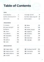
Table of Contents
Fintech App----------------------------------------------------
Theory-----------------------------------------------------------Introduction
7
Who is this ebook for and why use this format?
15
A few words about resources
21
UIvs.UX
23
Design roles
33
Good vs bad design
39
Howto understand design
47
What makes a design good
51
Get better at design quick
55
iOS Design princinples
65
iOS Elements Figma design basics
153
Intro to project
157
Project brief
161
Lean UX - our approach
164
Our design framework
169
UX research & market analysis
171
UX process overview
179
Paper sketches
189
Low vs Mid vs High-fidelity Wireframes
191
Inspiration board & Mood boards
195
Style guide and brand identity guidelines
205
Grids & layout
219
Please, play the video first!
225
Prepare your practice files
2T1
Ready, set, Figma!
233
103
121
Auto-layout 1 on 1
133
Constraints
143
3
Your Fintech III Kit
4
I
Design Manual -----------------------------------------------
Outro -------------------------------------------------------------
Launch Screen
241
Design hand-off
Onboarding
255
What’s next?
611
The Sign up
275
Final word
621
Account setup
303
603
If you’re reading this right now, the final version of this ebook hasn’t
Phone verification
327
been released yet. I’m currently writing 10 more chapters to explain our
Legal information
348
Fintech app flows and have two more bonuses in store for you! In the
Verify identity
379
Selfie verification
407
meantime, feel free to suggest a chapter you’d like to read about. Send it over to [email protected] , and I’ll make sure to include it!
All future updates and bonuses are completely free. I’ll be sending out Order a card
427
Top up account
455
Home
489
Open a balance
527
Money transfer
549
sure you don’t miss anything :)
Profile settings
569
Copyright © 2022 uiadrian. All rights reserved.
Upload avatar
595
emails to let you know about new releases.
Thank you again for purchasing this ebook; I hope you’ll like it!
To find all bonuses, templates, and mock-ups, look at the files provided with this e-book. I’m sharing my entire design framework, so make
No portion of this e-book may be reproduced in any form without
permission from the publisher (myself). For permissions to distribute or
translate this e-book, contact: [email protected].
5
6
I
Introduction
Introduction
Hello there! Ж
This is Natalie - she’s the
Adrian here. I am one of the designers behind this eBook. I just wanted
one who meticulously
to personally thank you for purchasing “the Ill’s Professional Design
planned all the contents of
Manual”!
this e-book and made sure
everything is where it Thank you so much for getting yourself a copy; now I’ll let on my
needs to be!
secret design process:)
This e-book is inspired by my own experiences, struggles, and overwhelming confusion I’ve been through at the beginning of my app
design journey, to running a design subscription agency and then
landing a job as a product design lead in one of the fastest-growing product design agencies in London (shoutout to Solace!), as well as getting myself to the point of living a very comfortable life at the
comfort of my own desk with only my laptop (and my wife) by my side.
The last part is not easily replicable, though, so I can’t promise you’ll
... and that’s me — Adrian, you probably know me by that 3D face popping up in your IG feed every now and
then.
Nice to meet you, friend!
find yourself a wife (or husband) after reading this e-book^. You will,
however, become more valuable to design agencies and clients alike, knowing to properly design an entire app from start to finish using the
best iOS design principles. Let’s give you a proper introduction first.
We’re really flattered to see you here and we are forever grateful for all your continuous support. Without you, we wouldn’t have been able to
write this e-book and it still feels surreal to think that we’ve built such an amazing community in just 8 months! Thank you so much for being
a part of it. V 7
8
Introduction
Introduction
A project in line with iOS standards, with well-structured design files
Why did we write this ebook?
and an organized and easy-to-follow design process. I hope this won’t sound the wrong way - Instagram is full of creators
preaching design best practices and sharing design tips without
This is why in this e-book, we're going to go through the very basics of
actually being a designer by trade. Now, I’m not saying you have to work
iOS design (which you shouldn't skip, by the way!) and only then move
in this industry to be posting helpful content on social media. That’s not
on to a live project, taking you through the entire design process, from
the point. You don’t have to be a designer to post about design tips, but
the start to the design hand-off, while actively following my steps and
you might need to build an app or two before you teach others about
designing with me, so that you can get the most out of it.
app design. Isn’t it like learning about business from someone who
All the stages of the design process are supplemented by an
never really ran a real business himself?
appropriate template that you can use in Figma for your own future
I really do enjoy all the helpful tips and guides people put out, and it’s a
projects. You have also received a file with our Fintech III Kit (100+
fantastic thing seeing our design community grow so fast. The problem
screens and growing) and a practice file with your very own practice
is that most of the information has already been posted before, and it’s
frames where we will replicate the entire design by following the
just repurposed to appeal to new audiences. I know this because I’ve
Design Manual part of this e-book. And if you ever decide you need
been guilty of that myself, searching for inspiration for my next big
additional information on the design basics, I suggest you read my
post, looking at posts of the big players (shoutout to @ui.sergio,
free e-book (it's in the e-book folder called "How to design better") or
@designill4u, @ui.martin, and a bunch of others talented designers)
check out my Instagram (@uiadrian) -1 cover all there is to know about
seeing what performs best on Explore and what doesn’t, and building
UX and III - elements, patterns, and components that you can find in
my content around a similar topic.
every design.
That’s why I want to slowly transition into more hands-on, real-life
This e-book is divided into 4 segments - the first two segments are
scenario guides where you might actually use this new knowledge and
theoretical, going over the UI/LIX basics, specifically applied to the
put it into practice. That’s also why this ebook was born. We were
iOS app design, and the Fintech app preparation. The last two are
missing a guide on approaching a project, using a design framework to
more practical, where we get our hands dirty and replicate the Fintech
plan it, design it, execute it, and present it to get more exposure.
App ourselves.
9
10 I
Introduction
Introduction
You might be thinking, why am I going through the basic principles of iOS if this e-book is all about designing an app?
Well, let's be clear. You won't get better at Ul design without understanding the principles that dictate the industry's standards.
You need to understand iOS design and seethe difference between the shiny but not-so-funotional designs on Dribbble and Behance and the daily apps that don't utilize the same crazy blurs and shadows,
oversaturated gradients, random font sizes, huge whitespaces, super
fancy shapes, and beautiful stock images.
Human Interface Guidelines are here to help you avoid that. And I'm here to help you understand the most important HIG principles in a more streamlined, visual, and simplified way.
I also feel like a disclaimer is due here. By no means I'm not saying that this is the one and only approach to designing a fintech app, at least
from the UX perspective. It's worth noting that I've just finished A random top performing post on Dribbble
working on a huge app for the biggest savings bank in the UK, so it's
You might be super talented and recognize good design patterns
safe to assume that some data and knowledge we gained working on
without understanding them correctly. Still, there will come a time
that project was used to design this Fintech app. I have to highlight
when your superficial knowledge will be questioned by another
that all our design decisions are not backed by any accurate testing,
product designer, senior designer, or developer that will see the gaps
and the design research and planning phase was simplified for
in your understanding of the iOS system and the design basics.
obvious reasons - not to make this e-book too long and boring.
11
12
I
Introduction
Introduction
If enough people are interested in the UX, we'll probably write a new
*Please note that this is a really ambitious project covering theory, UX
book to explain the UX process in much more detail. But for now, we’ll
research basics, and Ul design of a really complicated app in a
go through most UX stages, and to keep things simple, we're mainly
demanding niche - Fintech. I wanted to share as much of my design
focusing on the design part. Otherwise, this e-book would be 800
process with you as possible and guide you through it, but in real life,
pages long (which it will, after the 2nd update - ), and I feel you'd
there's little to no possibility that you'd be working on this kind of app
easily get lost in the process.
all by yourself.
All the screens we're going to be thoroughly analyzing will be named
In a real-life setting, the project would be proceeded with a kick-off
so that you can locate them quickly in your practice file and follow
meeting, a UX workshop, user interviews, market research, SWOT
along. I suggest you fire up your Figma and design in parallel with me.
analysis, stakeholder meetings, storyboarding, and mapping out user
I'll tell you howto set everything up when it's time, so don't worry
journeys. There are around 50-100 hours of work we're deliberately
about it for now.
skipping here to focus on the Ul more than the UX. A quick encouragement for my designer newbies 4 I know it feels daunting to start in UI (or UX) without experience, because how can you get experienced without working in the industry,
and how can you work in the industry without getting the experience first? The reality is simple, you have to practice, publish your work, and get noticed. But to get noticed, you have to design "good" interfaces;
by good, I mean standardized and in line with basic design principles. The following chapters will show you the exact way to design good
interfaces by using the best design principles, following a simple
design process, and adhering to iOS guidelines. Let's now talk about who will benefit from this e-book the most and
why we've used the writing format you see here. 14
I
Who is this ebook for?
Who is this ebook for?
Who is this ebook for? This e-book is for every creative person. It doesn’t matter whether you
are already a Ul or UX designer or a graphic designer or if you’re from a
completely non-related industry. This e-book will give you a basic understanding of good design principles, an in-depth look at the iOS design guidelines, and hands-on practical knowledge to create a fullfledged iOS app made in Figma that’s fully responsive and aligned
with Human Interface Guidelines (In a later release, we’ll also make it into a prototype!). This book will show you the building blocks you need to obtain to
Who is this for?
become a better designer and help you design your own iOS concept projects in the future. We wrote this e-book thinking about everyone
who’s lost in the learning process, looking for answers everywhere but getting bits of unrelated information that’s so spread out you can’t
make any real sense of it. We’ve compiled all the information you need to create a successful design and show you the exact design process I go through with every
app I’m working on. In the next 600 pages we cover almost all there is
to know about Ul design, and iOS design in particular, so there’s a lot to process, practice and learn from. This e-book alone should give you a very good foundation for designing better interfaces as our final test of knowledge requires you to design an entire Fintech App from start
to finish using our Design Manual and a Practice file. 15
16
Who is this ebook for?
Who is this ebook for?
On top of that, the cherry on top is the Fintech Ul Kit, 100+ highquality, responsive screens that we’re going to replicate by following the practical part of this e-book. We’ve fully designed and explained
15 chapters, but 9 more are coming in the second release.
'c°"»e *аг«ап
Style guide- Fintech Ul Kit
We’ll take you through market research, UX audits, user personas, information architecture, user flows, user journeys, inspiration boards,
пои,,
mood boards, brand guidelines, style guides, brainstorming solutions, building wireframes, working on mid-fidelity designs, and taking them into high-fidelity, prototyping (2nd release) and creating a hand-off documentation file for developers.
To supplement the theoretical knowledge you’ll get by reading this e
Fintech Ul Kit - SmartBank
book, we’ve also added templates for each of the design stages I’ve described, so you can get started right away and build your own products from the get-go.
Our Ul Kit and this e-book will evolve in time, and we’ll keep releasing new updates to it. Treat it as a real MVP that will be iterated, tested,
and improved upon, and you, being the first supporter of this work, will get lifetime free updates, no questions asked, no strings attached. 17
18
Why use this ebook format?
Why use this ebook format? When we started compiling all the information from the practice part and explaining our design decisions and the structure of each layout,
we found that having a regular vertical A4 format created issues while showing all the visuals we wanted to display on a single page. It was
practically impossible. A lot of the designs we describe are hard to understand when you
don’t see both pages and the information we’re referencing
Why use this ebook format?
We wanted this e-book to feel like a real book you read holding in your
hands. If you ever find it too difficult to read it like that, please let us
know, and we’ll try to release an additional, regular A4 version. Also, make sure your preview program is set to fit the screen or adjust the zoom values manually to find the perfect resolution for you to read.
It’s easiest to consume if the content spans across the entire screen. Hope you’ll enjoy it as much as we enjoyed writing it for you because
we had a blast!
simultaneously. You would need to scroll up and down to look at the
sections from a previous part to get additional context.
We’ve put close to 600 hours into writing this piece, and it would mean the world to us if you could leave a positive review when you’ve finished reading it (and enjoyed it!). It will help us
create more content in the future, and it will bring us enormous pleasure to know that this e-book has helped you in any way.
If you, however, found it lacking or not up to your expectations, please
reach out to me at [email protected]. I’d love to hear your feedback on how we can improve this e-book for future releases.
Thank you! A 19
20
Resources list
Resources list
Resources list
UX/UI Design framework - This file contains all templates we use for
our UX and Ul design process, from user journeys, IA, and user flows
As you might have noticed, we’ve attached a number of different
through mood boards to style guides, and brand guidelines.
resources to this e-book. Let’s explain what all of them are and how you should use them.
Font pack - Font installation files we used for the project.
Welcome video - This is my quick personal thank you note for you :)
Hand-off documentation (coming next week!) - All you need for a successful design hand-off. We’ll cover this part in later chapters.
Instructional video - You’ll find the links to this video right before we jump in to the Design Manual’s practical part. I go over the file setup,
How to design better - My free design e-book as a freebie. You might
and explain how you should replicate the designs yourself.
have read it or not, but hey, it’s free, so I wanted to make sure you get it too:)
Fintech Ul Kit - This file contains all the unedited Fintech App screens and is not meant for practice. Do with it whatever you want,
Dribbble & Instagram presentation mockups - simply upload your
use the app screens as a reference for your own work, get inspired or
beautiful shots on a frame and create amazing compositions. These
modify them and create your own awesome designs!
are attached to the main Fintech Ul Kit.fig file as a BONUS
• Design system - A simplified version of the design system used
for the Fintech App. The resource folder will grow as we release more updates and cover
• Components library - Dynamic components used in the Ul Kit
more flows. Make sure you get familiar with all files, and I hope you’ll Fintech Ul Kit Pratice Files - that’s the file we created for you to
make good use of them!
practice your designs. Each Fintech App screen has an empty frame
I thinkthat covers everything we needed to mention before jumping
next to it. This is where you should work on replicating, tracing, or
into our first theory chapter. It’s time to dive deep into the vast and still
copying the Ul kit. So far, 15 chapters have been explained, and you
uncovered world of User Interface and User Experience design.
should be able to progress through them just by following the Design
Manual part of this e-book. The remaining 9 flows are coming soon!
Follow me to the next page if you’re ready!
21
22 I
I
III vx UX
UIvsUX
2. A brief history of UX To get the whole picture about the design niche and UX in general, let’s travel back in time to its origins and quickly jump through the history of how user experience came to fruition.
At the beginning of the XIX century, User Experience started emerging
as a separate branch of the product industry. In the 1940s, Toyota developed a sociotechnical system called Toyota Production System, which was known as the first-ever production system centered around
the human. It focused on the interaction between humans and
technology. Toyota’s philosophy was based on constant development,
UIvsUX
improvement, decreasing waste, and empathizing with respect
toward their employees. It’s where the UX started to become a thing. Toyota and the value of human input
Donald Norman gives UX Design a name
The Ancient Greeks О
and ergonomics
4000 BC
t
500 BC
Walt Disney, the first UX designer?
Early 1900s
Feng Shui and the
1940s
1955
r
1965
1970s
Henry Dreyfuss and
importance of space
Frederick Winslow Taylor and the
the art of designing for people
quest for workplace efficiency
"0*
1995
Xerox, Apple and the PC era
Source: thenextweb.com
First examples of UX go as far as 4000 BC to the beginning of Feng Shui. Both UX, and Feng Shui aim to improve people’s lives through design and require good understanding of human behavior.
23
24
UlvxUX
UlvxUX
Fast-forward a few decades, we're jumping to the beginning of the
The UX without the U
1980s, when the Human-Computer Integration (HCI) was established
When I started out, I just couldn’t find much value in the UX process.
as a discipline concentrated around IT and human factor engineering.
Like many beginner designers, I jumped feet first into high-fidelity
Yeah, that's a lot of industry-specific jargon. To put it simply, HCI
designs, forgetting all about the research part. I mean actual
researchers observed and still observe how humans interact with
research, not just looking at what competitors designed and
computers and design technologies that allow humans to interact
borrowing design patterns that looked and felt good.
with computers in new, different ways. It wasn’t until the 90s, when a psychologist named Donald Norman joined the team in Apple as an
Advanced Technology Group Director and formulated the term "User
UX-u=x
Experience" in the same sense as it is known today. Over the past 30
years, it has evolved greatly and become the foundation for designing
any product in any industry.
User experience
User
The unknown
Ulis not UX, UX Is notui
This brings us to the modern days, where UX and Ul are often
And if this is, or it was you, it’s not just our fault that we used to skip
mistaken and considered synonyms, which is frustrating for UX and Ul
this part. UX is not that popular among small businesses where
designers. Both Ul and UX concentrate on usability and improving a
budgets are minimal, and there’s no room for proper analysis and
user's experience, but they do it in their own exciting ways.
research. You’ll understand that UX is at the heart of every successful Ul focuses more on the visual part of the project and its brand
product when you start progressing through the ranks and begin
perception and creates the visual impact that makes the app pleasant
working with better and more financially sound businesses.
to look at, accessible and easy to use by all users. UX has a more
User Experience goes much deeper than the visuals. It explores and
analytical approach and covers the very essence of the product - what
recognizes customer needs that allow companies to stand out from
it does, how it works, how it solves the user's problem, and how it
competitors, gain trust, and build powerful brand loyalty. It’s crucial
benefits the owner(s) of a product.
for building successful products. 25
26 I
Ul vx UX
Ul vx UX
Ul designers - what do they do?
UX designers use analytical tools and heuristic evaluations to focus on what the user sees, hears, feels, and thinks. User Experience is
They are very detailed and thorough with their application of design patterns that align with the all accessibility standards to create functional products, pleasant to look at and easy to use. They are a
creative bunch; they can be called visioners - they are, in fact,
honesty, emotions, and genuine feelings of real people who will use
the product or are already its users. The task of a UX designer is to learn as much as possible about a person in the context of a product
to help improve the overall experience.
trendsetters that are constantly looking for the next big thing. That’s
why Apple is so beloved by designers nowadays, transforming the industry with their use of vibrant colors, blurred backgrounds, slick
interfaces, and very dynamic and fluid animations that stood out against flat, monotone standard interfaces of the past. Using the collected data and principles of design, Ul designers create digital products such as websites, mobile apps, and all kinds of interfaces.
Ul in Ul designer stands for User Interface, which is all about designing the product's appeal.
A user interface is like a joke. If you have to explain
it, it’s not that good.
Credit: Coursera
Martin LeBlac
User Experience design, on the other hand, can be described as
Ul designer, in turn, deals with everything related to visuals because Ul
designing the visitors' experience (hence the name!). It focuses on
(user interface) design is designing the experience on the surface.
providing the user with the most pleasant experience in contact with
What’s at play here is the typography, hierarchy of content, colors,
the product because, let's face it, how the users perceive a product
appropriate spacing between elements and photos, consistency in
the outcome will dictate how successful it will be.
design, recognizable design patterns, movement, and animation.
27
28
UlvxUX
UlvxUX
UX designer creates the architecture of a product, wireframes, and
Ul vs UX described with a meme - the Heinz ketchup bottle
prototypes and proposes solutions, conducts research with users, and creates personas and user journey maps. There's no denying that
they're the real O.G.s here; they play the first orchestra, an executive role balancing on the border of the business (very often their own
sanity) and product user market. The role of a Ul designer is no less critical; it's very much based on data, but not as much as in the case of a UX designer. Every Ul
designer needs to know how people read, how they scan content,
what are the accessibility principles for people with disabilities, and so on, and so forth.
Illustration by Yannis Abelas
The Heinz glass bottle example goes deeper than just a simple Ul vs.
User Experience is collectively a variety of impressions, feelings, and
UX meme. The company decided to transition into a more accessible
reactions experienced by a person who comes in contact with a
bottle design when they discovered that a typical 5-year-old
product. From the first interaction with a digital product, there are
consumes about 60% more ketchup than a typical 40-year-old. When
feelings related to its use, they may be positive or negative, and UX
they realized the bottle design wasn’t the best solution for children,
designers' job is to always make sure they are positive.
they focused on solving a problem and improving their product’s
usability. Giving your kids a knife to soak it into the bottle or bang at the end of it to spurt out the ketchup didn’t seem like a perfect solution, so they came up with an EZ squirt bottle made out of soft
plastic and a nozzle. Much lighter to hold and much easier to operate,
it turned out to be a hit, and the total Heinz ketchup consumption
grew by over 12 percent. The glass bottle didn’t disappear forever, poor UX
good UX
though; it returned a couple of years later as a nostalgic limited edition you might get in your local stores.
29
30
UlvxUX
UlvxUX
Where do Ul and UX fit in all of this?
We’re all in this together, so make sure you always cooperate with your
Ul is a part of the UX process. UX process, however, is part of a much
team members and take some time to understand their work process.
more significant element - Customer Experience. The CX involves UX,
It’s only beneficial for you to improve your understanding of all the
but not only, but it also requires branding, marketing, customer
product design stages to be a better designer.
support, and how your entire company operates. The diagram below shows the relation between these elements.
UX designers Developers
Ul designers
Product managers
Who knows, maybe at some point in time, you decide that you want to transition to UX or Ul, or even better, become a well-equipped full
stack wireframes-slinging, a design-system-shooting product designer on a hiring list of all the popular tech startups on the market.
If you’re working or planning on joining a small agency, there’s a big
I hope this gave you more clarity on the UX and Ul and the core
chance that you will also be carrying the burden of a UX designer as a
differences between the two. Now that you’re equipped with this
Ul designer. In more prominent agencies, though, the roles are more
knowledge let’s discuss the key positions and their responsibilities in
divided. UX designers focus solely on the UX process, while Ul
a standard design agency ora bigger organization with a proper,
designers focus on the Ul. There are also other design-related
divided, creative department.
positions as design goes even deeper than interface and experience. 32
31 I
I
Designer roles
Designer roles
1
3. Designer roles You probably know this by now, the design niche is enormous. There
are so many things you could do and 1, for one, had no clue where to start. 1 didn’t know where to begin or find information about who does what in a design agency, where should 1 focus my energy the most, or
if 1 should just learn everything at once and become a jack-of-all-
trades but a master of none? 1 kept asking myself, who’s a product designer and a product owner? Who is a Scrum Master, and why does
he sound like a class from an MMORPG game? When 1 started out in design, 1 was confused with all the names and
Designer roles
positions the design industry offers. In the following chapter, I’d like to
show you the key responsibilities of each designer position and the role they play in a typical design agency. Maybe this will give you some
more clarity and help you decide on a branch of design you’d like to focus on later in your journey. Without any further ado, here are the most common designer roles:
UX Designer X The primary responsibilities of a UX designer are creating wireframes and prototypes, conducting research and interviews, creating user personas, user journey maps, information architecture, and designing
every experience related to the core functionalities of a product.
33
34
Designer roles
Designer roles
Ul Designer X
Interaction Designer (IXD) *i
Ul designers deal with the visual design of the components and
The primary responsibility of an interaction designer is to make sure
elements, applying styles, building systems and component libraries.
that designed products function properly when users interact with
Usually, Ul designers create interfaces, high-fidelity wireframes,
them.
prototypes, style guides, and design systems. They're responsible for fully understanding users' goals when
interacting with a product, application, or website, compiling user,
Product Designer
business, and technical requirements, and creating logical product
The leading roles and responsibilities of Product Designers usually
information architecture and interfaces for users to navigate.
involve both UX designers' and Ul designers' work. A Product Designer must demonstrate knowledge in developing and creating a product,
Scrum Master
including the research and design phase.
Scrum master works with the Product Owner and the Scrum Team
Product Designers participate in every stage of a product design
to refine and improve processes. They make sure that team
work. They also balance the users' needs and business goals,
members are well-trained in Agile methodologies.
ensuring everyone included in the design process is happy. They host daily stand-up meetings that last no longer than 15 minutes and allow each team member to share their progress on
Motion designer
the assigned tasks. They keep every design task in check.
Motion designers focus on animations and micro-interactions.
They’re responsible for creating smooth transitions between
elements on an app or a website. Motion designers may create animations and apply visual effects to bring their design ideas to life.
They create intricate prototypes that capture the micro-interactions
and animations needed for the end-product development. They are usually highly specialized UX designers. 36
35 I
I
Designer roles
Designer roles
Product owner iB
Web designer if
A Product Owner is a part of the scrum team. The key responsibilities
The primary skills and requirements for this role are the basic
of a Product Owner are to define user stories and create and maintain
knowledge of CSS, JavaScript, HTML, and web design principles.
the backlog of all tasks for the current product. Web designers design pixel-perfect websites that are documented
The Product Owner is the primary point of contact on behalf of the
and delivered to developers. They might also create them themselves
customer to identify the product requirements for the development or
using no-code platforms like Webflow and Elementor.
design teams working on the product.
UX Copywriter 1 UX Researcher Д
Their primary roles are analyzing data and using the cognitive UX researchers conduct in-depth research on target consumers in
psychology of humans. UX copywriters must empathize with the user
order to collect and evaluate data that will help in the product design
and his way of thinking to create the content of a digital product in an
process. UX researchers generally work with two types of research,
easy to consume, intuitive way. UX copywriters concentrate on writing
qualitative (how users feel while using a product, or what dificutlies
clear, short text that can assist users in making the best decision
they have in completing the step) and quantitative (numbers and
possible, which is business-focused.
statistics).
They are highly specialized copywriters that have a deeper They conduct user interviews, create and analyze studies, and carry
understanding of users' psychology and their needs.
out usability testing to collect and evaluate data.
37
1
38
Good vs Bad in Ul
Good vs Bad in Ul
4. Good vs bad designer Good design is not just about good looks. What’s happening behind the scenes is what makes or breaks the product. A good designer strives for good design; that’s pretty self-explanatory.
How can one define a good designer? What knowledge should he
acquire? What kind of skills? Or perhaps this is all about having a (super)natural design tingle, and the rest is screwed?
What do you need to be a good designer? For one, you don’t need a degree. Even though it definitely helps, countless self-taught designers are very successful in this industry
Good vs Bad in Ul
without having a degree. You can participate in different courses online, hire a mentor, or join a private Bootcamp but remember, there
are many skills you can acquire on your own, and you don’t need any design school to tell you that. However, there comes a time when you
might need the help of an expert to push you to that next level, and
you need to be very cautious about where you get your information from. If you’re learning from the internet, remember that there are
things that people might not tell you about unless you take part in
their expensive course, or if you’re lucky (and you are!), an inexpensive
course that will show you what’s happening behind the curtain. Don’t get me wrong, I learned a lot for free, and internet has been a real lifesaver for so many of my projects. I was never fulfilled, though. 40
39 I
I
Good vs Bad in Ul
Good vs Bad in Ul
I took part in dozens of paid courses, read tons of books, and even got
Let’s ask this again, do you need natural talent to be a good designer?
my master’s degree in design to “understand” design. And while all of
the above was crucial in forming my understanding of UX and Ul and got me to where I am right now, I wouldn’t say you have to follow the
same path I took. What you should do instead, is you need to practice your skills all the time. It’s a never-ending process, and nothing will
replace that. As the saying goes - practice makes perfect, and you must practice a lot. You’re asking me on IG for tips on how to learn Ul
design fast. WelL.there are no real shortcuts to learn design without
really understanding the basics. Some people consume the knowlegde faster, some slower, there is no trick that will make you a
great designer in a week or a month. Sometimes it takes years. But there’s one thing that’ll help you get there much faster. Don’t fall into
the trap of designing super visual concepts that are not usable. Even
A question that can be answered both with a yes, and a no. If you want
to become a designer (UX or Ul), you don’t necessarily need any natural talent. Of course, it helps to learn faster and recognize design
patterns when the rest is still chasing the basics. Really though, the secret is in creating designs, replicating them, analyzing them, iterating, and improving until you’re at a point where you can think
about specific design patterns and recall them from memory without looking at any references. The key is to consciously look at ways to
design and understand them. How often have you looked at an app
and didn’t even notice how it’s designed? What font sizes does Uber
use, and why is it so easy to navigate? Why can you just mindlessly swipe through your Instagram without thinking about it?
though you’ll get tons of likes on Dribbble or IG from inexperienced designers, this won’t bring you the proper attention of real clients. The
It’s because good design is invisible.
reality is relatively simple. Look at the most famous shots on Dribbble, then grab your phone and open your favorite apps. Do they use the
same design patterns? Sure, you’ll find resemblances for some designs, but if you dig deeper, you’ll quickly find out that most popular apps are looking great, sure, but without being too flashy or overly creative. They have the right amount of balance. Why is that? Why
Now you need to understand what makes it that way. Do you see Airbnb launching its new app update with a fresh redesign? Download
it and play around with it. See what you like and don’t like, take a few screenshots, replicate what they did, analyze it and make conclusions.
It all comes down to that very detail.
aren’t they more hip and trendy? Think about it for a second, and we’ll
circle back to that in a bit.
41
Practice makes perfect, and talent, talent won’t replace hard work.
42
I
Good vs Bad in Ul
I know this sounds like some cliche motivational speech, but it’s true.
By practicing, you can work on your weak points and improve areas
Good vs Bad in Ul
What defines a good designer?
There are certain traits that define good designers. Let’s look at them.
that need improvement. Even the best, super-talented designers started somewhere. They all
Innovative approach
had their share of bad, clunky projects that they would laugh at
A designer should look for new things, be up-to-date with trends and
nowadays. You don’t even have to look that far back; even when
technologies, be eager to learn and search for the new, stay open-
looking at my work from 2 years ago, I often ask myself how I could
minded, and be able to think quickly and on the go.
have been proud of this design?
Problem-solving capabilities
Remember that any digital product has a goal, whether it’s solving a
problem, giving information, or providing any sort of utility to a user. Creating products that don’t have an end goal means creating a product that’s not useful for anyone, which misses the whole point of the design. Think of all the flashy, beautiful designs with no real purpose in solving user problems. You don’t want that. A good sense of aesthethics
It is crucial to have a sense of aesthetics in design. A good design is
simple, clean, and at the same time, doesn’t require much thought to
process. Remember our last quote? Good design is invisible, and you
probably can attest to that when using your everyday apps. You’ll keep improving your skills and notice how imperfect your
It’s like you don’t even notice the design at all.
designs were and how much you’ve improved over the years.
43
44
Good vs Bod in III
Good vs Bod in III
Attention to detail
Empathetic
When every element is refined and carefully planned, the design
Putting the very user in the center is essential to designing a product
becomes aesthetic and remains consistent. The detail makes the
dedicated to a specific audience. Without knowing the users' needs,
design beautiful and eye-catching and brings it to life; the consistency
problems, and goals, we are designing for everyone and no one at the
in design strengthens the user's understanding of the product.
same time.
Meticulously organised
A good designer knows this and tries to get into the person's shoes.
It’s not only about keeping your desk uncluttered but, most importantly, your design files. Name your pages accordingly, create a
He's trying to solve the problem. This requires a lot of research and
analysis, which, in any case, shouldn't be skipped.
file structure, date it, name your layers, organize your project files, and
keep the project documentation and briefs in their respective folders. We all know this meme about naming project files in Photoshop. With
Figma, we don’t have to save them anymore, but I’m sure some of you remember those good ol’ PSD crashing days
Source: agentestudio.com
As designers, we solve user problems and improve their lives by making processes more accessible and simply better. Empathy
toward users is one of the most essential traits for a designer.
Source: farasnear.com
45
46
Howto understand design
Howto understand design
How to understand design Ul design isn’t only about making things look good. While this may be true to some extent, there’s more meaning to it. Remember each time
Facebook dropped a new redesign? People went nuts over the changes and didn’t like them at all, even though we got to see an improved, better version of the interface everytime. The design has to
be invisible otherwise you’ll get in trouble.
Howto understand design Source: memegenerator
People get used to how things look and making drastic changes can
only annoy regular users. We, as designers, appreciate it a lot when our favorite app gets a refresh, but that’s not the case with everyone.
Remember, people won’t notice if your design is excellent, but they will be the first to point out when it’s terrible. You have to find the right
balance and understand when enough creativity is enough.
How can you know it? Well, first, you have to understand the basics. 47
48
I
Howto understand design
Howto understand design
Know the basic principles of Ul design
Know the system you’re designing for
Contrary to popular belief, designing an interface isn’t just “painting
Android design is much different from iOS, and mobile design is an
with pixels.” Design is not art. It follows (or at least should follow) very
entirely different story than website design. You need to know the
strict and precise rules to create a visually stunning product that’s
system you’re designing for in and out, and most importantly, you
consistent and speaks to the genuine brand’s values.
need to understand the core philosophies that guide them.
You need a solid blueprint to build a beautiful house. Otherwise, you’re
We’ll cover the entirety of iOS design in the following chapters, so let’s
left with many poorly assembled materials and components that were
circle back to that.
patched up on the go without much thought and now are about to fall
apart. We don’t want such chaos in our work.
Know your design tools
To design efficiently and make the most out of your designs, you must There are certain principles, constraints, and regulations when
designing for specific devices, and we need to adhere to them to
create products that are easy to use and look at.
first master the tools. Get better at Figma, understand the basics, memorize the keyboard shortcuts, and get to know auto layout, layer
naming, and working with constraints. You’ll feel so much more
confident in your skills, and your work efficiency will skyrocket if you
first take the time to understand your design tools. We will cover many tips, tricks, and shortcuts you can use in Figma to
speed up your workflow in our Theory chapter and put them into good use in the Practical segment of this e-book.
Xd Even a simple button has to be designed according to specific rules. 49
50
What makes a good design
What makes a good design
What makes design good? Best designs are invisible -1 can't overstate this. As Ul designers, we aim to create simple and straightforward interfaces for users to get
things done quickly and effortlessly. Your content should be the hero of your Ul; everything else is
secondary and should be used to support your content. Your interface should be stripped down to the core aesthetic. Whenever you consider adding a new element to your Ul, ask yourself a question - is
this really necessary? Try to steer away from heavy gradients, textures, and layering shadows. Focus on the very basics and try to
improve from there. Let's take a look at the following example.
What makes design good
These are one of my top-performing shots on Dribbble. Are they better than the rest? Not really, one is just a walkthrough flow, and the
second is a bunch of patched-up widgets and components I created
for a different product. Is it a bad design? Again, not really. 51
52
I
What makes a good design
What makes a good design
I guess they are okayish, but why did they reach over 200k users and !
Notification Title
generate close to 300 likes? It’s because they stand out, are colorful,
push notification
Here's notification text.
and are fun. The presentation is what makes them successful.
modal sheet
X
Nothing else. Good design very often doesn’t stand out, and that’s
Choose a balance to open
normal. But hey! Shouldn’t likes on Instagram or Dribbble measure
how good or bad a design is? That’s the biggest misconception since
C Briti
search bar
Cancel
the creation of social media. Quantity never goes on par with quality.
So how can you tell if a design is good or bad?
Maybe let’s drop the word “bad” and use “incomplete” instead; we
I ^4
British Pound
|
Account number, IBAN, and UK sort code
modal card
We’ll cover almost every iOS element you need to design and show you
don’t want to offend anyone.
how to implement them into a real app. The right way.
Good design is simple. A screen is more powerful and valuable if more
is said with less. Every element of the design must support the Label
Label
Label
Label
Label
purpose of the app. If you remove all the noise and clutter from your tabbar
iOS Alerts
designs, create more space, and make your content the focal point of
Smart passcode
your app, you’re halfway there.
Are you sure you want to set a passcode that anyone can guess?
We’re going to practice what we preach here and cover so much more
Change it
Continue
about the good and the bad in iOS design in the following chapters, so iOS segmented picker
keep reading!
Debit card
53
54 I
I
Get better at design
Get better at design
5. How to get better at design fast Many designers feel like it’s unacceptable to copy someone else’s work. It seems as if you need to be able to conjure design ideas out of thin air, or else you’re not a real designer. I will tell you otherwise. Copying is not bad at all. It can actually do wonders for you!
Get better at design *fast
Stealing is wrong, though, don’t steal whole concepts. Borrow ideas,
copy what works, and analyze it. Taking someone else’s work and claiming it as your own; that’s terrible. But copying, copying is, in my humble opinion, the greatest way to truly understand a design, or an
app, or software application, and it’s the quickest way to learn how it was designed and why it may have been designed this way. 55
_ 56
I
Get better at design
Get better at design
Everyone starts somewhere, and if you want to be the best at what
You get to enjoy the best of Ul design by diving straight into visual
you do, you simply start by copying the best.
design. Every design decision has been planned out, tested, and
improved for you, so you can just enjoy the craft now. You no longer
This, my friend, is the simplest and fastest way for you to learn design. Let’s talk about why this is so effective.
Why copying work is so effective?
have to stare at your empty frame looking for design inspiration for your next concept for practice, unsure where to even start, and never
creating your design in the end.
You have to consciously think about what you are copying in such detail to replicate it. By profoundly analyzing other designs, you will
begin to understand how interfaces are constructed. You will start to recognize design patterns, font sizes, spacing between elements,
margins, and the use of color, but what’s most important, you have a chance to get into the head of a designer who created the interface to
analyze his decisions and learn from them. : be an 8px grid а
П mind the space for the status bar
what do these icons do? what happens when I start typing?
If you are new to design, copying the interface of existing apps can help you take your designs to another level, visually and literally. You
get to learn new visual patterns and start recognizing them, able
to think of new solutions on the spot. If you trace 5 designs of a few popular apps in each niche, you’ll improve your pattern recognition by a
mile. It’s that powerful, trust me. 57
58
Where to find apps to replicate?
Where to find apps to replicate?
Where to find apps to replicate?
Case study websites
Now, this is a tricky question. Every day, we are overwhelmed with
You can find tons of inspiring work in all niches, with real actionable
thousands of different designs on many creative platforms. These are
insights and results documented during the entire design process. An
mostly designs made by beginners and practicing designers, but if
excellent place to look is simply to type in Google - “(UX)lll Design
you know where to look, you’ll find some great works by amazing
Case study” and add the name of your favorite product or an app in
creators showcasing beautiful concepts and commercial work.
whatever niche you’re interested in designing for.
For the most part, they are lovely eye-catching candies that can serve as a great source of inspiration but are not always the best example to
take as direct inspiration to practice your design skills. There are many beautiful-looking designs that, at first glance, look amazing, but if you
Spotify UI/UX Design
Challenge mission HcImf; 'rahelp people |имп ra wheiever music they want, whenewr mey wa*n,
whertvei they went—in e oompleiefy legal ihd кснИЫа wiy." Ai a sveeming пм1с «ши, Spotify is the group lead and it want: bo stay tlsat way. For this гезвпгц. tfiey *an’1 [D improve
engagement and JWbgntn?n in thffjpp.
inspect them closely, you quickly find that they don’t even meet the
Solution The itflirtion ii- ю spend on Spotify's sodal capabilities. It's ^nporum to define rhe best
wbv
basic standards and principles of good design. The font sizes are all
forward h? underxlanding theuxerx' needs, and having a pcotofype aF the new featured integrated
over the place, colors are inconsistent, tab bars have elements
Role
Tools
Ul/UX Designer
Fipme, Adobe Rhritrato^ Adobe Photoshop
Duration
Team
floating way above the safe space obscuring important sections of
warn Unify witfwn the 4:1 nF Iho- app.
И hW4
the interface, and the composition doesn’t even make sense, logically.
VIEW PHOTOTYPE
SaIF O.r«t«l, wrtti guid^» fym пчпи< I
A design that would rapidly annoy real users. Commercial work is different from conceptual fairy tales, and you need to understand the key differences.
Source: Hiromejia.com
Behance & design agencies websites
There’s one particular question I get a lot in my DMs - where do I look
Behance is also a great place to find detailed case studies with
for good design inspiration? The answer is simple - look at the big
interesting information. Find the most popular design agencies in the
players. One of the best free ways to find good design inspiration,
industry and look up their Behance portfolio. They’ll likely have a case
both UX and UI, is to look at the case studies of well-known brands.
study prepared for each of their previous client’s products.
59
60
Where to find apps to replicate?
Where to find apps to replicate?
Many design studios share their most challenging case studies and
The truth about Dribbble
projects with detailed explanation of what’s been done and how it
Dribbble is fantastic for all things visual. When looking for visual
affects the company and its users. Look at their sites, too; companies
inspiration, it's my first place to go. It's literally all I need to create a
share their work documentation, and show their entire process, from
mood board for any new product. But, when it comes to UX research
UX to low-fidelity mockups, wireframes, animation, and final live
and looking for real solutions to clients' problems, it might not be the
products. It’s the process that attracts big clients. Design studios
best site to start your analysis.
know that and they go over and beyond to show off their work in the best light possible. That’s where you can learn from following their
thought process and replicating their work for practice.
МГвЬ Dajign
(«ролыте
5-alacv
tavBlapmvnf
Tapline4 Source: Dribbble.com The Client Tapllr» й th» SmS funding ptaltorm lhai uandtorms aubscrlptl&na In t о upfrwii cash. Get &№ of
I mean, you can find almost everything there. The problem is that
your a wind recurring raven uo uplrarrt tcdsy.
Dribbble is fast-paced. You can’t create a detailed case study on The Problem: Having recently dQsnd Нщ1г pm-sced rWnd, lepllrxj nncdnd to rHmmto fhfllr corporate Image to meet
Dribbble, nor can you genuinely explain your process and ideas. You
cusUxnfl* Md IrwMtor sxpeelfftlwiB, The ргечкня txsnd Wwtrty «ев dated, end they needed to I»
mtrt «unpertltk* In the msritof. Additionally, the messaging
incohcrtnt, and customers toiHid It
challenging to undamtand Tap, Ine's pftenag and Низ valua odd tor Snag businesses. Opmpllrncfitory
post one or two shots and move on. Plus, the algorithm on Dribbble
to messaging, the structure end vIbubIs at We wetnb needed to be teiwn totlw rflrt level tb meat
growth targets.
really favors the “old” users, and the most active designers on the
The Solution:
platform. Excellent work is often lost and never actually discovered.
We Started M Uia core cd the business modal with an In uepth discowiry process to understand the competrttve Inndsceptt. tjrnnfl чкп nnfl the cere offering. Then, wu duvlsrd [hrw enmtbn routes
You have to really dig deep to find good examples, which doesn’t Creadit: Tapline Case study by Solace Digital
61
mean it’s not possible. It’s just hard. 62
I
Where to find apps to replicate?
My top pick to find real inspiration
My personal best place to look for design inspiration with real
practical solutions and logical interfaces is mobbin.com. You might have seen me recommending this platform many times before, but it’s simply the best site for app design inspiration. And I’m saying this without being affiliated with them at all. Mobbin
has a massive collection of real apps released to the market, organized in segments and flows, so you can explore entire apps, filter
your results, and find exactly what you need for your next project.
Where to find apps to replicate?
Get it as soon as you read this e-book because you still have 550
pages to go through and 100++ screens of an iOS Fintech App design to analyze with me, replicate, and understand :D I’m holding back no secrets here, and you’ll get to see the entire
design framework I follow in coming up with new ideas and organizing
my work so that I am as efficient with my designs as possible. It’s as simple as that. I don’t want to be overly excited about this e book, but I wish I had access to this kind of product back when I
started. When I found out about directly tracing real apps, it was like a revelation. Why didn’t I think about this before? You get to see the best of Ul design, and you get to enjoy the process.
Practice makes progress. Each drawing one makes, each
study one paints, is a step forward. Vincent Van Gogh
Follow my steps replicating this app, and you’ll get to understand all the most critical design practices like the proper use of grids,
paddings, and margins, the size of display fonts, headings, callouts, body texts, use of colors, white space, iOS components, masking, designing for accessibility, and usability. It’s all in there!
63
64
I
iOS design principles
iOS design principles
6. Intro to iOS Design A few words before we dive into this chapter. I don’t want to focus too much on the design principles in this e-book because we’d have to
spend the following 200 pages describing just the basics. Instead, we’ll focus on the best principles of iOS design, which will also talk
about colors, typography, white space, grids, layouts, etc., applied to iOS specifically. There’s a big overlap between the two so you’re not
really missing out on anything, and if you really want to understand the
basics, checkout my free e-book that’s included with this one. Let’s talk about colors
iOS design principles
Color psychology is the science of color influenced by emotions,
cognition, and human behavior. Colors do not affect everyone equally. The perception of colors is determined by age, gender, and cultural
environment, even something as unique as a stimulus associated with
past experiences. The color scheme of a website or an app makes it memorable, trustworthy, appealing, and profitable. It's all about making an
excellent first impression. When creating a digital product, it's crucial
to think about your color scheme. Which colors to pick from the color wheel and why. Different colors send different messages to the user,
influencing their mood and perception of the product.
Some colors are so deeply engraved in a brand's history that they are sometimes as easily recognizable as the brand Itself. 65
_
66
iOS design principles
iOS design principles
facebook facebook Imagine Coca-Cola being blue or Facebook being red. Feels weird,
right? Color is an amazingly powerful tool for brand-building, storytelling, and conveying the right emotions.
Adobe Colors
2. Decide on the number of colors you’re going to use. It’s best to
How to pair colors
As designers, we realize how difficult it can be to choose the
have one primary, one secondary, and if you really need, one tertiary color with two neutrals - dark and light.
appropriate colors and color combinations for our designs.
Here are the main guidelines for choosing your color schemes: 1. Find your primary color - App designers use different methods to pick the best color palette for their apps. The most used methods are the analogous method and the monochromatic method of color
choice. Some do it by intuition or use color tools available on the web.
One of the most popular tools you can use to create your color palette manually is Adobe Colors. It’s a bit more complicated and if you’re a
beginner I wouldn’t worry about it for now. We’ll cover this later. experiencewelcome.com
67
68
iOS design principles
iOS design principles
3. Use secondary colors when needed - underlining a secondary
You shouldn’t use pure black or gray, though. There’s a little trick to
Call To Action or establishing a hierarchy between your content.
make your designs more attractive and add more of your brand personality. The key is to slightly tint your grays and blacks. Let’s say our brand’s color is blue. Look at the example below.
Let’s say this is our brand color
How bland and boring would your grays look if you went just plain
black. Also, blue feels a bit out of place next to pure black.
Notice how Testlio uses its brand colors to establish a hierarchy between the Call-To-Action buttons. Can you tell which one of the
Now, let’s use our brand color to tint our black. Open up your color
three draws the most attention?
picker settings in Figma and drag the pointer to the bottom-right corner of the screen and stop around 80-90% from the pure black
4. Use neutral colors - neutral colors are most often used for text to
create contrast between the elements and make them stand out. They
can also be used as background colors. The neutral colors are white, black, and gray, with all their shades and tints.
69
70 I
I
iOS design principles
iOS design principles
iOS Color palette
We can learn a lot about colors by looking at how other apps use them. There are specific colors used by Apple in their native apps, and they
all have a good reason behind it. Blue is used for buttons, icons, and actionable elements across the system.
Other colors, such as yellow, are used for notes, red for Apple Music, green for Messages, ocean blue for iMovie, etc. Different colors can be used to establish the brand. If you're unsure about what color
should you use, just go with blue, it's the safest bet. Can you tell the difference? That’s a tiny change, but it already feels
While designing, certain colors are assigned to specific actions; red is
much better. Besides, avoiding pure black also reduces eye strain.
used to present errors, and green is used to show progress or a successfully completed task.
However, it’s important not to rely solely on color to differentiate between actions or communicate important information. Apart from
color, we should provide text labels or glyph shapes so users with color blindness or other visual disabilities can understand it. We’ll talk more about color psychology and how we chose our color
palette for the Fintech app in the Practical part of this ebook.
Consider choosing a limited color palette that coordinates with your
app logo. Subtle use of color is a great way to communicate your brand language.
71
72
iOS design principles
iOS design principles
Dynamic System Colors
Contrast
In addition to system colors, iOS provides access to several defined
When talking about colors, we need to mention contrast. It’s one of
dynamic system colors that automatically adapt to both light and dark
the most important factors when it comes to accessibility. Your colors
modes. These can be divided into two sets of background colors -
should allow for your content to be legible. For the best possible
system and grouped - each having primary, secondary, and tertiary
contrast, try to go on the opposite ends of the color spectrum, white
alternatives. They have to establish hierarchy through the color of
against dark shade, light blue against darker blue, light green against
links, labels, placeholder text, separators, etc. A more comprehensive
dark green, etc. Use high brightness against low.
guide can be found in the Human Interface Guidelines documentation,
The best way to measure your contrast values and see if your content
which I highly suggest you study and analyze.
is legible is to use the WCAG contrast checker tool. Put in your background and foreground color values and check them against the
Neutral tones
double-A and triple-A standards. Your text will rarely pass both tests.
In iOS design, neutral tones act as a supporting character. These colors are usually made for secondary actions and help establish a
That’s not always the case with the GUI components (buttons, links, icons). Look at Facebook’s example.
hierarchy between buttons or actions. They help balance your design, are easy on the eyes, and bring more attention to the content. These
could be the following.
I’m Tertiary
I’m secondary
I’m Primary
facebook.com
73
74
iOS design principles
Facebook have recently changed the shade of their blue to a much
lighter and saturated version of blue. The hex code I picked from the button is #3975EA. Let’s test it against the #FFFFFF foreground color
used for the “Log In” text.
iOS design principles
Handy color tools If you don't know what colors to use or howto combine them to create beautiful palettes, fear not! There are numerous free resources
available online to help you generate color palettes. Let’s cover a few! Coolors.co - Great for color idea generation if you’re up for some
random fun and don’t know which direction to go. Contrast Ratio
4.27:1
Adobe Colors - Create color palettes with the color wheel or image, or
browse thousands of color combinations from the Adobe community. Paletton - A professional designer tool for creating fantastic color
combinations. Choose a scheme (mono, complementary, analogous, etc.), change one color, and the rest changes to match it. Even though they wouldn’t have passed the standard and large text
test, they would do just fine with interface elements. As you can see, the test passes the “Ul Components” double A standard, which is
enough contrast for us to work with.
For people with low vision or color blindness, all the controls they
need to interact with must have enough contrast to be easily
distinguishable from their background
75
I
iOS design principles
iOS design principles
You can download the San Francisco and New York fonts from the
iOS Typography
official Apple site at https://developer.apple.com/fonts/.
If you're interested in a general introduction to typography, I explain
the basics and the terms used to describe type in my free "Howto iPhone Typography Guidelines
design better" ebook. We'll not cover the type anatomy in this part since it's not relevant. Instead, let's focus on iOS typography and the
This is one of the most confusing topics in app design - what sizes of
basic principles and most common sizes used in iOS apps.
fonts to use for each typography element? Here’s a little breakdown.
Apple uses two type families in their own apps. They're free to download and use, and I suggest getting them from the official site.
Titles
17px
Page titles should be 28-34pt before scrolling,
The first font, which you'll probably use the most, is the San Francisco
17pt when scrolled
(SF) font. San Francisco is a sans serif type family that includes SF
Pro, SF Pro Rounded, SF Mono, SF Compact, and SF Compact
Bodytext
15-17px
Depending on the font
Compact is the system font in watchOS.
Secondary text
13-15px
Lighter color
The phrase 'The quick brown fox jumps over the lazy dog.' shown
Captions
12-13px
Used for segmented controls
Small text
H-12px
Used depending on the context
Buttons, text inputs
17px
Important buttons with
Rounded. SF Pro is the system font in iOS, macOS, and tvOS; SF
in San Francisco Pro.
New York (NY). New York is a serif typeface that provides a unique tone to complement the SF fonts. NY works as well in a graphic
medium font weight
display context (at large sizes) as it does in a reading context (at text Tab bar
sizes).
10-llpx
You shouldn’t go smaller thanlOpt
The phrase 'The quick brown fox jumps over the lazy dog.' shown in New York. 77
1 I
78
I
iOS design principles
iOS design principles
Body Font Take note of all the font weights and
You should always pick a font that, apart from looking clean, is legible
sizes Apple uses for their iOS apps.
and comfortable to read. When in doubt, refer to the most popular
Google fonts or use the default iOS font - SF Pro Text. Here are my top
recommendations for body text. Apart from different sizes, they use
higher/lower contrast text to add more visual hierarchy.
SF Pro Text
Inter
Open Sans
Accent colors are used for button links, icons, and active states. General Sans
Helvetica Neue
Roboto
Font Weight
Modern fonts come with variable or multiple font weights: Ultralight,
Text alignment
Thin, Light, Medium, Regular, Semibold, Bold, Heavy, Black. How do
Alignment is king; there’s no question about it. When your content is
you decide on which one to use for what size? The general consensus
aligned, it removes the clutter and makes the text much easier to
is that for sizes 11-19 px, you should use a Regular SF Text weight. For
read. But how can you ensure everything is aligned to one position?
sizes 20-34 px, you should use SF Display Medium, and at 34 px+, go
Introduce grids and mind the side margin for all your components.
with SF Display Bold. A similar idea applies to all your custom fonts.
We’ll cover grids in the practical part, but for now, let’s talk about theory and show you some examples of text alignment. 79
80
iOS design principles
iOS design principles
Look how the Apple Store app uses alignment to convey the hierarchy
Hierarchy
of the screen. The topmost content is aligned to the side margin (16
Typography is one of the main elements that create hierarchy, the
px); below sections are nested another 20 px inside, with the phone
second being the white space. It makes it easier to distinguish the
specs being pushed 80 px from the side margin. Your eyes follow this
order of importance by looking at how text elements are positioned on
pattern seamlessly to the price details and then a full-width СТА
a screen and how high their contrast is against the background.
button to take the desired action. What s also interesting is that the button remains in one position and is always visible. Why is that? You
Let’s analyze a relatively busy Apple Music screen.
want to have at east one Ca -to-Action visib e at a times.
I labeled by numbers the order in
which I looked at this screen without overthinking the meaning No Love Ww chosen to pay fbr your iPhone wilh Applet ard Monthly Installments. Your bag Iwill nolw f$ll$Ct monthly pricing for all eligible items. . earn тле
Summer Walker a SZ
of the content.
Smokin Our The Window Згипо Mars, Anderson .Paak & Silt...
Bitter {Narration By Carol... S
Look how Apple uses fonts to
Summer W.-iiker a Card! В
iPhone 13 Pro12SGB ip i Г?
$33.29/mo. for 24 mo. at П
Easy On Me
convey hierarchy. We start with 34
APRC
px Display text, move into a 22 px
Connect on your own l4ed
Sofa
ColjtKriZihiC
Ш
pension plan.
He does not have much time tn explore suitable investment possibilities in lhe
market due 1o his busy work and family
BRANDS
duties, therefore he is locking for a
professional investment adviser who cab
Credit: Solace Digital - our UX work on a finance app
NllCllKg,
help him build a long-term investment
Credit: Solace •igital - our UX work on an investment app
While user journey maps come in all shapes and formats, commonly, it’s represented as a timeline of all touchpoints between a user and a
Remember: you can find all the UX templates I use for all my
product. This timeline contains information about all channels users
commercial projects in the “Design framework” folder attached to this
use to interact with a product.
e-book. They’re all named accordingly so you can grab anything you
need and start designing!
What I like to do for my journeys is include an estimated time to
completion for each journey to highlight areas for improvement. 182
181 I
I
UX process overview
UX process overview
To create a successful user experience, we have to consider what the
Information Architecture
user expects to see and how we want to show that information as a
IA is truly a backbone for the design. Its job is to create a seamless
business. We have to think about our users' mental models when
experience that allows users to complete their tasks, not on finding
creating our products. Add information in places where your user
their way around the app. UX designers’job is to structure the content,
expects to find it. That’s why researching popular competitors could
so it’s easy for users to see what they might be looking for. The more
help create an experience that your users are familiar with.
content the product has, the more significant the role of IA is in the UX design process.
That’s also where the user persona comes into play. It’s crucial to
follow the logical flow of the UX stages, not to get confused or stuck at any step of the process.
User flows User flow - a map or diagram of the steps or screens that a user will go through while using a digital product. It can also be an illustration of someone moving through the system.
Why should we use user flows? They help understand the logical flow of steps that the user may take while using the product. How it Is different from Information Architecture? Credit: Solace Digital - our UX work on a student app
User flows are based on the IA. IA maps the whole application, which
Hierarchy and navigation are essential when designing your IA.
is the foundation for the user flow that shows the micro-interactions
Hierarchy defines the structure of the content and its order of
and the specific steps a user takes to achieve their goal.
importance; navigation defines how the user navigates through it. 183
184 I
I
UX process overview
UX process overview
Competitor’s UX Audit
Whenever you’re looking for a source of inspiration to develop your new product solutions and improve your customer’s experience analyze your competitors! UX Competitive analysis will help us define -
-------
what features we should add to our product, what things we could
——
improve, what patterns to use for the best interaction, and howto
measure the success of our product.
Supposing is good, but finding out is better.
Credit: Ivana Stojanovic
The UX Competitive analysis will help us prevent many problems,
User flows serve as a great base to start building your low-fidelity
understand our users' needs better, and determine which product
wireframes. But before we do, let's conduct a UX audit of our
features we should try and implement in our product.
competitors.
What exactly can we achieve by a competitive analysis?
We're not going to show any user flows in this release of an e-book, but
I've still included a Figjam template example that we would typically
• We get to explore all the weak and strong spots of our competitors
use. If you guys are interested, we'll include a separate UX chapter where we cover everything from start to finish going along with this
• When exploring the weak spots, we get to think of better solutions • We can define what’s missing in the existing product
project in the following e-book update.
• We get to understand the current market expectations and needs
Would you like to see the entire UX process broken down? Send me a DM on IG or an email to [email protected] and with enough
interest, I’ll try to include that in the future releases!
185
• We can work on our advertising angle and our Unique Selling
Proposition to develop a better go-to-market strategy.
Q 186
UX process overview
UX process overview
After documenting all the collected data, we’d then group all our Brainstorming Solutions
findings into a comparison table, analyze them, and draw conclusions. We should also analyze their copy and how they address the users.
This should give us a better understanding of their target audience and decide if we should use a similar tone of voice for our product.
A more in-depth and thorough competitor’s analysis would look something like this
Evaluation
•1: Landing Page > Enter Zip code > List available Restaurants > Select a choice > List food
items > Select a choree > Enter details > Confirm and Wait
1 Ж MENULOG H
UetR EATS
В ctehvet
UX/UI
By analyzing our competitors, we should be able to gather beneficial
feedback and notice visual patterns that are being repeated across most of your competitor’s products. We went the simplified route and audited each of the main areas of the competitors’ products. If this
was an actual project, we’d dive much deeper, creating a comparison table to group all our findings and directly compare them across our
Design
Ok
Poor
Great
Great
images
Poor
Poor
-
Great
S-Resufts
Poor
Poor
Ok
Poor
Filters
We should test at least 3-5 competitors, 2-3 direct and 1-3 indirect,
H Ok
Poor
Poor
Poor Poor
Great:
Great
Poor
-
-
Poor
Ok
--
Poor
Poor
--
Sorting
In-Search
--
-
-
Great
-
--
-
Order Sum“
Ok
Ok
-
Great
Great
Ok
Ok
Add more
-
-
-
-
-
-
-
About
--
--
■■
Poor
4/5
J/5
3/5
-
Reviews
Ok
Ok
oa Ette
3/5
3/5
1/s
1/3
5/5
Ok 4.5/5
Dev Load Time
selected products.
-
Good
Responsive
ifS
Yes
3/5
5/5
4/5
5/5
Yes
Yes
Yes
Yes
Source: UXplanet.org
track their user journeys, and measure the product’s usability to get
the best results. We’d also download their apps, go through their onboarding process, and explore the entire app ourselves.
187
188
I
UX process overview
UX process overview
Paper sketches
When it comes to paper prototyping, it’s not about being a good artist but about good thinking and quick idea generation. Paper prototyping
can be extremely helpful during the early conceptualizing stage, allowing one to quickly visualize and test various ideas.
We can either use an iPad or, traditionally, a pen and paper for
sketching. Paper prototyping allows us to quickly design and test
If you’re designing a similar solution for the nth time, you could live
without paper prototyping. But if you are looking fora novel solution, it
is a proper way to start your ideation process. You can find printed mockups online that represent the shape of a phone screen that you can then begin sketching on. To save even more
time, boot up your tablet and use software like Marvel or Balsamiq for a
more digital and automated approach to “paper” prototyping.
internally if the idea makes sense, and it can help discover
fundamental problems before diving right into wireframing. It’s unnecessary to draw too many details, it’s not required to do that at this stage. Paper prototyping helps you sketch the most essential
phases of the work. I use it mainly to sketch out the most important parts of the app to see what they could look like.
Many designers don’t take paper prototyping seriously, and it’s often underestimated. This is a quick, fast and efficient method that can be
done at the very early stages of the design process. It doesn’t require
any special skills. It’s easy to modify and change because everything is done manually. Should you use paper prototyping? It really depends on the context of the work and your preferences. readingwritingandgreentea.blog
189
190
I
UX process overview
UX process overview
Wireframes 9:41
Wireframes are an essential element of the product design process. A Order a card
wireframe is a skeleton mockup of a web or an app concept.
Dotxt card
Wireframes can come in a wide range of visuals, from low to high-
Physical debit card
fidelity, depending on your product design approach. Wireframes are
exchange rates
part of the physical design process, which comes after conducting Virtual debit card
research and discovering the product that's being designed. Once we
exchange rates
have our market research and analysis completed, a couple of interviews carried out, we know our market needs and wants, we've created our user persona, we've run through a couple of the most
important user journeys, we've designed our information architecture, and created our user flows for each segment of the app, we've audited
our competitors' products, and brainstormed solutions sketched out a few prototypes, now, we're finally ready to go into digital wireframes. There are two types of wireframes, actually three to be exact.
low-fidelity wireframe
mid-fidelity wireframe
Low fidelity wireframes They usually don’t involve any details or include any colors, just the
Mid fidelity wireframe
boxes and lines that act as image containers, text containers, cards,
They have a much more accurate depiction of the layout with more
etc., just to get the general structure and layout of each screen the
detail given to specific components like buttons, text, and links. It
right way. They give an overview of the product and its functionalities
usually has the correct spacing and font size and is colored either in
without getting into detail.
black and white, grayscale, or follows the color scheme of your style guide, all depending on your approach and client’s expectations.
191
192
UX process overview
1
UX process overview
1 It’s the closest iteration to your high-fidelity prototype, which usually
avoids final images, and illustrations and doesn’t strictly follow the
And lastly, we have high-fidelity wireframes, which are the closest you
same font styles and colors, but it might. They are great if you want to
I I
develop and present an idea before getting too bogged down in the
I
can get before your final product.
They use the correct font styles and all colors are applied, the imagery
fine details - perfect for our Lean UX approach.
is on-brand with the brand’s visual identity, and the placeholder text is
replaced with the proper product copy. They’re built on a design system and are dynamic, componentized, and responsive.
High fidelity wireframes I । 9:41
.dl ~ «
For our Fintech Ul Kit, we’ve skipped the low-fidelity preparation and started with mid-fidelity wireframes - you’ll find the mid-fidelity drafts inside the file on a separate page.
Order a card Debit card
Л Mfl
Physics 1 debit card Spend flkiiMiivivrilh no
>
I I l
Order a card -Il ♦ •
941
exchsngs rete&
— . . Order a card
Order a card
Virtual debit card
I
,.M ♦ «
9 41
О—.
Spend online right sway, no wnlt. no haul».
|
I
’
>
i=
>
।
1 1 1 high-fidelity wireframe
।
____
low-fidelity------ ►
____
mid-fidelity
____
------ ► high-fidelity
1 193
1 I
194
I
Mood boards
Mood boards
18. Inspiration vs. mood boards An inspiration board is a collection of reference work, images, and color blocks that provide a starting point for III designers to gather
visual feedback and inspiration for the project. Inspiration boards are
more than just a pretty collection of photos, shapes, and interfaces. They serve as a foundation for creating curated mood boards that are
a way to find the correct brand’s visual language. Inspiration board
Before designing and preparing a mood board for my projects, I start with an inspiration board consisting of different ideas, interfaces,
Mood boards
colors, and design patterns. I go over the internet and find designs I
like, screenshot them, and put them all together without any specific,
organized order or logical way. Whatever you find helpful for your project, snap a screenshot and save it to your Figma.
Where to find inspiration for your project?
We've already covered a lot of these, but the best source of visual inspiration is Dribbble. The sheer number of designs you can find is astonishing, and that’s precisely what we need here. We don’t need
outstanding UX and logical layouts. We just need visual inspiration, so go crazy and save whatever you find inspiring. Spend 15-20 minutes collecting inspiration and placing them all in your Figma.
You should end up with a board of inspirational images, interfaces, colors, and art that should look something like this (next page). 195
196
Mood boards
Mood boards
Mood board Mood boards are immensely helpful when creating a visual language. They are a significant step in a design process that helps eliminate the
guesswork from the visual output our stakeholders expect from the
project. Mood boards are a visual presentation of the style and theme of a given concept, a collection of colors, images, words, textures, and
similar materials that illustrate or describe a proposed style or theme. Mood boards help narrow down options and save time. They will make
your stakeholders feel more in control and a part of the design process, which allows to manage the expectations much better, and
Once you have a satisfying amount of inspiration collected, take some
progress through the design process much easier and without going
time and just look at it to find similar design patterns.
back and forth to change the style and start all over again.
Group them up into matching color schemes. You should end up with
How to create a mood board?
an inspiration board that looks like this 4
I usually start by making the inspiration board and splitting up all the inspirational references into separate groups that all use a similar color
scheme and similar design patterns. After they’re all grouped up, it’s time to putthem into a presentation template, add a title and a description to explain your choice of color and the overall visual direction and present these new findings to the
stakeholders to gather the initial feedback.
197
198
I
Mood boards
Mood boards
Mood boards are undoubtedly super valuable assets in the design process. They help start defining a general visual language and help get an idea of what a client likes and dislikes. I'm saying this from
experience, it pays to give this stage of the process more attention than it often receives. Before implementing mood boards into my design process, I can't say how many times I had to go back to a
project and change colors or give another round of visual adjustments
Mood board no. 1 - Dark Pastels The first mood board consists mainly of dark tones and pastel accent colors. While dark-themed Uls can be stylish and elegant, they often
appear dramatic and too sophisticated, especially for an app that should bring positive emotions and a sense of security and calmness.
We still wanted to include that variant for a potential dark mode design we could implement in a later release.
just because a client wanted to "test out" a different color or imagery.
We need to be careful designing dark Uls, though. All kinds of usability By taking the extra effort to make your mood boards more detailed
and polished, you'll build a stronger foundation for your product and
issues are coming into play here — mostly related to readability, scannability, accessibility, and contrast.
gather much better and more precise feedback.
After one or two rounds of mood board presentations, you'll agree on the visuals, and you'll be able to proceed to the next step of the Ul
design process, which is creating our style guide.
Let's talk about our choices for the Fintech app for a second now to
see what visual direction we should take with our product.
You’ll find the templates we used for this project in our worksheet file -
on a mood board page. All credit goes to Mixpanel, who shared their fantastic template with our Figma community!
199
a. 200
I
Mood boards
Mood boards
We also have to consider what time of day and the type of environment
Mood board no. 2 - Blue
our users will be using our app. Darker Ills usually go well with gaming
and movie apps. The gaming/movie-watching context and the environment where users are gaming or watching movies fit much
better with a black color palette. A black background design reinforces the visuals, introduces a sense of mystery, has better contrast, supports visual hierarchy, and is easier on the eye strain. Let’s pitch
this idea to the stakeholders.
Blue is a color of trust and confidence. It’s the most popular color choice for fintech apps and tech brands in general. It’s a universal color that anyone can identify with. The color blue is gradually being
associated with financial products, and new startups seem like they
need to jump on the trend train before it leaves, so it feels like
We shouldn’t go full dark Ul with this concept; instead, we should offer a toggle switch between light and dark modes at the user's preference.
We could create a more dynamic, striking experience with a sense of
everyone and their mom is using blue in their apps now. I wouldn’t use
the exact words to describe it to the stakeholders, of course, but you get the gist!
luxury and prestige that could provide improved user experience, which
correlates to enhanced customer engagement.
We want to be a bit different with our product, so let’s try something else with our third mood board design.
201
202
Mood boards
Mood boards
Mood board no. 3 - Green
We have to be careful with our greens, though. Too much green will make our app look bland, lethargic, and depressing. Making our green too green will make it look too generic. We have to find the right
Light / Gray + Green accents
balance, and the following exercise can help with that. We went into a different route and added a hint of blue to create our primary color.
We sot the мело-far rthafever we-'ra Aovi to Wb OtXH.jT. *hch Iв riettzuTf.ly $ jockJ end nice lime. Wt кмр il short end get to the ponL
Let’s say our client chose the last option. We don’t see any major
Wfl uee ftrS Wfl ID S#1 Ib4 SCf:>e far wl-JWver ms're лйгаЛ Ip bah *9J, whch q cfqlmrtfHy л good ml nee изд. We |®йр it shon and get»11ч point
Modem Clean Transparent
competition utilizing these colors, and they feel fresh, modern, and somewhat futuristic, buttoned down. There’s also one more thing I like
Bright
Fresh Clever
to do. Using our brand colors I quickly mockup a welcome screen to visualize what our end product might end up looking like.
SmartBank v2
Light/Oray 4-£keerii
ИМипч coSrnartBftnL
looking good!
Managing your money has never been so easy.
Green subconsciously creates a feeling of prosperity, wealth, harmony,
and freshness. It’s naturally associated with money, finances, banking, and ambition. It is also the second most visually pleasing color, as it is so common in nature.
Users are naturally pulled towards green, as we tend to see and
associate green with our environment. It’s also considered the most restful and relaxing color for the human eye to see. Brands with colors
Signup
Login
tend to appear as humble and accessible to their users.
203
204
I
Style guide
Style guide
19. Let’s create our style guide A style guide is a collection of pre-design elements, graphics, and
rules to follow to help make sure each page of the website or every screen app will look and feel consistent with the rest. While designing for web or apps, style guides serve as a primary reference point.
Style guides usually include typography, colors, grids, and spacing. A
style guide is essential, especially when working on a project with
multiple designers and developers at many stages. The focus will help to ensure that people aren't just making stuff up as they go but follow a very strict and precise style that's congruent across all platforms
Style guide & brand identity guidelines
and media. Suppose a business or a design team doesn't utilize a shared file that
documents all the intended look and feel of a product. In that case, visual inconsistencies will arise quickly, leaving users confused and
frustrated. No one likes chaos. We are drawn to coherent and congruent visuals, and that's what the style guide is for - to create
consistency across all our digital products.
Most user interface style guides include documentation for typography, iconography, layouts, and grids, color palette and components. More detailed documentation of all your components
in all their states falls under a design system definition.
205
I
Style guide
Style guide
Color palette
Grays
By picking colors from our mood board and presenting the sample
work to our stakeholders, we decided that our main primary color
would be deep sea green, with our accents being bright and green. Let’s create our entire color palette now.
Primary color
To create our grays, we’ll pick the darkest green tone of our primary color and slightly go down on the saturation scale until we arrive at a
shade as close to white as possible. This will be the color used for our
background, while a shade darker will serve as a background for our iOS controllers and other interface elements. A primary color will be the color displayed most frequently across our
app's screens and components. We want to make it more neutral, but
Our entire color palette
at the same time make it have enough weight to be distinguishable
from our background and stand on its own.
Accent (brand) colors
Our bright yellow-green accent color will be mainly used for CTAs and illustrations, and our ocean blue will be used to bring out more color in
our gradient backgrounds, and we’ll use it to highlight navigational elements, icons, and controls. 207
208
I
Style guide
Style guide
Logo
System colors (iOS)
When including our logo in the style guide, we want to explain the
We’ll take the system colors from the recommended iOS color palette
proper use of color combinations in any digital composition.
mentioned in the iOS design basics section. We’ll only need red for errors, blue for notification messages, orange for status icons, and
green for success messages and status icons.
SmartBank We want to make sure there are no misunderstandings when presenting our logos on different backgrounds, compositions, and
digital media. We want our brand to be associated with a set palette of
colors, and we don’t want any visual mix-ups and surprises.
Typography
Typography must speak for the brand. It’s a critical part of the design process that can single-handedly change your app's entire look and
feel. We chose the following fonts fortheir modernist, Grotesk-style,
SmartBank
SmartBank
209
geometric feel that’s fresh, light, and easy on the eyes.
Satoshi
Display & Headlines
General Sans
Callouts & Body text
210
Style guide
Style guide
Font sizes
Layout grid
Style
Typeface
Weight
Size
Line height (feeding)
We’ll build our app on a standard 8 px grid with 16 px side margins and
Display - Large
Satoshi
Bold
34 px
41px
safe space left for the status bar and the home navigator. We’ll set a
Heading 1
Satoshi
Boid
2врм
здрх
grid of 4 columns with 8 px gutters. To toggle it on and off, you’ll have
Heading 2
Satoshi
вою
22px
20px
to click "Control + G” on Mac and "Control + Shift + 4” on Win.
Heading 3
Satoshi
semibold
2Dpx
25px
Margin Left
Mobile grid Headline
Entitarwiknn
GcneraiSons
Medium
i?px
22px
General Sans
Medium
15px
2 Dpi
Gutters
Margin Right
We'll be using an a px gridr with 4 columns, 14 px s-de margins, and в px guttere.
Status Bar .Navigation Her
Body
GcncraiSans
Medium
17px
22px
Carttout
General Sant
Medium
16px
21 px
foobwta
General Sans
Medium
13px
18p« Column Grltf
4
We used the font sizes recommended by the Human Interface
Ctfumne
Stretch Type
]6px Margins
Spx flutter
Guidelines, so there are no changes here. We’ve only created two
variants - one regular and one bold, to keep things organized and our choices flexible. Tab Bar
Line-height and letter spacing values differ from font to font, and
you’re free to use the values suggested by iOS. Keep in mind that
Instead of aligning everything strictly on a grid, we’ll also use the "Soft
they were designed specifically for San Francisco font, and they
Grid" method, as it’s much easier for development. We cover the
might not be perfect suited for your font.
layout grids in the next chapter so that’s all you need to know for now.
211
212 I
Style guide
Style guide
Imagery and visuals
Avatars
With our imagery, we decided to go for the 3D look. 3D illustrations are
We’ll use a colorful library of avatars from our amazing Figma
definitely more eye-catching and will help us create our brand’s
community. You’ll find all the assets on the components page.
modern and youthful look. Our 3D renders will look vibrant and clay-like with visible roundness and playfulness matching our choice of fonts and colors.
The entire library of 3D components we used for this project can be found on the ui8 website called Feenancy. I’ve included a few of the elements in our files, but due to copyright reasons, I’m not allowed to
give you to the source files, guys; sorry about that! Credit: abhidesigns
Icon pack We’ve used the Huge Icons icon set from ui8. A fantastic collection of over 3000 icons grouped into 22 different categories.
HUGE ICONS LIBRARY
3000+ ICONS ® OUTLINE
9 SOLID
9
• BULK
© O Pixel perfet cectors О Build for quick changes
О
Organized layers panel О 24px grid base -
О Live stroke ( Figma only)
213
214
I
Style guide
Style guide
Brand identity guidelines (simplified)
Brand colors
We probably wouldn’t be tasked with creating brand identity guidelines Colors
as Ul designers, but it’s worth mentioning here anyway. Besides, knowing howto build even a simplified version of the brand identity guidelines for digital or app use will always be valuable for your future product work. A documented guide on using colors, logos, patterns,
The core palette will cover the majority of your needs. It’s intentionally small in variety so as to not dilute the brand visuals, which odds confusion.
FIREFLY
CASAL
CANARY GREEN
GEYSER
WILD SANO
WHITE
and thumbnails is a super helpful resource to have.
Mono color logo
Like the style guide, we’ve listed out our color palette colors with their names and highlighted the main brand accent, the Canary Green - a
fresh, vibrant, and modern color.
Brand Color
Green subconsciously creates a feeling of prosperity, wealth, harmony and freshness. By using a vibrant shade of green we're trying to achieve a more modern and youthful tone.
FREEDOM
RELAX
SPIRIT
HEALTH
Monochrome means using a single color throughout the whole logo design. It does not contain any other effects, shadows, or shades CANARY GREEN
other than the single color selected.
CANARY GREEN
HEX | E8F569
215
216
I
Style guide
Style guide
Backgrounds and use of color
Brand mark
We want to show alternative color combos so that there is 100% clarity
A brandmark is a symbol, element, or visual image that helps
on what we can do with the logo and what we should avoid. We aim to
immediately recognize a particular company. It’s crucial for developing
achieve maximum legibility with our logo stamps.
and maintaining our brand’s image - we would also use it to create our iOS app icon.
Brand Patterns
Brand patterns are used as an additional branding element. They playa significant role in creating strong brand recognition. They bring more
depth to the brand identity and create a more memorable brand experience. Furthermore, they often incorporate an element from a logo or a shape consistent with the whole brand image. 217
218
I
Grids & Layout
Grids & Layout
20. The mobile grid Having a good grid system in place helps organize our designs and
make much faster design decisions by giving us more control over alignments and spacing between elements.
In Figma, layout grids can be applied only to frames, but you can
enable multiple grids for multiple frames nested within other frames or
frames inside your components. This gives you total freedom in
creating as many grids as you need to space out the elements in your designs. Before explaining the different types of grids, let’s quickly
cover the basics.
Grids & Layout
How to create grids?
Select your frame, navigate to your properties' panel on the right, and click on the "Layout grid" plus button to create a grid layout. It will automatically create a 10 px grid for you. We don't want that, though.
We'll need to create a column grid and build our designs on a "Soft
Grid" instead of using the baseline grids.
Layout grid
219
220
I
Grids & Layout
Grids & Layout
Now that we have our column-type grid selected, let’s set them up
We’ve just created a 4-column grid, and it’s considered a "Soft Grid”
correctly. Change the Count to 4. Choose a color you’d easily
method based solely on a column alignment with vertical spacing
distinguish from your designs - usually blue, purple, or red is good.
being increments of 4 or 8. Let’s take a sample screen from our app
Leave the Type at “Stretch” - we want it to stretch the content inside
and analyze the spacing based on our “Soft Grid.”
but retain the same margin values on the side. Set the Margin to 16 px
- it is a value recommended by iOS and leaves enough safe space to work on. Lastly, change the Gutter to 8 px. We’ll use increments of 4
96px
and 8 to space out our elements on the artboard.
.ill •=* «
9:41
Verify your identity We need to check that you ere who you му you are. Hero's how you can do rt
iPhone 13 mini -1
24px
Method Qi verification ■q
Columns
X
80px Count
Color
4
|
f-i
Passport
>
Issued in United Kingdom
National identity card
>
issued in United Kingdom
Type
10%
0075FF
Width
Auto
Driving license
*■—J
issued in United Kingdom
32px
Margin
8px Stretch v
g
16
Make sure that your document
yf it hasn't expired
yj
Gutter
is clear and easy to read
the whole ID is in the picture
24px
8
Skip for now
60px
-□
In the example above, everything is perfectly spaced out in increments
of 4 pixels. That’s really the only thing we should look at when designing with a "Soft Grid”. What about “Hard Grid” though? 221
222
Grids & Layout
Grids & Layout
With "Hard Grid,” we would have to ensure that all elements, whether
That’s pretty much all you need to know about grids for now. We’re
text layers or shapes and containers, sit on a perfectly flat baseline
almost ready to jump into our Practical part.
grid. Let’s take a look.
Next up, you’ll see me record a short video explaining how you should approach the Practical workbook part, where you should find all the
assets and files, and how you should set up your Figma files for
maximum efficiency when working on improving your designs.
I’m super excited that you have arrived at this point in the e-book! This ..ll
9:41
means you’ve already gone through the basics of iOS design and
M
understand what different tools in Figma are used for. You know how
you should approach the UX of a product, you know what Ul design
Verify your identity
framework to use to avoid roadblocks in your design process, and you
We need to check that you are who you say you are. Here’s how you can do it
know the basics of auto layout, constraints, and grids.
Method of verification
Now it’s time to play that video and set up your Figma. We’re finally
ready to get our hands dirty and practice design!
Passport Issued in United Kingdom
I hope this introduction to our practical workbook gave you the
As you can see in the above example - our text layers are somewhat of
foundation to understand the very basics of iOS design. It’s time to
a baseline grid, although not every element is perfectly aligned there.
put this knowledge into practice.
This creates additional problems with development as there is no such See you on the following pages!
thing as a baseline grid in mobile app development, and it’s much
easier to just design with 4-pixel increments between elements
instead of perfectly aligning every element on a baseline.
223
X 224
I
I
Instruction video
Please, play the video first wireframes
225
Instruction video
21. A few words before we start designing This is a big project, and it would have been tough for me to explain
everything in written form. You’ve just gone through over 200 pages of introduction with another 350 pages of practical design knowledge
about all the essential mobile flows like Onboarding, account setup, Verifications, Settings, Insights, Home, Search, and so on in the next 15
practical chapters.
I owe you proper instruction on approaching this next part to maximize
the learning experience and work through each screen as effectively
and efficiently as possible. So, please, click on the image below and play this video first!
226
I
Practice files
Practice files
22. Your practice files setup This is one more reminder to prepare all your project files - if you’ve followed the instructions from the video, you should have everything
set up the right way. I just wanted to briefly go over everything you should have opened by now to make your learning experience as easy to follow as possible.
iOS 15 Ul Kit
This is your best friend and one of the most important assets we’ll use for this next part. You will also need this Ul kit when working on future iOS designs, so make sure you have it ready and easily accessible. The
Prepare your practice files
file is in the iOS 15 Ul Kit folder, and if you preferto work in a web
browser, you’ll find the link in the "Resources and Assets” document attached to this e-book.
227
228
Practice files
Practice files
UX and Ul design templates
All the UX and Ul templates we’ve used for this project can be found in the “UX/UI Design Framework” file in the main Fintech Ul Kit folder.
Fintech Ul Kit
This workbook comes with two Fintech Ul Kit files. One is a source file with no edits made whatsoever, with all the original components and assets and all pages following our Ul Design framework. You can do
whatever you need to with this file, use it as inspiration, borrow some Auto layout training file If you need to practice your auto layout, I’ve also included .fig files and
ideas for your own projects, change the colors, play around with the fonts, and build something new out of the components you have in the
library. Go crazy with it!
links to the Community practice file created by Figma themselves. We will keep on explaining the auto layout basics and best practices, but
The second file is our design practice workbook, where we’ll be
I’d recommend you at least give it a try and scan through the content
working on replicating our original designs by using best practices like
to see if you need to practice it more.
auto layout and constraints, making sure our spacing, margins, font sizes, and styles are consistent and standardized.
229
230
Practice files
Fintech practice files If you’ve watched the video, then you have already seen how to
approach this file, but I’ll repeat it one more time, just in case.
Practice files
Or you should trace them. To trace the design, simply export the original frame as a PNG, place it on your training frame, reduce the
copy layer opacity to around 20% and lock the layer in. Start creating
shapes and adding text layers in the same position as the original.
When you open up your Fintech practice files, you’ll see 100+ original
Look at the left original frame for reference when you need to look up
and 100+ empty frames. The empty frames are where you should be
the spacing between elements. To check the spacing between
working on replicating the designs I’ve created. The original frames
elements, click on an element and press “Option” on Mac or “Alt” on
should serve you as a reference point.
Windows. You will see values appear in red.
Depending on how comfortable you feel with the design, you should copy my designs to learn the proper spacing and font sizing.
^■41
Order a card
Order a card
Debit card
Credit card
Pt»v s to tJ debit Mrd
■ ■
SpVid Q Smart Влп к
Spend smarter every day, all from one app.
Managing your money has never been so easy*
walkthroughs allow you to curate their experience and guide them
through the workflows they should know about right away.
Wrtoomo loSnwtSank
Safe and secure international
WHiAhe Аосоинг
Explain what your app does, how it works, and what users can expect
500.00 GBP . н
С-ечк#.
from it in one or two short sentences. Make it short and sweet. I'.'lWIWlUFUt
ChrWCl Ор*до*ои
ess
£Кй $9
Bias
BIS8.
Signup 3 Cards
43 Welcome ta Revelui
Managing your money is about to get a lot better...
J3 Budgeting
Get a card with security settings you control
Login
Never overspend again with smart budgeting tools
Н£7?э. I I I. 1 I 1 I иЭ ™ 5 Iе 5 ■ Я
В
£500 0D"
। Cards
4-
Ъ О
■
Log In
Log in
Analytics
Looking at our options, we decided that the best approach would be
В
to go with the walkthrough screens. Our target audience is already
well familiar with the concept of fintech banking. On top of that, our
app features a pretty long onboarding and verifications process being a Fintech app, so having a guided tour wouldn’t be ideal for
introducing the app’s functionalities. Instead, we show them three reasons they should explore our app
further with two CTAs to sign up or log in to continue.
Revolut Walkthrough screens
260
259 I
I
Onboarding - the theory
Onboarding - the theory
Illustrations Digital products now include all sorts of illustrations as a standard
feature. They are, without a doubt, not only required to set the visual tone for your product but are also used to convey a story. This isn’t
something you should design as you go, but you should put a lot of thought into creating graphics for your digital product.
There are a few tips you should follow when designing and choosing your illustrations: Most importantly - choose a style and stick with it. If you decide to go
with 3d illustrations, do not mix them with flat outline drawings. While choosing your illustrations, think of the message you want to convey through your app. The images must match the character of
the product. Choose your brand colors as your illustration colors. Don’t mix too
many of them as the product will lack consistency and look like you’ve just patched up a number of random images that don’t go well with each other.
Use pre-made illustrations - look up ui8, Freepik, Storytale, or just browse through my Instagram and look for free illustration sites. I share a lot of them in my carousels!
Illustration pack from UI8.net
Suppose you’re looking for something more original but can’t really draw and model your own illustrations. In that case, you can look for
illustrations libraries, download a few that look similar, and modify them slightly. Change the color, so they all match each other, mix
them, take some aspects from the composition, and move them
around. You can really create commercial-worthy graphics by using the
elements uploaded by designers in our fantastic community. 263
264
..Il