Visual Data Mining: Techniques and Tools for Data Visualization and Mining [1st ed.] 9780471149996, 0-471-14999-3
Marketing analysts use data mining techniques to gain a reliable understanding of customer buying habits and then use th
396 52 20MB
English Pages 389 Year 2002
Recommend Papers


![Data mining: concepts and techniques [2 ed.]
9781558609013, 1558609016](https://ebin.pub/img/200x200/data-mining-concepts-and-techniques-2nbsped-9781558609013-1558609016.jpg)

![Visual Data Mining: Techniques and Tools for Data Visualization and Mining [1st ed.]
9780471149996, 0-471-14999-3](https://ebin.pub/img/200x200/visual-data-mining-techniques-and-tools-for-data-visualization-and-mining-1stnbsped-9780471149996-0-471-14999-3.jpg)
- Author / Uploaded
- Tom Soukup
- Ian Davidson
- Similar Topics
- Computers
- Organization and Data Processing
- Commentary
- not (but the cover is tiny)
File loading please wait...
Citation preview
John Wiley & Son- Visual Data Mining: Techniques and Tools for Data Visualization and Mining
Visual Data Mining: Techniques and Tools for Data Visualization and Mining by Tom Soukup and Ian Davidson
ISBN: 0471149993
John Wiley & Sons ?2002 (382 pages) Master the power of visual data mining tools and techniques.
Table of Contents
Back Cover
Comments
Table of Contents Visual Data Mining—Techniques and Tools for Data Visualization and Mining Trademarks Introduction Part I - Introduction and Project Planning Phase
Chapter 1
- Introduction to Data Visualization and Visual Data Mining
Chapter 2
- Step 1: Justifying and Planning the Data Visualization and Data Mining Project
Chapter 3
- Step 2: Identifying the Top Business Questions
Part II - Data Preparation Phase
Chapter 4
- Step 3: Choosing the Business Data Set
Chapter 5
- Step 4: Transforming the Business Data Set
Chapter 6
- Step 5: Verify the Business Data Set
Part III - Data Analysis Phase and Beyond
Chapter 7
- Step 6: Choosing the Visualization or Data Mining Tool
Chapter 8
- Step 7: Analyzing the Visualization or Mining Tool
Chapter 9
- Step 8: Verifying and Presenting the Visualizations or Mining Models
Chapter 10 - The Future of Visual Data Mining Appendix A - Inserts Glossary References Index List of Figures List of Tables List of Codes
-1-
Present to you by: Team-Fly®
John Wiley & Son- Visual Data Mining: Techniques and Tools for Data Visualization and Mining
Visual Data Mining-Techniques and Tools for Data Visualization and Mining Tom Soukup Ian Davidson
Wiley Publishing, Inc. Publisher: Robert Ipsen Executive Editor: Robert Elliott Assistant Editor: Emilie Herman Associate Managing Editor: John Atkins New Media Editor: Brian Snapp Text Design & Composition: John Wiley Production Services Designations used by companies to distinguish their products are often claimed as trademarks. In all instances where John Wiley & Sons, Inc., is aware of a claim, the product names appear in initial capital or ALL CAPITAL LETTERS. Readers, however, should contact the appropriate companies for more complete information regarding trademarks and registration. This book is printed on acid-free paper. Copyright © 2002 by Tom Soukup and Ian Davidson. All rights reserved. Published by John Wiley & Sons, Inc. Published simultaneously in Canada. Wiley also publishes its books in a variety of electronic formats. Some content that appears in print may not be available in electronic books. No part of this publication may be reproduced, stored in a retrieval system, or transmitted in any form or by any means, electronic, mechanical, photocopying, recording, scanning, or otherwise, except as permitted under Sections 107 or 108 of the 1976 United States Copyright Act, without either the prior written permission of the Publisher, or authorization through payment of the appropriate per-copy fee to the Copyright Clearance Center, 222 Rosewood Drive, Danvers, MA 01923, (978) 750-8400, fax (978) 750-4744. Requests to the Publisher for permission should be addressed to the Permissions Department, John Wiley & Sons, Inc., 605 Third Avenue, New York, NY 10158-0012, (212) 850-6011, fax (212) 850-6008, email: This publication is designed to provide accurate and authoritative information in regard to the subject matter covered. It is sold with the understanding that the publisher is not engaged in professional services. If professional advice or other expert assistance is required, the services of a competent professional person should be sought. Library of Congress Cataloging-in-Publication Data:
-2-
Present to you by: Team-Fly®
John Wiley & Son- Visual Data Mining: Techniques and Tools for Data Visualization and Mining
Soukup, Tom, 1962Visual data mining: techniques and tools for data visualization and mining / Tom Soukup, Ian Davidson. p. cm. "Wiley Computer Publishing." Includes bibliographical references and index. ISBN 0-471-14999-3 1. Data mining. 2. Database searching. I. Davidson, Ian, 1971- II. Title. QA76.9.D343 S68 2002 006.3-dc21 2002004004 Printed in the United States of America. 10 9 8 7 6 5 4 3 2 1 To Ed and my family for their encouragement -TOM To my wife and parents for their support. -IAN ACKNOWLEDGMENTS This book would not have been possible without the generous help of many people. We thank the reviewers for their timely critique of our work, and our editor, Emilie Herman, who skillfully guided us through the book-writing process. We thank the Oracle Technology Network and SPSS Inc., for providing us evaluation copies of Oracle and Clementine, respectively. The use of these products helped us to demonstrate key concepts in the book. Finally, we both learned a great deal from our involvement in Silicon Graphics' data mining projects. This, along with our other data mining project experience, was instrumental in formulating and trying the visual data mining methodology we present in this book. Tom Soukup and Ian Davidson My sincere thanks to the people with whom I have worked on data mining projects. You have all demonstrated and taught me many aspects of working on successful data mining projects. Ian Davidson To all my data mining and business intelligence colleagues, I add my thanks. Your business acumen and insights have aided in the formulation of a successful visual data mining methodology. Tom Soukup
-3-
Present to you by: Team-Fly®
John Wiley & Son- Visual Data Mining: Techniques and Tools for Data Visualization and Mining
ABOUT THE AUTHORS Tom Soukup is a data mining and data warehousing specialist with more than 15 years experience in database management and analysis. He currently works for Konami Gaming Systems Division as Director of Business Intelligence and DBA. Ian Davidson, Ph.D., has worked on a variety of commercial data-mining projects, such as cross sell, retention, automobile claim, and credit card fraud detection. He recently joined the State University of New York at Albany as an Assistant Professor of Computer Science.
Trademarks Microsoft, Microsoft Excel, and PivotTable are either registered trademarks or trademarks of Microsoft Corporation in the United States and/or other countries. Oracle is a registered trademark of Oracle Corporation. SPSS is a registered trademark, and Clementine and Clementine Solution Publisher are either registered trademarks or trademarks of SPSS Inc. MineSet is a registered trademark of Silicon Graphics, Inc.
-4-
Present to you by: Team-Fly®
John Wiley & Son- Visual Data Mining: Techniques and Tools for Data Visualization and Mining
Introduction Business intelligence solutions transform business data into conclusive, fact-based, and actionable information and enable businesses to spot customer trends, create customer loyalty, enhance supplier relationships, reduce financial risk, and uncover new sales opportunities. The goal of business intelligence is to make sense of change-to understand and even anticipate it. It furnishes you with access to current, reliable, and easily digestible information. It provides you the flexibility to look at and model that information from all sides, and in different dimensions. A business intelligence solution answers the question "What if ..." instead of "What happened?" In short, a business intelligence solution is the path to gaining-and maintaining-your competitive advantage. Data visualization and data mining are two techniques often used to create and deploy successful business intelligence solutions. By applying visualizations and data mining techniques, businesses can fully exploit business data to discover previously unknown trends, behaviors, and anomalies:
Data visualization tools and techniques assist users in creating two- and three-dimensional pictures of business data sets that can be easily interpreted to gain knowledge and insights. Visual data mining tools and techniques assist users in creating visualizations of data mining models that detect patterns in business data sets that help with decision making and predicting new business opportunities.
In both cases, visualization is key in assisting business and data analysts to discover new patterns and trends from their business data sets. Visualization is a proven method for communicating these discoveries to the decision makers. The payoffs and return on investment (ROI) can be substantial for businesses that employ a combination of data visualizations and visual data mining effectively. For instance, businesses can gain a greater understanding of customer motivations to help reduce fraud, anticipate resource demand, increase acquisition, and curb customer turnover (attrition).
Overview of the Book and Technology This book was written to assist you to first prepare and transform your raw data into business data sets, then to help you create and analyze the prepared business data set with data visualization and visual data mining tools and techniques. Compared with other business intelligence techniques and tools, we have found that visualizations help reduce your time-to-insight-the time it takes you to discover and understand previously unknown trends, behaviors, and anomalies and communicate those findings to decision makers. It is often said that a picture paints a thousand words. For instance, a few data visualizations can be used to quickly communicate the most important discoveries instead of sorting through hundreds of pages of a traditional on-line analytical processing (OLAP) report. Similarly, visual data mining tools and techniques enable you to visually inspect and interact with the classification, association, cluster, and other data mining models for better understanding and faster time-to-insight. Throughout this book, we use the term visual data mining to indicate the use of visualization for inspecting, understanding, and interacting with data mining algorithms. Finding patterns in a data visualization with your eyes can also be considered visual data mining. In this case, the human mind acts as the pattern recognition data mining engine. Unfortunately, not all models produced by data mining algorithms can be visualized (or a visualization of
-5-
Present to you by: Team-Fly®
John Wiley & Son- Visual Data Mining: Techniques and Tools for Data Visualization and Mining
them just wouldn't make sense). For instance, neural network models for classification, estimation, and clustering do not lend themselves to useful visualization. The most sophisticated pattern recognition machine in the world is the human mind. Visualization and visual data mining tools and techniques aid in the process of pattern recognition by reducing large quantities of complicated patterns into two- and three-dimensional pictures of data sets and data mining models. Often, these visualizations lead to actionable business insights. Visualization helps business and data analysts to quickly and intuitively discover interesting patterns and effectively communicate these insights to other business and data analysts, as well as, decision makers. IDC and The Data Warehousing Institute have sampled business intelligence solutions customers. They concluded the following: 1. Visualization is essential (Source: IDC). Eighty percent of business intelligence solution customers find visualization to be desirable. 2. Data mining algorithms are important to over 80 percent of data warehousing users (Source: The Data Warehousing Institute). Visualization and data mining business intelligence solutions reach across industries and business functions. For example, telecommunications, stock exchanges, and credit card and insurance companies use visualization and data mining to detect fraudulent use of their services; the medical industry uses data mining to predict the effectiveness of surgical procedures, medical tests, medications, and fraud; and retailers use data mining to assess the effectiveness of coupons and promotional events. The Gartner Group analyst firm estimates that by 2010, the use of data mining in targeted marketing will increase from less than 5 percent to more than 80 percent (Source: Gartner). In practice, visualization and data mining has been around for quite a while. However, the term data mining has only recently earned credibility within the business world for its abilities to control costs and contribute to revenue. You may have heard data mining referred to as knowledge discovery in databases (KDD). The formal definition of data mining, or KDD, is the extraction of interesting (non-trivial, implicit, previously unknown, and potentially useful) information or patterns in large database. The overall goal of this book is to first introduce you to data visualization and visual data mining tools and techniques, demonstrate how to acquire and prepare your business data set, and provide you with a methodology for using visualization and visual data mining to solve your business questions.
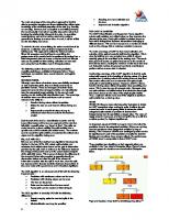
How This Book Is Organized Although there are many books on data visualization and data mining theory, few present a practical methodology for creating data visualizations and for performing visual data mining. Our book presents a proven eight-step data visualization and visual data mining (VDM) methodology, as outlined in Figure I.1. Throughout the book, we have stringently adhered to this eight-step VDM methodology. Each step of the methodology is explained with the help of practical examples and then applied to a real-world business problem using a real-world data set. The data set is available on the book's companion Web site. It is our hope that as you learn each methodology step, you will be able to apply the methodology to your real-world data sets and begin receiving the benefits of data visualization and visual data mining to solve your business issues.
-6-
Present to you by: Team-Fly®
John Wiley & Son- Visual Data Mining: Techniques and Tools for Data Visualization and Mining
Figure I.1: Eight-step data visualization and visual data mining methodology. Figure I.1 depicts the methodology as a sequential series of steps; however, the process of preparing the business data set and creating and analyzing the data visualizations and data mining models is an iterative process. Visualization and visual data mining steps are often repeated as the data and visualizations are refined and as you gain more understanding about the data set and the significance of one data fact (a column) to other data facts (other columns). It is rare that data or business analysts create a production-class data visualization or data mining model the first time through the data mining discovery process. This book is organized into three main sections that correspond to the phases of a data visualization and visual data mining (VDM) project: Project planning
Data preparation Data analysis
-7-
Present to you by: Team-Fly®
John Wiley & Son- Visual Data Mining: Techniques and Tools for Data Visualization and Mining
Part 1: Introduction and Project Planning Phase Chapter 1: "Introduction to Data Visualization and Visual Data Mining," introduces you to data visualization and visual data mining concepts used throughout the book. It illustrates how a few data visualizations can replace (or augment) hundreds of pages of traditional "green-bar" OLAP reports. Multidimensional, spatial (landscape), and hierarchical analysis data visualization tools and techniques are discussed through examples. Traditional statistical tools, such as basic statistics and histograms, are given a visual twist through statistic and histogram visualizations. Chapter 1 also introduces you to visual data mining concepts. This chapter describes how visualizations of data mining models assist the data and business analysts, domain experts and decision makers in understanding and visually interacting with data mining models such as decision trees. It also discusses using visualization tools to plot the effectiveness of data mining models, as well as to analyze the potential deployment of the models. Chapter 2: "Step 1: Justifying and Planning the Data Visualization and Data Mining Project," introduces you to the first of the eight steps in the data visualization and visual data mining (VDM) methodology and discusses the business aspects of business intelligence solutions. In most cases, the project itself needs a business justification before you can begin (or get funding for the project). This chapter presents examples of how various businesses have justified (and benefited) from using data visualization and visual data mining tools and techniques. Chapter 2 also discusses planning a VDM project and provides guidance on estimating the project time and resource requirements. It helps you to define team roles and responsibilities for the project. The customer retention business VDM project case study is introduced, and then Step 1 is applied to the case study. Chapter 3: "Step 2: Identifying the Top Business Questions," introduces you to the second step of the VDM methodology. This chapter discusses how to identify and refine business questions so that they can be investigated through data visualization and visual data mining. It also guides you through mapping the top business questions for your VDM project into data visualization and visual data mining problem definitions. Step 2 is then applied to the continuing customer retention VDM project case study.
Part 2: The Data Preparation Phase Chapter 4: "Step 3: Choosing the Data," introduces you to the third step of the VDM methodology and discusses how to select the data relating to the data visualization and visual data mining questions identified in Chapter 3 from your operational data source. It introduces the concept of using an exploratory data mart as a repository for building and maintaining business data sets that address the business questions under investigation. The exploratory data mart is then used to extract, cleanse, transform, load (ECTL), and merge the raw operational data sources into one or more production business data sets. This chapter guides you through choosing the data set for your VDM project by presenting and discussing practical examples, and applying Step 3 to the customer retention VDM project case study. Chapter 5: "Step 4: Transforming the Data Set," introduces you to the fourth step of the VDM methodology. Chapter 5 discusses how to perform logical transformations on the business data set stored in the exploratory data mart. These logical transformations often help in augmenting the business data set to enable you to gain more insight into the business problems under investigation. This chapter guides you through transforming the data set
-8-
Present to you by: Team-Fly®
John Wiley & Son- Visual Data Mining: Techniques and Tools for Data Visualization and Mining
for your VDM project by presenting and discussing practical examples, and applying Step 4 to the customer retention VDM project case study. Chapter 6: "Step 5: Verifying the Data Set," introduces you to the fifth step of the VDM methodology. Chapter 6 discusses how to verify that the production business data set contains the expected data and that all of the ECTL steps (from Chapter 4) and logical transformations (from Chapter 5) have been applied correctly, are error free, and did not introduce bias into your business data set. This chapter guides you through verifying the data set for your VDM project by presenting and discussing practical examples, and applying Step 5 to the customer retention VDM project case study. Chapter 7: "Step 6: Choosing the Visualization or Data Mining Tool," introduces you to the sixth step of the VDM methodology. Chapter 7 discusses how to choose and fine-tune the data visualization or data mining model tool appropriate in investigating the business questions identified in Chapter 3. This chapter guides you through choosing the data visualization and data mining model tools by presenting and discussing practical examples, and applying Step 6 to the customer retention VDM project case study.
Part 3: The Data Analysis Phase Chapter 8: "Step 7: Analyzing the Visualization or Data Mining Model," introduces you to the seventh step of the VDM methodology. Chapter 8 discusses how to use the data visualizations and data mining models to gain business insights in answering the business questions identified in Chapter 3. For data mining, the predictive strength of each model can be evaluated and compared to each other enabling you to decide on the best model that addresses your business questions. Moreover, each data visualization or data mining model can be visually investigated to discover patterns (business trends and anomalies). This chapter guides you through analyzing the visualizations or data mining models by presenting and discussing practical examples, and applying Step 7 to the continuing customer retention VDM project case study. Chapter 9: "Step 8: Verifying and Presenting Analysis," introduces you to the final step of the VDM methodology. Chapter 9 discussed the three parts to this step: verifying that the visualizations and data mining model satisfies your business goals and objectives, presenting the visualization and data mining discoveries to the decision-makers, and if appropriate, deploying the visualizations and mining models in a production environment. Although this chapter discusses the implementation phase, a complete essay of this phase is outside the scope of this book. Step 8 is then applied to the continuing customer retention VDM project case study. Chapter 10, "The Future of Visual Data Mining," serves as a summary of the previous chapters and discusses the future of data visualization and visual data mining. The Glossary provides a quick reference to definitions of commonly used data visualizations and data mining terms and algorithms.
Who Should Read This Book A successful business intelligence solution using data visualization or visual data mining requires the participation and cooperation from many parts of your business organization. Since this books endeavors to cover the VDM project from the justification and planning phase up to implementation phase, it has a wide and diverse audience.
-9-
Present to you by: Team-Fly®
John Wiley & Son- Visual Data Mining: Techniques and Tools for Data Visualization and Mining
The following definitions identify categories and roles of people in a typical business organization and lists which chapters are most advantageous for them to read. Depending on your business organization, you may be responsible for one or more roles. (In a small organization, you may be responsible for all roles). Data Analysts normally interact directly with the visualization and visual data mining software to create and evaluate the visualizations and data mining models. Data analysts collaborate with business analysts and domain experts to identify and define the business questions and get help in understanding and selecting columns from the raw data sources. We recommend data analysts focus on all chapters. Business Analysts typically interact with previously created data visualizations and data mining models. Business analysts help define the business questions and communicate the data mining discoveries to other analysts domain experts and decision makers. We recommend that business analysts focus on Chapters 1 through 4 and Chapters 8 and 9. Domain Experts typically do not create data visualizations and data mining models, but rather, interact with the final visualizations and models. Domain experts know the business, as well as what data the business collects. Data analysts and business analysts draw on the domain expert to understand and select the right data from the raw operational data sources, as well as to clarify and verify their visualization and data mining discoveries. We recommend domain experts focus on Chapters 1 through 4 and Chapters 6 and 9. Decision Makers typically have the power to act on the data visualization and data mining discoveries. The visualization and visual data mining discoveries are presented to decision makers to help them make decisions based on these discoveries. We recommend decision makers focus on Chapters 1, 2, and 9. Chapter 10 focuses on the near future of visualization in data mining. We recommend that all individuals read it.
Table I.1: How This Book Is Organized and Who Should Read It TOPIC AND VDM
DATA
BUSINESS
DOMAIN
DECISION
CHAPTER
STEP DISCUSSES
ANALYSTS
ANALYSTS
EXPERTS
MAKERS
1
Introduction to Data
√
√
√
√
√
√
√
√
√
√
√
√
√
√
Visualization and Visual Data Mining 2
Step 1: Justifying and Planning the Data Visualization/Data Mining Project
3
Step 2: Identifying the Top Business Questions
4
Step 3: Choosing the Data Set
5
-10-
Step 4: Transforming the √
Present to you by: Team-Fly®
John Wiley & Son- Visual Data Mining: Techniques and Tools for Data Visualization and Mining
Table I.1: How This Book Is Organized and Who Should Read It
CHAPTER
TOPIC AND VDM
DATA
BUSINESS
DOMAIN
DECISION
STEP DISCUSSES
ANALYSTS
ANALYSTS
EXPERTS
MAKERS
Data Set 6
Step 5: Verifying the
√
√
Data Set 7
Step 6: Choosing the
√
Visualization or Data Mining Model 8
Step 7: Analyzing the
√
√
√
√
√
√
√
√
√
√
Visualization or Data Mining Model 9
Step 8: Verifying and Presenting the Analysis
10
The Future of Visualization and Visual Data Mining
Software Tools Used There are numerous visualization software tools, and more are being developed and enhanced each year that you can use for data preparation, data visualization, and data mining. The graphical and data mining analysis capabilities of software tools vary from package to package. We have decided to limit our selection to four core packages for illustrating the data preparation and data analysis phases: Oracle, Microsoft Excel, SGI MineSet, and SPSS Clementine. These software packages are not required for reading or understanding this book, as the data visualization and data mining techniques described in the book are similar to those available in the majority of data visualization and data mining software packages.
Oracle The majority of query examples in the book are written using ANSI standard structured query language (SQL) syntax. For the data preparation extraction, cleanse, transform, and load (ECTL) tasks, we chose to use Oracle SQL*Loader syntax. For some of the logical transformation tasks, we chose to use Oracle procedural language SQL (PL/SQL). The majority of queries, ECTL, and logical transformation tasks can be accomplished using similar functions and tools in other popular RDBMS products, such as Microsoft SQL server, Sybase, Informix, DB2, and RedBrick.
-11-
Present to you by: Team-Fly®
John Wiley & Son- Visual Data Mining: Techniques and Tools for Data Visualization and Mining
Microsoft Excel Excel is the most widely used spreadsheet and business graphics software tool. Excel provides comprehensive tools to help you create, analyze, and share spreadsheets containing graphs. We chose to use Excel to illustrate core data visualization types such as column, bar, pie, line, scatter, and radar graphs. These traditional graph types are common to most visualization tool suites.
SGI MineSet Although no longer commercially available, we chose to use MineSet to illustrate advanced data visualization types, such as tree, statistics, and the 3D scatter graphs. These advanced graph types are common in most data mining software suites, such as ANGOSS Knowledge Studio, Oracle Darwin, IBM Intelligent Miner, and SAS Enterprise Miner.
SPSS Clementine Clementine supports a variety of data mining techniques, such as prediction, classification, segmentation, and association detection. We chose to use Clementine to illustrate these core data mining techniques. These core data mining techniques are common in most of the data mining software suites previously listed.
What's on the Web Site The companion Web site (www.wiley.com/compbooks/soukup) contains Web links to the data visualization and visual data mining software tools discussed throughout this book. It also contains Web links to the extraction, cleansing, transformation, and loading (ECTL) tools referenced in Chapter 4, as well as, other software tools discussed in other chapters. To demonstrate the eight-step data visualization and visual data mining methodology, we used a variety of business data sets. One business data set we used frequently was from a home equity loan campaign. We have included the entire home equity loan campaign prepared business data set on the Web site. For ease of transport and download, we have saved it as an Excel spreadsheet containing 44,124 records and 20 columns. At the end of Chapters 2 through 9, we applied each of the VDM steps to an ongoing customer retention case study. However, the size of the operations data sources, as well as the final two business data sets, is fairly large. For instance, the INVOICE.TXT file contains over 4.6 million rows. Therefore, we are providing the operational data sources and business data sets as an Access database file, casestudy.mdb, which is 180 MB. In addition, we are providing a 10 percent sample of each of the operational sources files, as well as the prepared business data sets as Excel spreadsheets, namely: 10 percent sample of the CUSTOMER.TXT, CONTRACT.TXT, INVOICE.TXT, and DEMOGRAPHIC.TXT operational source files
10 percent sample of the untransformed business data sets, customer_join and customer_demographics
-12-
Present to you by: Team-Fly®
John Wiley & Son- Visual Data Mining: Techniques and Tools for Data Visualization and Mining
10 percent sample of the prepared production business data sets, customer_join and customer_demographics Beware, if you use the sample Code Figure SQL on the 10 percent sample files instead of the complete data set your results may not exactly match those demonstrated in the book. However, depending on the capacity of your computer system and what database you are using, the 10 percent sample files may be easier for you to work with than the complete files contained in the Access database file. The decision of which set of files to use is up to you; nevertheless, we encourage you to work though the methodology steps with the customer retention operational data source files and business data set files as you read the book.
Summary The process of planning, preparing the business data set, and creating and analyzing data visualizations and data mining models, is an iterative process. Visualization and visual data mining steps as described in the visualization and visual data mining (VDM) methodology are frequently repeated. As you gain more understanding of the data set and the significance of one data fact (a column) to other data facts (other columns), the data and visualizations are refined. It is rare that data or business analysts create a production-class data visualization or data mining model the first time through the data mining discovery process. Often the data must be further transformed or more data is necessary to answer the business question. In some cases, discoveries about the data set lead to refining the original business questions. The power of visualization provides you the ability to quickly see and understand the data set and data mining model so you can improve your analysis interactively. We hope that this book helps you develop production-class visualizations and data mining models that address your business questions. Furthermore, we hope that this book gives you the essential guidance to make your VDM project a success. The next chapter introduces you to data visualization and visual data mining concepts used throughout the book.
-13-
Present to you by: Team-Fly®
John Wiley & Son- Visual Data Mining: Techniques and Tools for Data Visualization and Mining
Part I:
Introduction and Project Planning Phase
Chapter List Chapter 1: Introduction to Data Visualization and Visual Data Mining Chapter 2: Step 1: Justifying and Planning the Data Visualization and Data Mining Project Chapter 3: Step 2: Identifying the Top Business Questions
-14-
Present to you by: Team-Fly®
John Wiley & Son- Visual Data Mining: Techniques and Tools for Data Visualization and Mining
Chapter 1:
Introduction to Data Visualization and Visual Data
Mining Overview When you read a newspaper or magazine, or watch a news or weather program on TV, you see numerous data visualizations. For example, bar and column graphs are often used to communicate categorical and demographic discoveries such as household or population survey results or trends, line graphs are used to communicate financial market time-based trends, and map graphs are used to communicate geographic weather patterns. Have you ever asked yourself why? Could it be that two- and three-dimensional data visualizations are the most effective way of communicating large quantities of complicated data? In this book, not only do we emphasize the benefits of data visualization to analyze business data sets and communicate your discoveries, but we also outline a proven data visualization and visual data mining methodology that explains how to conduct successful data mining projects within your organization. Chapter 1 introduces you to a variety of data visualization tools and techniques that you can use to visualize business data sets and discover previously unknown trends, behavior, and anomalies. It also introduces you to a variety of data visualization tools and techniques for visualizing, analyzing, and evaluating popular data mining algorithms. This book discusses two broad classes of visualizations-(1) data visualization techniques for visualizing business data sets and (2) visual data mining tools and techniques for visualizing and analyzing data mining algorithms and exploring the resultant data mining models. The distinction is as follows:
Data visualization tools and techniques help you create two- and three-dimensional pictures of business data that can be easily interpreted to gain knowledge and insights into those data sets. With data visualization, you act as the data mining or pattern recognition engine. By visually inspecting and interacting with the two- or three-dimensional visualization, you can identify the interesting (nontrivial, implicit, perhaps previously unknown and potentially useful) information or patterns in the business data set. Visual data mining tools and techniques help you create visualizations of data mining models to gain knowledge and insight into the patterns discovered by the data mining algorithms that help with decision making and predicting new business opportunities. With visual data mining tools, you can inspect and interact with the two- or three-dimensional visualization of the predictive or descriptive data mining model to understand (and validate) the interesting information and patterns discovered by the data mining algorithm. In addition, data visualization tools and techniques are used to understand and evaluate the results of the data mining model. The output from a data mining tool is a model of some sort. You can think of a model as a collection of generalizations or patterns found in the business data set that is an abstraction of the task. Just as humans may use their previous experience to develop a strategy to handle, say, difficult people, the data mining tool develops a model to predict people who are likely to leave a service organization. Depending on the data
-15-
Present to you by: Team-Fly®
John Wiley & Son- Visual Data Mining: Techniques and Tools for Data Visualization and Mining
mining tool, an explanation of why a decision was made is possible. Some data mining tools provide a clear set of reasons as to why a particular decision was made, while others are black boxes, making decisions but not telling you why. In both cases, visualization is key in helping you discover new patterns and trends and to communicate these discoveries to the decision makers. The payoffs and ROI (return-on-investment) can be substantial for businesses that use a combination of data visualization and visual data mining effectively. A base knowledge of various types of data visualization and visual data mining tools is required before beginning the eight-step data visualization and data mining (VDM) methodology discussed in Chapters 2 through 9. A good working knowledge of the visualization types will aid you in the project planning, data preparation, and data analysis phases of your VDM project.
Visualization Data Sets The majority of business data sets are stored as a single table of information composed of a finite number of columns and one or more rows of data. Chapter 4 discusses how to choose the data from your operational data warehouse or other business data sources. However, before we begin introducing you to the visualization tools and techniques, a brief explanation of the business data set is necessary. Table 1.1 shows an example of a simple business data set with information (data) about weather.
Table 1.1: Business Data Set Weather CITY
DATE
TEMPERATURE
HUMIDITY
CONDITION
Athens
01-MAY-2001
97.1
89.2
Sunny
Chicago
01-MAY-2001
66.5
100.0
Rainy
Paris
01-MAY-2001
71.3
62.3
Cloudy
The information (data facts) about the WEATHER subject data set is interpreted as follows: WEATHER is the file, table, or data set name. A city's weather on a particular day is the subject under investigation. CITY, DATE, TEMPERATURE, HUMIDITY, and CONDITION are four columns of the data set. These columns describe the kind of information kept in the data set-that is, attributes about the weather for each city. ATHENS, 01-MAY-2001, 97.1, 89.2, SUNNY is a particular record or row in the data set. Each unique set of data (data fact) should have its own record (row). For this row, the data value "Athens" identifies the CITY, "01-MAY-2001" identifies the DATE the measurement was taken, "97.1" identifies TEMPERATURE in degrees Fahrenheit, "89.2" identifies the HUMIDITY in percent, and "Sunny" identifies the CONDITION. The level of detail or granularity of data facts (experimental unit) is at the city level.
-16-
Present to you by: Team-Fly®
John Wiley & Son- Visual Data Mining: Techniques and Tools for Data Visualization and Mining
Data visualization tools and techniques are used to graphically display the data facts as a 2-D or 3-D picture (representation) of the columns and rows contained in the business data sets.
Visualization Data Types Columns in a business data set (table or file) contain either discrete or continuous data values. A discrete column, also known as a categorical variable, is defined as a column of the table whose corresponding data values (record or row values) have a finite number of distinct values. For instance, discrete data type columns are those that contain a character string, an integer, or a finite number of grouped ranges of continuous data values. The possible data values for a discrete column normally range from one to a few hundred unique values. If there is an inherent order to the discrete column, it is also referred to as an ordinal variable. For instance, a discrete column whose unique values are SMALL, MEDIUM, or LARGE is considered an ordinal variable. A continuous column, also known as a numeric variable or date variable, is defined as a column of a table whose corresponding data values (record or row values) can take on a full range (potentially an infinite number) of numeric values. For instance, continuous data type columns are those that contain dates, double-precision numbers, or floating-point numbers. The possible unique data values for a continuous column normally range from a few thousand to an infinite number of unique values. Table 1.2 shows examples of the discrete and continuous columns.
Table 1.2: Discrete and Contin uous Column Examples COLUMN DATA TYPE
Discrete
COLUMN NAME
CITY
EXAMPLE ROW
DATA VALUE
VALUES
RANGE
Athens, Chicago, Paris
Finite number of cities in the world
Discrete
CONDITION
Sunny, Rainy
Finite number of weather conditions, such as Sunny, Partly Cloudy, Cloudy, Rainy
Ordinal
EDUCATION
Unknown, High School
Finite number of educational degree categories, such as High School, Bachelor, Master, Doctorate
Discrete
GENDER
M, F, U
Finite number of values, such as M for male, F for female, U for unknown
Ordinal
AGE_GROUPS
0-21, 22-35
Finite number of age range groups
-17-
Present to you by: Team-Fly®
John Wiley & Son- Visual Data Mining: Techniques and Tools for Data Visualization and Mining
Table 1.2: Discrete and Contin uous Column Examples COLUMN DATA TYPE
COLUMN NAME
EXAMPLE ROW
DATA VALUE
VALUES
RANGE
Discrete
PURCHASE_MONTH
January, February
Finite number of months
Continuous
DATE
01-MAY-2001,
All possible dates
02-MAY-2001 Continuous
TEMPERATURE
97.1, 66.2, 71.3
All possible numeric temperatures in degrees Fahrenheit
Continuous
HUMIDITY
89.1, 100.0, 62.3
All numbers between 0 and 100 percent
Continuous
TOTAL_SALES
1.00, $1,000,000.00
All possible total sales amounts
Visual versus Data Dimensions Take care not to confuse the terms visual dimension and data dimension. Visual dimension relates to the spatial coordinate system. Data dimension, on the other hand, relates to the number of columns in a business data set. Visual dimensions are the graphical x-, y-, and z-axis of the spatial coordinate system or the color, opacity, height, or size of the graphical object. Data dimensions are the discrete or continuous columns or variables contained within the business data set. If we use the business data set from Table 1.1, the data dimensions of the weather data set are the columns CITY, DATE, TEMPERATURE, HUMIDITY, and CONDITION. To create a two- or three-dimensional visualization of the weather data set, the columns under investigation are selected from the business data set to create a graphical data table. The graphical data table is used to map the column values of the business data set to corresponding data points in an x-, y-, or z-axis coordinate system. Figure 1.1 illustrates a column graph visualization comparing the TEMPERATURE and HUMIDITY continuous data dimensions by the CITY discrete data dimension for the weather data set. The corresponding graphical data table values for the TEMPERATURE and HUMIDITY columns are represented by the height of the bars. A pair of bars is drawn for each corresponding CITY value. Normally, the graphical data table is not part of the visualization; however, in this example, the table is included to illustrate how the column graph was created.
-18-
Present to you by: Team-Fly®
John Wiley & Son- Visual Data Mining: Techniques and Tools for Data Visualization and Mining
Figure 1.1: Column graph comparing temperature and humidity by city. Since the WEATHER data set only contained summer temperatures ranging from 32 to 120 degrees Fahrenheit, the same y-axis scale can be used for both HUMIDITY and TEMPERATURE. For a data set with different HUMDITY and TEMPERATURE ranges, two y-axes would be required-one for the HUMIDITY scale (0 to 100 percent) and one for the TEMPERATURE scale (-65 to 150 degrees Fahrenheit).
Data Visualization Tools Data visualization tools are used to create two- and three-dimensional pictures of business data sets. Some tools even allow you to animate the picture through one or more data dimensions. Simple visualization tools such as line, column, bar, and pie graphs have been used for centuries. However, most businesses still rely on the traditional "green-bar" tabular report for the bulk of the information and communication needs. Recently, with the advance of new visualization techniques, businesses are finding they can rapidly employ a few visualizations to replace hundreds of pages of tabular reports. Other businesses use these visualizations to augment and summarize their traditional reports. Using visualization tools and techniques can lead to quicker deployment, result in faster business insights, and enable you to easily communicate those insights to others. The data visualization tool used depends on the nature of the business data set and its underlying structure. Data visualization tools can be classified into two main categories: Multidimensional visualizations Specialized hierarchical and landscape visualizations
-19-
Present to you by: Team-Fly®
John Wiley & Son- Visual Data Mining: Techniques and Tools for Data Visualization and Mining
Choosing which visualization technique or tool to use to address your business questions is discussed in Chapter 7. Using and analyzing the visualization to discover previously unknown trends, behaviors, and anomalies in your business data set is covered in Chapter 8.
Multidimensional Data Visualization Tools The most commonly used data visualization tools are those that graph multidimensional data sets. Multidimensional data visualization tools enable users to visually compare data dimensions (column values) with other data dimensions using a spatial coordinate system. Figure 1.2 shows examples of the most common visualization graph types. Other common multidimensional graph types not shown in Figure 1.2 include contour, histogram, error, Westinghouse, and box graphs. For more information on these and other graph types refer to Information Graphics: A Comprehensive Illustrated Reference, by R. Harris (Oxford: Oxford University Press, 1999).
Figure 1.2: Multidimensional data visualization graph types. Most multidimensional visualizations are used to compare and contrast the values of one column (data dimension) to the values of other columns (data dimensions) in the prepared business data set. They are also used to investigate the relationships between two or more continuous or discrete columns in the business data set. Table 1.3 lists some common multidimensional graph types and the types of column values they can compare or the kinds of relationships they can investigate.
-20-
Present to you by: Team-Fly®
John Wiley & Son- Visual Data Mining: Techniques and Tools for Data Visualization and Mining
Table 1.3: Graph Types and Column Types GRAPH TYPE
TYPE OF COLUMN VALUES TO COMPARE
Column and bar
Used to compare discrete (categorical) column values to continuous column values
Area, stacked column or
Used to compare discrete (categorical) column values over a continuous column
bar, line, high-low-close, and radar Pie, doughnut, histogram,
Used to compare the distribution of distinct values for one or more discrete
distribution, and box
columns
Scatter
Used to investigate the relationship between two or more continuous columns
Column and Bar Graphs Column and bar graphs, such as clustered column and clustered bar graphs, compare continuous data dimensions across discrete data dimensions in an x- and y-coordinate system. Column graphs plot data dimensions much like a line graph, except that a vertical column is drawn from the x-axis to the y-axis for the value of the data dimension. Bar graphs are identical to column graphs, except the x-axis and y-axis are switched so that the bar graphical entities are drawn horizontally instead of vertically. In either case, the data values associated with different sets of data are grouped by their x-axis label to permit easy comparison between groups. Each set of data can be represented by a different color or pattern. Stacked column and bar graphs work exactly like the non-stacked version, except that the y-axis data dimension values from previous data sets are accumulated as each column is plotted. Thus, bar graphical entities appear to be stacked upon each other rather than being placed side by side. Figure 1.1 illustrates a multidimensional column graph visualization comparing the TEMPERATURE and HUMIDITY data dimensions by the CITY data dimension for the weather data set from Table 1.1. The interpretation of the bar graph in Figure 1.1 is left to the viewer-who posssesses perhaps the most sophisticated pattern recognition machine ever created. What conclusions can be discovered from the column graph illustrated in Figure 1.1? You may conclude the rule is that (in most cases) temperature tends to be higher than the humidity. However, in the case of Chicago, the rule is broken. Despite this, if you must also take into consideration the CONDITION column, you can refine the rule to be that temperature tends to be higher than humidity unless it is raining. Now the rule would be true for all rows in the data set. Obtaining more records for the data set and plotting them would help you visually test and refine your rule.
Distribution and Histogram Graphs An extremely useful analytical technique is to use basic bar and column graphs to display the distribution of values for a data dimension (column). Distribution and histogram graphs display the proportion of the values for discrete (nonnumeric) and continuous (numeric) columns as specialized bar and column graphs. A distribution graph shows the occurrence of discrete, non-numeric column values in a data set. A typical use of the distribution graph is to show imbalances in the data. A histogram, also referred to as a frequency graph, plots the number of occurrence of same or distinct values in the data set. They are also used to reveal imbalances in the data. Chapters 4, 5, and 6 use distribution and histogram graphs to initially explore the data set, detect imbalances, and verify the
-21-
Present to you by: Team-Fly®
John Wiley & Son- Visual Data Mining: Techniques and Tools for Data Visualization and Mining
correction of these imbalances. Chapters 7 and 8 use distribution and histogram graphs to discover and evaluate key business indicators. Figure 1.3 shows a distribution graph of the INVOICE DATE data dimension for 2,333 billing records for the first four months of 2000. From the distribution graph, you can visually see that the month of February 2000 had the most invoices. Since you can verify the number of records by month against the original operational data source, the distribution graph provides you a method for verifying whether there are missing records in your business data set.
Figure 1.3: Distribution graph of invoices for the first four months of 2000. Figure 1.4a shows a histogram graph of the number of invoices by REGION and Figure 1.4b shows a histogram graph of the number of invoices by BILLING RATE groupings for the first four months of 2000 from the same accounting business data set. In both of these graphs, you can visually see the skewness (lack of symmetry in a frequency distribution) in the column value distribution. For instance, the histogram graph of invoices by REGION (Figure 1.4a) is skewed toward the Eastern region while the histogram graph of invoice by BILLING RATE (Figure 1.4b) is skewed toward billing rates of $15.00 an hour or less.
-22-
Present to you by: Team-Fly®
John Wiley & Son- Visual Data Mining: Techniques and Tools for Data Visualization and Mining
Figure 1.4: Histogram graphs of invoices by region and by billing rate regions.
Box Graphs Understanding descriptive statistical information about the column's values has typically been accomplished by analyzing measurements of central tendency (such as mean, median, and mode), measurements of variability (such as standard deviation and variance), and measures of distribution (such as kurtosis and skewness). For more information about central tendency, variability, and distribution measurements, refer to Statistics for the Utterly Confused by L. Jaisingh (New York: McGraw-Hill, 2000). Table 1.4 shows some of the common descriptive statistics derived from the values of the continuous column BILLING RATE.
Table 1.4: Descriptive Statistics for BILLING RATE
-23-
Present to you by: Team-Fly®
John Wiley & Son- Visual Data Mining: Techniques and Tools for Data Visualization and Mining
BILLING_RATE
Mean
19.59751
Standard error
0.271229
Median
15
Mode
12
Standard deviation
13.10066
Sample variance
171.6274
Kurtosis
16.48715
Skewness
3.196885
Range
159
Minimum
7
Maximum
166
Sum
45721
Count
2333
Confidence level (95.0%)
0.531874
A variation on the histogram graph is the box plot graph. It visually displays statistics about a continuous column (numeric and date data types). Figure 1.5 shows two box plots for the BILLING RATE and INVOICE DATE.
-24-
Present to you by: Team-Fly®
John Wiley & Son- Visual Data Mining: Techniques and Tools for Data Visualization and Mining
Figure 1.5: Box graph of BILLING RATE and INVOICE DATE. The box graphs display the following for each continuous column in the data set: The two quartiles (25th and 75th percentiles) of the column's values. The quartiles are shown as lines across a vertical colored bar. The length of the bar represents the difference between the 25th and 75th percentiles. From the length of the bar you can determine the variability of the continuous column. The larger the bar, the greater the spread in the data. The minimum, maximum, median, and mean of the column's values. The horizontal line inside the bar represents the median. If the median is not in the center of the bar, the distribution is skewed. The standard deviation of the column's values. The standard deviation is shown + and - one standard deviation from the column's mean value. The box plots visually reveal statistical information about the central tendency, variance, and distribution of the continuous column values in the data set. The statistics graphs in Figure 1.5 show the position of the descriptive statistics on a scale ranging from the minimum to the maximum value for numeric columns. They are often used to explore the data in preparation for transformations and model building. Similar to the distribution and histogram graph, statistics graphs are frequently used to reveal imbalances in the data. Chapters 4, 5, and 6 use statistics graphs to initially explore the data set, detect imbalances, and verify the correction of these imbalances.
Line Graphs In its simplest form, a line graph (chart) is nothing more than a set of data points plotted in an x- and y-coordinate system, possibly connected by line segments. Line graphs normally show how the values of one column (data
-25-
Present to you by: Team-Fly®
John Wiley & Son- Visual Data Mining: Techniques and Tools for Data Visualization and Mining
dimension) compare to another column (data dimension) within an x- and y-coordinate system. Line and spline segments will connect adjacent points from the values of the data column. The data values for the x-axis can be either discrete or continuous. If the data values are discrete, the discrete values become the labels for successive locations on the axis. The data values for the y-axis must be continuous. Often line graphs are used to demonstrate time series trends. Figure 1.6 shows a line graph visualization comparing the 1-, 3-, 6-, and 12-month bond yield indices from 1/17/1996 to 6/23/2000. The time series data dimension (date) is plotted on the x-axis. The corresponding data values for the 1-, 3-, 6-, and 12-month yields are plotted on the y-axis. The corresponding column data values are shown as points connected by a line within the x-y coordinate system.
Figure 1.6: Line graph of bond yield indices. Figure 1.6 is the compilation of four individual line graphs. It allows you to quickly see how the yield indices compare to one another over the time dimension by the positions of the lines in the x- and y-coordinate system. In this single data visualization, over 4,500 pieces of information are communicated (1,136 individual daily readings of 4 values). Various trends may have been missed if you were only looking at column after column of numbers from a green-bar report. A high-low-close graph is a variation on the line graph. Instead of a single x-y data point, the high, low, and close column values are displayed as hash markers on a floating column (the floating column being defined by the high and low values) within the x- and y- coordinate system. A typical use of high-low-close graphs is to show stock trends. Another variation on the line graph is the radar graph, which shows radars with markers at each data point in a 360-degree coordinate system instead of the traditional 90-degree x-y coordinate system. Figure 1.7 shows a
-26-
Present to you by: Team-Fly®
John Wiley & Son- Visual Data Mining: Techniques and Tools for Data Visualization and Mining
radar graph of the bond yield indices comparing the 1- and 6-month bond yields. In Chapters 7 and 8, line and radar graphs are used to discover and analyze time-based trends.
Figure 1.7: Radar graph of bond yield indices.
Scatter Graphs Scatter graphs (sometimes referred to as scatter plots) are typically used to compare pairs of values. A scatter graph enables you to visualize the business data set by mapping each row or record in the data set to a graphical entity within a two- or three-dimensional graph. In contrast to the line graph, a scatter graphs displays unconnected points on an x-, y-, or z-coordinate system (3-D). In its simplest mode, data dimensions from the data set are mapped to the corresponding points in an x- and y-coordinate (2-D). The bubble graph is a variation of a simple scatter graph that allows you to display another data dimension of the data set as the size of the graphical entity, as well as its position within the x- and y-coordinate system. Figure 1.8 illustrates how you can use a scatter graph to investigate the relationship between the number of store promotions and the weekly profit. In Chapters 7 and 8, scatter graphs are used to discover and evaluate cause and effect relationships.
-27-
Present to you by: Team-Fly®
John Wiley & Son- Visual Data Mining: Techniques and Tools for Data Visualization and Mining
Figure 1.8: Scatter graph of weekly profit by number of promotions.
Pie Graphs Pie graphs display the contribution of each value to the sum of the values for a particular column. Discrete column values become the labels for the slices of the pie, while the continuous column values are summarized into contribution per the discrete column value. Figure 1.9a shows a pie graph comparing the percent contribution of the total votes cast for each candidate in the state of Florida during the 2001 U.S. presidential race. Pie graphs are also very useful in showing column value distributions. In Chapters 4, 5, and 6, they are used to compare column value distributions before and after data preparation steps.
-28-
Present to you by: Team-Fly®
John Wiley & Son- Visual Data Mining: Techniques and Tools for Data Visualization and Mining
Figure 1.9: Pie and doughnut graphs of the presidential vote in Florida. The doughnut graph is a variation on the pie graph. It can be used to compare and contrast multiple continuous columns at the same time. For instance, using a doughnut graph, you could show the voting percentages per U.S. presidential candidate in Florida, Wisconsin, and other states within the same visualization. This allows you to not only compare the vote percentages per candidate in Florida but also to compare those percentages against the other states that were visualized. Figure 1.9b shows a doughnut graph of the presidential vote in Florida.
-29-
Present to you by: Team-Fly®
John Wiley & Son- Visual Data Mining: Techniques and Tools for Data Visualization and Mining
Hierarchical and Landscape Data Visualization Tools Hierarchical, landscape, and other specialized data visualization tools differ from normal multidimensional tools in that they exploit or enhance the underlining structure of the business data set itself. You are most likely familiar with an organizational chart or a family tree. Some business data sets possess an inherent hierarchical structure. Tree visualizations can be useful for exploring the relationships between the hierarchy levels. Other business data sets have an inherent geographical or spatial structure. For instance, data sets that contain addresses have a geographical structure component. Map visualization can be useful for exploring the geographical relationships in the data set. In other cases, the data set may have a spatial versus geographical structure component. For instance, a data set that contains car part failures inherently has spatial information about the location of the failure within the car. The failures can be "mapped" to a diagram of a car (a car landscape). Another data set may contain where in the factory the failing part was manufactured. The failure can be "mapped" to a diagram of the factory (a factory landscape) to explore whether the failed part has any significance to the location where it was manufactured.
Tree Visualizations The tree graph presents a data set in the form of a tree. Each level of the tree branches (or splits) based upon the values of a different attribute (hierarchy in the data set). Each node in the tree shows a graph representing all the data in the sub-tree below it. The tree graph displays quantitative and relational characteristics of a data set by showing them as hierarchically connected nodes. Each node contains information usually in the form of bars or disks whose height and color correspond to aggregations of data values (usually sums, averages, or counts). The lines (called edges) connect the nodes together and show the relationship of one set of data to its subsets. Figure 1.10 illustrates the number of families on Medicaid from a 1995 Census data set using a tree graph. The "root" node, or start of the tree, shows the total number of families on Medicaid (the small, darker colored column on the right) and not on Medicaid (the taller, lighter colored column on the left) that occur in the entire data set. You can see the number of families on Medicaid is very small, as the height of the lighter column is much greater than the darker column. The second level of the tree represents the number of families on Medicaid by the various family types. By visualizing the data in this way, you may be able to find some combination attributes and values that are indicative of families having a higher than normal chance of being on Medicaid. As you can see from tree visualization, some types of families have a significantly higher chance of being on Medicaid than others (related subfamily and second individual family types versus non-family householders).
-30-
Present to you by: Team-Fly®
John Wiley & Son- Visual Data Mining: Techniques and Tools for Data Visualization and Mining
Figure 1.10: Tree visualization of proportion of families on Medicaid by family type and region.
Map Visualizations To explore business data sets for strong spatial (typically geographical) relationships, you can use a map visualization. The corresponding column values are displayed as graphical elements on a visual map based on a spatial key. Although the data set contains a geographic data dimension, what is not contained in the data set is the information that says there are 50 states in the United States, that California and New York are 3,000 miles apart, that California is south of Oregon, or what the latitude or longitude coordinates are for the states. For instance, you can plot your total sales by state, state and county, and zip code. Figure 1.11 is a map visualization of a business data set that contains information about the number of new account registrations by state. Using a corresponding color key, the states are colored based on the number of registrations by state. You can quickly determine from the map which sales locations (states and regions) are signing up more new customers than others. You can also see the geographic significance of the best-producing state or regions compared with other states and regions.
-31-
Present to you by: Team-Fly®
John Wiley & Son- Visual Data Mining: Techniques and Tools for Data Visualization and Mining
Figure 1.11: Map visualization of new account registrations by state.
Visual Data Mining Tools Visual data mining tools can be used to create two- and three-dimensional pictures of the how the data mining model is making its decision. The visualization tool used depends on the nature of data set and the underlying structure of the resulting model. For example, in Figure 1.12 a decision tree model is visualized using a hierarchical tree graph. From this visualization you can more easily see the structure of the model.
-32-
Present to you by: Team-Fly®
John Wiley & Son- Visual Data Mining: Techniques and Tools for Data Visualization and Mining
Figure 1.12: Tree visualization of a decision tree to predict potential salary. Unfortunately, not all data mining algorithms can be readily visualized with commercially available software. For instance, neural network data mining models simulate a large number of interconnected simple processing units segmented into input, hidden, and output layers. Visualizing the entire network with its inputs, connections, weights, and outputs as a two- or three-dimensional picture is an active research question. Visualization tools are also used to plot the effectiveness of the data mining model, as well as to analyze the potential deployment of the model. A gains chart is a line graph that directly compares a model's performance at predicting a target event in comparison to always guessing it occurs. The cumulative gain is the proportion of all the target events that occur up to a specific percentile. Figure 1.13 illustrates a cumulative gains chart. The population series refers to our random-guess model. From this line graph, you can compare and contrast the performance of different data mining models. You can also use these visualizations to compare and contrast the performance of the models at the time they are built and once they are deployed. You can quickly visually inspect the performance of the model to see if it is performing as expected or becoming stale and out-of-date. Other multidimensional data visualization tools are useful in analyzing the data mining model results, as well as comparing and contrasting multiple data mining models.
-33-
Present to you by: Team-Fly®
John Wiley & Son- Visual Data Mining: Techniques and Tools for Data Visualization and Mining
Figure 1.13: Evaluation line graph. The tree visualization in Figure 1.12 and the line visualization in Figure 1.13 are just two examples of how you can use data visualization to explore how data mining models make their decisions and evaluate multiple data mining models. Choosing which visual data mining tool to use to address your business questions is discussed in Chapter 7. Analyzing the visualization of the data mining model to discover previously unknown trends, behaviors, and anomalies in business data set is discussed in Chapter 8.
Summary Chapter 1 summarized data visualization and visual data mining tools and techniques that can be used to discover previously unknown trends, behaviors, and anomalies in business data. In the next chapter, we help you justify and plan a data visualization and data mining project so you can begin to exploit your business data with data visualization and visual data mining to gain knowledge and insights into business data sets and communicate those discoveries to the decision makers. Chapters 2 through 9 present and teach you a proven eight-step VDM methodology that we have used to create successful business intelligence solutions with data visualization and visual data mining tools and techniques.
-34-
Present to you by: Team-Fly®
John Wiley & Son- Visual Data Mining: Techniques and Tools for Data Visualization and Mining
Chapter 2:
Step 1: Justifying and Planning the Data
Visualization and Data Mining Project Overview Step 1 of the eight-step data visualization and data mining (VDM) methodology is composed of both the project justification and the project plan. Chapter 1 provided you with an introduction to visualization and data mining tools and techniques. This chapter shows you how to justify and plan the VDM project. Before the first row of data is visualized or mined, a project justification and plan needs to be developed to ensure the success of the project. The purpose of the project justification is to identify quantitative project objectives and develop a sound business case for performing the project, and to gain executive support and funding from the decision makers for the project. The project justification defines the overall business stimulus, return-on-investment (ROI) targets, and visualization and data mining goals for the project. The purpose of a project plan is to define the scope, high-level tasks, roles, and responsibilities for the project. The project plan establishes a roadmap and project time-line. It defines the roles and responsibilities of all participants who will be involved in the project and serves as an "agreement" of individual responsibilities among the operations and data warehousing, the data and business analyst, the domain expert, and the decision maker teams. A closed-loop business model is often helpful in modeling the business aspects of the project. The closed-loop model ensures the resulting visualizations or data mining models feed back into the initial data set sources. This feedback loop enables you to refine, improve, and correct your production visualizations or data mining models through time. Other feedback loops within the business model ensure your project stays focused, makes business sense, and remains within the scope of the project. This chapter begins by discussing three types of projects:
Proof-of-concept Pilot Production
We then introduce using a closed-loop business model, provide guidance to estimating the project timeline and resources, and define team roles and responsibilities for the project. At the end of this chapter, we introduce the case study of a customer retention business problem. We then apply the concepts discussed in this chapter to the case study to illustrate Step 1 of the VDM methodology.
Classes of Projects The overall scope of your VDM project can be categorized into three classes of projects: proof-of-concept, pilot, or production. Often a successful proof-of-concept or pilot project later leads to a production project. Therefore, no matter which type of project is planned, it helps to keep the overall structure of the project justification and plan consistent. This enables you to quickly turn a proof-of-concept project justification and plan into a pilot or
-35-
Present to you by: Team-Fly®
John Wiley & Son- Visual Data Mining: Techniques and Tools for Data Visualization and Mining
production project without starting over from scratch or wasting time and resources. Among other factors, the type of project will determine the following:
The difficulty and number of the business questions investigated The complexity and amount of data analyzed The quality and completeness of the data The project costs (personnel, software, and hardware cost) The duration of the project The complexity and number of resultant visualizations and models created A proof-of-concept VDM project has a limited scope. The overall scope of a proof-of-concept project is to determine whether visualization and data mining will be beneficial to your business, to prove to the decision makers the value of visualization and data mining, and to give your organization experience with visualization and data mining concepts. Typically, one or two relatively trivial business questions are investigated. The data set analyzed is limited to a small sample of existing data. The average duration of a proof-of-concept project normally is a few weeks. A pilot VDM project also has a limited scope. The overall scope of the pilot project is to investigate, analyze, and answer one or more business questions to determine if the ROI of the discoveries warrants a production project. The data set analyzed is limited to representative samples from the real data sources. Often you will need to purchase limited copies of the visualization and data mining tools. However, since the pilot project may not be implemented, you may not have to purchase the production hardware or copies of the visualization and data mining tools for everyone. The average duration of a pilot project is normally a few months . A production VDM project is similar to the pilot project in scope; however, the resulting visualizations and data mining models are implemented into a production environment. The overall scope of the production project is to fully investigate, analyze, and answer the business questions and then to implement an action plan and measure the results of the production visualizations and data mining models created. You will need to purchase licenses for the visualization and data mining tools for all production users and buy the production hardware. The average duration of a production project ranges from a few months to a year. The actual project deployment may last many years. Depending on the visualization and data mining experience level of your staff, you may need to augment it. For production projects, you will need a dedicated and trained staff to maintain the production environment. Many times after you see the benefits and ROI from the project, you will want to use visualization and data mining to answer other business questions or use VDM in other departments in your organization.
Project Justifications After you have decided which class of project to do, you next need to create a project justification. The project justification defines the overall business stimulus, ROI targets, and visualization and data mining goals for the
-36-
Present to you by: Team-Fly®
John Wiley & Son- Visual Data Mining: Techniques and Tools for Data Visualization and Mining
project. Developing a project justification begins by identifying a high-level business issue your business needs to address. Table 2.1 lists a few of the business issues that can be addressed by VDM projects.
Table 2.1: Business Issues Addressed by Visualizations or Visual Data Mining Projects BUSINESS ISSUE
VDM PROJECT OBJECTIVES
Target marketing
To discover segments of "ideal" customers who share the same characteristics, such as income level, and spending habits, with the best candidates for a specific product or service
Cross-marketing
To discover co-relations and associations between product sales and make predictions based on these associations to facilitate cross-marketing
Customer profiling
To create models to determine what types of customers buy which products
Identification of customer
To discover the best product matches for different segments of customers and
requirements
use predictions to find what factors will attract new customers
Financial planning and
To create descriptive or predictive models to aid in cash flow analysis and
asset evaluation
predictions, contingent claim analysis, and trend analysis to evaluate assets
Resource planning
To create descriptive or predictive models to aid in analyzing and comparing resources and spending
Competitive analysis
To segment customers into classes for class-based pricing structures and set pricing strategies for highly competitive markets
Fraud detection
To create descriptive or predictive models to aid in analyzing historical data to detect fraudulent behaviors in such industries as medical, retail, banking, credit card, telephone, and insurance
Attrition modeling and
To create descriptive or predictive models to aid in the analysis of customer
analysis
attrition
Chemical and
To create descriptive or predictive models to aid in molecular pattern modeling
pharmaceutical analysis
and analysis, as well as drug discovery and clinical trial modeling and analysis
Attempt to state your overall project goal in a single statement, for instance, "To discover segments of ideal customers who share the same characteristics and who are the best candidates for our new cable modem service offering." You may need to interview various departments within your organization before deciding on your project goal. For proof-of-concept projects, keep the overall project goal simple. For pilot or production projects, the overall project goal may be more complex. Use the examples in Table 2.1 to establish your own project objective. Perhaps the most difficult part of the project's business justification is determining realistic ROI objects and expected outcomes. You will often need the assistance of the business analysts or line-of-business manager to help quantify the cost of continuing to do business "status quo." Your aim should be to create a document that contains the project ROI objectives; describes the content, form, access, and owners of the data sources; summarizes the
-37-
Present to you by: Team-Fly®
John Wiley & Son- Visual Data Mining: Techniques and Tools for Data Visualization and Mining
previous research; explains the proposed methodology; and forecasts the anticipated outcome. When preparing the justification document, keep in mind the class of project you are planning, as well as your target audience-the decision makers and business experts. As reference material for your business justification, include industry examples of visualization and data mining success stories. Choose those success stories that relate to the business issues you are trying to address. Our companion Web site (www.wiley.com/compbooks/soukup) has links to the majority of the commercially available data visualization and visual data mining software providers. For example, you can find the following success stories on the SPSS, SAS, and Oracle Web sites.
Dayton Hudson Corp. Success Story Retail is a very competitive industry. The Dayton Hudson Corp. (DHC) success story highlights how they use data mining to grow their business and improve customer satisfaction. For instance, the DHC research and planning department also uses data mining to help select new store sites. By analyzing trade and demographic data for 200 to 300 potential new sites with descriptive, correlation, and regression data mining models, the research group can quantitatively determine which sites have the best potential market success for each of its store lines: Target, Mervyn's, Dayton's, Hudson's, and Marshall Field's. The DHC consumer research department also uses data mining to target customer satisfaction issues. Often respondent surveys include data files with several hundred thousand cases from DHC stores, as well as, competitive stores. These surveys are analyzed with data mining to gain knowledge about what is most important to customers and to identify those stores with customer satisfaction problems. The data mining results are used to help management better allocate store resources and technology, as well as improve training. For more information on the DHC success story, refer to the SPSS Web site at www.spss.com/spssatwork/template_view.cfm?Story_ID=4 (SPSS, 2002).
Marketing Dynamics Success Story Customer direct marketing is another industry that benefits from data visualization and data mining. The Marketing Dynamics success story highlights how they use visual data mining to develop more profitable direct marketing programs for their clients. Marketing Dynamics has access to large amounts of customer marketing data; however, the trick is to turn that data into insights. Through the use of data mining analysis, Marketing Dynamics is able to develop more profitable target marking programs for their clients, such as Cartier, Benjamin Moore & Company, SmithKline Beecham, American Express Publishing, and several prominent catalog companies. Marketing Dynamics uses analysis tools such as list analysis, data aggregation, cluster analysis, and other data mining techniques to deliver predictive models to their clients who then use these models to better understand their customers, discover new markets, and deploy successful direct marketing campaigns to reach those new markets.
-38-
Present to you by: Team-Fly®
John Wiley & Son- Visual Data Mining: Techniques and Tools for Data Visualization and Mining
For more information on the Marketing Dynamics success story, refer to the SPSS Web site at www.spss.com/spssatwork/template_view.cfm?Story_ID=25 (SPSS, 2002).
Sprint Success Story Telecommunications is yet another fiercely competitive industry that is benefiting from data visualization and data mining. The Sprint success story highlights how they use visual data mining for customer relationship management (CRM). Within the sphere of CRM, Sprint not only uses data mining to improve customer satisfaction, but also uses data mining for cross-selling, customer retention, and new customer acquisition. Sprint uses SAS to provide their marketing departments with a central analytic repository. Internal sales and marketing groups access this repository to create better target marketing programs, improve customer relationships, and cross-sell to existing customers. The central repository enables them to integrate multiple legacy systems and incorporate feedback loops into their CRM system. For more information on the Sprint success story, refer to the SAS Web site at www.sas.com/news/success/sprint.html (SAS, 2002).
Lowestfare.com Success Story Similar to the traditional retail industry, the Internet online travel industry may be even more brutally competitive. The Lowestfare.com success story highlights how they used data mining to target those customers most likely to purchase over the Internet. Lowestfare.com built a data warehouse with the most important facts about customers. By analyzing these data sets, they were able to better understand their customers in order to sell them the right products through the best channels, thus increasing customer loyalty. Developing successful target-marketing models helped Lowestfare.com increase profits for each ticket sold. Lowestfare.com augmented their customer data warehouse with 650 pieces of demographic information purchased from Acxiom. This enabled them to not only better understand who their customers were, but it also helped them to build predictive cross-selling models. Through data mining, they were able to identify the top (87) pieces of demographic information that profiled their customers. Then they were able to build data mining C&RT models that produced customer profiles based on purchase behavior and deploy these models into their Internet site. For more information on the Lowestfare.com success story, refer to the Oracle Web site at http://otn.oracle.com/products/datamining/pdf/lowestfare.pdf, "Lowestfare.com Targeting Likely Internet Purchasers."
-39-
Present to you by: Team-Fly®
John Wiley & Son- Visual Data Mining: Techniques and Tools for Data Visualization and Mining
Challenges to Visual Data Mining Many challenges exist for justifying your VDM project. The various stakeholders in the organization may not understand data mining and what it can do. Following are some common objections to visual data mining approaches.
Data Visualization, Analysis, and Statistics are Meaningless This objection is often due to a lack of familiarity with the process and benefits that visual data mining can provide. The objection can be overcome by explaining that data analysis is part of most decision-making processes. Whether consciously or subconsciously, individuals, teams, and organizations make decisions based on historical experience every day. Data mining can be easily compared to this decision-making process. For instance, if you view all your previous experiences as a large data set that can be investigated and analyzed, then the processes of drawing actionable conclusions from this data set can be likened to the task of data mining. A critical aspect of the VDM methodology is validation (discussed fully in Chapter 9). VDM tools and techniques only find the interesting patterns and insights. It is the various stakeholders, such as the decision makers and domain experts, that validate whether or not these discoveries are actionable, pragmatic, and worth implementing.
Why Are the Predictions Not 100 Percent Accurate? One of the benefits of data mining is that it provides you with quantification of error. To some, the very fact that an insight or model has error at all is cause to discount the benefits of visual data mining. After all, shouldn't the model be 100 percent accurate before it is deployed? The accuracy of a model is only one measure that can be used to value its worth. The ability to easily explain the model to regulators and domain experts and the ease of implementation and maintenance are other important factors. Often, analyzing the errors or false prediction cases leads to greater insight into the business problem as a whole. Similarly, visually comparing the model with line graphs (discussed in Chapter 8) assists you in evaluating and selecting the "best" models based on your project objectives.
Our Data Can't Be Visualized or Mined Data integrity is very important for building useful visualizations and data mining models. How does an organization determine that its data has the level of integrity needed to make a positive impact for the firm? At what point is the data good enough? The issue of data integrity unfortunately prevents many companies who would benefit from data mining capabilities from getting started on building what is potentially a valuable future core competency. Very few organizations possess data that is immediately suitable for mining unless it was collected for that purpose. A key part of the VDM methodology is data preparation (fully discussed in Chapters 4, 5, and 6), which explicitly involves making the data good enough to work with. Furthermore, it is quite feasible to measure the potential financial success of a visual data mining project by working with historical data. Often the VDM data preparation steps can help your organization pinpoint integrity problems with your existing historical data, as well as implement new standards to ensure the integrity of new business data before and as it is gathered.
-40-
Present to you by: Team-Fly®
John Wiley & Son- Visual Data Mining: Techniques and Tools for Data Visualization and Mining
Closed-Loop Business Model Whether you are planning a proof-of-concept, pilot, or production project, consider using a closed-loop business model. A business model is considered closed-loop when the output of the final stage feeds back into the initial step. The interactions among and between stages reveal the iterative nature of the business model. Most VDM projects can be diagrammed as a closed-loop business model. Figure 2.1 shows the business stages and interactions of a closed-loop business model for a VDM project. This model may be applied to a multitude of visualization and data mining projects, such as projects that: Prevent customer attrition Cross-sell to existing customers Acquire new customers Detect fraud Identify most profitable customers Profile customers with greater accuracy
Figure 2.1: Closed-loop business model. The business model can also be used for VDM projects that detect hidden patterns in scientific, government, manufacturing, medical, and other applications, such as:
-41-
Present to you by: Team-Fly®
John Wiley & Son- Visual Data Mining: Techniques and Tools for Data Visualization and Mining
Predicting the quality of a manufactured part Finding associations between patients, drugs, and outcomes Identifying possible network intrusions As illustrated in Figure 2.1, the closed-loop business model contains the data preparation and data analysis phases of the eight-step VDM methodology described throughout this book. However, the implementation phase is outside the book's scope. We have included the entire closed-loop business model to provide you with a business framework for justifying and planning your VDM project. Our companion Web site has links to the majority of the commercially available data visualization and "visual" data mining software providers where you can find information on the implementation phase of a VDM project. The following section discusses how to use the closed-loop business model for a customer attrition VDM project. The overall business goal of a customer attrition project was to reduce customer attrition from 30 percent to 25 percent. You may be saying to yourself that a 5 percent improvement doesn't seem to be a very valuable goal. However, in this particular case, 5 percent of approximately 4 million customers equates to 200,000 customers. Given the average customer represents $240.00 a year in sales, a 5 percent improvement equates to approximately $48 million in sales a year. The overall business strategy of the customer attrition project was to create, analyze, and deploy visualization and data mining models to discover profiles of customers who switched services to a competitor, to understand why they switched services, and to find current customers who have similar profiles and then to take corrective action to keep them from switching to the competition. The process of developing the business strategy and identifying the business questions is the second step of the VDM methodology, which we discuss in Chapter 3.
Using the Closed-Loop Business Model The first stage in the business model is to obtain and select the raw data from the data warehouse and business data repositories pertaining to customers. In the customer retention project, it was discovered that a "customer" was defined differently in the multiple databases. In addition, "customer attrition" was defined differently by different organizations. These types of data issues need to be resolved to ensure the proper data is selected. Unless they are resolved, the resulting analysis may be faulty. The process of obtaining and selecting the data are Steps 3, 4, and 5 of the VDM methodology and are discussed in Chapters 4 through 6.
Identifying the key business indicators is the next stage in the business model. Once all the project teams agreed on the business rules (definitions) of who constitutes a "customer," and what constitutes "customer attrition," visualization and data mining tools were used to begin the process of identifying the key business indicators for classifying satisfied versus lost customers. In the customer retention project, common indicators or profiles that define a satisfied customer as compared to a lost customer were discovered from the historical data. After the key indicators were discovered, the investigation and drill-down stage started. In this stage the data set is further investigated to gain business insights and understanding of behavior (patterns and trends) of lost customers. As shown in Figure 2.1, these business stages feed back into one another. If a key business indicator cannot be substantiated or doesn't make good business sense, other indicators need to be identified. Sometimes a key
-42-
Present to you by: Team-Fly®
John Wiley & Son- Visual Data Mining: Techniques and Tools for Data Visualization and Mining
business indicator looks promising on the surface, but upon further investigation, it doesn't really help in revealing insightful customer behaviors. During the customer retention project, it was discovered that customers who had originally selected a particular service rate plan were extremely likely to begin shopping around for a better rate after about 9 months of service. In addition, after a year of service, customers wanted new equipment. The process of identifying and analyzing the key business indicators and drilling down into the data is Step 7 of the VDM methodology, which we discuss in Chapter 8. The development of visual and analytical models for different business scenarios is the next stage. For instance, a model that identifies which customers are most likely to switch to the competition unless they are sent updated equipment may be too cost-prohibitive, whereas a model for changing a customer from one service plan to another may be more cost-effective. In this stage, the visualization and data mining models are used to help develop different business scenarios. The process of developing the visualizations and analytical models is also part of Step 7 of the VDM methodology, discussed in Chapter 8. Creating an action plan and gaining approval for the "best" strategic use of the models, visualizations, and insights that produce the best ROI based on the business goals is the next stage in the business model. In this stage, the visualizations and data mining models are used to communicate the findings to the decision makers and other business analysts. These business stages feed back into one another, as shown in Figure 2.1. There may be high-level business reasons for choosing one scenario over another. For instance, during the presentation of the customer attrition project findings to the decision makers, the vice president of finance suggested that upgrading the customers to newer equipment would not be as cost-prohibitive as originally thought (or modeled). The VP of finance had just renegotiated a contract with the equipment manufacturer that greatly reduced the cost of the equipment. The process of evaluating the "best" models is discussed in Chapter 8. Creating a presentation of the analysis is Step 8 of the VDM methodology, which we discuss in Chapter 9. Implementing the action plan once it has been approved is the next stage in the business model. In this stage, the visualizations or data mining model are prepared for production. For example, during the customer retention project, the rules from a data mining model were coded into the C language, and weekly batch procedures flagged customers who had a high probability of switching to the competition. The customer support center was given this list of customers at the beginning of each week. The customer support center then contacted each customer on the list throughout the week and either offered to upgrade them to newer equipment or to switch them to a different rate plan. Measuring the results of the action plan against the model is the next stage in the business model. For example, during the customer retention project, those customers offered and upgraded to the newer equipment were monitored for a full year to determine the actual ROI of the project. The decision tree model had estimated that the "upgrade" campaign would reduce customer attrition by 2.5 percent-$24 million. However, after 6 months, the actual measured results were only around 2 percent-$20 million. The initial data set was augmented with the results, and more refined data mining models were developed and put into production that resulted in a 3 percent reduction in customer attrition-$29 million. In addition to the "upgrade" campaign, the customer attrition project implemented a different data mining model to identify customers who should be offered a different plan before they switched to a competitor that reduced customer attrition by another 2 percent. Overall, the customer attrition project was deemed a success and added over $40 million to the bottom line. The customer retention project costs (personnel, software, and hardware) were approximately $800,000, resulting in a profit of $31 million for the first year. Using a closed-loop business model helped make the customer retention
-43-
Present to you by: Team-Fly®
John Wiley & Son- Visual Data Mining: Techniques and Tools for Data Visualization and Mining
project a success. The feedback loops enabled the data and business analysts to focus and improve their data mining models to glean a higher rate of return.
Project Timeline The project timeline will depend on the type of VDM project you are planning. Table 2.2 lists the average workdays per task for typical proof-of-concept, pilot, and production projects. We have compiled this list based on different real-world projects that we have completed. Of course, your "mileage" may vary depending on the business issues investigated, the complexity of the data, the skill level of your teams, and the complexity of the implementation, among other factors. Table 2.2 should give you a general guideline for estimating the project plan timeline for proof-of-concept, pilot, and production projects.
Table 2.2: Estimating the Project Duration PROJECT
VDM
TASK
PROOF-OF-C
PILOT
PRODUCTION
PHASE
METHOD
NAME
ONCEPT
Justify and
5
5
5
3
5
10
8
10
15
1
2
5
3
10
15
1
2
5
5
14
25
OLOGY STEP Planning 1
Plan Project 2
Identify the Top Business Questions Estimated Project Planning Phase Days
Data Preparation 3
Choose the Data Set
4
Transform the Data Set
5
Verify the Data Set Estimated Data Preparation Phase Days
-44-
Present to you by: Team-Fly®
John Wiley & Son- Visual Data Mining: Techniques and Tools for Data Visualization and Mining
Table 2.2: Estimating the Project Duration PROJECT
VDM
TASK
PROOF-OF-C
PILOT
PRODUCTION
PHASE
METHOD
NAME
ONCEPT
Choose the
3
10
15
5
10
15
2
10
15
11
30
45
OLOGY STEP Data Analysis 6
Visualization or Mining Tools 7
Analyze the Visualization or Mining Models
8
Verify and Present the Visualization or Mining Models Estimated Data Analysis Phase Days
Implementation Create Action
10
Plan 5
Approve Action Plan Implement
20
Action Plan 30
Measure Results
65
Estimated Implementatio n Phase Days TOTAL
24 days
PROJECT DURATION
-45-
Present to you by: Team-Fly®
54 days
150 days
John Wiley & Son- Visual Data Mining: Techniques and Tools for Data Visualization and Mining
Project Resources and Roles As illustrated in Table 2.2, schedule a few weeks if you are planning a proof-of-concept project, a month or more for a pilot project, and a few months to a year for a production project. When allocating your project resources, be sure to reach agreement with all teams. The project consists of multiple teams: operations and data warehousing, data and business analysts, domain experts, and decision makers. In the following sections, we will define each team and their responsibilities. The time and resource demands for each team will depend on the type of VDM project you are planning. A successful business intelligence solution using data visualization or visual data mining requires the participation and cooperation from many parts of a business organization. Depending on the size of your business organization, you may be responsible for one or more roles. (In small organizations, you may be responsible for all roles.) Tables 2.3 through 2.6 list the average workdays per resource for typical proof-of-concept, pilot, and production projects. We have compiled this list based on different real-world projects that we have completed. As with the project time-line, your "mileage" may vary depending on the business issues investigated, the complexity of the data, the skill level of your teams, and the complexity of the implementation, among other factors.
Data and Business Analyst Team The data and business analyst team is involved in all phases of the project; therefore, you can use Table 2.2 as a guideline for estimating the average workdays for typical proof-of-concept, pilot, and production projects. For proof-of-concept, pilot, and production projects, the data and business analyst team is often responsible for the following:
Justifying and planning the project to the decision makers and creating the project justification and planning document
Identifying the top business questions to be investigated
Mapping the top business questions into questions that can be investigated through visualization and data mining
Creating extract procedures for historical and demographic data with the guidance of domain experts and data warehousing team
Creating, analyzing, and evaluating the visualizations and data mining models with the guidance of domain experts
Presenting the solution to the decision makers and assisting to create an action plan
During the implementation phase of a production project, the data and business analyst team is often responsible for the following:
-46-
Present to you by: Team-Fly®
John Wiley & Son- Visual Data Mining: Techniques and Tools for Data Visualization and Mining
Implementing the solution's production environment and maintaining the solution's production environment until the operations team is trained
Measuring the results of the solution and using the results to further refine, enhance, and correct the production visualizations and data mining models
Domain Expert Team The role of the domain expert team is to act as consultants to the data and business analysts to ensure the correct data is obtained and valid business indicators are discovered. They also act as consultants to the decision maker team to ensure the solution makes sound business sense. Table 2.3 lists the average workdays for typical proof-of-concept, pilot, and production projects.
Table 2.3: Domain Expert Team Roles and Responsibilities VDM
TASKS
METHODOLOGY
PROOF-OF-CO
PILOT
PRODUCTION
5
5
5
3
3
9
NCEPT
STEP 1
Justify and Plan Project
2
Identify the Top Business Questions
3
Choose the Data Set
1
2
5
4
Transform the Data
-
-
-
Set 5
Verify the Data Set
1
2
5
6
Choose the
-
-
-
1
2
4
1
2
4
Visualization or Mining Tools 7
Analyze the Visualization or Mining Models
8
Verify and Present the Visualization or Mining Models Create Action Plan
5
Implement Action
10
Plan Measure Results
-47-
Present to you by: Team-Fly®
15
John Wiley & Son- Visual Data Mining: Techniques and Tools for Data Visualization and Mining
Table 2.3: Domain Expert Team Roles and Responsibilities VDM
TASKS
METHODOLOGY
PROOF-OF-CO
PILOT
PRODUCTION
16 days
62 days
NCEPT
STEP ESTIMATED
12 days
DAYS For proof-of-concept, pilot, and production projects, the domain expert team is often responsible for the following:
Helping the data and business analysts justify and plan the project
Helping the data and business analysts identify the top business questions to be investigated
Validating the data obtained by operations and the data and business analysts
Validating the key business indicators discovered by the data and business analysts
In addition, for the implementation phase of a production project, the domain expert team often has the following responsibilities:
Helping the data and business analysts and decision makers to create a valid action plan
Assisting in measuring the results of the project
Decision Maker Team The role of the decision maker team is to evaluate the business scenarios and potentially approve the solution. Table 2.4 lists the average workdays for typical proof-of-concept, pilot, and production projects.
Table 2.4: Decision Maker Team Roles and Responsibilities VDM
TASKS
METHODOLOGY
PROOF-OF-
PILOT
PRODUCTION
2
5
5
1
3
3
CONCEPT
STEP 1
Justify and Plan Project
2
Identify the Top Business Questions
3
Choose the Data Set
-
-
-
4
Transform the Data
-
-
-
Set
-48-
Present to you by: Team-Fly®
John Wiley & Son- Visual Data Mining: Techniques and Tools for Data Visualization and Mining
Table 2.4: Decision Maker Team Roles and Responsibilities VDM
TASKS
METHODOLOGY
PROOF-OF-
PILOT
PRODUCTION
CONCEPT
STEP 5
Verify the Data Set
-
-
-
6
Choose the
-
-
-
-
-
-
3
3
3
Visualization or Mining Tools 7
Analyze the Visualization or Mining Models
8
Verify and Present the Visualization or Mining Models Create Action Plan
3
Implement Action
2
Plan Measure Results ESTIMATED
3 6 days
11 days
19 days
DAYS For proof-of-concept, pilot, and production projects, the decision maker team is often responsible for the following:
Evaluating and approving the business justification and plan
Championing the project to the rest of the organization at a high level
Allocating the project funds
In addition, for the implementation phase of a production project, the decision maker team often has the following responsibilities:
-49-
Providing feedback to the data and business analysts during the action plan creation
Providing feedback to the measured results of the project
Present to you by: Team-Fly®
John Wiley & Son- Visual Data Mining: Techniques and Tools for Data Visualization and Mining
Operations Team The role of the operations team is to provide network, database administration, and system administration assistance to the data and business analyst team. They help in obtaining the project data, implementing the production system, as well as measuring the results. Table 2.5 lists the average workdays for typical proof-of-concept, pilot, and production projects.
Table 2.5: Operations Team Roles and Responsibilities VDM
TASKS
METHODOLOGY
PROOF-OF-CO
PILOT
PRODUCTION
2
3
3
1
2
5
NCEPT
STEP 1
Justify and Plan Project
2
Identify the Top Business Questions
3
Choose the Data Set
4
Transform the Data Set
5
Verify the Data Set
6
Choose the Visualization or Mining Tools
7
Analyze the Visualization or Mining Models
8
Verify and Present the Visualization or Mining Models Create Action Plan
5
Implement Action
20
Plan Measure Results ESTIMATED
15 3 days
5 days
48 days
DAYS For proof-of-concept, pilot, and production project, the operations team is often responsible for the following:
-50-
Present to you by: Team-Fly®
John Wiley & Son- Visual Data Mining: Techniques and Tools for Data Visualization and Mining
Identifying contact names for historical data, demographics data, network, and database administration services so the data and business analyst team can discuss questions and plan for obtaining the correct data
Ensuring compatibility and integration of the visualization or data mining software and hardware with the existing network and production environment
Creating any required databases required by the data and business analysts
Providing system management of the environment during the proof-of-concept and pilot stages
In addition, for the implementation phase of a production project, the operations team is often responsible for the following:
Helping to implement the production visualizations or data mining models
Helping create procedures to measure the results
Data Warehousing Team Some large organizations have separated the operations and data warehousing teams. In other organizations, a data warehouse doesn't exist, so there isn't a data warehousing team. If your organization has a data warehouse, the role of the data warehousing team is to provide extract files from the data warehouse or other business sources to the data and business analyst team. They help in obtaining the project data. Table 2.6 lists the average workdays for typical proof-of-concept, pilot, and production projects. However, if your organization doesn't have a data warehouse, you will need to identify individuals from the operations team that can help you obtain the necessary data from the available business data sources. In this case, the same roles and responsibilities as listed in Table 2.6 will apply to obtaining the data from other business data sources.
Table 2.6: Data Warehousing Team Roles and Responsibilities VDM
TASKS
METHODOLOGY
PROOF-OF-C
PILOT
PRODUCTION
2
3
3
ONCEPT
STEP 1
Justify and Plan Project
2
Identify the Top Business Questions
3
Choose the Data Set
1
2
5
4
Transform the Data
3
10
15
Set
-51-
Present to you by: Team-Fly®
John Wiley & Son- Visual Data Mining: Techniques and Tools for Data Visualization and Mining
Table 2.6: Data Warehousing Team Roles and Responsibilities VDM
TASKS
METHODOLOGY
PROOF-OF-C
PILOT
PRODUCTION
2
5
ONCEPT
STEP 5
Verify the Data Set
6
Choose the
1
Visualization or Mining Tools 7
Analyze the Visualization or Mining Models
8
Verify and Present the Visualization or Mining Models Create Action Plan
5
Implement Action
20
Plan Measure Results ESTIMATED
15 7 days
17 days
68 days
DAYS For proof-of-concept, pilot, and production projects, the data warehousing team is often responsible for the following:
Setting up and maintaining the environment for extract files
Creating the extract procedures from the data warehouse or other business sources
In addition, for the implementation phase of a production project, the data warehousing team is often responsible for the following:
Initiating procedures to provide daily and weekly and monthly extract files for the data and business analyst team
-52-
Helping create procedures to measure the results
Present to you by: Team-Fly®
John Wiley & Son- Visual Data Mining: Techniques and Tools for Data Visualization and Mining
Project Justification and Plan for the Case Study The president of Big Cellular phone company wanted to find a new and cost-effective way of retaining customers. In the weekly status meeting, the VP asked the IT department head what could be done to reduce customer attrition. The IT department head agreed to investigate the problem and report in 2 weeks. Thus began the project justification and plan for the customer retention case study. The project began by conducting interviews with the major stakeholders: the business analyst, domain expert, IT operations, and data warehousing staffs. We discovered from the customer service department that, according to its database, from 1996 through 1999, 182,319 contracts were canceled out of 501,424. On the surface, it would appear for this time period 36 percent of its customers dropped their service (churned). Reviewing the contract database, we learned that there were over 80 reasons given why customers canceled service. We discovered from the billing department, that over 58,000 contracts were terminated because the customer didn't pay his or her bills (or 32 percent of the assumed churners). We discovered from the data warehousing group that in the data warehouse, they had a wealth of information on every customer-over 300 pieces per customer. They also had an ongoing relationship with a demographics firm and had already augmented each customer in the warehouse with demographic data. After the first round of interviews, we had a group meeting with the major stakeholders to discuss objects for a visualization and data mining (VDM) pilot project. We suggested that with the wealth of information that Big Cellular had on its customers, data mining was the appropriate tool for not only investigating why customers were canceling their service but for building proactive models to reduce customer attrition. Furthermore, we suggested using visual data mining to aid the data and business analysts in selecting the data to be used for data mining, as well as in understanding and interpreting the data mining models. At the next meeting with the president of Big Cellular, the results of the interviews were presented. From the customer service department he was given a 4-year customer attrition rate of 36 percent; from the billing department, the 4-year rate was 24 percent; and from the data warehousing department, the 4-year rate was 18 percent. Big Cellular had just spent over $2 million over the past 2 years to build a data warehouse, so it was understandable that the president was not pleased to hear that no one knew for sure what the customer attrition rate was, nor did they know how to stop it. As a result of the meeting, it was decided that a visual data mining pilot project would be funded to develop descriptive and predictive models that would identify which type of customers were churning and to see if anything could be done to reduce the customer attrition rate. We set our VDM project goal at reducing customer attrition by 15 percent or better. We explained that through visualization and data mining, we could help Big Cellular not only identify its actual churn rate and provide profiles of churn, but to develop models that would predict the likely churners and when they were most likely to churn and why. The president decided that if he was satisfied with the results of the pilot project, he would consider whether to implement a production project.
Table 2.7 shows the project plan for the customer retention VDM pilot project. The estimated project duration was 45 days. The estimated total resource time for the data and business analyst team was 45 days, for the domain expert team 20 days, for the operations team 6 days, and for the data warehousing team 18 days.
-53-
Present to you by: Team-Fly®
John Wiley & Son- Visual Data Mining: Techniques and Tools for Data Visualization and Mining
Table 2.7: Project Plan for Case Study 1 PROJECT
VDM
TASK
DATA AND
DOMAIN
PHASE
METHOD
NAME
BUSINESS
EXPERTS
OLOGY
OPERATIONS
DATA WAREHO
ANALYSTS
USING
STEP Planning
1
Justify and
3
3
5
5
3
1
1
3
10
Plan Project 2
Identify the Top Business Questions
Data
3
Obtain Data
10
4
Transform
5
Preparation 5
the Data Set 5
Verify the
2
2
2
2
6
18
Data Set Data Analysis 6
Choose the
5
Visualization or Mining Tools 7
Analyze the
10
5
5
2
45
20
Visualization or Mining Models 8
Verify and Present the Visualization or Mining Models
Total Estimated Days
The data and business analyst team is involved in all phases of the customer retention VDM pilot project. In particular, this team is responsible for the following:
Identifying the top business questions to be investigated with the guidance of the domain experts. This task is discussed in Chapter 3.
-54-
Present to you by: Team-Fly®
John Wiley & Son- Visual Data Mining: Techniques and Tools for Data Visualization and Mining
Defining the extract procedures from the historical and demographic operational data sources with the guidance of the domain expert, operations, and data warehousing teams. These tasks are discussed in Chapter 4. Defining the logical transformations that need to be applied to the production business data set to enhance the information contained within the data set, to remove bias, and to facilitate visualizing and data mining of the business data set. These tasks are discussed in Chapter 5. Verifying that both the ECTL procedures, as well as the logical transformation operations, were applied correctly to the business data sets. These tasks are discussed in Chapter 6. Selecting which visualization techniques and visual data mining techniques are best suited for investigating the data visualization and visual data mining questions identified in Chapter 3. These tasks are discussed in Chapter 7. Creating, analyzing, and evaluating the visualizations and data mining models with the guidance of domain experts. These tasks are discussed in Chapters 7 and 8. Presenting the analysis to the decision makers. This task is discussed in Chapter 9. The domain expert team acts as consultants to the data and business analysts to ensure the correct data is obtained and valid business indicators and insights are discovered. In particular, this team is responsible for the following: Helping the data and business analysts identify the top business questions to be investigated. This task is discussed in Chapter 3. Determining the visualization and data mining analysis goals and success criteria. These tasks are discussed in Chapter 3. Verifying that both the ECTL procedures as well as the logical transformations operations were applied correctly to the business data sets. These tasks are discussed in Chapter 6. Providing business guidance to the business and data analysts in analyzing and evaluating the data visualizations and data mining models. These tasks are discussed in Chapter 8. Validating the key business insights discovered by the data and business analysts and evaluating potential deployment options. These tasks are discussed in Chapter 9. The operations team provides network, database administration, and system administration assistance to the data and business analyst team. They help to obtain and validate the project data (both the historical and demographic data). In particular, this team is responsible for the following: Identifying the physical location of the historical data, demographics data, and other operational data required to create the business data sets. They are also responsible for any network or database administration required to facilitate the data and business analyst team in obtaining the correct data. These tasks are discussed in Chapter 4. Providing system management of the environment during the pilot stages.
-55-
Present to you by: Team-Fly®
John Wiley & Son- Visual Data Mining: Techniques and Tools for Data Visualization and Mining
The data warehousing team provides extract files from the data warehouse or other business sources and assists the data and business analyst team in creating business data sets. In particular, this team is responsible for the following: Setting up and maintaining the exploratory data mart environment for extract files. These tasks are discussed in Chapter 4. Creating any extract procedures from the data warehouse, as well as any demographic data extracts. These tasks are discussed in Chapter 4. Creating the logical transformations and applying them to the production business data set. These tasks are discussed in Chapter 5. Correcting any ECTL or logical transformation operations errors discovered while verifying the business data set. These tasks are discussed in Chapter 6. The next step in the customer retention VDM pilot project is to identify the top business questions. The discussion of the customer retention project will continue at the end of the next chapter.
Summary Chapter 2 described how to justify and plan the visualization and data mining project, which is Step 1 of the eight-step VDM methodology. The next step of the planning phase is to map the top business question into problem definitions that can be investigated with data visualization and data mining, which we will cover in Chapter 3.
-56-
Present to you by: Team-Fly®
John Wiley & Son- Visual Data Mining: Techniques and Tools for Data Visualization and Mining
Chapter 3:
Step 2: Identifying the Top Business Questions
Step 2 of the VDM methodology is mapping the top business questions and project objectives into problem definitions and objectives that can be investigated through visualization and data mining techniques. In the previous chapter, we demonstrated how to justify and plan the VDM project. Chapter 3 focuses on how to rephrase your top business questions and project objectives. Throughout this chapter, we present industry examples that will help you rephrase your top VDM project business questions into visualization and data mining problem definitions. We will also present ROI and profit evaluation techniques that can assist you to map your VDM project ROI targets into achievable and measurable data mining goals. Finally, we apply Step 2 to the ongoing customer retention business case study.
Choosing the Top Business Questions You must ascertain what business questions need to be investigated, as well as map those business questions to problem definitions that can be addressed by data visualizations and data mining models. Identifying the top business questions takes collaboration among the data and business analysts, domain experts, or line-of-business managers who understand the business. You must find out and clarify what exactly is expected as the output of the VDM project. Is it a set of descriptive visualizations that provide insight into the business problem? Is it a deployable data mining model to predict potential prospects for a new product?
Identifying the business questions you plan to analyze and what the expected project output looks like helps you decide which visualization or data mining tools to use. For instance, even when data mining for new, descriptive patterns in the data, you need to start out with an idea of how many customer segments (clusters) or what degree of associations to search for. Chapter 7 is devoted to discussing which visualization or data mining tools to choose depending on the data and business questions. However, first the business questions need to be rephrased and mapped into data visualization or data mining problem definitions. The domain experts and line-of-business manager typically have a list of business questions that they need addressed. However, they often don't know how to map those questions into data visualization or data mining problem definitions. This list of business questions may be limited by the individual's perception of what is technologically capable. The use of data mining may allow new types of questions to be addressed. Chapter 1 may help you explain the capabilities of data visualization and data mining to team members that aren't familiar with visual data mining. As part of the VDM project plan, you may have gathered a list of potential business questions that you want to address through visualizations and data mining. The next step is to meet as a team (decision makers, domain experts, data and business analysts, and operations) and determine the importance of each potential business problem, estimate how difficult the visualization or data mining solution will be to discover, potentially deploy, and estimate the potential ROI and profit yields. The number and type of business questions identified and mapped
-57-
Present to you by: Team-Fly®
John Wiley & Son- Visual Data Mining: Techniques and Tools for Data Visualization and Mining
into data visualization and data mining problem definitions depend on the type of VDM project you are planning, the resources assigned to the project, and the project timeframe.
Problems Data Mining Does Not Address A common mistake that decision makers, business analysts, and domain experts make is to attempt to answer online analytical processing (OLAP) business questions with data visualization or data mining tools and techniques. An example of an OLAP business question is "Who are my top five resellers?" This type of business question is best addressed in an OLAP report. However, if the actual business problem is "What are the monthly trends of my top resellers and what are their profiles?", then this rephrased business question can be investigated with data visualization and data mining tools. You may need to help the data analysts understand the difference between OLAP and visual data mining questions. For years, decision makers, business analysts, and domain experts have been relying on and have grown comfortable with traditional green-bar reports. Since visual data mining may be totally new to them, you may need to suggest potential business questions or help them translate a collection of OLAP questions into data visualization or visual data mining questions.
Data Visualization Problem Definitions Rephrasing your top business questions into visual data mining questions depends on whether they are best investigated and analyzed by using data visualizations or by developing a data mining model to gain insight into the problem. In general, if you rephrase your business question into a multidimensional, comparative, geographic, or hierarchical question, it can be investigated, analyzed, and evaluated with data visualization tools and techniques. The following examples will help you determine what types of business questions you can answer through data visualization. In addition, you may be able to use these examples to help you rephrase your most important business questions into data visualization problem definitions. Chapter 7 will help you choose the best data visualization tools to address data visualization business questions, and Chapter 8 will help you analyze and evaluate the resulting visualizations. However, first you need to determine whether your business question is best addressed through data visualization or data mining.
Multidimensional or Comparative Visualization Problem Definitions "What are the trends of my top suppliers by product categories?" is an example of a multidimensional or comparative data visualization question. These types of questions can be investigated and answered through the column, bar, or scatter visualization tools. You may need help from the business analysts or domain experts in defining what a "top supplier" means and how to rank them. If the data set also contains a time-based variable (date column), the real business question may actually be "What are the monthly trends of my top suppliers by product categories?" For time-based comparative questions, you may choose to use line, radar, or area visualization tools. If the product categories (or one of the dimensions) are hierarchical in nature, you may be able to use a tree or hierarchical visualization tool to investigate the top supplier relationships among the product category hierarchy.
-58-
Present to you by: Team-Fly®
John Wiley & Son- Visual Data Mining: Techniques and Tools for Data Visualization and Mining
For different businesses or subject areas, multidimensional or comparative visualization problem definitions may be defined as follows:
What are the trends for my top-producing oil wells by energy types over the past five years? What are the trends in attribute types by the most active genes? Is there a correlation between airplane manufacturers and type of failure? Is there a correlation between insurance claims and automobile model?
Geographic or Spatial Data Visualization Problem Definitions "Where are my most loyal customers located?" is an example of a geographic or spatial data visualization question. The question can be investigated and answered through map visualization tools. You may need the help of the business analysts or domain experts in defining what a "loyal customer" means and how to rank them. Some map visualization tools can also investigate subject areas other than geographic maps, such as a chromosome map, an airport map, or an automobile assembly map. For different businesses or subject areas, geographic or spatial data technical problem definitions may be defined as follows: Is there a geographical trend based upon the location of my best-producing oil wells? Where are the most active gene sequences located on the chromosomes? Is there a spatial relationship between flight delays, and where the airline is located in the airport? Is there a correlation between failed automobile parts and where it was produced in the assembly plant?
Visual Data Mining Problem Definitions Analytic data mining tools can address complex business questions that at their core consist of a specific task that humans often inherently perform. To use data mining techniques, you must map the business questions to one or more of these tasks. The output from a data mining tool is a model of some sort. You can think of a model as a collection of generalizations or patterns found in the business data set that is an abstraction of the task. Just as humans may use their previous experience to develop a strategy to handle, say, difficult people, the data mining tool develops a model to predict behaviors and trends, such as which customers are likely to leave a service organization. Data mining tools tend to address one specific decision, problem, or task at a time, such as classification, estimation, association groupings, clustering and segmentation, or prediction. Depending on the data mining tool, an explanation of why a decision was made is possible. Some data mining tools provide a clear set of reasons why a particular decision was made, while others are black boxes, making decisions but not telling you why.
-59-
Present to you by: Team-Fly®
John Wiley & Son- Visual Data Mining: Techniques and Tools for Data Visualization and Mining
Often you will need to use multiple data mining tools to fully address your business questions. The following descriptions of data mining tasks and examples will help you determine what types of business questions are best addressed through data mining tools. In addition, you may be able to use these examples to help you map your business questions into data mining questions. Chapter 7 helps you choose the best data mining tools for these problems, and Chapter 8 helps you analyze and evaluate the resulting data mining models.
Classification Data Mining Problem Definitions Classification is the process of putting an object into a predetermined distinct category. Every day banks must categorize loan applications as acceptable or not acceptable, insurance companies must decide whether to investigate a suspicious claim or let it proceed, and ebusinesses must determine what type of advertisement a particular type of customer is likely to respond to. "Which of my customers are switching to the competition and why?" is a popular example of a classification data mining question. You can investigate and answer these types of question through classification data mining tools. You may need help from the business analysts or domain experts in selecting the relevant data about each existing customer. Often, visualizing the discoveries from the data mining models helps you understand the profile of a customer who switched to the competition or who didn't. The more pertinent information available, the more precise and useful the answers to the questions will be. If the competitor the customer chose is available, you can discover the profile of the customers who went to each competitor. Otherwise, you can only discover a generalized profile of customers that left your business for a competitor. Similarly, if the reason the customer left the organization is available, you can investigate what reasons drove particular types of customers to leave the organization. You can use data mining insights and predictions to enhance business applications such as customer relationship management (CRM), enterprise resource planning (ERP), Web portals, and wireless applications. For different businesses or subject areas, predictive classification questions may be as follows: Why are my oil wells not producing as well as last year? Which gene sequences cause which types of disease? Which airplane models are most likely to cause delays? Which failed automobile parts are related to the same subsystem failure?
Estimation Data Mining Problem Definitions Estimation is very similar to classification, except that each object is associated with a continuous value. For example, a telecommunications company may assign a customer a lifetime value in terms of dollars, a credit card company may estimate the dollars an individual will spend in a year, and a warranty provider may estimate the number of claims a particular product is likely to generate. You can view estimation as classification, but with many ordered categories. Because humans often prefer to deal with categories, you may convert the estimation into categories based on intervals of the estimated value. Often you will map a customer's lifetime value into categories such as low, medium, and high.
-60-
Present to you by: Team-Fly®
John Wiley & Son- Visual Data Mining: Techniques and Tools for Data Visualization and Mining
Association Grouping Data Mining Problem Definitions Association grouping consists of identifying which entities or items are likely to coexist in some situation. The quintessential example is market basket analysis. Each time a person goes shopping, if the store has the right equipment, it can determine what items the customer has bought (coexist) in his or her visit (situation). If the store were to look at all customers' buying transactions, it could determine if there are any pairs (or groups) of items that customers tend to buy at once. This information can be used for promotions, product placement, or pricing strategies. Association grouping has many other useful purposes. For example, a mobile provider of parts and services may determine what parts are most used in combination to determine how to better stock or restock their vans. Typically scatter graphs are used to investigate and analyze the results of an association grouping model. For different businesses or subject areas, descriptive association data mining problems definitions may be defined as follows: What energy types are produced together? What are the correlations between patients, drugs, and outcomes? What gene sequences occur together? What airplane models were delayed together? What automobile parts failed together?
Clustering and Segmentation Data Mining Problem Definitions Clustering and segmentation is the process of dividing a population of objects into subgroups of similar items. You can view clustering as implicitly forming categories. For example, a retailer may segment its customers based on demographics and spending habits and then label each group based on the cluster description. Clustering is referred to as descriptive or exploratory data mining, as it provides insights into a data set that are often useful for other data mining tasks. For example, the retailer who segments his customers based on their demographic and spending habits may then initially send out product promotions that appeal to their different tastes. From the feedback from that campaign, he may then build models for each cluster that predicts which particular customers will respond to future campaigns. For different businesses or subject areas, descriptive segmentation data mining problems definitions may be defined as follows: If I cluster by producing oil wells into three segments, what are their profiles? What are the top 10 groups of gene sequences, and how does each group differ from one another? What are the top three segments of failed automotive parts, and are there differences or similarities by car model? A specialized task often associated with clustering is outlier detection. The clusters represent groups of similar records. However, there may be objects or rows that do not belong strongly to any one cluster. These are examples of outliers, anomalies, and misfits. Depending on the business data set, these outliers may, for example, represent
-61-
Present to you by: Team-Fly®
John Wiley & Son- Visual Data Mining: Techniques and Tools for Data Visualization and Mining
fraudulent transactions or unusual customer behaviors or trends. Bar, column, histogram, distribution, and statistics graphs are often used to investigate and analyze the results of a cluster model.
Prediction Data Mining Problem Definitions Many data mining models can be used for prediction if they are used to forecast some value for a case. The difference between using a model for classification and for prediction is quite subtle. You can use a classification tool to build a model to classify existing loan applications for explaining what characteristics are associated with loans that default. If you then use that same model to determine whether to give a loan to a new customer, then you are using the model for predictive purposes.
Which Data Mining Techniques Can Address a Business Issue? Table 3.1 shows a typical mapping between data mining techniques and the typical business questions listed in Table 2.1 in Chapter 2. Often more than one data mining techniques is needed to better address a particular business problem. Table 3.1 shows which business questions the various data mining tasks can address. For more information on these and other visual data mining techniques refer to Visual Clues, by P. Keller and M. Keller (Los Alamitos: IEEE Computer Society Press, 1993), and Data Mining Techniques: For Marketing, Sales, and Customer Support by M. Berry and G. Linoff (New York: John Wiley and Sons, 1997).
Table 3.1: Which Visual Data Mining Techniques Can Address a Business Issue? BUSINESS ISSUE
CLASSIFICATION
Target marketing
√
Cross-marketing
√
Customer profiling
√
ESTIMATION
CLUSTERING
ASSOCIATIONS
√ √ √ √
Identify customer requirements Financial planning and
√
√
asset evaluation √
Resource planning
√ √
Competitive analysis Fraud detection
√
√
Attrition modeling and
√
√
√
√
analysis Chemical and pharmaceutical analysis For instance, retailers and database marketers can use predictive data mining to build marketing campaign applications that target those prospects that are most likely to respond to offers. The results can be integrated into
-62-
Present to you by: Team-Fly®
John Wiley & Son- Visual Data Mining: Techniques and Tools for Data Visualization and Mining
production applications. Examples include predicting a customer's likelihood to churn, respond to a special offer, be a profitable customer, file a claim, or spend large amounts of money. Ebusinesses and Web sites can enhance Web searches using data mining to present other documents or items that are related or "associated" in use or content. Once the data has been mined and the predictive models built, you can apply the models to "score" other data to make predictions. Scoring of data occurs in the database, and scores are then available for use by other applications. Data mining models stored in the database can provide insights and predictions on demand to interactive applications, such as call centers, that suggest "recommendations." For example, a call center application could use a customer's historical data together with responses from a call in progress to rate the customer's preferences and make personalized cross-sell recommendations.
Mapping the ROI Targets For problems that involve using data mining tools for prediction, you can directly measure the success of the project in financial terms. Most visualization and data mining tools enable you to associate a confidence or degree of belief with a prediction. For example, a model may predict that with a 75 percent chance a particular customer will defect. By ordering the model's predictions in terms of their confidence, we can chart the performance of the model in a number of ways described in Chapter 8. By determining the revenue and cost associated with each prediction, you can convert the model's performance into financial terms. Rather than referring to the top n predictions, the predictions can be divided into contiguous intervals of a fixed number of examples. Common intervals are quartiles (intervals of 25 percent of all examples), deciles (intervals of 10 percent of all examples) and percentiles (intervals of 1 percent of all examples). For instance, the 50th percentile means those observations that are in the 50th interval if the sorted examples are divided into intervals of width equal to 1 percent of all examples. Often the term cumulative is used when referring to charts based on percentiles, deciles, or quartiles. In this situation, the chart will show the model's performance up to and including the percentile, decile, or quartile referred to. "At what point is the model's performance too poor to continue using?" is a valid question to ask. The pragmatic answer is when it is no longer profitable. This cutoff point can be determined by using ROI charts and profit charts. The ROI chart shows the profit as a ratio of the cost multiplied by 100. You can turn the question around and ask, "Given a target ROI, what should the model's performance be?" This helps make the question of insight finding closed. It provides a goal that can be used to determine the success of the model-building process. To calculate the ROI, you need to address all costs associated with using the model. These include one-time set up costs such as:
Data collection and transformation Model building Model deployment into the information system infrastructure (if needed)
-63-
Present to you by: Team-Fly®
John Wiley & Son- Visual Data Mining: Techniques and Tools for Data Visualization and Mining
Logistical changes to business processes to make use of the model The use of visual data mining methods for prediction involves trying to correctly predict some important event. Not only do you need to predict the event, but you also need to associate a cost and revenue with each prediction. The simplest method of calculating ROI is to have a fixed cost and revenue for each prediction. For example, the data collected from a home equity loan campaign where customers were indiscriminately targeted could be used to build a model to identify individuals most likely to respond to future campaigns. Suppose every offer you send out costs $250 to create, mail, and follow up in person. The revenue you obtain due to a positive response is $500. Therefore, for every $250 you invest, you can get $500 in return if you pick a customer who responds to your offer. For every two guesses, if you guess right once, you will break even; if you do better, you will make a profit. The cost is the monies spent in reaction to the prediction, whereas the revenue is the monies gained if the prediction of the important event is correct. Figure 3.1 shows for this situation, the cumulative ROI chart for a model with the target ROI of 1.5, which represents a 50 percent return on every dollar spent.
Figure 3.1: Cumulative ROI chart. The ROI for this project may seem spectacular, but remember, the setup costs haven't been factored in. More than likely, the costs associated with making and following up on a prediction are fixed, but the revenue may be variable depending on the customer. It is even possible that both the cost and revenue associated with each prediction is variable. Consider a retention campaign where the organization has assigned lifetime values to the customers. From the lifetime value, you can derive a potential revenue if you successfully retain a customer who was to defect. How much effort you spend to keep the customer (for example, the size of the discount) may be a proportion of his or her lifetime value. Most data mining tools facilitate automatically producing a ROI with varying costs and revenues if they are provided as additional columns in the data set (these columns are usually not used for model-building purposes).
-64-
Present to you by: Team-Fly®
John Wiley & Son- Visual Data Mining: Techniques and Tools for Data Visualization and Mining
In the examples just discussed, the revenue of an incorrect prediction was assumed to be $0. However, in some situations such as insurance fraud, there is a negative cost associated with making an incorrect prediction of the target event occurring. This negative revenue may be associated with bad customer relations. For example, in the insurance fraud example, we could assume a customer wrongly accused of committing fraud will leave the organization; hence, the negative revenue is their lifetime value. Another way to show the financial performance of the model is to consider a profit chart that is the sum of revenue less the expense. Figure 3.2 shows the profit chart for the model. You can see from this chart that the most money you could potentially make from this situation using this model is nearly $35,000.
Figure 3.2: Cumulative profit chart. From the cumulative ROI and profit charts, as expected, the ROI and profits progressively get smaller as the models' ability to correctly predict the target event diminishes.
Determining the Visualization and Data Mining Analysis Goals and Success Criteria It is important to keep each business question "closed" by agreeing upon the number of production visualizations and data mining models to build. This helps to focus the project and stops the project from going off on perhaps important but tangential questions that were not agreed upon in the project scope. Once the pertinent questions have been gathered, it is important to understand and agree upon how to measure the success of the project. The measures used and the definition of success will vary depending on if it is a proof-of-concept, pilot, or production project. It is easier to specify the criteria for success of the project using the current measures the organization uses. This can be achieved using the following steps:
-65-
Present to you by: Team-Fly®
John Wiley & Son- Visual Data Mining: Techniques and Tools for Data Visualization and Mining
1. Gather the reports that an organization creates to track key strategic areas. 2. Identify the measures that quantify the information that the organization tracks. 3. Decode the measures. 4. Identify those measures that quantify the business questions the VDM project addresses. 5. Establish a baseline of how well (quantitatively) the business is currently doing in respect to the business question to be invested in the VDM project. When the project is completed, the baseline can be used to compare and measure the results of the project. If the criteria of the success of the project is in financial terms such as ROI and profit, then these need to be mapped onto the measures the organization tracks. After gathering the management reports, the VDM team needs to identify the measures that quantify the information that an organization tracks. Example business measures include:
Percentage of households that purchased the product
Number of responders to a marketing campaign
Average sale price
Average number of units purchased
Average pound volume
Total units purchased or amount financed
Once the measures are identified, it is important to validate the understanding of what the measures actually record. Analysts and information technologists often refer to these definitions as business meta data. You can think of business meta data as explanatory descriptions of business terms. For example, the meta data that describes profit may be simply "sales price of the item minus all costs to manufacture and sell the item." It is very important to have a fundamental understanding of the business meta data. Most meta data contains descriptions that require additional explanation, so it is important not to accept at face value meta data information. For instance in the previous example, you may need to research what "all costs to manufacture and sell the item" really represents. After the measures are identified, validated, and understood, the VDM team is prepared to understand the key performance indicators that measure the business questions to be addressed in the VDM project. Before the project is implemented (in the case of a production VDM project), the current baseline values for the measures to be used should be collected for comparison. Deploying a data mining project requires affecting the business process that you are trying to improve. Your measures should consider all impacts of the project, not just the direct and obvious measures. For example, if you were to deploy a credit card fraud detection project, an obvious measure would be the percentage accuracy of the model's predictions. However, auxiliary measures should include all other potential impacts on the business processes, such as the time spent investigating each case and the dollar amount of the fraudulent transaction. A model that is very accurate may not be as desirable if the dollar amount of the transactions caught are small and took more time than normal to investigate.
-66-
Present to you by: Team-Fly®
John Wiley & Son- Visual Data Mining: Techniques and Tools for Data Visualization and Mining
Problem and Objective Definitions for the Case Study Step 2 of the VDM methodology maps out or rephrases the top business questions and project objectives into problem definitions and objectives that can be investigated through visualization and data mining techniques. According to the VDM project plan outlined in Chapter 2, this step is estimated to take approximately 5 working days to complete. The tasks for Step 2 are assigned to the following teams: The data and business analyst team is responsible for identify and ranking the top business questions to be investigated with the guidance of the domain experts. They also map the top business questions into visualization and visual data mining problem definitions. The domain expert team is responsible for assisting the data and business analyst teams in identifying the top business questions. They also determine the visualization and data mining analysis goals and success criteria. The overall goal of the customer retention project was to find a new and cost-effective way of retaining customers. However, from the discussion of the case study in Chapter 2, no one could determine exactly how big the customer attrition problem was or how much it was costing Big Cellular. The Big Cellular customer retention problem and estimating its cost can first be investigated and analyzed with data visualization tools and techniques. For instance, the attrition rate and cost questions can be mapped into the following data visualization questions: What are the monthly and yearly customer attrition trends for the past 3 years? What is the average monthly and yearly cost to Big Cellular from customer attrition for the past 3 years? The answers to these business questions will enable Big Cellular to quantify the customer retention problem in terms of the number of lost customers, as well as the loss of monthly and yearly revenue caused by losing these customers. Future new marketing campaigns and visual data mining models can use these measurements to gauge the success or failure of the campaign or model.
In the case study section of Chapter 2, the visual data mining goals were to develop descriptive and predictive models that would identify which type of customers were churning and see if anything could be done to reduce the customer attrition rate. Another visual data mining goal was to help Big Cellular not only identify their actual chum rate and provide profiles of churners, but to develop models that would predict the likely churners and when they were most likely to churn and why. The overall VDM project goal was to reduce customer attrition by 15 percent or better. These high-level visual data mining goals can be mapped into the following four key data mining business questions:
Question 1: What are the profiles of the individuals who are leaving Big Cellular?
-67-
Present to you by: Team-Fly®
John Wiley & Son- Visual Data Mining: Techniques and Tools for Data Visualization and Mining
Question 2: Can a data mining model be developed to predict if an individual is going to churn? Question 3: Can a data mining model be developed to predict when an individual is going to churn? Question 4: Can the data mining models explain why an individual will churn? The data mining solution for question 1 involves profiling the lost customers. The solution can be achieved by clustering the lost customers into similar groups and then profiling each group. The data mining solution for question 2 involves developing a model to classify each record in the business data set into either a "churn" or "not churn" category. The data mining solution to question 4 requires explaining why the churn decision was made. The model generated to answer question 2 can be used for this purpose. The data mining solution for question 3 is a difficult problem given the requirement to predict if a customer will leave and when. Since the approved project is a VDM pilot project, the solution will be to rephrase the question into a simpler data mining question. Question 3 will be rephrased as "Can a data mining model be developed to predict recent, midterm, or long-term defection chances?"
Summary Chapter 3 described how to map your most important business questions and project objectives into problem definitions and objectives that can be investigated through visualization and data mining techniques. Step 2 also helped you determine and quantify your visualization and data mining analysis goals and success criteria. This step completes the planning phase of your VDM project. In the next chapter, we begin the first step of the data preparation phase. Step 3 selects and transforms operational data into business data sets that can be used to investigate the visualization and visual data mining business questions and objectives just identified.
-68-
Present to you by: Team-Fly®
John Wiley & Son- Visual Data Mining: Techniques and Tools for Data Visualization and Mining
Part II:
Data Preparation Phase
Chapter List Chapter 4: Step 3: Choosing the Business Data Set Chapter 5: Step 4: Transforming the Business Data Set Chapter 6: Step 5: Verify the Business Data Set
-69-
Present to you by: Team-Fly®
John Wiley & Son- Visual Data Mining: Techniques and Tools for Data Visualization and Mining
Chapter 4:
Step 3: Choosing the Business Data Set
Overview Most businesses collect an enormous amount of transactional and historical data. It is common for an Online Transaction Processing (OLTP) system to contain hundreds of relational database management system (RDBMS) tables. Some businesses have also implemented data warehouses, data marts, and other operational data stores to support decision-making information about their businesses. These warehouses, marts, and stores may also contain hundreds of RDBMS tables. So how do you select a business data set that contains the data facts (columns) you need to address your business questions from all these operational data sources?
Step 3 of the VDM methodology is choosing business data sets based on the technical definitions identified in the previous chapter. In this chapter, the focus is on creating an exploratory data mart to serve as the repository for one or more production business data sets. The exploratory data mart will contain one or more tables extracted, cleansed, transformed, and loaded from your operational data sources. To investigate different facets of the business questions, business data subsets can then be selected from the exploratory data mart repository. These business subsets may be used to create multiple data visualizations. Supersets such as the entire table or a combination of tables from the exploratory data mart may also be analyzed through data mining algorithms to create predictive and descriptive data mining models. Once the exploratory data mart containing the foundation tables is extracted, cleansed, transformed, and loaded from the operational data sources, you may need to logically transform and fine-tune them before creating meaningful data visualizations or data mining models. Logical transformations typically accomplished inside the data visualization or visual data mining tool is discussed in the next chapter. In this chapter, we address the issue of where to get the data, what type of data to select, and how much. We also address how to handle the extract, cleanse, transform, and load (ECTL) processes. We conclude by applying Step 3 to the ongoing business case study. The class of VDM project you are planning (proof-of-concept, pilot, or production) dictates the complexity and amount of information required to address your business questions. In the project plan, you defined the scope of the project and identified the VDM team roles and responsibilities for choosing the business data set. With the assistance of the operations and data warehousing team, you can begin to identify the business data sources and develop ECTL procedures for populating your exploratory data mart. The domain expert team functions as consultants through the selection process to validate the completeness and correctness of extracted data.
Identifying the Operational Data In Chapter 3, you identified the top business questions and mapped them into technical definitions. From this step, you may have already discussed possible operational data sources with the data and business analyst, domain expert, operations, and data warehousing teams. If your company has already created, populated, and deployed a data warehouse, a tremendous amount of work has already been done for you. The exploratory data mart is designed to store information that answers the business questions under investigation. The class of VDM project you are planning and the complexity and number of raw business data sources (operational data sources) will define the scope of the exploratory data mart. In a sense, the exploratory data mart
-70-
Present to you by: Team-Fly®
John Wiley & Son- Visual Data Mining: Techniques and Tools for Data Visualization and Mining
is a denormalized subset of the operational data typically contained in star schemas in a data warehouse; similarly, it can be a subject-oriented extract from OLTP systems. Because the exploratory data mart is organized to support a single business function, users will find it easy to traverse the data and create data visualizations and perform visual data mining. When designing the exploratory data mart, keep in mind that it is designed primarily to support executives, senior managers, and business analysts in making complex business decisions. The primary objective of the exploratory data mart is to bring together information from disparate sources and put it into a format that is conducive to making business decisions. It is up to you, the data and business analyst, domain expert, IT operations, and data warehousing teams to define what data will populate your exploratory data mart. In many cases, you must cleanse and translate the operational data before including it. The term operational data is most often used to refer to data that is generated by your OLTP system. However, for an exploratory data mart, we have expanded the definition to include any data source that is used to maintain the day-today operations of your business as long as that data contains information pertaining to the business questions under investigation. For example, operational data sources can include data from one or more of the following sources:
Legacy data that has been collected and stored in relational or nonrelational databases. Data collected and managed by customer service's database systems. These database systems are often used to manage and leverage relationships with your customers. Purchased external data from demographic information providers, such as Axciom, R.L. Polk, and others. Data collected and managed by Enterprise Resource Planning (ERP) systems. Other operational data exports or flat files. Figure 4.1 diagrams the overall flow of data from the operational data sources to the exploratory data mart. The data selection operation is represented as a reduction arrow, since it denotes that you only need to select a subset of the data from the operational data sources. The ECTL process is illustrated as four separate tasks; however, using commercially available tools such as Microsoft's Data Transformation Service tool, you can accomplish all four tasks in one step.
-71-
Present to you by: Team-Fly®
John Wiley & Son- Visual Data Mining: Techniques and Tools for Data Visualization and Mining
Figure 4.1: Data flow from operational data sources to the visualization and data mining tools.
Exploratory Data Mart In its simplest form, the exploratory data mart can contain a single table, such as that shown in Table 4.1. For proof-of-concept and pilot VDM projects, you may only need a few tables in the exploratory data mart. For example, if your business question dealt with customer and product revenues, you would implement an exploratory data mart that contains one or more tables with information about the performance metrics of customers and product revenues. You would need to identify the operational source systems that contain raw revenue data, as well as determine the business rules that will help maintain those business data sets.
Table 4.1: Tot_Store_Sales_99 STORE
REGION LOCATION FLOOR_PLAN SQ_FEET S_YEAR TOTAL_SALES
Store No. 1
East
New York
Modern
4000
1999
5,343.30
Store No. 3
East
Atlanta
Compact
2000
1999
2,312.72
Store No. 4
West
Los Angeles
Original
6000
1999
6,681.67
-72-
Present to you by: Team-Fly®
John Wiley & Son- Visual Data Mining: Techniques and Tools for Data Visualization and Mining
Table 4.1: Tot_Store_Sales_99 STORE
REGION LOCATION FLOOR_PLAN SQ_FEET S_YEAR TOTAL_SALES
Store No. 5
West
San
Original
5000
1999
5,945.20
Francisco Store No. 7
East
Pittsburgh
Compact
3000
1999
3,945.25
Store No. 8
East
New Orleans Original
8000
1999
4,846.10
Store No. 9
West
Seattle
Compact
1500
1999
3,861.45
Store No. 10
Central
Dallas
Original
3000
1999
4,453.50
Store No. 11
Central
Cincinnati
Original
5000
1999
6,987.12
Store No. 12
Central
Minneapolis
Compact
3000
1999
2,978.39
Store No. 13
Central
Louisville
Compact
2000
1999
2,134.00
Store No. 14
West
Phoenix
Original
5000
1999
3,487.94
Store No. 15
West
Denver
Compact
1500
1999
2,134.65
Store No. 16
Central
St Louis
Original
5000
1999
3,134.03
Store No. 17
East
Washington
Original
4000
1999
3,314.99
Store No. 18
East
Miami
Compact
3000
1999
2,523.34
Store No. 19
East
Boston
Compact
5000
1999
3,003.75
Store No. 20
Central
Nashville
Original
7000
1999
5,341.34
Store No. 2
Central
Chicago
Original
5000
1999
5,532.33
Store No. 6
East
Philadelphia
Compact
1500
1999
3,343.00
We strongly recommend that you store those tables in a relational database management system (RDBMS). Oracle Server, Microsoft SQL Server, and IBM DB2 are all examples of RDBMSs. The RDBMS provides management of computer resources, shared access, security, programming interfaces, and many other data manipulation and transformation functions that may be required for maintaining the business data sets for your VDM project. Another reason to store your data in an exploratory data mart is to keep the information consistent and maintain version control throughout your project. Later in this chapter we discuss creating and documenting the ECTL procedures. For proof-of-concept and pilot VDM projects, you may want to have the operations team create a separate database instance to serve as your exploratory data mart. Optionally, you can simply have the team set up an RDBMS user and store the business data sets as independent tables within an existing database. For larger pilot and production VDM projects, you may need to have your own RDBMS installed on the machine you are using as the data visualization and data mining server.
-73-
Present to you by: Team-Fly®
John Wiley & Son- Visual Data Mining: Techniques and Tools for Data Visualization and Mining
Many VDM projects fail when an exploratory data mart isn't used. Performing numerous transformations against the operational data source and then against the business data set is prone to introduce errors into the data visualizations or data mining models. For instance, one large car manufacturer had completed a data mining and statistical analysis to determine whom to market their new car models to. Unfortunately, the business data set had gone through so many changes that logical and data consistency errors were introduced. It wasn't until one of the data analysts started to use visual data mining that the errors were uncovered. Weeks of hard work had to be abandoned, and the business data set had to be re-created almost from scratch.
Business Data Sets The first task in choosing the business data set is to identify the data dimensions (columns) from the operational data sources. The process of identifying the business data sources begins by mapping the business questions identified by VDM Step 2 to raw tables and columns from your operational data sources. It is rare that you will create a definitive business data set the first time through the process. In addition, when visualizing or data mining the business data set, you may find that you have to refine your data selection to include more data facts or different data facts. For this reason, it is very important that you develop and document the extract procedures and use an exploratory data mart approach to storing and maintaining your business data sets. The business data set concept was first introduced in Chapter 1 in the context of data visualization and visual data mining tools. In RDBMS terms, you can think of the business data set as the result of an SQL query that may join many tables together from multiple data operational sources into a single table or view in the exploratory data mart. The business data set can also be thought of as a report table that contains all the information necessary to answer the business question under investigation. For a particular visualization you may only use two or more columns selected from the exploratory data mart table. For a particular data mining algorithm you may select multiple columns from one or more tables in the exploratory data mart. Table 4.1 is an example of a simple table with information (columns and rows) about a chain of department stores used to answer business questions about sales by store type for 1999. It is the result table created from the SQL query shown in Code Figure 4.1. The SQL query in Code Figure 4.1 inserts one record for each store with the sum of all sales for that store for 1999 into the exploratory data mart table Tot_Store_Sales_99. In this case, we are using a database link indicated by SOURCE_TABLE_NAME@DBLINK to demonstrate that the operational data sources are from other database. In Code Figure 4.1, the operational data sources are the store and transaction RDBMS tables from the online transaction processing system database, oltp_database. Later in this chapter, we address how to select and convert raw data flat files into the exploratory data mart. Code Figure 4.1: SQL query to build the total store sales table for 1999. CREATE OR REPLACE TABLE Tot_Store_Sales_99 AS SELECT decode (store.regionid,
-74-
Present to you by: Team-Fly®
John Wiley & Son- Visual Data Mining: Techniques and Tools for Data Visualization and Mining
1, 'East', 2, 'Central', 3, 'West') REGION, store.store_name STORE, store.city LOCATION, decode (store.planid, 1, 'Original', 2, 'Compact', 3, 'Modern') FLOOR_PLAN, store.location_size SQ_FEET, avg(transaction.year) S_YEAR, sum(transaction.sales) SALES FROM transaction@oltp_database, store@oltp_database WHERE transaction.store_key = store.store_key and transcation.year = 1999 GROUP BY store.regionid, store.store_name, store.city, store.planid, store.location_size ORDER BY store.store_name
-75-
Present to you by: Team-Fly®
John Wiley & Son- Visual Data Mining: Techniques and Tools for Data Visualization and Mining
In this book, we use standard SQL query statements for readability and to demonstrate how
Note
to select the business data set from the raw data sources into tables in the exploratory data mart. The exact SQL syntax varies from one RDBMS to another. For instance, you use the decode function shown in Code Figure 4.1 with Oracle SQL, but with other databases such as Microsoft SQL, you use the case function. A multitude of standard SQL query tools are available that enable you to create the SQL query through point-and-click graphical user interfaces (GUIs). For more detailed information on SQL and to determine if a point-and-click GUI is available, refer to the SQL reference manual of the RDBMS you are using. The information (data facts) about the store subject data set is interpreted as follows:
STORE is the file, table, or data set name. The subject under investigation is the total sales by store for 1999.
STORE, REGION, LOCATION, FLOOR PLAN, SQ_FEET, S_YEAR, and TOTAL_SALES are seven columns or data dimensions of the data set. These columns describe the kind of information stored in the data set-that is, attributes or data dimensions about the store.
Data Types Columns in an exploratory data mart table contain either discrete or continuous data values. A discrete column, also known as a categorical attribute, is defined as a column of the table whose corresponding data values (record or row values) have a finite number of distinct values. For instance, discrete data type columns are those that contain character string, integer, or a finite number of grouped ranges of continuous data values. The possible data values for a discrete column normally range from one to a few hundred unique values. The discrete columns from Table 4.1 are STORE, REGION, STORE, LOCATION, and FLOOR PLAN. Though column S_YEAR contains numeric data, it can be considered discrete because its values are limited to a finite number of values. A continuous column, also known as a numeric attribute, is defined as a column of a table whose corresponding data values (record or row values) can take on a full range (potentially an infinite number) of continuous values. For instance, continuous data type columns are those that are double-precision or floatingpoint numbers. The possible unique data values for a continuous column normally range from a few thousand to an infinite number of unique values. Dates can be represented as continuous columns in some tools. Table 4.1 contains two continuous columns, SQ_FEET and TOTAL_SALES.
Experimental Unit An important property of the exploratory data mart table (business data set) is that its rows or records all agree on the same experimental unit. In data mining terminology, an experimental unit is defined as the level, degree, or granularity of facts about the subject. For many data visualization tools, the rows in the business data set do not necessarily need to exist at the same experimental unit. However, if you plan to use the business data set for data mining, all the records in the data set must agree on the same experimental unit. That is, the data facts contained in
-76-
Present to you by: Team-Fly®
John Wiley & Son- Visual Data Mining: Techniques and Tools for Data Visualization and Mining
a row must agree on the level or degree of information about the subject. Identifying the experimental unit for your business data set will guide you in choosing the columns from the raw business data sources. For Table 4.1 the experimental unit is the individual store. Each row of data has information about a particular store at the store level. The experimental unit rule ensures that when you aggregate the data facts to a higher level, the information does not become skewed or meaningless. Adding the continuous column, state population, to each row would break the experimental unit rule for the store business data set. For instance, if you aggregate the table to the region level, the column values for state population would be skewed, since there are multiple cities in each state. The region column doesn't break the rule, since it is a discrete descriptive column. Mixing different levels of data (facts) in a single business data set often causes the data mining analysis to be invalid, as the patterns discovered are not useful or accurate. Another example that illustrates the issue with the experimental unit can be found with most OLTP databases used for customer accounting. For instance, there are multiple levels of information that a business keeps about its customers and their accounts. The marketing and customer service databases may keep information at the customer level such as customer name, address, marital status, and other demographic information. However, the OLTP database may bill customers at the contract level, such as contract ID, balance, payments, and monthly charges. If you need to build a business data set that uses information from all three databases, you need to first define the experimental unit or the level of information required to answer the business question. Do you need information at the customer level or the contract level? To further exacerbate the problem, a "customer" in one database may not mean the same as a "customer" in the other database.
Often in the operational data sources, there can be one-to-many or many-to-many relationships for the entity under investigation. During the selection process, the entity record (all columns for a particular experimental unit) must agree on the level of information concerning that entity. For instance, in the customer accounting OLTP database, information may be recorded at the contract level. In the marketing and customer service databases the information may be recorded at the customer level. If customer demographic information from the marketing and customer services databases is included when contracts are analyzed, invalid predictive and descriptive patterns will be found. If you need to include demographic data, you must aggregate the contract information to the experimental unit of a customer. You could "distribute" the continuous column values over the experimental unit. Statistical normalization and other techniques for addressing these issues are discussed in Chapter 5.
Surveying Discrete and Continuous Columns with Visualizations Data visualization tools such as histogram, distribution, and statistics graphs can help you survey and analyze discrete and continuous columns from the operational data sources. Inspecting the column values helps you decide if the operational data contains information you need to answer business questions. For instance, Figure 4.2 shows a distribution graph of the data from Table 4.1.
-77-
Present to you by: Team-Fly®
John Wiley & Son- Visual Data Mining: Techniques and Tools for Data Visualization and Mining
Figure 4.2: Distribution graph of total store sales table for 1999. The distribution graph in Figure 4.2 shows the possible values for each discrete column grouped by distinct values. For the continuous columns, SQ_FEET and TOTAL_SALES, you can use a distribution graph after you have grouped the continuous column into value range groups. Inspecting these groups enables you to visually see the distribution of the values over the entire data set. For instance, a state column would have 50 distinct bars that display the count of records in the data set that correspond to each state. By using these graphs, you can visually see the skewness, or the lack of symmetry, in a frequency distribution of the column values. For continuous columns (numeric and date data types), the range of the column values is divided into subranges called bins. The count of the number of records within each bin is displayed next to the bin range. The number of bins is typically calculated using one of the following techniques:
Entropy. This technique chooses the value range group so that each group (bin) is similar, thus minimizing entropy or disorder among range groups. Entropy is a measure from information
-78-
Present to you by: Team-Fly®
John Wiley & Son- Visual Data Mining: Techniques and Tools for Data Visualization and Mining
theory that refers to the degree of disorder of data. The higher the entropy of a data set, the
more diverse and mixed its values. Uniform range. This technique divides the data set into bins evenly distributed across the range of values for the column. Uniform weight. This technique divides the data set into bins each with the same weight (or number of rows or records) of column values per bin group. User-defined ranges. This user-defined technique is used when you want to see the distribution of records in specific range group. For instance, target marketers may want to know the distribution of ages in the groups 1 to 21, 22 to 30, 31 to 40, 41 to 50, and so on.
For more information on binning techniques, refer to Data Preparation for Data Mining by Dorian Pyle (San Diego: Academic Press, 1999). Histogram graphs frequently reveal imbalances in the operational data. You can use histogram graphs to explore the operational data to help you decide whether the operational data contains the information required to answer your business questions and whether to include those columns in your exploratory data mart. Histogram graphs can also help you evaluate what further processing is required to prepare the column before continuing the visualization or data mining process. Often, discrete columns contain too many distinct values (over 25) that slow down data mining tools and make visually discovering significant patterns difficult. For example, you may discover that it is necessary to group distinct values into larger category groupings (super-categories). Chapter 5 discusses how to transform these types of columns into larger category groupings. The statistics graph, also referred to as a box plot, in Figure 4.3 provides you even more information about the continuous columns, SQ_FEET and TOTAL_SALES. For each continuous column, the box plots display: The two quartiles (25th and 75th percentiles) of the column's values. The quartiles are shown as lines across a vertical colored bar. The length of the bar represents the difference between the 25th and 75th percentiles. From the length of the bar you can determine the variability of the continuous column. The larger the bar, the greater the spread in the data. The minimum, maximum, median, and mean of the column's values. The horizontal line inside the bar represents the median. If the median is not in the center of the bar, the distribution is skewed. The standard deviation of the column's values. The standard deviation is shown + and - one standard deviation from the column's mean value.
-79-
Present to you by: Team-Fly®
John Wiley & Son- Visual Data Mining: Techniques and Tools for Data Visualization and Mining
Figure 4.3: Statistics graph of total store sales table for 1999. The box plots visually reveal statistical information about the central tendency, variance, and distribution of the continuous column values in the source operational data, showing the position of the descriptive statistics on a scale ranging from the minimum to the maximum value for numeric columns. These graphs are frequently used to reveal imbalances in the operational data. Some versions of statistics (box) graphs include whiskers. These are lines drawn from the boundaries of the 25th and 75th percentiles bar to the largest and smallest values that are not outliers. Outliers are values that are more than 1.5 bar lengths from the 25th or 75th percentile. Outliers are normally caused by recording errors, caused when the sample is from a skewed population distribution, when it is not from the same population, or simply due to a small sample size. For more information on outlier detection, refer to Robust Regression and Outlier Detection by P. Rousseeuw and A. Leroy (New York: John Wiley & Sons, 1987). Use statistics graphs to help decide whether the operational data contains the information required to answer your business questions and whether to include the source operational data column in your exploratory data mart. Figure 4.4 is a histogram graph showing the interaction between the LOCATION discrete column and TOTAL_SALES continuous columns. You can use this type of histogram to determine the interaction of discrete and continuous columns in the operational data sources. Use these graphs to help decide whether the operational data contains the information required to answer your business questions and whether to include the source operational data columns in your exploratory data mart.
-80-
Present to you by: Team-Fly®
John Wiley & Son- Visual Data Mining: Techniques and Tools for Data Visualization and Mining
Figure 4.4: Histogram graph of total store sales table for 1999. Figure 4.5 is a distribution graph showing the interaction between the FLOOR_PLAN and the LOCATION discrete columns. You can use the distribution graph to determine the interaction between columns in the operational data sources. Use distribution graphs to help decide whether the operational data contains the information required to answer your business questions and whether to include the source operational data columns in your exploratory data mart.
Figure 4.5: Distribution graph of total store sales table for 1999.
-81-
Present to you by: Team-Fly®
John Wiley & Son- Visual Data Mining: Techniques and Tools for Data Visualization and Mining
Selecting Columns from the Operational Data Sources Data does not equal information. All the data, as it exists in your operational systems, may not be very useful in your exploratory data mart and thus not useful for creating data visualizations or visual data mining models to answer your business questions. The purpose of the exploratory data mart is to use a subset of the available data to provide information that you can use to answer your business questions. The information (columns from operational data sources) should be those columns that have been corrected, organized, and improved to make it more meaningful, accurate, and easy to use. Here are some common examples of problems with the data from operational data sources:
The data from the operational data sources often contains codes that are unfriendly. For the sake of efficient data entry, operational systems extensively use codes that serve as shorthand for longer names. When a sales order is being processed, the order entry person may enter a code like "P1" to indicate that the order was placed by phone, as opposed to email, the Web, regular mail, or any of the other available means. Data entry personnel often memorize these codes and become quite comfortable using them. Others in the company will have no idea what order code P1 means. Transforming the order code column values with their expanded meaning adds value and understanding (information) to your business data set. The data from the operational data sources does not incorporate business rules, or the business rules are not consistent. Operational systems are not concerned with much of the information that you need for data visualization or data mining. For instance, the order entry person doesn't track profit, only unit quantity and price. On the other hand, the CEO, sales manager, and finance manager are very concerned about profit. Calculations necessary to determine profit are often performed separately by several people spread throughout various departments, each using a unique formula. Understanding what business rules are embedded within the operational data sources will help you correctly and consistently transfer this information into your exploratory data mart. The data from the operational data sources is "dirty." In other words, the data in its current form is not accurate and would therefore prove unreliable. If you include dirty data in your exploratory data mart, your resultant visualizations and data mining models may be inaccurate and lead to erroneous conclusions. Sometimes there are limits to how clean you can make the data, which forces you to determine a lesser, but acceptable, level of cleanliness that will still support your business objectives. Handling dirty data by ignoring it is not acceptable. Another point to keep in mind is that cleaning the data may benefit your operational systems, not just your exploratory data mart. When cleaning data, your aim should be to improve its quality, consistency, and usefulness. For example, if a particular column is known to be incorrectly populated, it is best to remove it even though it may potentially be very useful. Making sure that the columns that are visualized or mined are reliable will save you considerable rework.
-82-
Present to you by: Team-Fly®
John Wiley & Son- Visual Data Mining: Techniques and Tools for Data Visualization and Mining
Encoded Data Dimensions A common mistake made while choosing the data for the exploratory data mart is to select coded data dimensions (columns). For example, if you are building a business data set to answer questions about hospital patient histories, you may want to include the type of procedure the patient underwent. However, the OLTP billing database for a particular patient may have code 890 for the type of procedure. In most cases, the end users of the visualization or data mining model aren't going to know what procedure code 890 means. During the selection process, you should decode the coded data dimensions into their full meanings. That is, the value of 890 should be replaced with the string "Basic Physical" from a lookup table in the database. Many OLTP tables have been normalized to the third or higher normal forms. This technique has been historically used to keep the transaction and transaction detail tables as small as possible, to speed up the processing of the transactions, and to maintain referential integrity. However, it makes our job more difficult, since we in fact need to denormalize the data set. Often, multiple table joins are required to decode all "coded columns." Code Figure 4.1 shows the use of the SQL decode operator to decode the REGIONID and PLANID columns into their full meanings. Code Figure 4.2 demonstrates how to replace the decode operator with SQL table joins, since it may not be an SQL operator your database supports. Furthermore, if you have to decode more than just a few values, the SQL decode syntax can become extremely lengthy. In addition, if the operational data changes their coding scheme, you would need to modify your original SQL statement. Code Figure 4.2: SQL query using joins to select the total store sales for 1999. CREATE OR REPLACE TABLE tot_store_sales_99 AS SELECT region.region_name REGION, store.store_name STORE, store.city LOCATION, floorplan.floor_plan_name FLOOR_PLAN store.location_size SQ_FEET, avg(transaction.year) S_YEAR, sum(transaction.sales) SALES FROM transaction@oltp_database, store@oltp_database, region@oltp_database, floorplan@oltp_database WHERE transaction.store_key = store.store_key and transaction.year = 1999 and store.regionid = region.regionid (+) and store.planid = floorplan.planid (+) GROUP BY store.regionid, store.store_name,
-83-
Present to you by: Team-Fly®
John Wiley & Son- Visual Data Mining: Techniques and Tools for Data Visualization and Mining
store.city, store.planid, store.location_size ORDER BY store.store_name The (+) syntax on the region and floorplan table joins indicates to perform an outer join. The outer join ensures that in case there isn't a corresponding reference in the region or floorplan tables, a row is still returned with a blank for the region or floorplan table lookup. To maintain the integrity of exploratory data mart tables, you should use outer joins. For complex business data sets, the number of joins grows dramatically. The operations and data warehousing teams can assist in the creation (and optimizing) of the SQL query statements.
Data Dimension Consistency Another problem you may face is data dimension consistency, an issue all data warehouse, data mart, and operational data store builders must deal with regularly. The classic example is the column GENDER. In the OLTP database, the GENDER column could be coded as a numeric 0, 1, and 2, where 0=Unknown, 1=Male, and 2=Female. In the purchased demographics data set, the same GENDER column may be coded as a text string whose values are either Unknown, Male, Female, or NULL (empty). In the customer support database, GENDER may be coded as a single character column whose values are U, M, F, or NULL. The data warehouse, data mart, or operational data store builder must first decide on a consistent format for GENDER, then create procedures that convert the other formats before inserting or updating the records about the customer into the database. For more information on this and other issues involved in building a data warehouse, refer to The Data Warehouse Toolkit by Ralph Kimball (John Wiley & Sons, Inc.).
Business Rule Consistency Business rule consistency is similar to data dimensional consistency in that the various operational data sources may use different rules to calculate a metric. For instance, the business rule to calculate profit may be different in the OLTP database than in the customer care database. Within the exploratory data mart, the domain experts and the data and business analysts need to determine the right formula as it pertains to the business question under investigation. The formula can then be documented in the ECTL procedures so that it's done once, automatically, and is then readily available to users of the exploratory data mart. Calculations, such as the one performed to determine profit, are the logical and mathematical translation of business rules. A number of business rules can be incorporated into the exploratory data mart in this manner, thus enforcing them with ease.
Unique Columns Unique columns such as primary and foreign key are typically not very useful for data visualizations or data mining. Normally, you do not want to extract unique key columns from the operational data sources into your exploratory data mart, since they are not useful in discovering patterns in data visualizations or data mining. However, there are exceptions to this rule. You may need to keep one or more primary keys in the exploratory data mart tables. Although they may not be used for data visualization or data mining, you need to join your
-84-
Present to you by: Team-Fly®
John Wiley & Son- Visual Data Mining: Techniques and Tools for Data Visualization and Mining
results back to the original records for the operations data sources. So if a target marketing data mining model was created, the primary key must join back to the name and address table to generate the targeted mailing list.
Figure 4.6 illustrates unique or nearly unique columns from an OLTP shipment-tracking system. The columns AIRBILL_NBR and INVOICE_NO contain different values for almost every row in the operational data source. These types of columns do not lend themselves to meaningful data visualization, nor do they convey any useful information to data mining algorithms that are searching for patterns. Therefore, unless you need to use a unique column as a key for joining back to the original data set, there is no need to select these columns into your exploratory data mart.
Figure 4.6: Unique columns displayed in a distribution graph.
Duplicate Columns Duplicate columns are another type of column that you may not want to select from the operational data sources. Examples of duplicate columns are birthday and age that both indicate the age of the customer. Normally, you really only need to extract one of the columns. Since age can be determined by birthday, and only the age of the person in the data set is important to answering your business question, you only want to select either the BIRTHDAY or AGE column but not both. To help decide which column to select, compare a histogram of both BIRTHDAY and AGE. As a general rule of thumb, keep the column that has the fewest NULL values, which indicates that it has fewer unknown or empty values or contains the most up-to-date information. For instance, the AGE column values may not have been updated or maintained, but you can compute a person's current age from the current date using their corresponding BIRTHDAY column value. However, there are exceptions to this rule as well. For example, you may want to keep both BIRTHDAY and AGE to see if there are seasonal buying patterns or other correlations based on age of the customer and his or her birthday month. In this case, age has a separate meaning from birthday.
-85-
Present to you by: Team-Fly®
John Wiley & Son- Visual Data Mining: Techniques and Tools for Data Visualization and Mining
Correlated Columns Columns become highly correlated when one column is used to calculate another. Similar to duplicate columns, highly correlated columns tend to show the same pattern relevance and characteristics. Depending on your business question, this may be exactly what you want to find. In other cases, you should select only one of the correlated columns. For example, if the PRICE and QUANTITY column values were used to calculate the COST column value, then the PRICE and QUANTITY column combination, and the COST column are highly correlated. The data mining tools will discover PRICE and QUANTITY column combination and COST column have nearly equivalent characteristics. However, we already know this, since the fields are highly correlated. To avoid finding known patterns, keep only one of the highly correlated columns or column combinations in exploratory data mart. Not surprisingly, there are exceptions to this rule as well. For example, you may want to keep all three columns if you logically transform them into different category groupings or you are looking for association rules. For instance, if the column PRICE was binned into Low, Medium, and High groups, then both the COST and PRICE_BIN columns (but not the original PRICE column) could be used with most predictive and descriptive data mining algorithms.
Insignificant Columns Insignificant columns are those columns that contain values for less than 2 percent of the source records (population of potential records). Often with purchased demographics, there are numerous columns that don't contain values other than NULL. As a rule of thumb, don't include insignificant columns in your exploratory data mart. In general, data visualizations or data mining will not find any significant patterns based on insignificant columns.
Figure 4.7 shows a distribution graph of column REGION_CODE. NULLs or unknown data values account for 99.29 percent of the values for REGION_CODE. Use distribution graphs and histograms to reveal insignificant columns in the data sources.
-86-
Present to you by: Team-Fly®
John Wiley & Son- Visual Data Mining: Techniques and Tools for Data Visualization and Mining
Figure 4.7: Distribution graph of REGION_CODE.
Developing and Documenting the ECTL Procedures The ECTL process consists of all of the steps necessary to extract data from its current location, cleanse and transform the data from operational data sources to business data using your business rules, and load that data into your exploratory data mart. This four-step process is often carried out by a single toolset or a combination of toolsets and internal processes. Following are a few facts about ECTL tools:
Extraction refers to the process of identifying and retrieving a set of data from an operational system. Many companies already have systems in place to extract flat files from their operational systems. But there are tools that enable administrators to execute more granular extractions where they only retrieve the files needed to load the exploratory data mart. Cleansing tools allow you to modify the source operational data before adding it to the exploratory data mart. The amount of cleansing depends on how dirty the source data is. If the source data is coming directly from a data warehouse, it may have already been cleaned. Transformation tools allow you to apply business rules for integrating data from multiple tables and source systems. The most typical rules involve aggregating data from two or more fields to create a summary table or total.
-87-
Present to you by: Team-Fly®
John Wiley & Son- Visual Data Mining: Techniques and Tools for Data Visualization and Mining
Most ECTL tools format their output in the format required by the target database's load utility. The tools then use a scheduling mechanism to trigger the load. Commonly, from 60 to 80 percent of the VDM project is made up of the ETCL process-extracting data from the source system or systems, cleansing dirty data, transforming the data to improve its usefulness, and loading the improved data into the exploratory data mart. In addition, if you are selecting columns from multiple operational data sources, you may first need to create a staging table corresponding to each operational data source. After you complete the ECTL process for each data source, you can merge the staging tables into the final production business data set table. The ECTL process is not a simple task. Following are some of the frequently encountered factors that complicate the process and make it more time-consuming:
The source operational data is unfamiliar and cryptic. Legacy systems and even the more modern ERP systems have databases that are huge and cryptic. To ensure the success of your exploratory data mart, make sure you enlist the assistance of IT or operations, who know these databases (not just the structure, but what the data means). When this knowledge isn't readily available, you end up doing a great deal of work to acquire the database familiarity that you need. Operational source system databases are generally very complex. They're designed for transaction performance, not for friendly navigation. Data models can literally cover an entire wall of the DBA's office. The programming required to pull data together from a myriad of tables using complex join logic is very time-consuming. Sometimes the data that you need to answer your business questions simply does not exist in any form that you can access. This means that you need to figure out some way of getting that data into electronic form so that it can be included in the exploratory data mart. This can require an enormous amount of work. You need to determine how clean the data needs to be for the purposes of answering your business questions, then develop or acquire a means to cleanse the operational data before inserting it into the exploratory data mart. The most common example of dirty data is found in customer data. Names and addresses, in particular, are notorious for being entered into operational systems in inconsistent ways and with inconsistent spellings. It is inevitable that once you start looking closely at your source data and trying to extract it, you will discover problems that you didn't anticipate. You need to spend up-front time exploring actual source data and experimenting with it to uncover these surprises as early as possible. This exploration and the resolution of the problems that are uncovered will increase the efficiency and effectiveness of your exploratory data mart for your VDM project. When you're dealing with multiple-source systems, the time consumption due to each of the preceding points is multiplied. You also face the challenge of trying to build a means to handle as much of the ECTL process as possible through a central mechanism that interacts with all of your source systems. Even though the tools that are specifically designed to handle ECTL tasks have now become viable, some source systems are so proprietary that ECTL tools cannot interact with them effectively. Your
-88-
Present to you by: Team-Fly®
John Wiley & Son- Visual Data Mining: Techniques and Tools for Data Visualization and Mining
only choice in such a case is to use a tool or programming language that is specific to your proprietary source system. These tools are often primitive and thus difficult and inefficient to use. Even if you purchase one of the good ECTL tools, you will need to invest a fair amount of up-front time learning how to use it. You may need to include data sets stored in other formats or stored as flat files in your exploratory data mart. Not only do you need to transfer the data, but you also need to transform the data types. Unfortunately, not all data types are stored in a consistent format. Continuous-column data types like numbers with decimal points and dates are normally the most difficult to transfer between statistical packages or from flat files. This process is not only time-consuming, but it is also error-prone. For those data sets with many columns (hundreds) or a variety of data types such as decimal numbers and dates, converting the data set from one software package to another becomes a serious impediment.
Data Cleaning As part of the ECTL procedure you must address the quality of the data from the operational data sources before including it in your exploratory data mart. Data in the real world tends to be incomplete and inconsistent, with a lot of noise. For example, in theory, discrete columns such as GENDER from a customer database should only contain M and F for male and female. However, often they contain other values or no value at all. Another example of noise is in discrete columns such as USA_STATE that contained more than 50 distinct values (51 if you include District of Columbia). Likewise, the continuous column AGE from a customer operational data source may contain negative age values or age values over 120. During the ECTL procedure you need to develop methods for handling these data quality issues. There are various techniques for handing these data quality anomalies. The following three are the most widely used:
Ignore the operational data source column or record while loading it into the exploratory data mart. This method is the fastest way to fix the data quality anomalies. However, it is also the most dangerous. This technique may bias your production business data set and lead to less accurate data mining models and data visualizations, since you are ignoring potentially useful information. Before using this method, decide whether the column should be ignored or whether to ignore the entire record. In some cases, you may determine that the column is insignificant to answering your business question and can be safely ignored.
Use a global constant to fill in the missing or fix the inconsistent value for discrete columns. Though very time-consuming, this method tends to produce more accurate data mining models and data visualizations. Depending on the ECTL tool you are using, you can programmatically "fix" the missing or inconsistent value. Using the GENDER example, you could replace all values that are not M or F with U to indicate unknown. Using the USA_STATE example, you could replace invalid state codes with NA to indicate the state value is not available.
Use a calculated value to fill in the missing or fix the inconsistent value for continuous columns. This method is also extremely time-consuming, but it tends to produce more accurate data mining models and data visualizations. Using the AGE example, you could replace all values that were
-89-
Present to you by: Team-Fly®
John Wiley & Son- Visual Data Mining: Techniques and Tools for Data Visualization and Mining
outside the range of ages 0 to 120 with the calculated mean, mode, or median value of the entire data set or a random sample of the data set. Another method is to replace the inconsistent or incomplete values with the most probable value by calculating the value using a data mining model. For example, you could use regression (curve fitting) or inference tools. Likewise, you could use other methods such as nearest neighbor (estimates values by setting them to the value of the nearest known data point, with respect to the distance metric), linear interpolation (interpolated from closest values in same row or column or both), or based on statistical variance. The problem with all these methods is that they may unfairly bias your production data set. A column or record is biased if, in the long run, it consistently over- or underestimates the value and adversely skews the entire column. For instance, if you used the third method to calculate the AGE value by using the mean of the other AGE values, you may be introducing bias. If only younger female customers supplied their ages while older female customers didn't, using the mean age would underestimate the older female ages. Likewise, if historically, customer ages in the operational data source weren't updated or maintained frequently in the operational data source, the mean age would reflect a younger population than in reality.
For detailed information on handling data noise, NULLs, and techniques and tools for replacing missing and empty value, refer to Data Preparation for Data Mining by D. Pyle (San Diego: Academic Press, 1999). The ECTL tool you use to populate your exploratory data mart typically contains some basic data cleansing or data scrubbing tools and functions. In addition, numerous commercial software packages are available to assist in cleansing the data, such as Firstlogic's i.d. Centric, Qualitative Marketing Solutions, Group 1 Software, The Trillium Software System, Innovative Solutions, MatchWare, DataFlux Data Quality Workbench, Electronic Digital Documents' DataCleanser, People-Smith, and Intelligent Search Technology's NameSearch, among others. Refer to our companion Web site (www.wiley.com/compbooks/soukup) for more information on these and other ECTL tools.
Techniques for Handling Data Noise, NULLs, and Missing Values You can determine the best technique by assessing the operational data sources using histogram, distribution, and statistics graphs to detect data quality problems. The domain expert and the data and business analyst teams need to discuss what technique to use to correct the data quality problems on a case-by-case basis. Once you've discussed each column, you can choose to handle the data noise, NULLs, and missing values by:
Not including the column in your exploratory data mart Not including the records that contain the data noise, NULLs, or missing values in your exploratory data mart Replacing the data noise, NULL, or missing value with a default value that defines the value as unknown Replacing the data noise, NULL, or missing value with a derived value
-90-
Present to you by: Team-Fly®
John Wiley & Son- Visual Data Mining: Techniques and Tools for Data Visualization and Mining
Keeping the column or record and addressing the problem inside the data visualization or data mining tool There are a few simple and practical techniques for handling data noise in the operational data source. These include converting all characters to upper- or lowercase and range-checking continuous and discrete columns during the selection of the columns from the operational data sources. Code Figure 4.3 implements some simple and practical techniques for reducing data noise, NULLs, and missing data in your exploratory data mart. Code Figure 4.3: SQL query using selection constraints to minimize data anomalies. CREATE OR REPLACE TABLE tot_store_sales_99 AS SELECT UPPER (region.region_name) REGION, UPPER (store.store_name) STORE, UPPER (store.city) LOCATION, UPPER (floorplan.floor_plan_name) FLOOR_PLAN store.location_size SQ_FEET, avg(transaction.year) S_YEAR, sum(transaction.sales) SALES FROM transaction@oltp_database, store@oltp_database, region@oltp_database, floorplan@oltp_database WHERE transaction.store_key = store.store_key and transaction.year = 1999 and store.regionid = region.regionid (+) and store.planid = floorplan.planid (+) and store.location_size between 0 and 10000 and transaction.sales between 0 and 1000000 GROUP BY store.regionid, store.store_name, store.city, store.planid, store.location_size ORDER BY store.store_name In Code Figure 4.3, the selection constraints and string functions are shown in bold print. For instance, the UPPER function automatically corrects regions names like East, east, EasT that exist in the region and floorplan tables by translating them all to EAST. The range checks on the continuous column values store.location_size, transaction.sales excludes all records that didn't satisfy those ranges, including NULL values. The domain experts
-91-
Present to you by: Team-Fly®
John Wiley & Son- Visual Data Mining: Techniques and Tools for Data Visualization and Mining
and the data and business analysts will need to decide on the appropriate ranges for continuous variable. By excluding records, the sum of transaction.sales column will be numerically inaccurate. But including extreme values (outliers) causes inaccuracy in the data set as a whole. Many data visualization and data mining algorithms rely on the minimum, maximum, and mean values to decide on the scale of an axis or how to segment the column. Removing the outliers aids these tools in finding better and more accurate patterns on the entire data set. You could also remove the (+) outer join from the region and floorplan table joins to ensure there are no blank regions or floorplans. However, if there isn't a corresponding reference in the region or floorplan tables, the transaction.sales column will again be numerically inaccurate. In this case, you do not want to exclude the record (unless it fails the range check). To handle potential blank or NULL region or floorplan values, you can issue an SQL update statement to globally replace all blank or NULL region or floorplan values with a string constant such as NA or UNKNOWN.
Handling NULLs Some data mining algorithms handle NULLs and blanks better than others. For example, association rule generators and decision trees can typically deal with NULLs better than other algorithms. Other data mining algorithms have trouble dealing with blanks and NULLs, and they experience longer training times and produce less accurate models. While you can associate different semantics with NULLs, usually NULLs represent missing or unknown values. The difference is that a missing value for a column is one that has not been entered or captured in the operational data. An empty value for a column is one that has no real-world value. For example, if an operational data record contained the following columns: FIRSTNAME, MIDDLENAME, LASTNAME, and if a person's MIDDLENAME was not given at the time the customer was entered into the customer database, it is usually represented by the NULL or blank value in the database. This type of NULL indicates that the value is missing. On the other hand, if there are no flights between Las Vegas and Dallas, a query such as "find the average flight time from Las Vegas to Dallas" yields a NULL value. This time, the NULL indicates the value is unknown. Some databases, such as Oracle RDBMS, do not distinguish between NULL and empty strings. In such a case, it is not possible to differentiate between an unknown middle name and a person who does not have a middle name. On the other hand, Sybase RDBMS distinguishes between NULL and empty strings. To complicate the issue, not all data visualization and data mining tools can handle NULLs. Therefore, you need to develop a strategy for consistently handling NULLs when selecting columns from the operational data sources. You also need to know how NULLs are treated by the data visualization and data mining software. In some cases, the visualization or data mining tool will give you the option of excluding the NULLs. For instance, Microsoft Excel treats discrete column NULLs as empty cells. There are three ways that Excel can plot an empty cell in the data range: don't plot the data point, interpolate the data point, or plot it as a zero value. Normally, Excel does not plot a point for that cell. For example, where there is no value for a time-series column, there will be a break in the line graph. The solution is to have Excel interpolate the data point. In this case, Excel averages the data from the surrounding values to estimate the missing data. If the empty cell actually reflects a zero value, your chart can also reflect a zero value.
-92-
Present to you by: Team-Fly®
John Wiley & Son- Visual Data Mining: Techniques and Tools for Data Visualization and Mining
In most relational database systems, a column value can be tested using the IS NULL condition operator to indicate that it contains no data (not even zero) and IS NOT NULL to indicate that it contains some data (even zero).
Table 4.2 contains NULLs for continuous columns to illustrate why you need to either replace the NULLs or remove the records. Many times you will aggregate the operational data sources to the experimental unit of the business question under investigation. If your experimental unit is at the customer level, you will aggregate all the detail sales transactions about each customer to the individual customer level. However, NULL values are ignored when the SUM, AVG, MIN, MAX, and COUNT aggregation operations are computed.
Table 4.2: Six Transactions Records for Customer 1000. RECORD
TOTAL_SALES
1
3000
2
2000
3
NULL
4
4000
5
1000
6
0
The aggregation operator sum(TOTAL_SALES) would produce $10,000 for customer 1000. In some tools, the aggregation operator count(TOTAL_SALES) would produce 5, even though there are 6 transaction records in the data set. The aggregation operator avg(TOTAL_SALES) would produce $2,000. In this case, the NULL is ignored but the 0 isn't. However, if you calculated the customer's average with the expression sum(TOTAL_SALES) / count(CUSTOMER_NUMER), you would get $1,666.67. As you can see, the accuracy of your aggregation is dependent on how NULLs are being processed. A rule of thumb to avoid biasing your production business data set is to not allow NULLs in any continuous columns you are selecting for your exploratory data mart.
Sampling the Operational Data Sources Depending on the business question and what types of visualizations and data mining you will perform, you may be able to reduce the size of the tables contained in the exploratory data mart by sampling the data from the operational data source. A query that joins multiple million-row tables can take hours or days to complete. What happens when you discover in a later VDM step that you really needed to select a different column or perform a different join? One technique to reduce the time to create data sets, models, and visualizations is random sampling. Often the number of rows in the tables from the raw data sources is in the millions. In some case you can use random sampling to reduce the number of records selected for your business data set. For a proof-of-concept or pilot project, you may be able to use random sampling if your source data sets are large (over 50,000 rows) to
-93-
Present to you by: Team-Fly®
John Wiley & Son- Visual Data Mining: Techniques and Tools for Data Visualization and Mining
speed up your visualization and analysis efforts. There are a variety of reasons to sample the original data, including:
Increasing the performance of the data visualization or data mining tool.
Paring down a large data set, such as one with millions of records. Using random sampling, you can pass a random sample to generate a model that is usually as accurate as one derived from the full data set.
Training a neural network or other classification algorithms. You should reserve a sample for training and a sample for testing.
However, you should use sampling with caution if the target event of interest is rare. For example, if your aim is to predict insurance claim fraud, even though you may have millions of records, only a small proportion of these are examples of the event of interest. Depending on the business question and type of VDM project you are planning, sampling can cut hours or days out of the visualization and visual data mining process. Not only can you create your initial business data set faster, but also the data visualization tools and visual data mining tools complete faster when working on a smaller data set. We often use random sampling to test the business data set to ensure we have chosen the correct columns from the raw data sources and to build some initial data visualizations and data mining models.
Most data mining software packages support a transformation operation that allows you to create a random sample of a preexisting business data set. However, if you need to sample the raw data source table to create a new business data set, you could use SQL (in most versions) to perform the random sampling. For instance, the Oracle SQL select statement supports sampling syntax called the sample_clause. This clause enables you to select a random sample of rows from the table, rather than from the entire table. However, you can only use the sample clause in a query that selects from a single table. Joins are not supported. The disadvantage with the SQL sample syntax is that it doesn't work on table joins. However, you can achieve the same results by using a CREATE TABLE ... AS SELECT query to materialize a sample of an underlying table and then rewrite the original query to refer to the newly created table sample. If you wish, you can write additional queries to materialize samples for other tables. Code Figure 4.4 demonstrates using the Oracle SQL select sample syntax to select a random sample from multiple raw data source tables. Code Figure 4.4: Creating a 10 percent random sample of total store sales for 1999. CREATE OR REPLACE TABLE temp_transactions_sample AS SELECT transaction.year, transaction sales FROM transaction
-94-
Present to you by: Team-Fly®
John Wiley & Son- Visual Data Mining: Techniques and Tools for Data Visualization and Mining
WHERE transaction.year = 1999 sample (10); CREATE OR REPLACE TABLE tot_store_sales_99_sample AS SELECT region.region_name REGION, store.store_name STORE, store.city LOCATION, floorplan.floor_plan_name FLOOR_PLAN store.location_size SQ_FEET, avg(sample_transaction.year) S_YEAR, sum(sample_transaction.sales) SALES FROM sample_transaction, store, region, floorplan WHERE transaction.store_key = store.store_key and transaction.year = 1999 and store.regionid = region.regionid and store.planid = floorplan.planid and GROUP BY store.regionid, store.store_name, store.city, store.planid, store.location_size ORDER BY store.store_name
-95-
Present to you by: Team-Fly®
John Wiley & Son- Visual Data Mining: Techniques and Tools for Data Visualization and Mining
First, you must identify the largest table that you need to sample to reduce the size of the resulting business data set. In Code Figure 4.4 the transaction table was chosen. Compared to the store, region, and floorplan tables, it was by far the largest. Next, you create a sample of that table with only the column required for the business data set. In this case, it was transaction.year and transaction.sales. Finally, you perform the table joins using and referring to the newly created sample table instead of the original table. This technique circumvents the restriction that you cannot specify the sample syntax in join queries. You can use this technique for most data visualization and data mining software if you are using ODBC connections for the raw data source tables and the RDBMS supports random sampling SQL select statement syntax.
Avoiding Biased Sampling We have described the benefits of sampling, but there are also drawbacks. If you don't use random sampling to select the truly random subset from all the potential rows, you could be introducing bias into your business data set. For example, if you selected the first 50,000 rows from a million-row table, your business data set could be biased. Are the first 50,000 rows really representative of the information contained within the entire table? Perhaps the first 50,000 rows correspond to your earliest customers. Figure 4.8 shows a map visualization of the first 50,000 rows of a 5-million-row OLTP transaction table. In the map visualization, you see that the majority of the monthly profit by state ranges between $15,900 and $24,600. There are 45 states that fall into this range. The most profitable states are represented by the darkest shade. There are 12 states whose monthly store profits range between $21,700 and $30,400. However, are the first 50,000 rows truly representative of the entire 5-million-row data set?
Figure 4.8: Map visualization of the first 50,000 rows of average store profit by month. Insert Figure 1 shows a map visualization of the average store profit by month using random sampling to select 50,000 rows. The first thing you notice is the profit per month has increased. There was a product increase during
-96-
Present to you by: Team-Fly®
John Wiley & Son- Visual Data Mining: Techniques and Tools for Data Visualization and Mining
the third and fourth quarter that only affected transactions later in the year. If you selected only the first 50,000 rows, your business data set would be missing transactions that show the effects on profit by the product increase. In Insert Figure 1, you can also see that stores in some states are very profitable or not very profitable. There are 22 states whose store profits range from $28,400 to $50,600 per month. Conversely, store profits in 22 other states range between $16,800 and $19,900. If you were using store profitability to decide which stores to close, the sampling bias illustrated in Figure 4.8 would lead you to choose the wrong stores to close. Perhaps the following true story will help further demonstrate the effect that biased sampling can have on your results. In 1936, the Democratic candidate for U.S. president was Franklin Delano Roosevelt, just finishing his first term as president. The Republican candidate was Alfred M. Landon, governor of Kansas. The editors of a well-known magazine, The Literary Digest, decided to conduct a poll to predict the winner in the election. The problem facing the editors was how to obtain a random list of names of those to be queried. The editors hired pollsters who compiled their target list of people to contact from telephone books and lists of registered car owners from all over the United States. They concluded from the survey that Mr. Landon would win the election. However, Roosevelt overwhelmingly won in all states except Maine and Vermont, the biggest electoral-college victory in U.S. history. What went wrong with The Literary Digest polling? During the Great Depression, more Republicans owned telephones and cars than did Democrats. So the random sample was biased toward Republicans and not a true random sample of the population of eligible U.S. voters. The pollsters thought they were asking the question, "Who are most American citizens going to vote for president?" However, because of the bias, they were asking, "Who are most Republicans going to vote for president?" And the election's answer was the same as the poll's answer. Most Republicans did vote for Landon. However, during the depression there were many more Democratic voters than Republican voters. This example, as well as more detailed information about sampling bias, can be found in Statistics, 3d ed., by D. Freedman, R. Pisani, and R. Purves (New York: W. W. Norton & Company, 1998). The election-poll sampling story shows how sampling bias can result in incorrect data visualizations or data mining models. If you are going to perform sampling to reduce the size of your business data set, make sure the sampling mechanism gives you a truly random sample.
Available ECTL Tools For proof-of-concept and pilot VDM projects, it is possible to write programs that perform and manage the ECTL process. However, you may consider using a commercially available ECTL tool for larger pilot and production VDM projects. (In some cases, these vendor software tools are referred to as ETL tools, because they consider cleansing a part of the transformation process.) The purpose of ECTL tools is to eliminate or reduce the need for inhouse coding of extract and transformation programs. These tools operate according to rules defined by the data and business analyst and domain expert team. Often they generate batch extract and transformation programs (in C or COBOL, for example) based on those rules, or they interpret the rules at run time while extracting source data into the exploratory data mart. The main benefit of ECTL tools that generate code is that they usually support more complex data transformations than interpretive ECTL products and are therefore particularly well suited to VDM production projects involving large amounts of legacy data. If necessary, you can customize the generated code or enhance it using in-house
-97-
Present to you by: Team-Fly®
John Wiley & Son- Visual Data Mining: Techniques and Tools for Data Visualization and Mining
coded exit routines. One problem with code-generation tools, however, is that they often create large numbers of batch programs that are difficult to manage, especially if you need to update the extract and transformation rules frequently and regenerate the program code. Examples of ECTL tool code generators include Informix/Ardent's Warehouse Executive, Evolutionary Technologies International's ETI-Extract tool suite, and Microsoft's Data Transformation Service. The current direction of ECTL vendors is to offer an alternative to the code generation approach by supplying products that incorporate their own language for defining ECTL tasks. Instead of generating code, these tools interpret the definitions during ECTL routines. Many also supply customizable templates for extracting data from transaction processing packages such as ERP systems. The key benefit of these tools is that they are faster, cheaper, and easier to install and use than code generation products. Consequently, they are ideal for proof-of-concept and pilot projects that require rapid development times. Examples of interpretive ECTL tools include Informix/Ardent DataStage, IBM Visual Warehouse (now called DB2 Warehouse Manager), Informatica Corp.'s PowerCenter, and Oracle's Data Mart Suites.
Documenting the ECTL Procedures Documenting the ECTL procedures, although a tedious process, enables you to ensure the integrity and accuracy of data, as well as maintain the production business data sets in the exploratory data mart. In Chapter 6, we discuss verifying the business data set. These documents will prove invaluable for accomplishing this VDM step. Some ECTL tools include a meta data repository tool that helps document the location of the data source, the transformation applied, and the data target in the exploratory data mart. If your ECTL tool doesn't have a meta data repository tool, you can keep the meta data in an Excel workbook. At a minimum, you need to document the meta data concerning each column in the production business data set that is shown in Table 4.3. This table illustrates the type of documentation you need to maintain for each production business data set table in the exploratory data mart. The table shows the descriptive data for Table 4.1.
Table 4.3: ECTL Table-Level Documentation META DATA ELEMENT
META DATA (DESCRIPTION)
Table name
Tot_Store_Sales_99
Description
Total store sales for 1999
Experimental unit
Data is aggregated at the individual store level
Update frequency
One time
Table data sources
OLTP database tables transactions, store, region, and floorplan
Table 4.4 illustrates the type of documentation you need to maintain for each column in a particular production business data set. This table shows the descriptive meta data using the ECTL procedure from Code Figure 4.3. The exploratory data mart column value ranges show the descriptive meta data from the histogram graph in Figure 4.2 and the statistics graph in Figure 4.3.
-98-
Present to you by: Team-Fly®
John Wiley & Son- Visual Data Mining: Techniques and Tools for Data Visualization and Mining
Table 4.4: ECTL Column-Level Documentation for Table Tot_Store_Sales_99 SOURCE
EXPLORATORY DATA MART
ECTL
TABLE
COLUMN
COLUMN
COLUMN
COLUMN
ECTL
STEP
NAME
NAME
NAME
DATA
VALUE RANGE
TRANSFORMA
TYPE 1
OLTP
regionid and
region
region_name
REGION
Discrete
TIONS East, Central, West
Decode of regionid to region_name and TO_UPPER
2
OLTP
store_name
STORE
Discrete
Stores 1-20
TO_UPPER
City
LOCATION
Discrete
Cities in the USA
TO_UPPER
OLTP
planid and
FLOOR_PL
Discrete
Original Compact
Decode of plan id
floorplan
floor
AN
Modern
to floor and
store 3
OLTP store
4
TO_UPPER 5
OLTP
location_size
SQ_FEET
Continuous
1500-8000
store 6
OLTP
Range Check 0-10000
Year
S_YEAR
Discrete
1999
transactio
Range Check 1999
n 7
OLTP
Sales
TOTAL_SA
Continuous
2,134.00-$6,987.12
LES
transactio
Range Check 0-1000000
n
Choosing the Business Data Set for the Case Study Step 3 of the VDM methodology is choosing business data sets based on the technical definitions identified in Chapter 3. In this step, the selected columns from operational data are extracted, cleansed, transformed, and loaded into an exploratory data mart. According to the VDM project plan outlined in Chapter 2, this step is estimated to take 10 working days to complete. The tasks for Step 3 are assigned to the following teams: The data and business analyst team is responsible for defining the extract procedures from the historical and demographic operational data sources with the guidance of domain expert, operations, and data warehousing teams. The operations team is responsible for identifying the physical location of the historical data, demographics data, and other operational data required to create the business data sets. They are
-99-
Present to you by: Team-Fly®
John Wiley & Son- Visual Data Mining: Techniques and Tools for Data Visualization and Mining
also responsible for any network or database administration required to facilitate the data and business analyst teams in obtaining the correct data. The data warehousing team is responsible for setting up and maintaining the environment for extract files. They are also responsible for creating any extract procedures from the data warehouse, as well as any demographic data extracts. The overall objective of Step 3 for the customer retention VDM pilot project is to create and document an ECTL process that creates an accurate, complete, and useful picture of each Big Cellular customer. Since this project is a pilot project, we need to categorically document the process so that it can be replicated if the pilot project gains management approval to be deployed into production.
Identifying the Operational Data Sources For the customer retention project, the project team (after hours of meetings) identified three in-house operational data sources and one purchased demographic source that contained information to address the business questions identified in Chapter 3. The operational data sources tables were as follows:
CUSTOMER.TXT contained 641,369 historical records about current and past customers. Nine columns from the customer service database were selected: CUSTOMERID, CITY, STATE, ZIP, ACTIVATEDDATE, PGR-CODE, CURRENTBALANCE, BIRTHDATE, and CREDIT_SCORE. This file was extracted from the customer service database.
CONTRACT.TXT contained 641,369 historical records about contracts held by customers. Seven columns from the customer billing database were selected: CUSTOMERID, CONTRACTID, TM_CODE, DESCRIPTION_TM_CODE, ENT_DATE, REASON_DESCRIPTION, and ACCESS_FEE. This file was extracted from the customer billing database.
INVOICE.TXT contained 4,596,319 historical records about invoices sent to the customers. Five columns from the OTLP database were selected: CUSTOMERID, INVOICE_DATE, OPEN_AMOUNT, INVOICE_AMOUNT, and TOTAL_PAID. This file was extracted from the customer billing database.
For another marketing project, the company had purchased demographic information on 100,000 of their customers. The domain experts and the data and business analysts decided that since the demographic data was less than 6 months old, it might prove useful in answering the business question of why customers were leaving. However, it was also decided that two production business data sets would be created. The first business data set would only contain the results of merging the customer, contract, and invoice operations data sets. The second business data set would be a subset of the first business data set, with only those customers who had matching records in the demographic data set. The demographic source table contained the following information:
DEMOGRAPHIC.TXT contained 100,000 records purchased from a demographic information provider. The purchased demographic data set contained the following 16 columns:
-100-
Present to you by: Team-Fly®
John Wiley & Son- Visual Data Mining: Techniques and Tools for Data Visualization and Mining
CUSTOMERID, AGE, OCCUPATION_1ST, OCCUPATION_2ND, HOME_OWNER, LENGTH_RESIDENCE, MARTIAL_STATUS, SECOND_GENDER, WORKING_WOMAN, BANK_CARD, GAS_DEPT_RETAIL_CARD, T_E_CARD, CREDIT_CARD_BUYER, PREMIUM, UPSCALE, AGE_2ND, and ESTIMATED_INCOME. To keep pilot project costs down, it was decided to not purchase a formal ECTL tool but rather to use the tools, utilities, and functions within the RDBMS to extract, cleanse, transform, and load the exploratory data mart. The CUSTOMER, CONTRACT, and INVOICE files were extracted from the legacy mainframe as ASCII comma-delimited flat files. All strings where enclosed in double quotes, numbers contained decimal places, and dates were in MM/DD/YYYY format. Because a formal ECTL tool would not be used, the Oracle's sqlload utility was used to perform the majority of the ECTL functions. However, first each file was loaded independently into the exploratory data mart. After they were loaded and partially cleaned, they were joined to create the production business data sets. Since all the tables contained the same primary key, the join operation was relatively simple. In many cases, to prevent loading missing and dirty data, the table creation scripts enforced many NOT NULL table constraints.
Figure 4.9 diagrams the ECTL process that will be applied to the CUSTOMER, CONTRACT, INVOICE, and DEMOGRAPHIC operational data sources to the exploratory data mart business data sets. For each operational data source, we will demonstrate the following steps:
How to evaluate the operational data source using histograms and statistics graphs. In this step, the entire operational data source file is loaded into the exploratory data mart (as is). We use visualizations to evaluate the columns and their value ranges to determine what ECTL processing is necessary.
-101-
How to create the interim exploratory data mart table and the ECTL processing script to populate the table. How to evaluate and document the ECTL process.
Present to you by: Team-Fly®
John Wiley & Son- Visual Data Mining: Techniques and Tools for Data Visualization and Mining
Figure 4.9: Overview of the ECTL process.
ECTL Processing of the Customer File After the "raw" customer file is loaded into the exploratory data mart, histogram, distribution, and statistics graphs can be used to evaluate the columns and contents of the CUSTOMER.TXT data file. Since the operations team extracted from the mainframe system, there may be some conversion issues. The visualizations also help pinpoint data quality issues.
Figure 4.10 highlights some of the problems discovered with the "raw" CUSTOMER.TXT data file.
-102-
Present to you by: Team-Fly®
John Wiley & Son- Visual Data Mining: Techniques and Tools for Data Visualization and Mining
Figure 4.10: Distribution and statistics graphs of the raw customer table. The problems and their solutions are discussed in the next few paragraphs.
-103-
Present to you by: Team-Fly®
John Wiley & Son- Visual Data Mining: Techniques and Tools for Data Visualization and Mining
The range of the column ACTIVATEDDATE is from 09/23/1996 through 08/12/1999. The distribution looks normal-that is, the mean is fairly close to the middle of the range of values and most of the observations are close to the mean. From the 25 percent and 75 percent quartiles, we can see that most customers were activated in 1998 and 1999. However, the raw data file is missing 112,941 values, or approximately 18 percent of the total population. After a discussion about the missing data with the operations team, it was discovered that there had been a few historical software bugs where the ACTIVATEDDATE values were not captured. Basically, there was no way to recapture this missing data. After a discussion with the domain experts, it was decided that there still may be some useful patterns discovered by including the column in the exploratory data mart. The range of the continuous column BIRTHDATE is from 12/32/0100 to 08/12/1999. Clearly, the column contains dirty data. We need to address removing the extreme values when loading the column into the exploratory data mart. The column also is missing a few values; however, the percentage of missing values is insignificant. After the missing data was discussed with the domain experts, it was decided to remove those customer records that had extreme values or missing values for the BIRTHDATE column. Approximately 30 percent of the customer records are also missing values for the CREDIT_SCORE column. In addition, the column contains multiple codes (credit scores and approval codes). After a discussion with the domain experts, it was decided to include the column in the exploratory data mart. The visualization or data mining tool would be used to create new columns that would separate these multiple data facts. All empty values would be replaced with the string value of UNKOWN. The CURRENTBALANCE column contained an insignificant amount of missing values; however, it did contain some outliers. After a discussion with the domain experts, it was decided to exclude those records with extreme values, since the majority of customers had a current balance around $20.00. The STATE discrete column also contained some dirty data. Clearly, there aren't 129 states in the United States. It was decided to include the column, and before joining the customer table with other tables, a 50-state (plus the District of Columbia) validation table would be used to clean up the incorrect states. The next step was to implement the changes into the creation and load scripts. Code Figure 4.5 demonstrates the customer table creation and load scripts to load the CUSTOMER.TXT file into the exploratory data mart. Code Figure 4.5: Customer table creation script and load scripts. -First Create the RDBMS table CREATE TABLE customer ( customerid NUMBER(10)
CONSTRAINT nn_customer_customerid NOT NULL,
city
VARCHAR(50) CONSTRAINT nn_customer_city NOT NULL,
State
VARCHAR(2)
zip
VARCHAR(10) CONSTRAINT nn_customer_zip NOT NULL,
CONSTRAINT nn_customer_state NOT NULL,
activateddate DATE,
-104-
Present to you by: Team-Fly®
John Wiley & Son- Visual Data Mining: Techniques and Tools for Data Visualization and Mining
prgcode
VARCHAR(2)
CONSTRAINT nn_customer_prgcode NOT NULL,
currentbalance NUMBER(10,2) CONSTRAINT nn_customer_currentbalance NOT NULL, Birthdate DATE
CONSTRAINT nn_customer_birthdate NOT NULL,
Credit_Score VARCHAR(50), CONSTRAINT pk_customer_customerid PRIMARY KEY (customerid))
- customer.ctl Oracle SQLLDR control file LOAD data INFILE 'customer.txt' INSERT INTO TABLE customer FIELDS TERMINATED BY ',' TRAILING NULLCOLS ( customerid, city enclosed by '"'
"UPPER(:city)",
state enclosed by '"'
"SUBSTR(UPPER(:state),1,2)",
zip enclosed by '"' activateddate
"SUBSTR(:zip,1,5)", DATE "MM/DD/YYYY",
prgcode enclosed by '"', currentbalance
"NVL(:currentbalance, 0)",
birthdate
DATE "MM/DD/YYYY",
credit_score enclosed by '"' "NVL(:credit_score, 'UNKNOWN')"
-105-
Present to you by: Team-Fly®
John Wiley & Son- Visual Data Mining: Techniques and Tools for Data Visualization and Mining
Out of the 641,369 extracted customer records from the mainframe, only 2,517 records (0.39 percent) were rejected during the cleaning, transformation, and load process. Figure 4.11 shows the results of the ECTL process. Only the ACTIVATEDDATE column was not constrained to allow NULLs or missing values. The NULLs or missing data for column CURRENTBALANCE were set to 0, and the NULLs or missing values from CREDIT_SCORE were set to UNKNOWN. A unique constraint was placed on the CUSTOMERID to ensure no duplicate records were loaded.
Figure 4.11: Distribution and statistics graphs of the transformed customer table.
-106-
Present to you by: Team-Fly®
John Wiley & Son- Visual Data Mining: Techniques and Tools for Data Visualization and Mining
There are still data quality problems with the transformed table; however, many of them will be addressed by constraining which records are used during joins to the other tables to create the final production business data set. Table 4.5 shows a useful state validation table that has been loaded into the exploratory data mart. Not only will it validate the STATE column in the customer table, but also it can be used to augment the state information. For instance, when we join the tables together, we can also include the region information. Adding the region information may help in finding regional trends if no state trends are discovered.
Table 4.5: State Validation Table FIPS STATE
FIPS STATE
NUMERIC
ALPHA
RECORD
CODE
CODE
REGION
EAST OR WEST
1
01
AL
E_S_CENTRAL
USA_E
2
02
AK
AK
USA_W
3
04
AZ
MOUNTAIN
USA_W
4
05
AR
W_S_CENTRAL
USA_W
5
06
CA
PACIFIC
USA_W
6
08
CO
MOUNTAIN
USA_W
7
09
CT
NEW_ENGLAND
USA_E
8
10
DE
MID_ATLANTIC
USA_E
9
11
DC
S_ATLANTIC
USA_E
10
12
FL
S_ATLANTIC
USA_E
11
13
GA
S_ATLANTIC
USA_E
12
15
HI
HI
USA_W
13
16
ID
MOUNTAIN
USA_W
14
17
IL
E_N_CENTRAL
USA_E
15
18
IN
E_N_CENTRAL
USA_E
16
19
IA
W_N_CENTRAL
USA_W
17
20
KS
W_N_CENTRAL
USA_W
18
21
KY
E_S_CENTRAL
USA_E
19
22
LA
W_S_CENTRAL
USA_W
20
23
ME
NEW_ENGLAND
USA_E
21
24
MD
S_ATLANTIC
USA_E
-107-
Present to you by: Team-Fly®
John Wiley & Son- Visual Data Mining: Techniques and Tools for Data Visualization and Mining
Table 4.5: State Validation Table FIPS STATE
FIPS STATE
NUMERIC
ALPHA
RECORD
CODE
CODE
REGION
EAST OR WEST
22
25
MA
NEW_ENGLAND
USA_E
23
26
MI
E_N_CENTRAL
USA_E
24
27
MN
W_N_CENTRAL
USA_W
25
28
MS
E_S_CENTRAL
USA_E
26
29
MO
W_N_CENTRAL
USA_W
27
30
MT
MOUNTAIN
USA_W
28
31
NE
W_N_CENTRAL
USA_W
29
32
NV
MOUNTAIN
USA_W
30
33
NH
NEW_ENGLAND
USA_E
31
34
NJ
MID_ATLANTIC
USA_E
32
35
NM
MOUNTAIN
USA_W
33
36
NY
MID_ATLANTIC
USA_E
34
37
NC
S_ATLANTIC
USA_E
35
38
ND
W_N_CENTRAL
USA_W
36
39
OH
E_N_CENTRAL
USA_E
37
40
OK
W_S_CENTRAL
USA_W
38
41
OR
PACIFIC
USA_W
39
42
PA
MID_ATLANTIC
USA_E
40
44
RI
NEW_ENGLAND
USA_E
41
45
SC
S_ATLANTIC
USA_E
42
46
SD
W_N_CENTRAL
USA_W
43
47
TN
E_S_CENTRAL
USA_E
44
48
TX
W_S_CENTRAL
USA_W
45
49
UT
MOUNTAIN
USA_W
46
50
VT
NEW_ENGLAND
USA_E
47
51
VA
S_ATLANTIC
USA_E
-108-
Present to you by: Team-Fly®
John Wiley & Son- Visual Data Mining: Techniques and Tools for Data Visualization and Mining
Table 4.5: State Validation Table FIPS STATE
FIPS STATE
NUMERIC
ALPHA
RECORD
CODE
CODE
REGION
EAST OR WEST
48
53
WA
PACIFIC
USA_W
49
54
WV
S_ATLANTIC
USA_E
50
55
WI
E_N_CENTRAL
USA_E
51
56
WY
MOUNTAIN
USA_W
Documenting ECTL Procedure for the Customer File Table 4.6 shows the table-level documentation for the customer table. Table 4.7 shows the column-level documentation. The values in the column named column value range will be used to constrain the selection of the customer table to remove outliers while it is being joined to the other tables. For instance, the BIRTHDATE column will be constrained to include only cellular customers that are from 10 years old to 100 years old.
Table 4.6: ECTL Table-Level Documentation for the Customer Table META DATA ELEMENT
META DATA (DESCRIPTION)
Table name
Customer
Description
Details about individual cellular phone customers, such as where they live and their financial credit score
Experimental unit
Unique customerid
Update frequency
One time
Table data sources
Extract file from the mainframe customer billing system
Table 4.7: ECTL Column-Level Documentation for the Customer Table SOURCE
EXPLORATORY DATA MART
TABLE
COLUMN
COLUMN
COLUMN
COLUMN
ECTL
NAME
NAME
NAME
DATA
VALUE
TRANSFOR
TYPE
RANGE
MATIONS
Continuous
1 to
Unique
641,498
Constraint
VALID DATE
Mainframe
CUSTOME
CUSTOMERI
customer
RID
D
Mainframe
ACTIVATE
ACTIVATED
Continuous
09/23/1996
customer
DDATE
DATE
(DATE)
to
table
08/12/1999
table Mainframe
-109-
BIRTHDAT
BIRTHDATE
Continuous
Present to you by: Team-Fly®
01/01/1900
VALID DATE
John Wiley & Son- Visual Data Mining: Techniques and Tools for Data Visualization and Mining
Table 4.7: ECTL Column-Level Documentation for the Customer Table SOURCE
EXPLORATORY DATA MART
TABLE
COLUMN
COLUMN
COLUMN
COLUMN
ECTL
NAME
NAME
NAME
DATA
VALUE
TRANSFOR
TYPE
RANGE
MATIONS
(DATE)
to
customer
E
table
01/01/1990
Mainframe
CITY
CITY
Discrete
Valid Cities
TO_UPPER
Mainframe
CREDIT and
CREDIT_SCO
Discrete
A-Z
NULLs
customer
SCORE
RE
customer table
transformed to UNKNOWN
table Mainframe
CURRENTB
CURRENTBA
customer
ALANCE
LANCE
Continuous
-$1,000 to
NULLs
$1,000
transformed to $0.00
table Mainframe
PRGCODE
PRGCODE
Discrete
1 to 33
None
STATE
STATE
Discrete
50 USA
TO_UPPER
customer table Mainframe customer
States Plus
table
District of Columbia
Mainframe
ZIPCODE
ZIP
Discrete
customer
Valid Zip
Sub-string 5
Codes
characters
table
ECTL Processing of the Contract File After the "raw" contract file is loaded into the exploratory data mart, histogram, distribution, and statistics graphs can be used to evaluate the columns and contents of the CONTRACT.TXT data file. Since the operations team extracted from the mainframe system, there may be some conversion issues. The visualizations also help pinpoint data quality issues. Figure 4.12 highlights some of the problems discovered with the "raw" CONTRACT.TXT data file. These problems, along with their solutions, are as follows:
The CUSTOMER_ID column from the contract file closely resembles the CUSTOMERID column from the customer file. The column CONTRACT_ID can be removed, since we only need the CUSTOMERID column to join the tables.
-110-
Present to you by: Team-Fly®
John Wiley & Son- Visual Data Mining: Techniques and Tools for Data Visualization and Mining
The ACCESS_FEE column seems to contain valid data. No additional cleaning or transformations are necessary. It was decided to rename this column CONTRACT_FEE to provide a more descriptive name.
The DESCRIPTION_TM_CODE and TM_CODE columns are duplicate columns. Since the DESCRIPTION_TM_CODE column is the decode meaning of the TM_CODE column, the duplicate column TM_CODE column will be removed.
The ENT_DATE column seems to contain only one year's worth of data. After a discussion with the operations and domain expert teams, it was discovered that the ENT_DATE represents when customers renew their contract. Since the majority of contracts are renewed yearly, the data seems relatively clean. There are a few outliers that will be removed during the table joins. It was decided to rename the column RENEWAL_DATE.
The REASON_DESCRIPTION column shows reasons the customers gave for not renewing or for dropping their cellular service. However, if the reason description is "ACTIVATION", it indicates the customer hasn't churned. Therefore, the REASON_DESCRIPTION column values can be used to segment the records into those churners and non-churners, depending on whether the REASON_DESCRIPTION = "ACTIVATION".
-111-
Present to you by: Team-Fly®
John Wiley & Son- Visual Data Mining: Techniques and Tools for Data Visualization and Mining
Figure 4.12: Distribution and statistics graphs of the raw contract table. The next step was to implement the changes into the creation and load scripts. Code Figure 4.6 demonstrates the contract table creation and load scripts to load the CONTRACT.TXT file into the exploratory data mart.
Code Figure 4.6: Contract table creation script and load scripts.
-112-
Present to you by: Team-Fly®
John Wiley & Son- Visual Data Mining: Techniques and Tools for Data Visualization and Mining
-First Create the RDBMS table CREATE TABLE contract ( customerid
NUMBER(10) CONSTRAINT nn_contract_customerid NOT NULL,
filler1
NUMBER,
filler2
NUMBER,
tm_description VARCHAR(6) CONSTRAINT nn_contract_tm_description NOT NULL, renewal_date
DATE,
churn_reason
VARCHAR(40) CONSTRAINT nn_contract_churn_reason NOT NULL,
contract_fee
NUMBER (10,2) CONSTRAINT nn_contract_contract_fee NOT NULL, CONSTRAINT pk_contract_customerid PRIMARY KEY (customerid))
- contract.ctl Oracle SQLLDR control file LOAD data INFILE 'contract.txt' INSERT INTO TABLE contract FIELDS TERMINATED BY ',' TRAILING NULLCOLS ( customerid, tm_description enclosed by '"' "UPPER(:tm_description)", renewal_date
-113-
DATE "MM/DD/YYYY",
Present to you by: Team-Fly®
John Wiley & Son- Visual Data Mining: Techniques and Tools for Data Visualization and Mining
churn_reason enclosed by '"'
"UPPER(:churn_reason)",
contract_fee
"NVL(:contract_fee, 0)"
) -drop the columns filler1 and filler2 ALTER TABLE CONTRACT DROP ("FILLER1", "FILLER2") CASCADE CONSTRAINTS Out of the 675,599 extracted contract records from the mainframe, only 174,175 records (25.9 percent) were rejected during the cleaning, transformation, and load process. All the rejected records were duplicate records and failed the unique primary key constraint. After discussing this with the operations teams, they discovered that their extract procedure from the mainframe selected all active and renewed customer contracts. Therefore, to use only the most current contracts, the CONTRACT.TXT file was sorted by CONTRACTID, then CUSTOMERID before it was loaded into the exploratory data mart. This enabled us to only insert the most current customer contracts. Insert Figure 2 shows the results of the ECTL process.
Documenting ECTL Procedure for the Contact File Table 4.8 shows the table-level ECTL documentation, and Table 4.9 shows the column-level ECTL documentation for the contract table. The column value range values will be used to constrain the selection of the customer table to remove outliers while it is being joined to the other tables. For instance, the RENEWAL_DATE column will be constrained to only include cellular contracts within the potential range of dates while customer activated the cellular plans.
Table 4.8: ECTL Table-Level Documentation for the Contract Table META DATA
META DATA (DESCRIPTION)
ELEMENT Table name
Contract
Description
Details about the contract held by individual cellular phone customers, such as renewal date. Sorted by CONTRACTID, CUSTOMERID in descending order to ensure only the most recent contracts are loaded.
Experimental unit
Unique customerid
Update frequency
One time
Table data sources
Extract file from the mainframe contract system
Table 4.9: ECTL Column-Level Documentation for the Contract Table SOURCE
-114-
EXPLORATORY DATA MART
Present to you by: Team-Fly®
John Wiley & Son- Visual Data Mining: Techniques and Tools for Data Visualization and Mining
TABLE
COLUMN
COLUMN
COLUMN
COLUMN
ECTL
NAME
NAME
NAME
DATA
VALUE
TRANSFORMATI
TYPE
RANGE
ONS
Continuous
1 to
Unique Constraint
Mainframe
CUSTOME
CUSTOM
contract table
RID
ERID
Mainframe
ACCESS_F
CONTRA
contract table
EE
CT_FEE
Mainframe
TM_CODE
TM_DESC
contract table
_DESCRIP
RIPTION
641,498 Continuous
$0.00 to
None
$500.00 Discrete
Valid terms
TO_UPPER
(rate plans)
TION Mainframe
ENT_DAT
RENEWA
Continuous
09/23/1996
contract table
E
L_DATE
(DATE)
to
Valid Date
08/12/1999 Mainframe
REASON_
CHURN_R
contract table
DESCRIPT
EASON
Discrete
Free-flow
TO_UPPER
textual description
ION
ECTL Processing of the Invoice File After the "raw" invoice file is loaded into the exploratory data mart, histogram, distribution, and statistics graphs can be used to evaluate the columns and contents of the INVOICE.TXT data file. Since the operations team extracted from the mainframe system, there may be some conversion issues. The visualizations also help pinpoint data quality issues.
Figure 4.13 highlights some of the problems discovered with the "raw" INVOICE.TXT data file. These are as follows:
The CUSTOMER_ID column is within the same range as the customer file. Notice that it is skewed toward earlier (numerically smaller) customer numbers. This is expected since these customers have received more invoices over the date range.
The columns INVOICE.AMOUNT, OPEN_AMOUNT, and TOTAL_PAID clearly contain some dirty data. However, the columns' means are within reason. After a discussion with the domain expert team, it was decided to remove any records whose amounts were over $1,000.00.
The INVOICE_DATE column shows that there are also some extreme dates (outliers). After a discussion with the domain expert team, it was decided to remove any records whose INVOICE_DATE did not fall between 09/23/1996 and 08/12/1999 to be consistent with the customer table.
-115-
Present to you by: Team-Fly®
John Wiley & Son- Visual Data Mining: Techniques and Tools for Data Visualization and Mining
Figure 4.13: Distribution and statistics graphs of the raw invoice file. The next step was to implement the changes into the creation and load scripts. Code Figure 4.7 demonstrates the invoice table creation and load scripts to load the INVOICE.TXT file into the exploratory data mart. Code Figure 4.7: Invoice table creation script and load scripts. --First Create the RDBMS table CREATE TABLE Invoice ( customerid NUMBER(10)
CONSTRAINT nn_Invoice_customerid NOT NULL,
Invoice_Date DATE, Open_Amount NUMBER (10,2) CONSTRAINT nn_Invoice_open_amount NOT NULL,
-116-
Present to you by: Team-Fly®
John Wiley & Son- Visual Data Mining: Techniques and Tools for Data Visualization and Mining
Invoice_Amount NUMBER (10,2) CONSTRAINT nn_Invoice_Invoice_amount NOT NULL, Total_Paid NUMBER (10,2) CONSTRAINT nn_Invoice_total_paid NOT NULL ) -- Invoice.ctl Oracle SQLLDR control file load data infile 'invoice.txt' insert into table invoice fields terminated by ',' trailing nullcols ( CustomerID, Invoice_Date enclosed by '"' "TO_DATE(:invoice_date, 'YYYY/MM')", Open_Amount, Invoice_Amount, Total_Paid ) Since the invoice table is not the same experimental unit as the customer and contract table, it needs to be aggregated to the customer level; that is, it must be aggregated by CUSTOMERID so that there is only one record per customer. The SQL statement WHERE-conditions will remove all records that have suspect amounts from the aggregation, as shown in Code Figure 4.8. Code Figure 4.8: Aggregating the invoice table. CREATE TABLE invoice_aggregate AS SELECT
customerid, SUM(open_amount) TOT_OPEN_AMT,
-117-
Present to you by: Team-Fly®
John Wiley & Son- Visual Data Mining: Techniques and Tools for Data Visualization and Mining
SUM(invoice_amount) TOT_INVOICE_AMT, SUM(total_paid) TOT_PAID_AMT, COUNT(invoice_date) NUM_INVOICES FROM invoice WHERE
open_amount < 1000 and invoice_amount < 1000 and total_paid < 1000 and invoice_date between
TO_DATE('09/23/1996','MM/DD/YYYY'} and TO_DATE('08/12/1999','MM/DD/YYYY') GROUP BY CUSTOMERID
The aggregation transformation is typically considered a logical transformation. Aggregations and other logical transformations are covered in detail in Chapter 5. However, we have included the aggregation of the invoice table here, since later in this section we will join the aggregated invoice table to the customer and contract table to create the customer_join business data set. Figure 4.14 shows the results of the aggregation. After seeing the resulting statistics graphs, the domain experts pointed out that the aggregated invoice data is now very clean. The SQL WHERE condition cleaned up the outliers. You will notice that the mean TOT_INVOICE_AMT of $728 is approximately equal to the sum of the means of TOT_PAID_AMT and TOTAL_OPEN_AMT. More on techniques for verifying the production business data set is covered in Chapter 6.
Figure 4.14: Distribution and statistics graphs of the aggregated invoice table.
Documenting ECTL Procedure for the Invoice File Table 4.10 shows the table-level ECTL documentation, and Table 4.11 shows the column-level ECTL documentation for the invoice table. The column value range values will be used to constrain the selection of the customer table to remove outliers while it is being joined to the other tables. For instance, the RENEWAL_DATE column will be constrained to only include cellular contracts within the potential range of dates while customer activated the cellular plans.
Table 4.10: ECTL Table-Level Documentation for the Invoice Table
-118-
Present to you by: Team-Fly®
John Wiley & Son- Visual Data Mining: Techniques and Tools for Data Visualization and Mining
META DATA ELEMENT
META DATA (DESCRIPTION)
Table name
Invoice
Description
Aggregated monthly invoices amounts by individual cellular phone customers
Experimental unit
Unique customerid
Update frequency
One time
Table data sources
Extract file from the mainframe customer billing system
Table 4.11: ECTL Column-Level Documentation for the Invoice Table SOURCE
EXPLORATORY DATA MART
TABLE
COLUMN
COLUMN
COLUMN
COLUMN
ECTL
NAME
NAME
NAME
DATA
VALUE
TRANSFORMATI
TYPE
RANGE
ONS
Continuous
1 to 641,498
Unique Constraint
Aggregated
None
Mainfra
CUSTOME
CUSTOMERI
me
RID
D
Mainfra
OPEN_AM
TOT_OPEN_A
me
OUNT
MT
invoice table Continuous
total of
invoice
amount
0 LOOP INSERT into gene_table_flattened (gene_name, attribute, color) VALUES
-137-
Present to you by: Team-Fly®
John Wiley & Son- Visual Data Mining: Techniques and Tools for Data Visualization and Mining
(v_gene_name, v_attribute, v_color); v_weight := v_weight -1; END LOOP; -- inner loop END LOOP; -- outer loop to fetch rows close cursor_weight; END; The PL in PL/SQL stands for procedural language. This coding language extends the limited functionality of SQL by providing numerous third- and fourth-generation language constructs, such as the ability to conditionally change an SQL statement and loop through records one at a time (cursors) and the ability to apply conditional logic (if-then-else), among others. The process begins by defining a PL/SQL cursor to hold the original data set. Then for each row in the data set, rows are inserted into the new table called gene_table_flattened for the count of the record weight. The new table gene_table_flattened contains one row per the number of record weights from the original table. Table 5.3 shows the results of the flattening technique.
Table 5.3: Unbiased GENE Table with the Record Weight Removed GENE_NAME
ATTRIBUTE
COLOR
X
Hair
Brown
X
Hair
Brown
X
Hair
Brown
Y
Hair
Black
Y
Hair
Black
X
Eyes
Blue
X
Eyes
Blue
X
Eyes
Blue
X
Eyes
Blue
Y
Eyes
Green
Why is transforming column and record weight necessary? Depending on the data visualization and what you are showing, it may not be. However, it is normally required to achieve more accurate data mining models. Figure 5.3 illustrates two rule sets for predicting the gene label The left-hand decision tree rule set was built using the GENE table with a record weight (Table 5.2). The rules clearly show that only the weighted column is taken into
-138-
Present to you by: Team-Fly®
John Wiley & Son- Visual Data Mining: Techniques and Tools for Data Visualization and Mining
consideration and not the physical traits at all. Keeping the record weight as a data fact caused the creation of an erroneous data mining model. The right-hand decision tree rule set was built using the unbiased GENE table with the record weight removed (Table 5.3). Not only does this model take into consideration the physical traits, but it predicts the correct gene 100 percent of the time based on the physical traits rather than the record weight. Therefore, if you plan to use data mining with the business data set, you may need to perform multiple weighted column and record transformations before using the business data set. Chapters 6 and 7 discuss creating and analyzing data mining model in more detail.
Figure 5.3: Data mining rules.
Transforming Time Series Data Sets For creating data visualizations, a data set formatted as a time series table is very useful. For instance, Chapter 1 contained examples of how a time series table can be used to create insightful line and area graphs. However, many data mining tools require you to reverse pivot the time series data set. Similar to record weights, the algorithms assume each column in the data set to be independent of all the other columns. Table 5.4 lists the first few records from a data set containing yield index information. The format of the data set illustrates the most common format for time series data sets. That is, the first column is the object of interest and the subsequent columns are observations of that object at different time intervals. In the case of Table 5.4, the first column is the date of the bond index, the second and subsequent columns are the bond index yield rate for 10 days, 1 month, 3 months, 6 months, and so on.
-139-
Present to you by: Team-Fly®
John Wiley & Son- Visual Data Mining: Techniques and Tools for Data Visualization and Mining
Table 5.4: Yield Index Data Set IDX_DATE
IDX_10D
IDX_1M
IDX_3M
IDX_6M
IDX_12M
1/17/1996
0.0759
0.076
0.0752
0.0747
0.0739
1/18/1996
0.0759
0.0765
0.0758
0.0753
0.0747
1/19/1996
0.0759
0.076
0.0755
0.0749
0.0743
1/22/1996
0.0759
0.076
0.0753
0.0748
0.0742
1/23/1996
0.0759
0.0761
0.0756
0.0749
0.0744
1/24/1996
0.0759
0.076
0.0755
0.0748
0.0741
1/25/1996
0.0759
0.076
0.0753
0.0746
0.0738
1/26/1996
0.0759
0.076
0.0753
0.0746
0.0738
1/29/1996
0.0759
0.0761
0.0756
0.0748
0.0741
1/30/1996
0.0759
0.076
0.0755
0.0748
0.074
1/31/1996
0.0759
0.0761
0.0756
0.0741
0.0729
2/1/1996
0.0759
0.076
0.0753
0.074
0.0728
Code Figure 5.3 demonstrates how to reverse pivot the time series data set from Table 5.5 into independent columns and records. The SQL UNION operator is used to create a view of the yield data set in the format of date of the index (object of interest), day range (observation time), and index value (observation). In the transformed format, the view yield_rev_pivot satisfies the data mining requirement that the columns in the business data set are independent of one another.
Table 5.5: Yield_Rev_Pivot Index Data Set
-140-
IDX_DATE
DAYS
IDX
1/17/1996
10
0.0759
1/17/1996
30
0.076
1/17/1996
91
0.0752
1/17/1996
183
0.0747
1/17/1996
365
0.0739
1/18/1996
10
0.0759
1/18/1996
30
0.0765
1/18/1996
91
0.0758
1/18/1996
183
0.0753
Present to you by: Team-Fly®
John Wiley & Son- Visual Data Mining: Techniques and Tools for Data Visualization and Mining
Table 5.5: Yield_Rev_Pivot Index Data Set IDX_DATE
DAYS
IDX
1/18/1996
365
0.0747
Code Figure 5.3: Reverse pivoting a time series data set. CREATE or REPLACE VIEW yield_rev_pivot AS -- Transform the series Into the new format SELECT yield.idx_date IDX_DATE, '10' DAYS, yield.idx_10d IDX FROM yield -- Use the UNION operator to combine the previous series with -- the next transformation UNION SELECT yield.idx_date IDX_DATE, '30' DAYS, yield.idx_1m IDX FROM yield -- Use the UNION operator to combine the previous series with -- the next transformation UNION SELECT yield.idx_date IDX_DATE, '91' DAYS,
-141-
Present to you by: Team-Fly®
John Wiley & Son- Visual Data Mining: Techniques and Tools for Data Visualization and Mining
yield.idx_6m IDX FROM yield -- Use the UNION operator to combine the previous series with -- the next transformation UNION SELECT yield.idx_date IDX_DATE, '183' DAYS, yield.idx_6m IDX FROM yield -- Use the UNION operator to combine the previous series with -- the next transformation UNION SELECT yield.idx_date IDX_DATE, '365' DAYS, yield.idx_12m IDX FROM yield Table 5.5 illustrates the results of the reverse pivot SQL query for the first two records from the original yield index data set. You can use similar procedures to reverse pivot with one or more time series columns. The data mining algorithms can now detect patterns based on the observation object, the observation time dimension, and the observed value.
Aggregating the Data Sets Many of the data visualization and visual data mining tools include aggregation functions. An aggregation transformation provides a way to group information according to your business question and to generate statistics about that information. The aggregation function normally provides the following functions that you can apply to continuous input columns: COUNT, COUNT DISTINCT, SUM, AVG, MAX, MIN, STDDEV, and VARIANCE.
-142-
Present to you by: Team-Fly®
John Wiley & Son- Visual Data Mining: Techniques and Tools for Data Visualization and Mining
You typically aggregate by one or more discrete or continuous columns in the data set. The aggregation transformation is often used to create summary data sets from hierarchical, spatial, and geographic data sets.
The business question helps you determine the level of aggregation required for the visualization or the level to use for the data mining algorithm. For instance, if your business question is "What is the average price of cars purchased by year by state?" and your experimental unit level of your production business data set is at the individual car purchase level, you would need to aggregate to the state and year level. Table 5.6 illustrates the first 10 rows from the car sales data set as it may exist in the exploratory data mart to answer this question.
Table 5.6: Car Sales Business Data Set STATE
P_YEAR
P_PRICE
GA
1995
43,132
GA
1996
37,324
GA
1996
20,090
TX
1995
20,300
TX
1996
53,900
TX
1996
60,000
GA
1995
29,800
TX
1999
30,480
TX
1998
45,000
GA
1999
60,000
You could accomplish the required aggregation in a variety of ways. Code Figure 5.4 demonstrates how to use a standard SQL statement to create a new data set or view car_sales_year_state that aggregates the data set by the discrete columns STATE and P_YEAR. Code Figure 5.4: Aggregating using standard SQL. CREATE OR REPLACE VIEW car_sales_year_state AS SELECT p_year, state, count(p_price)P_COUNT, avg(p_price) AVG_PRICE
-143-
Present to you by: Team-Fly®
John Wiley & Son- Visual Data Mining: Techniques and Tools for Data Visualization and Mining
FROM car purchases GROUP BY state, p_year Table 5.7 illustrates the results of the aggregation. From the view, you would be able to visualize a map of the United States, showing the number of cars purchased by year, as well as the average sales price by state.
Table 5.7: Aggregation View of the Car Sales Business Data Set P_YEAR
STATE
P_COUNT
AVG_PRICE
1995
GA
2
36466
1996
GA
2
28707
1999
GA
1
60000
1995
TX
1
20300
1996
TX
2
56950
1998
TX
1
45000
1999
TX
1
30480
Figure 5.4 shows two map visualizations of the aggregation view of the car sales business set. The map in Figure 5.4a shows the data set for 1996 when the average sales price per car in Texas was $56,950, compared to $28,707 in Georgia. The map in Figure 5.4b shows the data set for 1999 when the average sales price per car in Texas was $30,480, compared to $60,000 in Georgia.
Figure 5.4: Map visualizations of the aggregated car sales data set.
Filtering Data Sets You may want to use a filter to refine your selection of records from the data set to investigate different aspects of the business question. This table-level transformation enables you to create subsets of the data set based upon your filtering condition or a boolean expression. Only records for which the condition or expression evaluates to TRUE are kept. During the selection of the business data set for the case study in Chapter 4, many filtering operations were performed on the operational data set to remove extreme values (outliers) before loading the data into the
-144-
Present to you by: Team-Fly®
John Wiley & Son- Visual Data Mining: Techniques and Tools for Data Visualization and Mining
exploratory data mart. Logical filtering of the production business data set uses filtering to change the focus of the data set. Using the data set generated from Code Figure 5.5, you could use filtering to focus your attention on a specific year or yield maturity day index. To accomplish the filtering, you can use either standard SQL or the embedded filtering tools within the data visualization and data mining tools. If your production business data set is large, you may want to perform the filtering as an ODBC query. Code Figure 5.5 shows an SQL query generated by filtering only 10-day indexes and selecting data for only 1998. Code Figure 5.5: SQL query to filter only 10-day yield indices for 1998. SELECT
YIELD_REV_PIVOT.IDX_DATE,
YIELD_REV_PIVOT.DAYS, YIELD_REV_PIVOT.IDX FROM YIELD_REV_PIVOT YIELD_REV_PIVOT WHERE YIELD_REV_PIVOT.IDX_DATE BETWEEN '01-JAN-1998' AND '31-DEC-1998' AND YIELD_REV_PIVOT.DAYS = '10' In addition, most data visualization and data mining tools also support sampling of the data set to create a subset of the production business data set. However, to avoid sampling bias, make sure the tool is creating a random sample and not just selecting the first X number of rows. Refer to the discussion on avoiding sampling bias in Chapter 4.
Column-Level Logical Transformations Column-level logical transformations affect the structure of the columns within the entire production business data set. Simple column transformations such as adding or removing a column and changing the number and type of columns of the data set typically do not change the number of records in the data set. Other logical transformations such as column value grouping and transforming NULL values change the column values but do not change the number of columns in the data set. Some of the common column-level logical transformations are as follows: Simple column transformations. These are logical column transformations such as remove column, change column data type, or create new column based on an expression. These column-level transformations enable you to manipulate the data set. Often, you can combine multiple columns (data facts) into a single column that aids you in visualizing or enhancing the accuracy of the data mining model.
Column value grouping transformations. These are logical transformations to group ranges of continuous and discrete values into larger groupings. These column-level transformations enable
-145-
Present to you by: Team-Fly®
John Wiley & Son- Visual Data Mining: Techniques and Tools for Data Visualization and Mining
you to improve the under-standability of your visualizations and boost the probability of discovering patterns of the data mining algorithms.
Simple Column Transformations Simple column transformations include removing, adding, and changing the column's data type. Depending on whether you want to globally alter the business data set, you can perform many of the simple column transformations within the data visualization or data mining tool. In other cases, if you want the column changes to affect all visualizations and data mining, you should update your ECTL procedures to not select the column or add or change the column from the operational data source before loading the data into the exploratory data mart. Other times, you may want to remove, add, or change the column temporarily to see what effect it has on the data mining algorithm. For instance, if you are using association rules, you may want to keep correlated columns (that's what you're looking for). However, for predictive data mining algorithms, you should remove all but one of the correlated columns. Each data visualization and data mining tool has its own unique column transformation language. For continuous (numeric) columns, most tools have simple math functions like add, multiply, and divide. For discrete (string) columns, most tools have simple string functions like substring() and isnull(). In addition, most tools allow for "if-then-else" and other higher-level conditional functions, as well as comparison operators.
Remove Column Transformation Perhaps the simplest column transformation is the remove column transformation. This transformation removes the column from the production business data set. Normally, you use this transformation when you want to remove unique, duplicate, or highly correlated columns from the data set.
Add Column Transformation Another simple column transformation is the add column transformation. This transformation adds a column to your production business data set based on a mathematical expression. You generally use this transformation to create a new column based on other columns within the data set, usually to combine other columns or to create new data facts. For example, if the production business data set contains the columns QUANTITY and PRICE, but the sales price is needed to answer the business question, you could create a new column SALES_PRICE as defined as QUANTITY times PRICE. In most cases, you would then remove the QUANTITY and PRICE columns from the data set, since they will be highly correlated to the newly created SALES_PRICE column.
Often you can use the add column transformation to decipher a column's meaning or to use a column as more than one data fact. For instance, suppose you have the column SALES_DATE in the format DD-MON-YYYY and you are looking for seasonal (time series) trends. You may want to use the add column transformation to convert the SALES_DATE into one or more of the following time series data facts: SALES_YEAR, SALES_QUARTER, SALES_MONTH, SALES_WEEK, and SALES_WEEKDAY. Code Figure 5.6 demonstrates how you could create the new column within SQL. For more date format conversions, refer to your RDBMS SQL manuals.
-146-
Present to you by: Team-Fly®
John Wiley & Son- Visual Data Mining: Techniques and Tools for Data Visualization and Mining
Code Figure 5.6: Add column date transformations. SELECT --- To transform the sales_date Into a calendar Year TO_CHAR(sales_date,'YYYY') SALES_YEAR, --- To transform the sales_date Into a calendar Quarter TO_CHAR(sales_date,'Q') SALES_QUARTER, --- To transform the sales_date Into a calendar Month TO_CHAR(sales_date,'MON') SALES_MONTH, --- To transform the sales_date Into the calendar Week TO_CHAR(sales_date,'WW') SALES_WEEK, --- To transform the sales_date Into day of the week TO_CHAR(sales_date,'DAY') SALES_DAY FROM source_table
Change Column Data Type Transformation The change column data type transformation is another simple column transformation. This transformation changes a column's data type when possible. For instance, a continuous column containing numbers that represent four-digit years can easily be converted to a four-character discrete column. Another example of a change type column transformation is a three-character string that contains the quantity of a product sold. You could easily convert it into a continuous (numeric) column. Often you will find that the operational data sources use a data type that isn't appropriate for your data visualization or data mining efforts. For instance, the column PART_NUMBER is most likely stored as a continuous (numeric) column in the operational data source; however, its true meaning is a discrete, categorical column. For instance, it is insignificant to know the numeric sum of all PART_NUMBER parts. However, it may be significant to know how many PART_NUMBER=0123456789 parts failed. The visualization and data mining tools do make a distinction between continuous and discrete columns, so you can use the change column data type transformation to convert the columns into their logical meanings. Sometimes the original data source column used a numeric data type instead of a character data type column definition to save disk space. For example, the column GENDER may contain the numeric whose values are either 0 or 1. However, the logical meaning of the value 0 is Male and the logical meaning of the value 1 is Female for the GENDER column. If you don't change the column type, a rule induction algorithm may find a rule that contains the expression "GENDER value of 0.3". But the value 0.3 (though numerically closer to female than male)
-147-
Present to you by: Team-Fly®
John Wiley & Son- Visual Data Mining: Techniques and Tools for Data Visualization and Mining
doesn't help define a business rule. In most cases, you want to know whether to market to male or female customers, not to 0.3 type customers. Therefore, you need to use the change type transformation to change the GENDER column from continuous to discrete. In addition, for readability of the visualization or data mining model, you may want to decode the GENDER column. For instance, you can add a column called GENDER_FULL that is defined by the following expression: if ('GENDER' = 0) then ("Male") else ("Female") Note that if the values for the column can contain the values 0, 1, or NULL (?), all three possible cases may need to be considered depending on the original column's values: if ('GENDER'= 0) then ("Male") else (if ('GENDER' = 1) then ("Female") else ("Unknown"))
Column Grouping Transformations One of the most useful logical column transformations is a column grouping transformation. This transformation creates a new column based on a range selection criteria imposed on the original column. It can be applied to both discrete and continuous columns. Following are the methods for each:
For discrete columns, the new group column value is a superset of individual values. For instance, if your business question dealt with searching for pattern for drug interactions, you may find that transforming the SPECIFIC_DRUG column into a DRUG_CLASS may assist in visualizing and data mining the data set. Most data visualization and data mining tools perform poorly (don't find predictive or descriptive patterns) when the number of distinct column values is over 30. Developing techniques to reduce the number of distinct values to 30 or less can be very useful.
For continuous columns, the new group column value is also a superset of individual column values. This process is often referred to as binning continuous columns. Once the continuous column values are binned into the range group, the new column can be considered a discrete column. For instance, the U.S. census uses predefined income range groups. If your data set contained a customer's individual income, you may consider binning the INCOME column into range groups. Most data visualization and data mining tools can benefit from binning to discover predictive or descriptive patterns. The domain expert and the data and business analyst teams will need to decide the degree of grouping to apply to discrete and continuous column within the production business data set. In addition, you must decide whether to perform these column grouping transformations within the data visualization and data mining tools or as part of your ECTL procedures. A rule of thumb is if you end up repeating the same column groupings for every production visualization or data mining model, you want to perform the column grouping as part of the ECTL procedures. However, if you perform different column grouping transformations to investigate different aspects of the business data set, you would not want to be locked into a predefined column grouping transformation accomplished as part of the ECTL procedure. On the other hand, most data visualization and data mining tools are
-148-
Present to you by: Team-Fly®
John Wiley & Son- Visual Data Mining: Techniques and Tools for Data Visualization and Mining
not as efficient at performing transformations as an ECTL tool is. Especially for iterative data mining processes, you may want to let the ECTL tool perform the transformation for overall efficiency and performance.
Grouping Transformation on Discrete Columns In general, for data visualization and data mining, discrete columns that take on more than 30 values are not very useful for showing trends or discovering patterns. For instance, one Internet service provider's RATE_PLAN column contained 194 distinct rate plans for its 75,860 customers, as illustrated by the middle histogram, Rate Plan Original, in Figure 5.5.
Figure 5.5: Distribution graph of rate plan transformations. After a talk with the domain experts, it was discovered that actually only the first two digits of the RATE_PLAN column signified the rate plan. The third digit was used to indicate the billing cycle. Therefore, a column grouping transformation needs to be applied to the RATE_PLAN column to remove the billing cycle information. In Figure 5.5, the right-hand histogram graph, Rate Plan Substring, demonstrates the effects of using a substring column transformation on the original RATE_PLAN column to create the Rate Plan Substring column. As you can see from Figure 5.5, there are really only 60 rate plans available. However, 60 distinct values may still be too many to be useful, especially for data visualizations. If you look at the Rate Plan Substring histogram graph, the first few rate plans really contain the majority of customers (the majority of the rate plan variance among customers). One common technique to further reduce the number of distinct values for a column is to combine insignificant column values into an "Other" catchall group. Normally, you can group those distinct values that account for less than 2 percent of the total records into the "Other" group. At this point, you may also want to decode the RATE_PLAN into a user-friendly format. For instance, you could decode rate plan value 42 into its business meaning "Basic," and so on from the rate plan description lookup table. The resulting column grouping transformations (and one decode transformation) are shown in the left-hand histogram graph, Rate Plan Final.
Code Figure 5.7 illustrates a sample grouping transformation procedure written in Oracle PL/SQL. The sample procedure is passed two parameters. The first parameter is the threshold percentage of the distinct values groupings to keep. The second is the replacement string to use for those groups that fall below the threshold. For example, you could call the procedure from SQL with the following syntax: execute group_column (2,'Other'). The procedure uses a PL/SQL cursor to create a list of distinct values for the column and a frequency count for each distinct value. Then the procedure counts all the records in the data set to be able to calculate the percentage
-149-
Present to you by: Team-Fly®
John Wiley & Son- Visual Data Mining: Techniques and Tools for Data Visualization and Mining
distribution of distinct column values to the whole. Finally, the parameter string 'Other' is used to replace those values whose distinct count percentages fall below the threshold parameter. Code Figure 5.7: PL/SQL procedure to perform the grouping transformation. CREATE OR REPLACE PROCEDURE group_column (p_percent_input p_fill_value
NUMBER, VARCHAR)
IS -- Variables used by the procedure v_percent_input v_fill_value v_rec_total
NUMBER; VARCHAR2(255); NUMBER;
v_column_value
VARCHAR2(255);
v_column_value_count
NUMBER;
v_percent_calc
NUMBER;
-- PL/SQL cursor to hold the distinct values and their count CURSOR c_column IS SELECT rate_plan, count(rate_plan) FROM copy_of_business_data_set GROUP BY rate_plan ORDER BY count(rate_plan) asc; BEGIN -- Load the passed parameters v_percent_input v_fill_value
-150-
:= p_percent_input; := p_fill_value;
Present to you by: Team-Fly®
John Wiley & Son- Visual Data Mining: Techniques and Tools for Data Visualization and Mining
-- Get the total record count In the data set SELECT count(rate_plan) INTO v_rec_total FROM copy_of_business_data_set; -- Open and Loop through the PL/SQL cursor OPEN c_column; LOOP FETCH c_column INTO v_column_value,v_column_value_count; EXIT WHEN c_column%NOTFOUND; -- Calculate the percentage of the record count for a -- the current distinct value v_percent_calc := v_column_value_count/v_rec_total*100;
-- Check If the calculate percentage Is less than the -- percentage passed to the procedures IF v_percent_calc 60 (0.602) CHURN = ACTIVE {RULE #8} CONTRACT_FEE > 25 (0.629) CHURN=NEARFUTURE {ROLE #9} REGION S_ATLANTIC CONSUMER_CARD YES CONTRACT_FEE =< 25 ESTIMATED_INCOME =< 70 (0.556) CHURN=ACTIVE {RULE #10) ESTIMATED_INCOME > 70 (0.582) CHURN=NEARFUTURE {RULE #11} CONTRACT_FEE > 25 (0.614) CHURN = NEARFUTURE {RULE #12} CONSUMER_CARD NO (0.636) CHURN = NEARFUTURE {RULE #13} Notes:
-302-
The customer_demographic business data set columns are denoted in bold. The accuracy of path or rule is denoted in parentheses. The rule number is denoted in bold italics.
Present to you by: Team-Fly®
John Wiley & Son- Visual Data Mining: Techniques and Tools for Data Visualization and Mining
The path or rule is built by reading to include all previous conditions. For instance, rule 1 is read as follows:
IF
RATE_PLAN = '100 MINUTES' or '300 MINUTES' or BASIC or 'UNLIMITED'
AND CONTRACT_FEE= < $10'
THEN
CHURN = 'ACTIVE' The accuracy of the rule is 66.6%.
Some interesting decision tree paths or rules that resulted in predicting which customers were most likely to churn within the next 12 months of their contract activation date are listed in Table 8.10.
Table 8.10: Example of Decision Tree Rules for Predicting Churn within 12 Months of Activation RULE NUMBER
ACCURACY OF PREDICTION
DECISION TREE PATH
1
85.6%
RATE_PLAN = 100-Minute or Other
4
67%
RATE_PLAN = 200, 300-Minute, Basic, or Unlimited CONTRACT_FEE>$10 HOME_OWNER=OWN or RENT GENDER=FEMALE, NULL or UNKNOWN
Summary In this chapter, we have focused on interpreting what the data visualizations are showing you about your prepared business data set and what information can be derived to answer your visualization business questions. We also focused on using data visualizations to analyze, evaluate, and gain insights into the results of data mining models. We demonstrated how these types of visualization can be useful to compare and contrast multiple data mining models that address your data mining business questions. In the next chapter, we discuss the last step of the data analysis phase of the VDM project: verifying the data visualization and data mining discoveries with other data and business analysts. Once verified, a selected number of data visualizations and data mining models will be used for the analysis presentation that is presented to the decision makers.
-303-
Present to you by: Team-Fly®
John Wiley & Son- Visual Data Mining: Techniques and Tools for Data Visualization and Mining
Chapter 9:
Step 8: Verifying and Presenting the Visualizations or
Mining Models Step 8 of the VDM methodology is composed of three parts. First, you need to verify that the visualizations and data mining model satisfied your business goals and objectives. Next, you need to create a business presentation of the visualization and data mining discoveries to give to the decision makers. Then, based on the type of VDM project, you may need to deploy the visualizations and mining models into the production environments. Step 8 is the third and final step in the data analysis phase. In this chapter, we focus our attention on verifying that the discovered business trends and data mining models are significant in answering the business questions. The data and business analysts need to consult with the domain experts and other business analysts to verify that the analysis from the previous chapters is valid, accurate, and significant. After verifying and evaluating the analysis, we illustrate useful techniques for preparing a business presentation for the decision makers. We also discuss potential deployment options for the visualizations and data mining models. Finally, we apply Step 8 to the ongoing customer retention business case study. Implementing the data visualization or data mining models into the production environment can be a meticulous and time-consuming process and is outside the scope of this book. However, we will discuss the overall steps of the implementation phase, as well as which steps need to be addressed based on the type of VDM project.
Verifying the Data Visualizations and Mining Models In Chapter 6, the business data sets were verified to ensure that they represented a true, error-free, and unbiased portrayal of the operational data source information. From these business data sets, data visualizations and data mining models were created to address the business questions under investigation. Likewise, the data visualizations and data mining models you developed need to be verified to ensure they represent a true, error-free, and unbiased portrayal of real business trends to ensure the accuracy of your analysis.
Verifying Logical Transformations to the Business Data Set While creating the graphical data table, you may have aggregated certain columns from the business data set or selected a subset of the data based upon certain criteria. You need to make certain that these aggregations and selection operations didn't introduce errors or bias into your analysis. Similarly, you may have removed columns, added calculated columns, grouped column values into ranges, or performed other transformations while building a data set to investigate. You also need to make certain these transformation operations didn't introduce errors or bias into your analysis.
In some cases, you can use the discrete and continuous column verifications techniques described in Chapter 6 to verify the graphical data table or data set used to create the data mining model. In most cases, you will need to rely on the domain experts and other business analysts to help you verify any "logical" transformations, such as profit and expense column calculations. Following are examples of verification questions that can help you to ensure the visualization or data mining model truly represents the real business trends:
-304-
Present to you by: Team-Fly®
John Wiley & Son- Visual Data Mining: Techniques and Tools for Data Visualization and Mining
If you aggregated the business data set by a date-type column, was the date continuous over the period of investigation? For example, if you aggregated by INVOICE_DATE and your business only sends invoices on Mondays and Tuesdays, only visualizations aggregated to a weekly, monthly, or yearly granularity will not be biased. Was INVOICE_DATE the best column to use, or is there another date-type column that isn't as biased or is more appropriate in relation to the
business question under investigation? Was the data continuous over the period of investigation? For example, if there were multiple promotions that started at different times during the period, the effects of one promotion may have crossed over to the start of another promotion. Whenever possible, it is best to isolate one
cause-and-effect time period from another. If you grouped column values into ranges, were the groupings biased? For example, if you grouped customer incomes into High, Medium, and Low categories, you need to verify with the business and other data analysts that your definitions of High, Medium, and Low correspond to
their definitions and the business definitions used throughout the organization. If you used a sampling technique to reduce the size of the operation data source or business data set, did you normalize the results or transform them back into population amounts? For example, if you created a visualization of total customers or total profit by some category, the visualization totals only represent or depict the sample and not the entire population. Often, sampled data totals confuse the decision makers. Normally, they know approximately how many customers or the total profit the business makes. To transform the sample totals back into population amounts, you should divide the totals in the graphical data table by the sampling percent to calculate the population amount. For example, if you used a 10 percent sample and one of the totals in your graphical data tables is $100, you can divide $100 by 0.10 (10 percent) to get $1,000. The $1,000
is the actual total amount in the population. If you are using visualization to augment traditional green bar reports, do the numbers in the visualization correspond to the totals and subtotals in the green bar reports? A simple verification technique is to cross-check the figures between the hard-copy report and the visualization amounts.
Verifying Your Business Assumptions If ROI and profit charts were used to evaluate and choose the best data mining model, you need to verify the revenue and expense assumptions and calculations with the domain experts and the other data and business analysts. Following are example verification questions that can help you ensure the best model was selected based on realistic business factors:
Was the time basis the same for all ROI and profit calculations? For instance, are you measuring the expenses and revenues by month, quarter, year, or other cycle? Make sure you are using the
same basis for all your calculations. Did you include all the expense costs of a negative classification in the ROI and profit calculations? For instance, you need to include the cost of the VDM project, the estimated cost of deploying the model into the production environment, the estimated maintenance and monitoring costs of the model, and the mailing or solicitation costs in your expense costs.
-305-
Present to you by: Team-Fly®
John Wiley & Son- Visual Data Mining: Techniques and Tools for Data Visualization and Mining
Did you include all the revenue or profit from a positive classification in the ROI and profit calculations? For instance, a new customer may buy multiple services or products from your business, not just the service or product you are currently using the data mining model to target.
Verifying the data visualizations and data mining models is an important step to ensure the accuracy and integrity of the analysis. This step takes the collaboration of all the VDM teams. Whenever possible, use quantitative measurements and verification strategies instead of qualitative approaches. Make sure all teams agree on the business definitions and assumptions used for the visualizations and data mining models. It is easier to re-create a data visualization using a modified or corrected graphical data table or re-create a data mining model with a modified or corrected data set than it is to explain to the decision makers why the analysis was flawed or the total yearly sales doesn't match the yearly sales report.
Organizing and Creating the Business Presentation Once the analysis has been verified, you can begin organizing and creating your business presentation. The key to a successful presentation is to know your target audience. Many of the data visualizations created during the analysis and evaluation process may be very interesting to you and other data and business analysts; however, they are often too detailed or complex to use for the presentation to the decision makers. For instance, a decision tree model visualization may contain hundreds of classification paths or rules, but for the business presentation, you only need to highlight the most important rules and insights. Often, providing the decision makers with a bulleted list of the most important rules has a greater impact than providing all the details.
Parts of the Business Presentation Numerous books are available that provide advice on creating successful presentations. The presentation content will depend on your target audience and the type of VDM project: proof-of-concept, pilot, or production. It may be useful to structure your presentation into three main sections:
Description of the VDM project goals and objectives
investigated
Highlights of the discoveries and data mining models as they relate to the top business questions Discussion of the next steps or call to action
Presenting the results of a visual data mining project can be particularly challenging due to the often high expectations and partial understanding that come with using new technology. As a rule of thumb, explicitly state all the assumptions, goals, and outcomes associated with each step to make sure everyone is at the same level of knowledge. This means that you may spend as much as 5 minutes per page of the presentation. A 1-hour presentation should contain no more than 45 minutes of slides, leaving 15 minutes for discussion at the end of the presentation. It is often a good idea to prepare handouts for your presentation. If you are using a presentation product like Microsoft PowerPoint, the presentation notes feature enables you to supply more details about the slide. This is extremely useful if the slide contains a visualization or data mining model, since you can describe the visualization
-306-
Present to you by: Team-Fly®
John Wiley & Son- Visual Data Mining: Techniques and Tools for Data Visualization and Mining
or data mining model in more detail as a slide note. Print the presentation in note-page format so that the top half of the handout page contains a hard copy of the presentation slide and the bottom half of the page contains detailed notes about the visualization or data mining model insights and discoveries. Your audience can use the handouts to take notes during the presentation. It also serves as a method for you to document the analysis.
Description of the VDM Project Goals As part of the presentation to the decision makers, you should clearly restate the project goals and objects. During Step 1 of the VDM methodology, you originally defined your project goals and objectives as part of the project justification and plan. Have they changed based upon the analysis of the business data set? In some cases, perhaps you were able to build data mining models or discover trends with higher degrees of accuracy than you had originally projected. In other cases, perhaps you weren't able to attain the improvements or discoveries that you had originally projected.
For instance, your VDM project goal may have been to develop data mining models to improve overall customer response to a target marketing campaign by 10 percent. However, after performing the data analysis phase, you may have been able to create data mining models that could improve the customer positive response rate to the campaign from 7 percent to over 50 percent. Through the analysis, you may have discovered data mining techniques to improve the quality of the responders (list of responders most likely to buy the product or service), not necessarily to increase the total number of responders to the campaign. Restating the project goals and objectives as part of the presentation ensures that you and your audience are all in agreement. In this case, restate your project goal as "to improve the customer positive response rate from 7 percent to 50 percent."
Highlights of the Discoveries and Data Mining Models This portion of the presentation consists of communicating the business insights and discoveries found through the data analysis phase. Using data visualization in your presentation helps you communicate your discoveries to the decision makers. If the data visualization is complex and can't be simplified, you may need to augment the visualization with a bulleted list of the discovered insights. Figure 9.1 illustrates this combined technique using the tree graph from the home equity loan campaign analysis example. In this example, only the left path of the tree is shown, which highlights the decision paths for those customers who were most likely to respond to the home equity loan campaign. The bulleted list next to the visualization lists the most important rules.
-307-
Present to you by: Team-Fly®
John Wiley & Son- Visual Data Mining: Techniques and Tools for Data Visualization and Mining
Figure 9.1: Slide explaining the classification rules from a decision tree model. Chapters 7 and 8 discussed numerous visualization techniques for communicating your data visualization discoveries. For data visualizations business questions, the following graph types may be useful in highlighting your visualization insights and discoveries in your business presentation: Frequency graphs are useful for illustrating how key business indicators were discovered and evaluated. For example, using Figure 8.2 from Chapter 8, you can provide business insight into the home equity loan campaign responders' ages in relation to the customer base.
Pareto graphs may be used as a visual communication tool for illustrating and ranking the most important key business indicators. For example, using Figure 8.7 from Chapter 8 and Insert Figure 10, you can provide business insights about the home equity loan campaign responders' ages and mortgage ages by showing the profile of the majority (80 percent) of the responders.
If the answer to the data visualization questions contained a time-based component, you can use radar graphs as a visual communication tool for illustrating the season trends or problem areas. You can also use line graphs for highlighting time-based relationship discoveries.
In many cases, scatter graphs may be too complex to use. However, if you use a bulleted list to describe the insights and add trend lines to the graph, you may be able to use scatter graphs as part of your presentation to highlight cause-and-effect relationships between business indicators. The majority of these graph types lend themselves to easy interpretation and may not need a bulleted list to supplement communicating your discoveries. However, if you plan to create handouts as part of the presentation,
-308-
Present to you by: Team-Fly®
John Wiley & Son- Visual Data Mining: Techniques and Tools for Data Visualization and Mining
you may need to redefine the colors used for the graphical entities (columns, bars, lines, points), as well as the background color of the graph. For black-and-white handouts, avoid using light colors such as yellow for the graphical entities. In addition, only use a white background for the graph area. Even for color handouts, you should proof the readability and understandability of the printed version of the visualization. For complex visualizations, add notes to the handouts, instead of trying to fit all the information on a single presentation slide.
Chapter 8 also discussed numerous visualization techniques for communicating your data mining insights and discoveries. For data mining classification and prediction business questions, the following graph types are useful for highlighting your discoveries and their performance in your business presentation. Cumulative lift, response, and gain charts are useful for showing comparisons among multiple data mining models and demonstrating the strength of using each model versus guessing. In many cases, you should be prepared to explain how to interpret the graph. You may want to use a bulleted list to explain the business impacts of using one model versus another.
Cumulative ROI and profit charts are useful for presenting the financial aspects of deploying a particular model. In the companion bulleted list, you may want to include the business assumptions used to build the charts. For example, list the cost associated with making a prediction and the benefit for a correct classification and the cost (if any) for an incorrect classification. In the presentation notes, describe how the tool is calculating the estimated revenue, as well as the estimated costs. Figure 9.2 shows a slide with a bulleted list that explains the cumulative return on investment chart for the home equity loan campaign.
Figure 9.2: Slide explaining the estimated profits by model.
-309-
Present to you by: Team-Fly®
John Wiley & Son- Visual Data Mining: Techniques and Tools for Data Visualization and Mining
For data mining segmentation business questions, column graphs can be used as visual tools for communicating the discovered customer segments and what differentiates them from each other. Figure 9.3 shows a slide that uses a bulleted list to explain the four customer profiles discovered in the response to home equity loan campaign. You can see from this graph that the lack of a presence of using smart banking correlates well with a low response rate to the campaign. This may indicate that the campaign was communicated well to customers who used smart banking.
Figure 9.3: Slide highlighting home equity loan campaign customer profiles.
Call to Action For proof-of-concept VDM projects, the call to action may be simply to gain approval to start a pilot or production VDM project. For pilot VDM projects, you may want to present potential deployment options for implementing the discoveries and data mining models in a production environment. For production VDM projects, you may want to present a high-level overview plan for deploying the discoveries and data mining models into the production environment. In all three cases, it is useful to document what you believe are the short- and long-term steps for implementing the pilot or production VDM project. Short-term call-to-action tasks are those steps that can be accomplished in a few days or weeks and don't require colossal resource or process changes to the production environment. The following are examples of short-term call-to-action steps: Purchase software and hardware to support the pilot or production project.
Request a larger sample, larger date ranges, or full exports of the operational data sources that may have only been sampled for the proof-of-concept or pilot projects.
Request personnel resources for the pilot or production project.
-310-
Present to you by: Team-Fly®
John Wiley & Son- Visual Data Mining: Techniques and Tools for Data Visualization and Mining
Long-term call-to-action tasks are those steps that take longer to implement and frequently require process changes to the production environment. The following are examples of long-term call-to-action steps: Automate periodic updates to the exploratory data mart from the operational data sources or data warehouse.
Automate the VDM data mining models into the production environment.
Deploy automatic measurement and monitoring facilities to measure the effectiveness of the data mining models.
Initiate a marketing project that uses the results of the pilot or production project. If your call to action is to gain approval to convert a proof-of-concept into a pilot or production project, you may want to list the new proposed project goals and what resources will be required for the new project. You may also want to provide an estimated project timeline. (Recall that these topics are discussed in Chapter 2.)
VDM Project Implementation Phase Chapter 2 first introduced the closed-loop business model (as illustrated in Figure 9.4). It was used to illustrate the business stages and interactions of a production VDM project. Deploying the visualization or data mining models into the production environment can be a meticulous and time-consuming process and is outside the scope of this book. However, we will describe the steps of the implementation phase as they relate to the call to action section of the business presentation.
-311-
Present to you by: Team-Fly®
John Wiley & Son- Visual Data Mining: Techniques and Tools for Data Visualization and Mining
Figure 9.4: Closed-loop business model. The number of steps of the implementation phase you need to address in your business presentation and eventually need to perform depends on your VDM project type: For proof-of-concept VDM projects, the project goal is to illustrate what discoveries and insights can found in the business data set. Typically, proof-of-concept projects do not include an implementation phase.
For a pilot VDM project, you need to develop and investigate potential business scenarios and propose an action plan and gain approval for the action plan. Frequently, the action plan is to demonstrate
-312-
Present to you by: Team-Fly®
John Wiley & Son- Visual Data Mining: Techniques and Tools for Data Visualization and Mining
how visualization and data mining model discoveries and insights address the business questions. The action plan is to gain approval to deploy those discoveries into the production environment or begin a fully funded production VDM project. In some cases, the pilot project analysis may be comprehensive enough to act on without redoing the data preparation and data analysis phases. Sometimes, you can merely use larger samples or longer date ranges, or you can resample the current operational data sources to update and verify the discoveries.
For a production VDM project, you typically discuss and perform all the steps in the implementation phase.
Create Action Plan The first stage in the implementation phase is creating an action plan and exploring business scenarios for implementing or deploying the "best" data visualizations or data mining models that produce the best ROI or profits based on the business goals. In this stage, the visualizations and data mining models are used to communicate the findings to the decision makers and other business analysts. During the business presentation, the discussion of the next steps or call to action is in reality an overview of the implementation action plan. The action plan needs to demonstrate how the data visualizations or data mining models will address the business questions. It should include the estimated expense, as well as the potential revenue for deploying the project into the production environment. If possible, create multiple action plans (business scenarios) to present to the decision makers that contrast the positive and negative implications of deploying each.
Approve Action Plan The second stage in the implementation phase is gaining the approval of management to execute the action plan. The aim of the business presentation is for the decision-making team to give you approval to act upon one of the business scenarios you have just presented. As illustrated in Figure 9.3, the approval stage feeds back into the create action plan phase. Perhaps the decision makers will request more information or will ask you to analyze different aspects of the business questions and create different business scenarios to be investigated.
Implement Action Plan Implementing the action plan once it has been approved is the next stage in the business model. In this stage, the visualizations or data mining models are prepared for production. An example of a production visualization implementation plan may be to automate the data preparation, creation of the graphical data tables, and creation of the graphs. Perhaps nightly, the refreshed graphs are posted to Web pages so that in the morning the decision makers can review the graphs containing the updated sales trends or other information. An example of a production data mining plan may be to convert the data mining model into a C program or a set of standard SQL queries or procedures that run against the data warehouse. A nightly or weekly batch procedure may be developed that creates a list of customers who have a high probability of switching to the competition or some other predicted behavior. This list of customers could then be used by the customer support center to contact each customer and proactively offer to switch them to a different rate plan (or some other proactive tactic to attempt to capitalize on or modify their predicted behavior).
-313-
Present to you by: Team-Fly®
John Wiley & Son- Visual Data Mining: Techniques and Tools for Data Visualization and Mining
The Web-ready graphs and prepared customer list deployment examples are only high-level descriptions of a deployment action plan. The actual implementation plan is often extremely complex and detailed, and it requires the collaboration of multiple departments throughout the organization, such as IT, marketing, and customer service, among others.
Measure the Results The final implementation stage is measuring the results of the action plan. Planning how the results will be measured and performing the measurements are often overlooked in many visual data mining projects. In Chapter 3, we discussed the need for identifying measures to validate the success of the VDM project. Similarly, you need to identify quantitative indicators for measuring the results of the implementation. Did the insights from the Web-ready graphs help the decision makers and others to proactively avoid overproducing a certain part or increase margins by proactively changing discounts? Did the prepared customer list reduce the number of customers who switched to the competition? For a production project presentation, you may want to describe how the proposed deployment plan will be measured. Before the project is implemented, the current baseline values for the measures to be used should be collected for comparison. Deploying a visual data mining project requires affecting the business process that you are trying to improve. Your measures should consider all impacts of the project, not just the direct and obvious measures. For example, if you were to deploy a credit card fraud detection project, an obvious measure would be the percentage accuracy of the predictions the model makes. However, auxiliary measures should include all other potential impacts on the business processes, such as the time spent investigating each case and the dollar amount of the fraudulent transaction.
Whenever possible, the measuring-results stage should be automated to capture effectiveness measurements. This often enables you to develop more quantitative methods for evaluating the effectiveness of the deployed visual data mining projects over time. It also provides you with a tool to proactively evaluate whether changes to the data visualizations or data mining models are required. As illustrated in Figure 9.3, the measure results stage feeds back into the data preparation phase. In some cases, the data mining model may have become less effective over time and needs to be "retrained" to discover new customer behaviors from more current data. In other cases, the business questions may have changed or new business questions may have arisen that require a new VDM project be undertaken. In either case, measuring the results is paramount to monitoring the effectiveness of the visual data mining project.
Verifying and Presenting the Analysis for the Case Study According to the customer retention VDM pilot project plan outlined in Chapter 2, Step 8 should take approximately 5 working days to complete. The tasks for Step 8 are assigned to the following teams:
The data and business analyst team is responsible for evaluating the analysis and creating and making the business presentation of the discoveries and analysis to the decision makers.
The domain expert team is responsible for providing business guidance to the data and business analysts in analyzing and evaluating the data visualizations and data mining models and verifying that the visualizations and data mining models satisfy the business objectives.
-314-
Present to you by: Team-Fly®
John Wiley & Son- Visual Data Mining: Techniques and Tools for Data Visualization and Mining
In the previous two chapters, we showed a number of data visualizations and data mining tools that illustrated how Big Cellular phone company's business questions could be addressed. Before the business presentation can be created, the logical transformations to the business data sets and the business assumptions need to be verified.
Verifying Logical Transformations to the Business Data Set During the creation and analysis of the data visualizations to answer the attrition rate and cost questions, the graphical data set was created by aggregating by the ACTIVATION_DATE date-type column. For other visualizations, the graphical data set was created by aggregating by the RENEWAL_DATE date-type column. Which column is the correct date column to use for the aggregation? The answer to this question helps to determine which graphs to use in the business presentation. Recall that seasonal trends were discovered no matter which date was used for the aggregation. After this question was discussed with the domain experts and other data and business analysts, it was agreed that the organization as a whole tends to measure customer attribution rates and costs by the RENEWAL_DATE versus the ACTIVATION_DATE date-type column. In a sense, another transformation was how the tenure of the customer was calculated. Recall that the business data set didn't include how many months a customer had been active with Big Cellular. After this question was discussed with the domain experts and other data and business analysts, it was agreed that the total number of monthly invoices a customer received did indeed correspond to how many months the customer was active with Big Cellular. The final transformation that needs to be verified is the removal of numerous columns from the customer_demographic business data set used to build the data mining models. Table 8.8 from Chapter 8 lists the columns and the reasons for their removal. However, each should be discussed with the domain experts and other data and business analysts to verify the removal reasons. After the removal reasons were discussed, it was agreed that the resulting business data set was valid and still representative of the customer population.
Verifying the Business Assumptions From the data visualization discussed earlier in Chapter 8 of the case study, it was determined that Big Cellular lost approximately 35 percent of its 465,000 customers over a 3-year period. This cost the company just over $4 million. Furthermore, each lost customer cost approximately $25 in unpaid bills. If these potential lost customers can be isolated, we can save the organization money. The initial approach was to develop a customer retention plan to give away $50 worth of free calls. The cost to produce and mail out the offer is $2, making the total cost per customer $52. The estimated revenue for each correct prediction of a positive response will be $101, which includes the unpaid bills. If the offer is sent to a customer who was not going to defect, then no additional revenue is gained. It was decided that this was a simple but fair set of assumptions to make, and the revenue due to keeping a customer who would normally churn would depend on which cluster (see Table 8.7) the customer was part of. However, with the lack of any quantitative information on the payoff for each customer, a single average return would suffice.
The Business Presentation The business presentation for the customer retention VDM pilot project will consist of three main sections: project goals and objectives, discovery highlights, and the call to action. The overall presentation will consist of 12
-315-
Present to you by: Team-Fly®
John Wiley & Son- Visual Data Mining: Techniques and Tools for Data Visualization and Mining
presentation slides. Visualization and data mining model details will be included in the presentation notes. In the majority of the cases, a bulleted list will accompany the visualization to highlight the insights and discoveries uncovered during the data analysis phase of the project.
Customer Retention Project Goals and Objectives The first slide of the business presentation contains a concise description of the project goals and objectives. For the customer retention VDM pilot project, slide 1 lists the following project goals and objectives. Project goals include:
Finding a new, cost-effective way of retaining customers
Reducing yearly customer attrition by 15 percent or better
Project objectives include:
Identifying the yearly churn rate and customer attrition cost to Big Cellular Developing data mining models to profile churning customers
Developing data mining models to predict likely churners and when they would churn
Slide 2 contains the list of business questions addressed in the project. For the customer retention VDM pilot project, slide 2 lists the following six business questions: 1.
What are the monthly and yearly customer attrition rates and trends from September 1996 through August 1999?
2.
What are the average monthly and yearly customer attrition costs and trends from September 1996 through August 1999?
3.
What are the profiles of the individuals who are leaving Big Cellular?
4.
Can a data mining model be developed to predict if an individual is going to churn?
5.
Can a data mining model be developed to predict when an individual is going to churn?
6.
Can the data mining model explain why an individual will churn?
Highlights of the Discoveries This portion of the customer retention business presentation consists of creating slides and adding notes to the handouts describing the insights and discoveries uncovered during the analysis phase. Slide 3 of the presentation (Insert Figure 14) addresses the monthly and yearly customer attrition rates and trends. You can use the corresponding slide-note page to describe the seasonal trends discovered in Figures 8.25 and 8.26 from Chapter 8. For example, you may want to list discovered insights such as a high rate or spike in the number of customers who churned was discovered around Christmastime for 1996, 1997, 1998, and 1999. This spike is caused by the tendency of Big Cellular customers to buy service around the holidays, taking advantage of the Christmas season promotions. However, after their early contract is over, they tend to churn. If you add up all the churn rates and divide by the number of observations, you get an overall churn rate of 39.38 percent from January 1997 through July 1999. Slide 4 (Figure 9.5) addresses the monthly and yearly customer addition costs and trends. This slide illustrates business question 2. Depending on the audience, you may want to provide a detailed list of the number of
-316-
Present to you by: Team-Fly®
John Wiley & Son- Visual Data Mining: Techniques and Tools for Data Visualization and Mining
customers, average cost, total cost, and so on by churn type in the handout note page for this slide. In addition to the cost by churn type, you may want to include the overall paid amounts by churn type, as illustrated in Figure 8.27 from Chapter 8.
Figure 9.5: The different types of customers that got away. Slide 5 (Figure 9.6) illustrates the different types of churners found using a K-means clustering technique. The four types of clusters are very different from one another and yielded some very interesting and surprising insights. As part of the corresponding handout note pages, you may want to include additional insights concerning each cluster. First, there was a segment of customers that are financially very attractive, responsible bill payers but defected because of perceived poor service. Surprisingly, a significant portion of churners left because they had moved residences and their invoices were returned to the organization. A third group of churners were relatively long-time customers who left with large unpaid balances. Finally, there was a segment of churners who were very similar demographically to the first segment but were involuntarily terminated. We note the major difference between the two segments is that the first segment proactively joined Big Cellular, whereas the fourth cluster joined Big Cellular in reaction to a mall or family solicitation.
-317-
Present to you by: Team-Fly®
John Wiley & Son- Visual Data Mining: Techniques and Tools for Data Visualization and Mining
Figure 9.6: Financial return for models that predict defection. Slide 6 (Figure 9.6) presents the financial performance of the models that predict defection. Using the cost and revenue assumptions previously described, the best model to use is the decision tree model that performs consistently and provides the highest dollar yield. Slide 7 presents in high-level detail the important factors that the decision tree model used to predict customers who were likely to churn. As part of the corresponding handout note page, you may want to list several insights. First, there is no consistent event or fact that can predict churn. Rather, there was a multitude of reasons that vary depending on factors such as calling plans and even how the customer was solicited. This indicates that perhaps some calling plans were initially price-competitive but no longer are and that the solicitation schemes that make use of malls and relatives lead to a high defection rate within 1 year. In particular, you may want to list the following insights as to why customers left Big Cellular. No consistent factors (such as bad service) drive defection. This varies depending on rate plan, location, who sold the service, and economic situation.
Major drivers of defection include rate plan, geographic location, activation month, contract fees, customer age, and type of customer (upscale or not).
Predictions help explain previously described segments. For example, cluster 4 customers who left can be predicted by the rule:
-318-
RATE_PLAN 100, 300-Minute, Other or Unlimited,
UPSCALE=YESAGE_RANGE 20s, 80s or Teens,
ACTIVATION_MONTH=December,
REGION=E_S_Central
Present to you by: Team-Fly®
John Wiley & Son- Visual Data Mining: Techniques and Tools for Data Visualization and Mining
CONTRACT_FEE Y), confidence quantifies how often X and Y occur together as a fraction of the number of records in which X occurs. For example, if the confidence is 50 percent, X and Y occur together in 50 percent of the records in which X occurs. Thus, knowing that X occurs in a record, the probability that Y also occurs in that record is 50 percent. Also called predictability. cross-validation A common method of estimating predictive error, cross validation splits that data set into k equal-sized pieces called folds (typically 10). k predictive models are built, each tested on a distinct fold after being trained on the remaining folds. The process can be repeated multiple times to increase the reliability of the estimate. decision tree This is a predictive model based on a branching series of tests. Each test examines the value of a single column in the data and uses it to determine the next test to apply. The results of all tests determine which label to predict. A decision tree is a representation of a decision procedure for determining the class of a given instance. A decision tree can
consist of: Leaf nodes (or answer nodes) that indicate a class name
Non-leaf nodes (or decision nodes) that indicate an attribute name branches to another decision tree for each value of that attribute The top-down induction of decision trees is a popular approach to learning. This approach uses attribute-based descriptions and the learned concepts are represented by decision trees. It is possible to categorize conjunctive and disjunctive descriptions of concepts with if-then rules, which can be lifted from the trees. These rules often offer a more flexible representation than the decision trees themselves. entropy A measure from information theory, entropy refers to the degree of disorder of data. The higher the entropy of a data set, the more diverse and mixed its values. Many of the mining algorithms operate by dividing data to minimize
-348-
Present to you by: Team-Fly®
John Wiley & Son- Visual Data Mining: Techniques and Tools for Data Visualization and Mining
entropy. error rate This is the rate of correct or incorrect predictions made by the model over the data set. Error rate is usually determined by using an independent test data set that was not used at any time during the learning process. More complex accuracy estimation techniques, such as cross-validation, are sometimes used, especially with data sets that contain a small number of instances. evidence This is the degree to which a probability estimate affects an eventual prediction. expected confidence This is the frequency of occurrences of the RHS item in the data set. So the difference between expected confidence and confidence is a measure of the change in predictive power due to the presence of the LHS item. Expected confidence gives an indication of what the confidence would be if there were no relationships between the items. experimental unit In data mining terminology, this is defined as the level or degree of facts about the subject.
F-R feed-forward neural network This is a commonly implemented neural network whose topology/structure always means that the direction of the connections between the input layer, hidden layers, and output layer always flow from the input layer to the output layer. See also backpropagation. holdout This is the fraction of the data set (commonly two-thirds) that is used to train a model so that the remainder may be set aside for testing. KDD Short for knowledge discovery in databases, KDD is the same as data mining. A formal definition of KDD is the extraction of interesting (nontrivial, implicit, previously unknown, and potentially useful) information or patterns in large databases. inductive learning This process is when the teacher provides examples for the learner, and the learner generalizes the given examples to induce general rules. Because human learning is mostly based on experimental observation (empirical learning), it is easier for us to produce good examples than to generate explicit and complete general rules. In general terms, learning concepts from examples can be symbolically represented as follows. Let U be a universal set of objects (there is no limitation on the size of U); then a concept C can be categorized as a subset of objects in U. Learning concept C means learning to recognize objects in C. If X is any object in universe U, then the learner can recognize whether X is in C. The objects in the preceding paragraph are described in terms of their attributes. These attributes have a number of possible values. For example, a person can be described in terms of the attributes "height," "hair color," and "eye color," and the "height" attribute could have values "tall" or "short." The induction task is to develop a classification rule that can be used to determine the class of any object from the value of its attributes.
-349-
Present to you by: Team-Fly®
John Wiley & Son- Visual Data Mining: Techniques and Tools for Data Visualization and Mining
All inductive learning systems address the same task of inducing classification rules from examples. These systems often generate knowledge in the form of decision trees, which are able to solve difficult problems of practical importance. label column This is the single column that a predictive model is attempting to predict. The user must select the label in advance. For example, Customer Response is a good candidate for the label column of a consumer marketing data set. lift This is the ratio of confidence to expected confidence of a rule created by association rule generators. Generally, the greater this number, the more interesting the rule. In the context of classification, lift measures the classifier's performance at predicting a particular target event relative to the target event's occurrence in the sample. lift curve A method for assessing predictive accuracy of a model, the lift curve visually displays the advantage a classifier provides over random determination of the label column. mean This can be thought of as the number found by adding the values of data in a sample, then dividing by the number of pieces of data. The mean is usually denoted by x-bar, and is popularly called "average." For example, the mean of (1 +2 +3) /3 is 2. median This is the middle number when numbers are arranged in order of size. model This is a description based on observed phenomena, often omitting certain details. A model may imply prediction. For example, if a direct-mail model is formed, it implies "This is what we think a direct mail customer looks like." The learner can change values and observe the effects of the change on the operation of the system. predictability This is an alternative term for confidence. See also confidence. prevalence This is an alternative term for support. See also support. prior probability For a class label, this is the probability of seeing the label in the data for a randomly chosen record, ignoring all attribute values. Mathematically, this is the number of records with the class label divided by the total number of records. range This is the difference between the largest- and smallest-possible value of a column. record weight This is a numerical value applied to each row in the data. If supported, the mining tool treats a row with a weight k as if there were k copies of that row. regressor This is a predictive model where the label takes on a continuous value. Regressors are very similar to classifiers.
-350-
Present to you by: Team-Fly®
John Wiley & Son- Visual Data Mining: Techniques and Tools for Data Visualization and Mining
return-on-investment This is a financial term that measures the worth of a project by measuring what benefits (return) accrue from an investment. Also known as ROI. row This is a record in a relational table. rules These are prescribed patterns of behavior applied to the handling of data, such as rules of association or rules of classification. A rule is also the unique path followed in a decision tree to get from root to leaf in order to classify the records. A rules-based system performs inferences by applying a set of if-then rules to a set of facts following a given procedure.
S-T skewness This refers to the lack of symmetry in a frequency distribution. standard deviation A measure of dispersion of data, standard deviation is defined as the square root of variance. support This quantifies how often X and Y occur together in the file as a fraction of the total number of records given an Association Rule X —> Y (X implies Y). For example, if the support is 1 percent, X and Y occur together in 1 percent of the total number of records. Also referred to as prevalence. test data set This consists of records in the data set that have been set aside to test the error rate of a classifier after it has been induced. training data set This is a subset of the data set, segmented off before major data manipulation, used to build a classifier or model. It consists of records in the database for which the label has been determined, based on descriptive attributes. It is used by the inducer to learn how to construct the classifier.
-351-
Present to you by: Team-Fly®
John Wiley & Son- Visual Data Mining: Techniques and Tools for Data Visualization and Mining
References Barquin, R. and H. Edelstein, editors. 1997. Planning and Designing the Data Warehouse. Upper Saddle River, NJ: Prentice Hall. Berry, M. and G. Linoff. 1997. Data Mining Techniques: For Marketing, Sales, and Customer Support. New York: John Wiley & Sons. Chernoff, H. 1973. "The Use of Faces to Represent Points in k-Dimensional Space Graphically." Journal of the American Statistical Association. Vol. 68: pp. 342, 361–367. Cleveland, W. 1993. Visualizing Data. Summit, NJ: Hobart Press. Freedman, D., R. Risani, and R. Purves. 1998. Statistics. Third Edition. New York: W. W. Norton & Company, Inc. Harris, K. 1999. "Mapping Crime: Principles and Practice." Crime Mapping Research Center. www.ojp.usdog/gov/cmrc. Harris, R. 1999. Information Graphics: A Comprehensive Illustrated Reference. Oxford: Oxford University Press. Inxight Software, Inc. 2002. "Inxight Star Tree Studio Example of Bestbuy.com." From Inxight Web site at www.inxight.com/products/st_studio_in_action_st.html. Jaisingh, L. 2000. Statistics for the Utterly Confused. New York: McGraw-Hill. Keller, P. and M. Keller. 1993. Visual Clues. IEEE Transactions on Visualization and Computer Graphics Volume 4. Los Alamitos, Calif.: IEEE Computer Society Press. Kimball, R. and M. Ross. 2002. The Data Warehouse Tool Kit, Second Edition. New York: John Wiley & Sons. Oracle Corporation. 2001. "Lowestfare.com Targeting Likely Internet Purchasers." From Oracle Web site at: http://otn.oracle.com/products/datamining/pdf/lowestfare.pdf. Pyle, D. 1999. Data Preparation for Data Mining. San Diego: Academic Press. Rousseeuw, P. and A. Leroy. 1987. Robust Regression and Outlier Detection. Wiley Series in Probability and Mathematical Statistics. New York: John Wiley & Sons. SAS Institute Inc. 2002. "SAS CRM a Good Call for Telco Giant." From SAS Web Site at www.sas.com/news/success/sprint.html. SPSS Inc. 2002. "Dayton Hudson Corp." From SPSS Web site at www.spss.com/spssatwork/template_view.cfm?Story_ID=4.
-352-
Present to you by: Team-Fly®
John Wiley & Son- Visual Data Mining: Techniques and Tools for Data Visualization and Mining
SPSS Inc. 2002. "Marketing Dynamics." From SPSS Web site at www.spss.com/spssatwork/template_view.cfm?Story_ID=25. Tufte, Edward R. 1983. The Visual Display of Quantitative Information. Cheshire, CT: Graphics Press. Tufte, Edward R. 1990. Envisioning Information. Cheshire, CT: Graphics Press. Tufte, Edward R. 1997. Visual Explanations. Cheshire, CT: Graphics Press. Two Crows. 2002. "Data Mining '99: Technology Report." From Two Crows Web site at www.twocrows.com/publictn.htm.
-353-
Present to you by: Team-Fly®
John Wiley & Son- Visual Data Mining: Techniques and Tools for Data Visualization and Mining
Index A accuracy, verification element, 173, 344 action plan approving, 327, 349–50 closed-loop business model, 35 creating, 327, 349 implementing, 327–28, 349–50 results measurement, 328–29, 349–50 add column transformation, 144–45, 343 aggregated data sets, table-level transformations, 132, 140–42, 343 aggregation, verification, 197–98 analysis goals, ROI targets, 59–61 analyzing association grouping, 284 Big Cellular case study, 292–315 cause-and-effect relationships, 296–99 churn, 299–305 classification, 276–83 clustering, 284–88 customer retention, 309–12 data visualizations, 254–75 decision trees, 288–89 defector predictions, 305–8 estimation, 283–84, 348 frequency graph, 254–62, 347 gains chart, 280–81 key business indicators, 254–62 lift charts, 278–79 line graph, 268–69, 347 neural networks, 290 Pareto graph, 262–65, 347 profit charts, 281–82, 347 radar graph, 265–67, 347 response chart, 278, 279 return on investment (ROI) charts, 281–82, 348 scatter graph, 270–75, 347 segmenting, 284–88 sorting predictions by confidence, 278 termination of service predictions, 312–15 time relationships, 294
-354-
Present to you by: Team-Fly®
John Wiley & Son- Visual Data Mining: Techniques and Tools for Data Visualization and Mining
visual data mining, 276–90 area graphs bond yield indices, 216 tool selection, 345 uses, 216 association grouping problem definitions, 54 visual data mining, 226, 284, 345–46 association rules, unsupervised learning tool, 233–34 assumptions, verifying, 319–20 asymmetrical (skewed) distribution, frequency graph, 257, 258
B backup copies, business data sets, 155 bar graphs average costs by promotion, 214 average monthly bond yields, 213 continuous column comparison, 345 data dimension comparison, 10 store sales by floor plan, 210 summarized data display, 208 total versus unpaid invoices, 296,297 bell curve (symmetric), frequency graph, 257 bias, defined, 344 biased sampling, avoiding, 94–96 Big Cellular case study bar graphs, 297 bubble graphs, 296, 298 business assumption verification, 330 business presentation, 331–37 business questions, 62–63 call to action presentation, 334–37 cause-and-effect relationships, 296–99 churn analyzing, 299–305 column graphs, 294, 299–305 customer retention analyzing, 309–12 customer retention goals/objectives, 331 data visualization tool selections, 243–48 defector predictions, 305–8 discovery highlights presentation, 332–34 key business indicators, 295–96 lift charts, 306–7, 313
-355-
Present to you by: Team-Fly®
John Wiley & Son- Visual Data Mining: Techniques and Tools for Data Visualization and Mining
logical transformation verification, 329–30 loyal versus lost customers by/renewal date, 293 objective definitions, 61–63 Pareto graphs, 295–96 problem definitions, 61–63 profit charts, 308 project justifications, 44–48 return on investment (ROI) charts, 308 scatter graphs, 296, 298 termination of service predictions, 312–15 time relationships, 294 bimodal distribution, frequency graph, 257, 258 bins, continuous columns, 76 box plot graphs continuous column comparison, 77–78 statistics display, 12–14 brushing, dynamic visualization, 353 bubble graphs cause-and-effect relationships, 298 invoice by unpaid amount, 298 scatter graph variation, 16 bulleted lists, presentation element, 323 business and data analyst teams, analyzing responsibilities, 292 business assumptions, verifying, 319–20, 330 business data set audit backup copies, 155 continuous column verification, 178–180 data preparation operation integrity, 173–81, 344 data preparation operation logic, 181–88 discrete column verification, 174–77 logical transformation verification, 318–19, 329–30 verification reasons, 171–72 business indicators frequency graphs, 254–62 Pareto graphs, 262–65 business issues data mining techniques, 55–56 project justification, 27–28 business meta data, defined, 61 business models, closed-loop, 32–36, 326–27, 341 business questions Big Cellular case study, 62–63 business assumption verification, 319–20 comparative problem definitions, 51–52
-356-
Present to you by: Team-Fly®
John Wiley & Son- Visual Data Mining: Techniques and Tools for Data Visualization and Mining
customer retention goals/objectives, 331 data mining tool selections, 248–50 data visualization problem definitions, 51–52 geographic problem definitions, 52 identifying, 49–50, 341 logical transformation verification, 318–19 multidimensional problem definitions, 51–52 OLAP (online analytical processing), 50–51 radar graphs, 265–67 spatial data problem definitions, 52 tool selection criteria, 225–26 visual data mining problem definitions, 52–55 business rules, consistency, 82
C calculated values, data cleaning, 88 call to action tasks Big Cellular case study presentation, 334–37 presentation section, 324–25, 349 categorical variable, defined, 6 change column data type transformation, 145–46, 343 charts cumulative, 57 cumulative gains, 22–23 cumulative lift, 323 cumulative return on investment (ROI), 323 gains, 22, 280, 323 lift, 277–79, 306–7, 313, 323 profit, 281–82, 308, 319–20, 323, 348 response, 278–79, 323 return on investment (ROI), 281–82, 308, 319–20, 348 churn analyzing, Big Cellular case study, 299–305 classes, projects, 26–27 classification neural networks, 230–31 problem definitions, 53 visual data mining analyzing, 276–83 visual data mining process, 226, 345–46 classifiers, decision trees, 282–83 cleansing, ECTL process, 85, 342 closed-loop business model action plans, 35
-357-
Present to you by: Team-Fly®
John Wiley & Son- Visual Data Mining: Techniques and Tools for Data Visualization and Mining
customer attrition project, 34–36 data selections, 34 defined, 32 development stage, 35 implementation phases, 326–27 key business indicators, 34–35 project types, 32–33 results measurement, 35–36 clustered relationship pattern, scatter graphs, 274 –75 clustering problem definitions, 54–55 unsupervised learning tool, 234, 346 visual data mining, 284–88 visual data mining process, 226, 345–46 cluster pattern, time graphs, 269 column graphs average bond yields, 213 average cost by promotion, 214–15 calling plan, profiling lost customers, 302 continuous column comparison, 208, 345 data dimension plotting, 10 demographic/invoice information, profiling clusters, 303 discrete column arrangements, 210 profiling clusters by churn reason, 299–300 profiling clusters of lost customers by state, 301 sale contract, profiling lost customers, 305 summarized data display, 219 temperature/humidity by city, 7 time relationships, 294 total store sales by floor plan, 211 column-level transformations add column, 144–45, 343 change column data type, 145–46, 343 continuous columns, 150–51, 343 customer_demographic data set, 166–68 customer_join data set, 156–63 data verification, 181–87, 344–45 discrete columns, 146, 147–49, 343 remove column, 144, 343 simple column, 143–46 value grouping, 144, 146–51 column weights, transformations, 133–34 columns adding, 144–45, 343
-358-
Present to you by: Team-Fly®
John Wiley & Son- Visual Data Mining: Techniques and Tools for Data Visualization and Mining
changing data type, 145–46, 343 coded data dimensions, 80–81 continuous, 6–7, 74–79 correlated, 84 data dimensions, 7 data set element, 5 data types, 6 dependent, 228–31 discrete, 6, 74–79 duplicate, 83–84, 342 insignificant, 84–85 non-value-adding (insignificant), 342 removing, 144–45, 343 unique, 82–83, 342 verification, 194 comparative problem definitions, 51–52 comparisons, presentation charts, 323 consistency, 82 constants, global, 88 continuous columns bins, 76 data cleaning, 88 data dimensions, 6–7 defined, 6 exploratory data mart, 74–79 grouping transformations, 150–51, 343 verification, 178–80 contract files, ECTL processing, 109–13 contract table, ECTL data preparation verification, 197 CONTRACT.TXT table, exploratory data mart, 100, 109–14 correlated columns, exploratory data mart, 84 creation scripts contract table, 112 customer table, 105 demographic table, 121–22 invoice table, 112 credit card company, customer spending estimations, 54 CRM (customer relationship management), data mining, 53 cross-validation, visual data mining, 282 cumulative charts, predictions, 57 cumulative gains chart, 22–23 cumulative lift charts, showing comparisons, 323 cumulative return on investment (ROI) charts, financial presentation, 323 curved relationship pattern, scatter graphs, 274
-359-
Present to you by: Team-Fly®
John Wiley & Son- Visual Data Mining: Techniques and Tools for Data Visualization and Mining
customer attrition project, closed-loop business model, 34–36 customer_demographic_audit table, ECTL process verification, 189–98 customer_demographic data set column-level transformations, 166–68 logical transformations, 155, 164–68 table-level transformations, 164–68 customer files, ECTL processing, 102–9 customer ID, verification, 190 customer_join_audit table, ECTL process verification, 189–98 customer_join data set column-level transformations, 156–63 documenting logical transformations, 163–64 logical transformations, 155–62 customer_join table, adding demographic table, 126 customer relationship management (CRM), data mining, 53 customer response, VDM project goal, 321 customer retention Big Cellular case study, 309–12 goals/objectives presentation, 331 CUSTOMER.TXT table, exploratory data mart, 100–110
D database systems, operational data source type, 69 data/business analyst team Big Cellular case study, 45 business question responsibilities, 61 implementation responsibilities, 329 logical transformation responsibility, 154 project champion, 340 project responsibilities, 38 verification responsibilities, 189 data cleaning, ECTL process, 87–92, 342 data collection, ROI set up cost, 58 data dimensions consistency, 82 defined, 7 encoded, 80–81 versus visual dimensions, 7 data integrity, visual data mining benefit 32 data noise, ECTL process, 89–91 Data Preparation for Data Mining (D. Pyle), 89 data preparation operations
-360-
Present to you by: Team-Fly®
John Wiley & Son- Visual Data Mining: Techniques and Tools for Data Visualization and Mining
continuous column verification, 178–80 discrete column verification, 174–177 ECTL process verification, 177, 180–81 integrity verification, 173–81, 344 logical transformation verification, 181–87 data profiling software, 188, 345 data selections, closed-loop business model, 34 data sets aggregated, 132, 140–42, 343 columns, 5–7 customer_demographic, 155, 164–68 customer_demographic_audit table, 189–98 customer_join, 155, 156–62 customer_join_audit table, 189–98 data flow, 129–30 exploratory data mart, 71, 74, 98–100 filtered, 132, 142–43, 343 logical transformation verification, 329–30 production business, 125–26, 154–68 records, 5 rows, 5 subject data, 5 table-level transformations, 131–43, 343 time series, 131, 137–40, 343 verification, 318–19 weighted, 131–33, 343 data structures, size/complexity, 354 data types columns, 6 continuous columns, 74–79 discrete columns, 74–79 exploratory data mart, 74 transformations, 145–46, 343 visual data mining tool handling techniques, 240–42 data visualizations after deployment uses, 290–91 area graph, 267–69 association grouping, 284 classification, 277–83 clustering, 284–88 comparative problem definitions, 51–52 decision trees, 288–89 ECTL operation verification, 177,180–81, 344 estimation, 283–84, 348
-361-
Present to you by: Team-Fly®
John Wiley & Son- Visual Data Mining: Techniques and Tools for Data Visualization and Mining
frequency graph, 254–62, 347 gains chart, 280–81 geographic problem definitions, 52 geometric techniques, 351 graph-based techniques, 351 hierarchical techniques, 351 high-low graph, 267–69 hybrid techniques, 351 icon-based techniques, 351 landscape/hierarchical tools, 206, 221–24, 345 line graph, 267–69, 347 multidimensional problem definitions, 51–52 multidimensional tools, 206, 208–20, 345 neural networks, 290 parallel coordinates, 351–52 Pareto graph, 262–65, 347 pixel-oriented techniques, 351–52 problem definitions, 51–52 radar graph, 265–67, 347 real-world examples, 3 response chart, 278–81 return on investment (ROI) charts, 281–82, 348 scatter graph, 270–75, 347 segmenting, 284–88 spatial data problem definitions, 52 stacked column graph, 267–69 tool selection criteria, 243–48 user-defined layouts, 351–53 versus visual data mining, 4 data warehousing team logical transformation responsibility, 154 meta data responsibility, 340 project responsibilities, 42–43 verification responsibilities, 189 Dayton Hudson Corp., visual data mining success story, 29 deciles, defined, 57 decision maker team business scenario evaluation, 340 project responsibilities, 40–41 decision trees analyzing, 288–89 classifiers, 282–83 customer retention analyzing, 309–12 supervised learning tool, 228–30
-362-
Present to you by: Team-Fly®
John Wiley & Son- Visual Data Mining: Techniques and Tools for Data Visualization and Mining
termination of service predictions, 313–15 defector predictions, Big Cellular case study, 305–9 demographic files, ECTL processing, 118–24 DEMOGRAPHIC.TXT table, exploratory data mart, 101, 118–24 dependent columns, decision trees, 228–30 dimensions, visual versus data, 7 discovery highlights Big Cellular case study presentation, 332–34 presentation section, 321–24 discrete columns decision trees, 228–30 defined, 6 exploratory data mart, 74–79 grouping transformations, 146–49, 343 logical transformation verification, 199–201 logistic regression models, 232–33 scatter graphs, 270 verification, 174–77 distribution graphs analyzing column information, 75–79 data imbalance display, 10–11 total store sales table, 78 weekly income, 184–86 documentation customer_demographic data set, 168 customer_join data set, 163–64 logical transformations, 151–54 domain expert team Big Cellular case study, 47 business guidance responsibilities, 292 business question responsibilities, 62 consultant role, 340 implementation responsibilities, 329 project responsibilities, 38–40 doughnut graphs described, 17–18 multiple discrete columns, 345 summarized data display, 219 drill-through, dynamic visualization, 353 duplicate columns, exploratory data mart, 83–84 dynamic visualizations, 353
-363-
Present to you by: Team-Fly®
John Wiley & Son- Visual Data Mining: Techniques and Tools for Data Visualization and Mining
E ECSs (enterprise charting systems), 350 ECTL (extract, cleanse, transform, and load) processes biased sampling avoidance, 94–96 cleansing, 85, 87–92, 342 commercial tools, 96–97 continuous columns, 88 contract files, 109–13 contract table verification, 197 customer files, 102–9 data cleaning, 87–92, 342 data noise handling, 89–91 data set verification, 344 defined, 68 demographic file, 118–24 documenting, 97–98 exploratory data mart, 85–98 extraction, 85, 342 global constants, 88 invoice files, 113–18 invoice table verification, 197–98 missing value handling, 89–91 NULL value handling, 91–92 operational data source sampling, 92–94 random sampling, 92 time-consuming factors, 86–87 transformation, 86, 342 verification, 177, 180–81, 189–98, 344 edges (lines), tree graphs, 19 encoded data dimensions, exploratory data mart, 80–81 enterprise charting systems (ECSs), 350 entropy, bin calculation technique, 76 ERP (enterprise resource planning) data mining, 53 operational data source type, 69 estimation linear regression models, 231–32 problem definitions, 54 visual data mining, 284, 347–48 visual data mining process, 226, 345–46 Euclidean distances, clustering model, 285–86 experimental unit defined, 74
-364-
Present to you by: Team-Fly®
John Wiley & Son- Visual Data Mining: Techniques and Tools for Data Visualization and Mining
exploratory data mart, 74–79 levels, 342 many-to-many relationships, 75 OLTP database issues, 75 one-to-many relationships, 75 exploratory data mart business data sets, 71, 74 business rule consistency, 82 coded data dimensions, 80–81 continuous columns, 74–79 contract file processing, 109–13 CONTRACT.TXT table, 100, 109–14 correlated columns, 84 customer file processing, 102–9 customer_join table, 125–26 CUSTOMER.TXT table, 100–110 data dimension consistency, 82 data flow, 129–30 data sets, 98–100 data types, 74 demographic file processing, 118–24 DEMOGRAPHIC.TXT table, 101, 118–14 discrete columns, 74–79 distribution graphs, 75–79 duplicate columns, 83–84 ETCL procedures, 85–98 experimental unit, 74–79 histogram (frequency) graphs, 75–79 insignificant columns, 84–85 invoice file processing, 113–18 INVOICE.TXT table, 100, 113–19 operational data sources, 69–70, 79–85, 100–102 production business data set, 125–26 purpose, 68 statistics graphs, 75–79 total store sales table, 70–74 unique columns, 82–83 extract, cleanse, transform, and load processes. See ECTL extraction, ECTL process, 85, 87–92, 342
F filtered data sets, table-level transformations, 132, 142–43, 343
-365-
Present to you by: Team-Fly®
John Wiley & Son- Visual Data Mining: Techniques and Tools for Data Visualization and Mining
flat distribution, frequency graph, 257, 259, 260–261 flat files, operational data source type, 69 foreign key, unique column type, 82–83 frequency (histogram) graphs bimodal distribution, 257 data analyzing, 254–61 data preparation operation verification, 181–87 discovery highlights, 322 flat distribution, 257 invoices by hourly rate, 12 invoices by region, 12 mortgage age, 260 number of occurrence plotting, 10–11 outliers, 258, 261 skewed distribution, 258 surveying discrete columns, 75–79 teaser rate responders, 261
G gain charts data visualization, 280–81 showing comparisons, 323 visual data mining, 22 geographical relationships, map visualization, 20–21 geographic problem definitions, 52 geometric techniques, data visualizations, 351 global constants, data cleaning, 88 goals, VDM project, 321, 331 graph-based techniques, data visualizations, 351 graphs area, 216–17 bar, 10, 12–13, 208–14, 297 box plot, 13–14, 77–78 bubble, 16, 296, 298 cluster patterns, 269 column, 7, 10, 208–14, 216, 219, 294, 299–305, 324 distribution, 10–11, 75–79, 184–86 doughnut, 17–18, 219 high-low, 267–69 high-low-close, 15, 217–18 histogram (frequency), 10–12, 184, 186–87, 254–61, 322, 347 line, 14–15, 216, 268–69, 347
-366-
Present to you by: Team-Fly®
John Wiley & Son- Visual Data Mining: Techniques and Tools for Data Visualization and Mining
lines (edges), 19 map, 222–23, 345–46 median line uses, 268–69 Pareto, 262–65, 295–96, 322, 347 pie, 17–18, 77, 219 radar, 15–16, 208, 218, 265–67, 323, 347 scatter, 16–17, 220–221, 270–75, 296, 298, 323, 347 shift patterns, 269 skewness, 76 stacked bar, 10 stacked column, 10, 216, 267–69 statistics, 77 time, 269 tree, 19–20, 222–24, 345 trend patterns, 269 Web-ready, 328
H handouts, presentation use, 321 Harris, R. (Information Graphics: A Comprehensive Illustrated Reference), 8 hierarchical techniques, data visualizations, 351 hierarchical tools, tree graphs, 19–20 high-low-close graphs bond yield indices, 218 categorical column values over date-type continuous column, 345 continuous column comparison, 214 line graph variation, 15 uses, 217 histogram (frequency) graphs bimodal distribution, 257 data analyzing, 254–61 data preparation operation verification, 181–87 described, 10–12 discovery highlights, 322 flat distribution, 257 invoices by hourly rate, 12 invoices by region, 12 mortgage age, 257–60 number of occurrence plotting, 10–11 outliers, 261 skewed distribution, 258 surveying discrete columns, 75–79
-367-
Present to you by: Team-Fly®
John Wiley & Son- Visual Data Mining: Techniques and Tools for Data Visualization and Mining
teaser rate responders, 261 hybrid techniques, data visualizations, 351 hyperbolic trees, 351
I icon-based techniques, data visualizations, 351 implementation action plan, 327–28, 349–50 measuring results, 328–29, 349–50 Information Graphics: A Comprehensive Illustrated Reference (R. Harris), 8 insignificant columns, exploratory data mart, 84–85 integrity data preparation operations verification, 173–81, 344 verification element, 173, 344 invoice files, ECTL processing, 113–18 invoice table, ECTL data preparation verification, 197–98 INVOICE.TXT table, exploratory data mart, 100, 113–19
J Java (JSR 073) standard, 350, 354 joins, customer/contract/invoice tables, 125
K Keller, P. and M. (Visual Clues), 55 key business indicators Big Cellular case study, 295–96 discovery/evaluation presentation, 322 frequency (histogram) graphs, 254–61 Pareto graphs, 262–65, 322 K-means model, unsupervised learning tool, 234, 346 Kohonen, Teuvo, 235 Kohonen maps, 235
L landscape tools, map visualizations, 20–21 landscape visualizations
-368-
Present to you by: Team-Fly®
John Wiley & Son- Visual Data Mining: Techniques and Tools for Data Visualization and Mining
map graphs, 222–23, 345 tree graphs, 222–24, 345 layouts, user-defined, 351–53 legacy data, operational data source type, 69 lift charts Big Cellular case study, 306–7, 313 data visualization, 278–81 model performance measure, 277–78 showing comparisons, 323 linear regression models, supervised learning tool, 231–32 line graphs bond yield indices, 15 categorical column values over date-type continuous column, 345 described, 14–15 time-based trend search, 348 time relationships, 268–69 uses, 216 lines (edges), tree graphs, 19 load scripts contract table, 112 customer table, 105 demographic table, 121–22 invoice table, 112 loan applications, default value predictions, 55 logic, data preparation operations verification, 181–88 logical transformations business data set verification, 318–19, 329–30 column-level, 131, 143–51, 343 customer_join data set, 155, 156–64 data preparation operation verification, 181–87 documenting, 151–54 production business data set, 154–68 table-level, 131–43, 343 verification, 199–201, 344–45 logistical changes, ROI set up cost, 58 logistic regression models, supervised learning tool, 232–33 Lowestfare.com, visual data mining success story, 30–31
M management, action plan approval responsibility, 327 many-to-many relationships, experimental units, 75 map graphs
-369-
Present to you by: Team-Fly®
John Wiley & Son- Visual Data Mining: Techniques and Tools for Data Visualization and Mining
spatial or geographical analysis, 345–46 uses, 222–23 map visualizations, 20–21 market basket analysis, association grouping, 54 Marketing Dynamics, visual data mining success story, 29–30 measuring-results stage, implementation element, 328–29 median line, graphs, 268–69 Microsoft PowerPoint, presentations, 321 missing values, ECTL process, 89–91 mobile providers, association grouping, 54 model building, ROI set up cost, 58 model deployment, ROI set up cost, 58 models defined, 52 K-means, 234, 346 lift, 277–78 linear regression, 231–32 logistic regression, 232–33 monitoring after deployment, 290–91 neural networks, 230–31 rule set, 228–30 set up costs, 58 use questions, 227 multidimensional problem definitions, 51–52 multidimensional tools bar graphs, 10, 12–14 box plot graphs, 13–14 bubble graphs, 16 column graphs, 10 distribution graphs, 10–11 doughnut graphs, 17–18 frequency (histogram) graphs, 10–12 high-low-close graphs, 15 histogram (frequency) graphs, 10–12 line graphs, 14–16 pie graphs, 17–18 radar graphs, 15–16 scatter graphs, 16–17 multidimensional visualizations area graphs, 216–17 bar graphs, 208–14, 216 column graphs, 208–14, 216, 218 doughnut graphs, 218–19 high-low-close graphs, 216–18
-370-
Present to you by: Team-Fly®
John Wiley & Son- Visual Data Mining: Techniques and Tools for Data Visualization and Mining
line graphs, 217, 345 pie graphs, 218–19 radar graphs, 208, 218 scatter graphs, 220–21 stacked bar graphs, 218 stacked column graphs, 216
N negative relationship pattern, scatter graphs, 273, 275 neural networks analyzing, 290 supervised learning tool, 230–31 non-value-adding columns, 342 no relationship pattern, scatter graphs, 272, 275 normal distribution, frequency graph, 259 NULL value, ECTL process, 91–92
O objects, outlier detection, 55 OLAP (online analytical processing), 50–51 OLTP (Online Transaction Processing), 67, 75 one-to-many relationships, experimental units, 75 operational data source defined, 69 ECTL process sampling, 92–94 exploratory data mart, 79–85, 100–102 operations team administration responsibility, 340 Big Cellular case study, 47 project responsibilities, 41–42 organizations, experimental unit levels, 342 outlier detection, defined, 55 outlier distribution, frequency graph, 261
P parallel coordinates, information representation, 351–52 Pareto graphs Big Cellular case study key business indicators, 295–96
-371-
Present to you by: Team-Fly®
John Wiley & Son- Visual Data Mining: Techniques and Tools for Data Visualization and Mining
data analyzing, 262–65, 347 key business indicator ranking, 322 Pareto Principle, 262 percentiles, defined, 57 pie graphs data comparison, 345 described, 17–18 discrete column verification, 177 uses, 218–19 pilot projects Big Cellular case study, 45–49 closed-loop business model, 327 data and business analyst team, 38 data warehousing team, 42–43 decision maker team, 40–41 domain expert team, 38–40 operations team, 41–42 scope, 27, 341 timeline factors, 36–37 pixel-oriented techniques, data visualizations, 351–52 PMML (Predictive Model Markup Language) standard, 350, 354 positive relationship pattern, scatter graphs, 272, 275 predictions cumulative charts, 57 decile interval, 57 defector, 305–9 linear regression models, 231–32 one-time set up costs, 58 percentile interval, 57 problem definitions, 55 quartile interval, 57 ROI target mapping, 57–61 sorting by confidence, 278 termination of service, 312–15 visual data mining process, 226, 345–46 Predictive Model Markup Language (PMML) standard, 350, 354 presentations Big Cellular case study, 331–37 bulleted lists, 323 call to action tasks, 324–25 column graphs, 324 components, 320–25 cumulative lift charts, 323 customer retention project goals/objectives, 331
-372-
Present to you by: Team-Fly®
John Wiley & Son- Visual Data Mining: Techniques and Tools for Data Visualization and Mining
discovery highlights, 321–24, 332–34 frequency graphs, 322 gain charts, 323 handouts, 321 Pareto graphs, 322 profit charts, 323 radar graphs, 323 response charts, 323 scatter graphs, 323 time length, 321 VDM project goals description, 321 primary key, unique column type, 82–83 problem areas, radar graph uses, 265–67 production business data set customer_demographic data set, 155, 164–68 customer_join data set, 155–64 exploratory data mart, 125–26 logical transformations, 154–68 transformation responsibilities, 154 production projects closed-loop business model, 327 data and business analyst team, 38 data warehousing team, 42–43 decision maker team, 40–41 domain expert team, 38–40 operations team, 41–42 scope, 27, 341 timeline factors, 36–37 product promotions, clustering, 55 profit charts assumption verification, 319–20 Big Cellular case study, 308 financial presentations, 323 predictions, 281–82, 348 project classes, types, 26–27 project justifications Big Cellular case study, 44–48 business issues, 27–28 defined, 25 ROI object determinations, 28–29 success stories, 29–31 project plan Big Cellular case study, 44–48 defined, 25
-373-
Present to you by: Team-Fly®
John Wiley & Son- Visual Data Mining: Techniques and Tools for Data Visualization and Mining
project responsibilities data and business analyst team, 38 data warehousing team, 42–43 decision maker team, 40–41 domain expert team, 38–40 operations team, 41–42 projects closed-loop business model, 32–33, 326–27 customer attrition, 34–36 data and business analyst team, 38 data warehousing team, 42–43 decision maker team, 40–41 domain expert team, 38–40 operations team, 41–42 resource allocation, 36 timeline factors, 36–37 proof-of-concept projects closed-loop business model, 326 data and business analyst team, 38 data warehousing team, 42–43 decision maker team, 40–41 domain expert team, 38–40 operations team, 41–42 scope, 26, 341 timeline factors, 36–37 purchased data, operational data source type, 69 Pyle, D. (Data Preparation for Data Mining), 89
Q quantification of error, visual data mining benefit, 31–32 quartiles, defined, 57 questions business, 62–63 model use, 227 visual data mining, 225–26, 248–50, 345–46
R radar graphs bond yield indices, 16 data analysis, 348
-374-
Present to you by: Team-Fly®
John Wiley & Son- Visual Data Mining: Techniques and Tools for Data Visualization and Mining
data comparison, 345 line graph variation, 15 multidimensional visualizations, 208 seasonal trends, 265–67, 323 uses, 218 random sampling, defined, 92 RDBMS (relational database management system), 67 record weights, transformations, 135–37 records, data set element, 5 relational database management system (RDBMS), 67 relationships cause-and-effect, 296–99, 323 line graphs, 268–69 many-to-many, 75 one-to-many, 75 scatter graphs, 270–75 time, 294 remove column transformation, 144, 343 resource allocation, projects, 36 response charts data visualization, 278–81 showing comparisons, 323 responsibilities data and business analyst team, 38 data warehousing team, 42–43 decision maker team, 40–41 domain expert team, 38–40 operations team, 41–42 results measurement closed-loop business model, 35–36 implementation element, 328–29 ROI (return on investment) charts assumption verification, 319–20 Big Cellular case study, 308 cut-off point determination, 281–82, 348 financial aspect presentation, 323 visual data mining benefits, 4 ROI targets analysis goals, 59–61 business meta data, 61 cumulative charts, 57 mapping, 57–61 one-time set up costs, 58 success criteria, 59–61
-375-
Present to you by: Team-Fly®
John Wiley & Son- Visual Data Mining: Techniques and Tools for Data Visualization and Mining
rows data set element, 5 outlier detection, 55 rule set models, supervised learning tool, 228–30
S sampling biased, 94–96 ECTL process, 92–94 scatter graphs Big Cellular case study, 296–99 cause-and-effect relationships, 323 continuous column relationships, 345 data analyzing, 270–75, 347–48 data point plotting, 220–21 value comparisons, 16–17 uses, 220–21 scope pilot project, 27, 341 production project, 27, 341 proof-of-concept project, 26, 341 scripts contract table, 112 customer table, 105 demographic table, 121–22 invoice table, 112 seasonal trends, radar graphs, 265–67 segmentation problem definitions, 54–55 visual data mining process, 226, 284–88, 345–46 self-organizing maps (SOMs), unsupervised learning tool, 235 shift pattern, time graphs, 269 skewed (asymmetrical) distribution, frequency graph, 258 skewness, defined, 76 slides, presentation element, 321–22 software data cleaning, 89 data profiling tools, 188, 345 ECTL tools, 97 SOMs (self-organizing maps), unsupervised learning tool, 235 spatial coordinate system, visual dimension, 7 spatial data problem definitions, 52
-376-
Present to you by: Team-Fly®
John Wiley & Son- Visual Data Mining: Techniques and Tools for Data Visualization and Mining
Sprint, visual data mining success story, 30 stacked bar graph data comparisons, 345 described, 10 uses, 218 stacked column graph described, 10 continuous column plotting, 216 discrete column comparison, 345 summarized data display, 216 state validation table, 107–8 statistics graphs, operational data imbalances, 77 subject data, data set element, 5 success criteria, ROI targets, 59–61 supervised learning tools decision trees, 228–30 linear regression models, 231–32 logistic regression, 232–33 neural networks, 230–31 rule set models, 228–30 symmetric (bell curve), frequency graph, 257
T table-level transformations aggregated data sets, 132, 140–42, 343 column weights, 133–34 customer_demographic data set, 164–68 data verification, 181–87, 344–45 filtered data sets, 132, 142–43, 343 record weights, 135–37 time series data sets, 131, 137–40, 343 weighted data sets, 131, 132–33, 343 tables continuous columns, 74–79 contract, 197 CONTRACT.TXT, 100, 109–14 CUSTOMER.TXT, 100–110 customer_demographic, 155, 164–68 customer_demographic_audit, 189–98 customer_join, 125–26, 155–62 customer_join_audit, 189–98 DEMOGRAPHIC.TXT, 101, 118–24
-377-
Present to you by: Team-Fly®
John Wiley & Son- Visual Data Mining: Techniques and Tools for Data Visualization and Mining
discrete columns, 74–79 flattening weighted, 135–36 invoice, 197–98 INVOICE.TXT, 100, 113–19 state validation, 107–8 total store sales, 70–74 tasks, call to action, 324–25, 334–37, 349 telecommunications company, customer estimations, 54 termination of service predictions, Big Cellular case study, 312–15 threshold relationship pattern, scatter graphs 273, 275 time graphs, 269 time relationships Big Cellular case study, 295 line graphs, 268–69 timelines, project factors, 36–37 time series data sets, table-level transformations, 131, 137–40, 343 total store sales table, exploratory data mart, 70–74 transformations add column, 144–45, 343 aggregations, 132, 140–42, 343 change column data type, 145–46, 343 column grouping, 144, 146–51, 343 column-level, 131, 143–51, 343 column weights, 133–34 continuous columns, 150–51, 343 customer_demographic data set, 155, 164–68 customer_join data set, 155, 156–64 data preparation operation verification, 181–87 discrete columns, 146, 147–49, 343 documenting, 151–54 ECTL process, 86, 342 filters, 142–43, 343 record weights, 135–37 remove column, 144, 343 simple column, 143–46, 343 table-level, 131–43, 343 time series, 131, 137–40, 343 weighted data sets, 131–133, 343 tree graphs bestbuy.com, 224 data set presentation, 19–20 hierarchical structure, 222, 345–46 yearly profit by region, 224 trend pattern, time graphs, 269
-378-
Present to you by: Team-Fly®
John Wiley & Son- Visual Data Mining: Techniques and Tools for Data Visualization and Mining
U uniform range, bin calculation technique, 76 uniform weight, bin calculation technique, 76 unique columns, exploratory data mart, 82–83 unsupervised learning tools association rules, 233–34 clustering, 234, 347 K-means model, 234, 347 Kohonen maps, 235, 347 self-organizing maps (SOMs), 235 user-defined layouts, 351–53 user-defined ranges, bin calculation technique, 76
V variables, categorical, 6 VDM project goals customer retention presentation, 331 presentation section, 321 verification accuracy element, 173, 344 aggregation, 197–98 business assumptions, 319–20, 330 business data set logical transformations, 318–19 columns, 194 continuous columns, 178–80 contract table, 197 customer ID, 190 data preparation operation integrity, 173–81, 344 data profiling tools, 188, 345 discrete columns, 174–77 ECTL processes, 177, 180–81, 344–45 integrity element, 173, 344 invoice table, 197–98 logical transformations, 181–87, 199–201, 329–30, 344–45 profit charts, 319–20 reasons for, 171–72 return on investment (ROI) charts, 319–20 Visual Clues (P. and M. Keller), 55 visual data mining association grouping, 54, 226, 284, 346 business issues, 55–56
-379-
Present to you by: Team-Fly®
John Wiley & Son- Visual Data Mining: Techniques and Tools for Data Visualization and Mining
business questions, 225–26, 248–50, 346 classification, 53, 226, 276–83, 346 clustering, 54–55, 227, 284–88, 346 cross-validation, 282 cumulative gains chart, 22–23 data analysis phase, 347–50 data integrity, 32 data preparation phase, 341–47 data type handling, 240–42 decision trees, 21–22, 282–83, 288–89 dynamic visualizations, 353 enterprise charting systems (ECSs), 350 estimation, 54, 226, 283–84, 346 gains chart, 22 implementation, 326–29, 349 Java (JSR 073) standard, 350, 354 model use questions, 227 neural networks, 290 OLAP shortcomings, 50–51 outlier detection, 55 overcoming common objections, 31–32 prediction, 55, 226, 346 Predictive Model Markup Language (PMML) standard 350,354 problem definitions, 52–55 project planning phase, 339–41 quantification of error, 31–32 segmentation, 54–55, 227, 284–88, 346 software trends, 350–54 strength/weakness listings, 238–40 supervised learning tools, 227–33, 346 supervised versus unsupervised tools, 225 tool by task listings, 236 tool selection criteria, 225 unsupervised learning tools, 233–36, 346 versus data visualization, 4 visual dimensions, defined, 7 visualizations brushing, 353 business question identification, 49–50 data sets, 5–7 data structure size/complexity, 354 data types, 6 data visualization versus visual data mining, 4 drill-through, 353
-380-
Present to you by: Team-Fly®
John Wiley & Son- Visual Data Mining: Techniques and Tools for Data Visualization and Mining
dynamic, 353 map, 20–21 multidimensional tools, 8–18 tree, 19–20
W Web-ready graphs, 328 Web sites Oracle, 31 SAS, 30 SPSS, 29 wiley.com, 29 weighted data sets, table-level transformations, 131–33, 343 weighted table, flattening, 135–36
X x-axis bar and column graphs, 10 graph use, 218
Y y-axis bar and column graphs, 10 graph use, 214 stacked bar/column graphs, 10
-381-
Present to you by: Team-Fly®
John Wiley & Son- Visual Data Mining: Techniques and Tools for Data Visualization and Mining
List of Figures Introduction Figure I.1: Eight-step data visualization and visual data mining methodology.
Chapter 1: Introduction to Data Visualization and Visual Data Mining Figure 1.1: Column graph comparing temperature and humidity by city. Figure 1.2: Multidimensional data visualization graph types. Figure 1.3: Distribution graph of invoices for the first four months of 2000. Figure 1.4: Histogram graphs of invoices by region and by billing rate regions. Figure 1.5: Box graph of BILLING RATE and INVOICE DATE. Figure 1.6: Line graph of bond yield indices. Figure 1.7: Radar graph of bond yield indices. Figure 1.8: Scatter graph of weekly profit by number of promotions. Figure 1.9: Pie and doughnut graphs of the presidential vote in Florida. Figure 1.10: Tree visualization of proportion of families on Medicaid by family type and region. Figure 1.11: Map visualization of new account registrations by state. Figure 1.12: Tree visualization of a decision tree to predict potential salary. Figure 1.13: Evaluation line graph.
Chapter 2: Step 1: Justifying and Planning the Data Visualization and Data Mining Project Figure 2.1: Closed-loop business model.
Chapter 3: Step 2: Identifying the Top Business Questions Figure 3.1: Cumulative ROI chart. Figure 3.2: Cumulative profit chart.
Chapter 4: Step 3: Choosing the Business Data Set Figure 4.1: Data flow from operational data sources to the visualization and data mining tools. Figure 4.2: Distribution graph of total store sales table for 1999. Figure 4.3: Statistics graph of total store sales table for 1999. Figure 4.4: Histogram graph of total store sales table for 1999. Figure 4.5: Distribution graph of total store sales table for 1999. Figure 4.6: Unique columns displayed in a distribution graph. Figure 4.7: Distribution graph of REGION_CODE. Figure 4.8: Map visualization of the first 50,000 rows of average store profit by month. Figure 4.9: Overview of the ECTL process. Figure 4.10: Distribution and statistics graphs of the raw customer table. Figure 4.11: Distribution and statistics graphs of the transformed customer table. Figure 4.12: Distribution and statistics graphs of the raw contract table. Figure 4.13: Distribution and statistics graphs of the raw invoice file. Figure 4.14: Distribution and statistics graphs of the aggregated invoice table.
-382-
Present to you by: Team-Fly®
John Wiley & Son- Visual Data Mining: Techniques and Tools for Data Visualization and Mining
Figure 4.15: Partial distribution and statistics graphs of the raw demographic file. Figure 4.16: Partial distribution and statistics graphs of the transformed demographic table.
Chapter 5: Step 4: Transforming the Business Data Set Figure 5.1: Data flow from exploratory data mart to the visualization and data mining tools. Figure 5.2: Column graph of gene showing the influence of column weights. Figure 5.3: Data mining rules. Figure 5.4: Map visualizations of the aggregated car sales data set. Figure 5.5: Distribution graph of rate plan transformations. Figure 5.6: Histogram graph of AGE. Figure 5.7: Histogram graph of AGE using a 10-year grouping transformation. Figure 5.8: History of logical transformations in SPSS's Clementine. Figure 5.9: Define type of logical transformation in SPSS's Clementine.
Chapter 6: Step 5: Verify the Business Data Set Figure 6.1: Using distribution pie graphs to perform discrete column verification. Code Figure 6.2: SQL queries to perform continuous column verification. Figure 6.2: Using a box plot to perform continuous column verification. Figure 6.3: Distribution graph used to verify the change column type operation. Figure 6.4: Before and after histogram graphs of grouping weekly income into four groups. Figure 6.5: Before and after histogram graphs of grouping weekly income into eight groups. Figure 6.6: Before and after histogram graphs of grouping TEASER_RATE. Figure 6.7: Histogram and distribution graph of customer age.
Chapter 7: Step 6: Choosing the Visualization or Data Mining Tool Figure 7.1: Column and bar graphs of total store sales by floor plan (data table not sorted). Figure 7.2: Column and bar graphs of total store sales by floor plan (data table sorted in ascending order). Figure 7.3: Column and bar graphs of average monthly bond yields from April 1996 to April 1999. Figure 7.4: Column and bar graphs of average cost by promotion category. Figure 7.5: Area graph of bond yield indices from 1/17/1996 through 5/17/2000. Figure 7.6: High-low-close graph of bond yield indices from January 1997 through December 1999. Figure 7.7: Scatter graph of CEO salary versus age. Figure 7.8: Scatter graph of crime rate versus median income. Figure 7.9: Map graph of male car buyers by state. Figure 7.10: Tree visualization of yearly profits by region by sales branch by product type. Figure 7.11: Tree graph of structure of www.bestbuy.com. Figure 7.12: Example of a neural network. Figure 7.13: Column graphs of loyal versus lost customers by activation year. Figure 7.14: Column graphs of loyal versus lost customers by renewal year. Figure 7.15: Distribution graph of customer attrition 09/23/1996 to 08/12/1999. Figure 7.16: Bar graph of the total cost of customer attrition 09/23/1996 to 08/12/1999. Figure 7.17: Profile of customers who churn by churn reasons. Figure 7.18: Tenure of customers in months.
-383-
Present to you by: Team-Fly®
John Wiley & Son- Visual Data Mining: Techniques and Tools for Data Visualization and Mining
Chapter 8: Step 7: Analyzing the Visualization or Mining Tool Figure 8.1: Frequency graph of responses by customer age. Figure 8.2: Frequency graph of the population as a whole versus the responses by customer age. Figure 8.3: Bimodal, skewed, flat, and outlier frequency graphs. Figure 8.4: Frequency graph of responses by mortgage age. Figure 8.5: Frequency graph of responders versus population by mortgage age. Figure 8.6: Frequency graph of responders by teaser rate. Figure 8.7: Pareto graph of responders by age. Figure 8.8: Projected versus historical working women population changes by state. Figure 8.9: Multivitamin compound influence on hair, eyes, and skin. Figure 8.10: Line Graph of Average Bond Yields including a Median Line. Figure 8.11: Scatter graph of lost customers by number of service calls. Figure 8.12: Six basic patterns in scatter graphs. Figure 8.13: Cumulative lift chart. Figure 8.14: Cumulative response chart. Figure 8.15: Cumulative gains chart. Figure 8.16: Cumulative return on investment (%) chart. Figure 8.17: Fluctuation of the difference between actual buying power and the square of the actual minus predicted buying power. Figure 8.18: Web graph of most common co-occurring events. Figure 8.19: Radar graph of the distances between cluster centers. Figure 8.20: Scatter graph of the distances between observations and cluster centers. Figure 8.21: Cluster profiles. Figure 8.22: Identifying what differentiates a cluster by what proportion of the cluster has a key characteristic. Figure 8.23: Comparing false positive and correct predictions segments. Figure 8.24: Identifying the important columns for a model. Figure 8.25: Lost versus loyal customers by renewal date. Figure 8.26: Lost versus loyal customer trends. Figure 8.27: Total cost of churn by reason. Figure 8.28: Bar graph of total unpaid versus paid invoices. Figure 8.29: Bubble and scatter graphs of number of invoices by total unpaid. Figure 8.30: Profile of the clusters by churn reason. Figure 8.31: Profile of clusters by state. Figure 8.32: Profile of clusters by calling plan. Figure 8.33: Profile of clusters by demographic and invoice information. Figure 8.34: Profile of clusters by sale contact method. Figure 8.35: Cumulative lift chart of decision tree and logistic regression models. Figure 8.36: Noncumulative lift chart of decision tree and logistic regression models. Figure 8.37: Cumulative ROI (%) chart of decision tree and logistic regression models. Figure 8.38: Cumulative profit chart of decision tree and logistic regression models. Profit shown is per 2,000 customers. Figure 8.39: Cumulative lift chart comparing general decision tree churn model with early detection decision tree churn model.
-384-
Present to you by: Team-Fly®
John Wiley & Son- Visual Data Mining: Techniques and Tools for Data Visualization and Mining
Chapter 9: Step 8: Verifying and Presenting the Visualizations or Mining Models Figure 9.1: Slide explaining the classification rules from a decision tree model. Figure 9.2: Slide explaining the estimated profits by model. Figure 9.3: Slide highlighting home equity loan campaign customer profiles. Figure 9.4: Closed-loop business model. Figure 9.5: The different types of customers that got away. Figure 9.6: Financial return for models that predict defection. Figure 9.7: An early-churn detection model.
Chapter 10: The Future of Visual Data Mining Figure 10.1: Eight-step data visualization and visual data mining methodology. Figure 10.2: Visualization of multidimensional data set using Chernoff Faces. Copyright © H. Chernoff. (Chernoff, 1973).
Appendix A: Inserts Insert 1: Map visualization of a random sample of 50,000 rows of Average Store profit by month. Insert 2: Distribution and statistic graphs of the transformed contract table. Insert 3: Scatter graph of the gene data set using the record weight as the entity size. Insert 4: Using distribution pie graphs to verify logical column grouping operations. Insert 5: Using distribution pie graphs to verify the ECTL operations on the State column. Insert 6: Radar graph of average bond yields. Insert 7: Line graphs of average bond yields using different y-axis ranges. Insert 8: Distribution pie graphs of average cost by promotion and sub-promotion categories. Insert 9: Tree graph of a decision tree model. Insert 10: Pareto graph of responders by their mortgage age. Insert 11: Clusters discovered in the line graph of average bond yields. Insert 12: Cumulative profit chart. Insert 13: Lost versus loyal customers by activation date. Insert 14: Monthly churn rate trends comparison. Insert 15: Three-dimensional hyperbolic tree visualizations of the structure of a Web site. (Used with permission from T. Munzer.) Insert 16: A parallel coordinate visualization. (Used with permission from Matthew O. Ward.)
-385-
Present to you by: Team-Fly®
John Wiley & Son- Visual Data Mining: Techniques and Tools for Data Visualization and Mining
List of Tables Introduction Table I.1: How This Book Is Organized and Who Should Read It
Chapter 1: Introduction to Data Visualization and Visual Data Mining Table 1.1: Business Data Set Weather Table 1.2: Discrete and Contin uous Column Examples Table 1.3: Graph Types and Column Types Table 1.4: Descriptive Statistics for BILLING RATE
Chapter 2: Step 1: Justifying and Planning the Data Visualization and Data Mining Project Table 2.1: Business Issues Addressed by Visualizations or Visual Data Mining Projects Table 2.2: Estimating the Project Duration Table 2.3: Domain Expert Team Roles and Responsibilities Table 2.4: Decision Maker Team Roles and Responsibilities Table 2.5: Operations Team Roles and Responsibilities Table 2.6: Data Warehousing Team Roles and Responsibilities Table 2.7: Project Plan for Case Study 1
Chapter 3: Step 2: Identifying the Top Business Questions Table 3.1: Which Visual Data Mining Techniques Can Address a Business Issue?
Chapter 4: Step 3: Choosing the Business Data Set Table 4.1: Tot_Store_Sales_99 Table 4.2: Six Transactions Records for Customer 1000. Table 4.3: ECTL Table-Level Documentation Table 4.4: ECTL Column-Level Documentation for Table Tot_Store_Sales_99 Table 4.5: State Validation Table Table 4.6: ECTL Table-Level Documentation for the Customer Table Table 4.7: ECTL Column-Level Documentation for the Customer Table Table 4.8: ECTL Table-Level Documentation for the Contract Table Table 4.9: ECTL Column-Level Documentation for the Contract Table Table 4.10: ECTL Table-Level Documentation for the Invoice Table Table 4.11: ECTL Column-Level Documentation for the Invoice Table Table 4.12: ECTL Table-Level Documentation for the Demographic Table Table 4.13: ECTL Column-Level Documentation for the Demographic Table
Chapter 5: Step 4: Transforming the Business Data Set Table 5.1: GENE table with Multiple Column Weights per Record Table 5.2: GENE Table with Only a Record Weight Table 5.3: Unbiased GENE Table with the Record Weight Removed Table 5.4: Yield Index Data Set
-386-
Present to you by: Team-Fly®
John Wiley & Son- Visual Data Mining: Techniques and Tools for Data Visualization and Mining
Table 5.5: Yield_Rev_Pivot Index Data Set Table 5.6: Car Sales Business Data Set Table 5.7: Aggregation View of the Car Sales Business Data Set Table 5.8: Logical Transformations Column-Level Documentation for Business Data Set Drug1n Table 5.9: Logical Transformations Column-Level Documentation for Business Data Set customer_join Table
5.10:
Logical
Transformations
Column-Level
Documentation
for
Business
customer_demographic
Chapter 6: Step 5: Verify the Business Data Set Table 6.1: ECTL Column-Level Documentation for Table Tot_Store_Sales_99 Table 6.2: Results of the SQL Queries to Perform Discrete Column Verification Table 6.3: Results of the SQL Queries to Perform Continuous Column Verification Table 6.4: ECTL Column-Level Documentation for the Customer Table Table 6.5: Verification Statistics for the CUSTOMERID Column Table 6.6: Verification Statistics for the CURRENTBALANCE Column Table 6.7: Verification Statistics for the ACTIVATEDDATE Column Table 6.8: Verification for the STATE Column Table 6.9: ECTL Column-Level Documentation for the Contract Table Table 6.10: Results of the Aggregation Verification Technique
Chapter 7: Step 6: Choosing the Visualization or Data Mining Tool Table 7.1: Graph Type, Column Type under Investigation, and When to Choose Table 7.2: Example Logistic Regression Model Table 7.3: Example Association Rule Model Table 7.4: Example K-Means Clustering Model Table 7.5: Data Mining Tool by the Core Data Mining Tasks They Address Table 7.6: Attributes of Resulting Model by Data Mining Tool Table 7.7: Strengths and Weaknesses of Data Mining Tools Table 7.8: Properties of the Business Data Set by Data Mining Tool
Chapter 8: Step 7: Analyzing the Visualization or Mining Tool Table 8.1: Graphical Data Table of Customer Age, Percent of Contribution, and Cumulative Percent Table 8.2: Confusion Matrix for Decision Tree Classifier Table 8.3: Average Teaser Rate by Confusion Matrix Segments Table 8.4: Profile of Clusters by Churn Reason Table 8.5: Profile of Clusters by Customer Location Table 8.6: Profile of Clusters by Calling Plan Table 8.7: Completed Profile of Lost Customers Table 8.8: Columns Removed from the customer_demographic Data Set and Removal Reasons Table 8.9: Example of Decision Tree Rules for Predicting Churn Table 8.10: Example of Decision Tree Rules for Predicting Churn within 12 Months of Activation
-387-
Present to you by: Team-Fly®
Data
Set
John Wiley & Son- Visual Data Mining: Techniques and Tools for Data Visualization and Mining
List of Codes Chapter 4: Step 3: Choosing the Business Data Set Code Figure 4.1: SQL query to build the total store sales table for 1999. Code Figure 4.2: SQL query using joins to select the total store sales for 1999. Code Figure 4.3: SQL query using selection constraints to minimize data anomalies. Code Figure 4.4: Creating a 10 percent random sample of total store sales for 1999. Code Figure 4.5: Customer table creation script and load scripts. Code Figure 4.6: Contract table creation script and load scripts. Code Figure 4.7: Invoice table creation script and load scripts. Code Figure 4.8: Aggregating the invoice table. Code Figure 4.9: Demographic table creation script and load scripts. Code Figure 4.10: Joining the customer, contract, and invoice tables. Code Figure 4.11: Adding the demographic table to the customer_join table.
Chapter 5: Step 4: Transforming the Business Data Set Code Figure 5.1: Reverse pivoting weighted columns in SQL. Code Figure 5.2: Flattening a weighted table using PL/SQL. Code Figure 5.3: Reverse pivoting a time series data set. Code Figure 5.4: Aggregating using standard SQL. Code Figure 5.5: SQL query to filter only 10-day yield indices for 1998. Code Figure 5.6: Add column date transformations. Code Figure 5.7: PL/SQL procedure to perform the grouping transformation. Code Figure 5.8: Creating audit backup copies for the business data sets. Code Figure 5.9: Logically transforming the ACTIVATEDDATE column. Code Figure 5.10: Logically transforming the BIRTHDATE column. Code Figure 5.11: Logically transforming the CREDIT_SCORE column. Code Figure 5.12: Column-grouping PL/SQL procedure. Code Figure 5.13: Logically transforming the PRGCODE column. Code Figure 5.14: Logically transforming the TM_DESCRIPTION column. Code Figure 5.15: Logically transforming the RENEWAL_DATE column. Code Figure 5.16: Creating the CUSTOMER_DEMOGRAPHIC table. Code Figure 5.17: Replacing 0 and 1 with YES and NO values. Code Figure 5.18: Logically transforming the HOME_OWNER, GENDER, MARITAL_STATUS, and INCOME columns.
Chapter 6: Step 5: Verify the Business Data Set Code Figure 6.1: SQL queries to perform discrete column verification. Code Figure 6.3: Discrete column verification technique to perform an integrity check on the CUSTOMERID column. Code Figure 6.4: Continuous column verification technique to perform an integrity check on the ACTIVATEDDATE column. Code Figure 6.5: Discrete verification technique to perform an integrity check on the STATE column.
-388-
Present to you by: Team-Fly®
John Wiley & Son- Visual Data Mining: Techniques and Tools for Data Visualization and Mining
Code Figure 6.6: Continuous aggregation verification technique. Code Figure 6.7: Discrete column verification technique for logical transformations.
Chapter 7: Step 6: Choosing the Visualization or Data Mining Tool Code Figure 7.1: SQL query to create a data table for the graph from the total store sales business data set. Code Figure 7.2: SQL query to create a data table for the graph from the bond yield business data set. Code Figure 7.3: SQL query to create the training set of labeled records. Code Figure 7.4: Example linear regression model.
Chapter 8: Step 7: Analyzing the Visualization or Mining Tool Code Figure 8.1: SQL query to build the graphical data table for a frequency graph. Code Figure 8.2: Calculating the median constant value in SQL. Code Figure 8.3: SQL query to re-create rule. Code Figure 8.4: Decision tree model to predict individuals who churn. Code Figure 8.5: Decision tree model to predict individuals who are likely to churn within 12 months.
-389-
Present to you by: Team-Fly®