SEPTEMBER 2014 Juxtapoz
138 69 29MB
English Pages [132] Year 2014
Recommend Papers


File loading please wait...
Citation preview
JENNY MORGAN WITH BOB DYLAN SPOON & HEDI SLIMANE
SEPT 2014, n164 $5.99
ERNIE TORRES JORDAN TAYLOR
FOLLOW THE STORY AS STREET ARTISTS LNY, NDA, AND MATA RUDA LEAVE THEIR ARTISTIC MARK ON BROOKLYN. JanSport.com/LiveOutside
JUXTAPOZ
ISSUE 164 / SEPTEMBER 2014
10
CONTRIBUTOR
14
INTRODUCTION
18
THE REPORT
22
EVENT
24
PICTURE BOOK
32
DESIGN
36
FASHION
42
INFLUENCES
48
JENNY MORGAN
60
BRECHT VANDENBROUCKE
70
REG MOMBASSA
78
ISAAC TIN WEI LIN
88
SCOTT GREENWALT
96
MAJA RUZNIC
JR DOTY
BOB DYLAN
CASEY GRAY JOSH CHEUSE
CLAY HICKSON HEDI SLIMANE SPOON
104
TRAVEL INSIDER
108
STUDIO TIME
110
BOOK REVIEWS
114
EVENT
118
PRODUCT REVIEWS
120
SIEBEN ON LIFE
122
POP LIFE
126
PERSPECTIVE
JUXTAPOZ.COM
TORONTO
LUCIEN SHAPIRO
GRAFFITI IN TAHITI
12 PACK WITH TRAVIS MILLARD
BILL PLYMPTON
Another Time, Another Day by Scott Greenwalt
S TA F F
FOUNDER
PRESIDENT + PUBLISHER
ROBERT WILLIAMS
GWYNNED VITELLO
ADVERTISING + SALES DIRECTOR
ALEX WILLIAMS [email protected] 415-822-3083 XT: 415
EDITOR
CFO
EVAN PRICCO
JEFF RAFNSON
ADVERTISING SALES
EBEN STERLING ART DIRECTOR
ACCOUNTING MANAGER
BRENT GENTILE
KELLY MA
MARKETING DIRECTOR
DAVE SYPNIEWSKI MANAGING EDITOR
CIRCULATION CONSULTANT
ALEX NICHOLSON
JOHN MORTHANOS
CO-FOUNDER
CONTRIBUTING WRITERS
GREG ESCALANTE
SIMON COLE GREG ESCALANTE KRISTIN FARR BRENT GENTILE MICHAEL KNOWLTON AUSTIN McMANUS CALEB NEELON EVAN PRICCO GABE SCOTT HANNAH STOUFFER SAMARIA WAY
[email protected]
AD OPERATIONS MANAGER
CO-FOUNDER
SUZANNE WILLIAMS CHIEF TECHNICAL OFFICER
NICK LATTNER CONTRIBUTING WEB + PRINT EDITORS
KRISTIN FARR JOEY GARFIELD AUSTIN McMANUS GABE SCOTT MICHAEL SIEBEN HANNAH STOUFFER
CONTRIBUTING PHOTOGRAPHERS
JESSIE ADLER WILLIAM BOICE SANNE DELCROIX JR DOTY SAM GRAHAM AUSTIN McMANUS ALEX NICHOLSON JOHN SHEARER
PHOTOGRAPHY DIRECTOR
AUSTIN McMANUS CONTRIBUTING PHOTO EDITORS
ESTEVAN ORIOL DAVID BROACH BROCK FETCH
THE FINAL READER
KRISTIN FARR CONTRIBUTING ILLUSTRATOR
TRAVIS MILLARD
EDITORIAL ASSISTANTS
AGENCY DESIGNER
LALÉ SHAFAGHI MARY SLINKERT
MIKE BRESLIN MARKETING + AD MANAGER
SALLY VITELLO WEBSTORE COORDINATOR
YOLANDA RODRIGUEZ MAIL ORDER + CUSTOMER SERVICE
TOM SHATTUCK [email protected] [email protected] 415-822-3083
PRODUCT SALES MANAGER
RICK ROTSAERT 415–852–4189 PRODUCT PROCUREMENT
JOHN DUJMOVIC SHIPPING
DILLON AGUILAR BRANDON AYALA DERIK STEVENSON IAN SEAGER TECHNICAL LIAISON
SANTOS ELY AGUSTIN
MAX STERN INTERNS
JESSE FIGUEROA LAUREN YOUNG SMITH HANNAH TURNER-HARTS
JENNY MORGAN WITH BOB DYLAN SPOON & HEDI SLIMANE
JUXTAPOZ ISSN #1077-8411 SEPTEMBER 2014 VOLUME 21, NUMBER 9 Published monthly by High Speed Productions, Inc., 1303 Underwood Ave, San Francisco, CA 94124–3308. © 2014 High Speed Productions, Inc. All rights reserved. Printed in USA. Juxtapoz is a registered trademark of High Speed Productions, Inc. Reproduction in whole or in part without written permission is prohibited. Opinions expressed in articles are those of the author. All rights reserved on entire contents. Advertising inquiries should be directed to: [email protected]. Subscriptions: US, $34.99 (one year, 12 issues) or $75.00 (12 issues, first class, US only); Canada, $75.00; Foreign, $80.00 per year. Single copy: US, $5.99; Canada, $6.99. Subscription rates given represent standard rate and should not be confused with special subscription ofers advertised in the magazine. Periodicals Postage Paid at San Francisco, CA, and at additional mailing ofces. Canada Post Publications Mail Agreement No. 0960055. Change of address: Allow six weeks advance notice and send old address label along with your new address. Postmaster: Send change of address to: Juxtapoz, PO Box 884570, San Francisco, CA 94188–4570. The publishers would like to thank everyone who has furnished information and materials for this issue. Unless otherwise noted, artists featured in Juxtapoz retain copyright to their work. Every efort has been made to reach copyright owners or their representatives. The publisher will be pleased to correct any mistakes or omissions in our next issue. Juxtapoz welcomes editorial submissions; however, return postage must accompany all unsolicited manuscripts, art, drawings, and photographic materials if they are to be returned. No responsibility can be assumed for unsolicited materials. All letters will be treated as unconditionally assigned for publication and copyright purposes and subject to Juxtapoz’ right to edit and comment editorially.
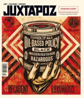
SEPT 2014, n164 $5.99
Psychosomatic, 2011, Oil on canvas (detail) by Jenny Morgan Private Collection. Courtesy Driscoll Babcock Galleries
Juxtapoz Is Published by High Speed Productions, Inc. 415–822–3083 email to: [email protected] juxtapoz.com
™
TRADITIONAL & HEAVY DUTY
DENIM
WE MAKE GREAT CANVAS...
YOU MAKE IT ORIGINAL. For the largest selection of high-quality canvas, experience The Art District™, only at Aaron Brothers.
BLACK
BURLAP
Join our color challenge virtual artist conference.
SHADOWBOX
DOWNLOAD the app from GOOGLE PLAY or the iTUNES APP STORE
For more info and special discount go to aaronbrothers.com/juxtapoz
CO N T R I B U TO R
JR DOTY BEHIND THE PORTRAIT OF MAJA RUZNIC
I FIRST WORKED WITH JR DOTY A YEAR AGO, for the September 2013 issue, when she did the portraiture for Joshua Hagler's interview. At that juncture, Josh and Maja had recently begun spending a lot of time together, which would eventually lead to the inception of the DRIFT project discussed in my interview with Maja for this issue. Maja was an integral part of Josh's styling for his portrait shot, and it was clear right of the bat that Maja and JR had great chemistry together. I'm pleased to say that the four of us have forged a good friendship out of that opportunity. But the professional bond is best summed up by JR herself. "When Gabe asked me to photograph Maja Ruznic for the September issue of Juxtapoz, I was extremely excited. Maja has modeled for me before, and we have a strong working relationship. Part of the challenge of creating and styling an artist portrait is determining how one’s art translates into their physical being. With Maja, though, there is no separation between her paintings and herself. She truly lives through the characters she creates. After discussing concepts with her, I decided the only option was to transform Maja into a character of herself. The photo shoot was a blast; all Maja had to do was be her charismatic self and it just took of from there. Of course, being incredibly photogenic doesn’t hurt either." JR Doty has spent the majority of the last year driving 40,000 miles around the U.S. with her husband and collaborator, Joe Glasco. While documenting countless dilapidated and abandoned locations, the two have collected thousands of artifacts and continue to explore the aesthetic relationship between locations, materials, composition, textures, and contexts.
For more information about JR Doty, visit jrdoty.com
JUXTAPOZ.COM / PHOTOGRAPHY
10
SEPTEMBER 2014
“Canvas Detroit presents neither an empty canvas nor a finished canvas, but a living canvas...” — Marion Jackson
Canvas Detroit julie pincus | Nichole christian
in Canvas Detroit, Julie Pincus and nichole christian combine vibrant full-color photography of the city’s much-buzzed-about art scene with thoughtful narrative that explores the art and artists that are re-creating Detroit. This beautifully designed and informative volume showcases the stunning breadth and depth of artwork currently being done in Detroit. it will be essential reading for anyone interested in arts and culture in the city.
For more information visit www.canvasdetroit.com order online at wsupress.wayne.edu • By phone at 1.800.978.7323 $34.99 • 8.5 x 10.5 • 296 pages • 450 full-color illustrations ISBN 9780814340233 • Available wherever books are sold
I N T R O D U C TI O N
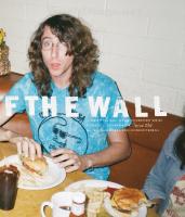
ISSUE No 164 I KNOW EVERYONE IS SICK OF HEARING ABOUT BANKSY but I need to honestly thank him. Not for anything related to street art, or anything he has ever done in art. Actually, I want to thank him for sending me in the opposite direction, for mobilizing hundreds of revellers desperate to Instagram two paintings he created with Os Gemeos hanging underneath the High Line in NYC on 10th Avenue and 24th Street on October 18, 2013. Because of that proverbial “shit show” of social media hysteria, myself and Jux contributing editor Austin McManus got the hell of the block and accidentally walked into a gallery around the corner to come face-to-face with the magnificent paintings of Jenny Morgan. Morgan was an artist I was familiar with, but like most art in the 21st Century, the initial interaction was an Internet relationship. Blogs and Tumblrs never quite capture a good painting, the detail, the scale, or even the nuance. However, stepping into the ground floor space of Driscoll Babock, with Morgan’s new body of work, How to Find a Ghost, taking over the gallery, gave the work a new meaning. One piece in particular, Kings and Queens, the one in which Morgan stands in front of in her portrait later in this issue, was a stunner that assumed a figurative style, its size and light haze over each subject wearing a hypnagogic, dreamlike feel. It was a brand new form of hyperrealism, a genre of contemporary art that we planned to investigate in a new book title. But these works were changing my mind about how to tackle the book. Maybe hyperrealism can be surreal, maybe it can be portraits that have blurred lines, literally, that distort your vision while still holding an almost photo-like quality. These insights changed the direction of the book. I’m not the type to announce myself to a gallery. I don’t pass the Juxtapoz business card across the front desk and expect… well, expect anything. I just like to take a walk around a few galleries and get a feel, a feeling, take some notes. Like everyone else, I will Instagram or text a photo to a friend to get feedback. But there was something really satisfying about seeing such a savvy marketing and social media interaction that was Banksy’s Better Out Than In project, and immediately going into a quiet gallery with stunning paintings by an artist with a fantastic craft and inspiring skill. That detour led to two covers, one on this issue and one on the upcoming book. The Juxtapoz staf gets questions all the time about the future of galleries and museums and how social media afects our interactions with art. Sure, the Internet can get us all excited about a particular art project, and can prove to be just as efective as a good art book to create the buzz
14
SEPTEMBER 2014
that makes you want to see something in person. And I think that’s where we want to direct our readers. We want you to go see art. Whether reading about Bob Dylan’s sculptures motivates you to want to go see other industrial craftsmen, or Britt Daniel of Spoon makes you want to investigate the work of William Eggleston, or Isaac Tin Wei Lin’s mural work encourages you want to go see Public Art, go out and do it. Be inspired. As the fall season kicks of, countless galleries will put on spectacular programs in the coming months. Go celebrate art in person. The September issue takes us around the globe, capturing the studio skills of Jenny Morgan, the political slant of Belgium-born Brecht Vandenbroucke, the tactile side of Bob Dylan, an amazing journey by Maja Ruznic, and the bottlecap mastery of Lucien Shapiro. Hopefully this fall, you will run into art that is both memorable and showstopping. Enjoy #164
Detail of painting by Jenny Morgan Photograph by Jessie Adler
APR 30—NOV 3
Leading Ladies and Femmes Fatales
Marc Davis is best known for creating beguiling, dynamic, and marvelously-designed characters, such as Sleeping Beauty’s Maleficent, Peter Pan’s Tinker Bell, and One Hundred and One Dalmatian’s Cruella de Vil. Fall under the spell of these leading ladies and femmes fatales with an exhibition of Davis’ work for The Walt Disney Studios and Disneyland Park, celebrating his ability to bring these beauties to life.
waltdisney.org Marc Davis, visual development for Sleeping Beauty, ca. 1959; Collection Mike Glad; © Disney | Leading Ladies and Femmes Fatales: The Art of Marc Davis is organized by The Walt Disney Family Museum. | © The Walt Disney Family Museum® Disney Enterprises, Inc. | © 2014 The Walt Disney Family Museum, LLC | The Walt Disney Family Museum is not afliated with Disney Enterprises, Inc.
MALIA MANUEL
CHRIS SHARMA
FEATURED STYLE | CASSIUS
DONAVON FRANKENREITER
SANUK.COM
THE REPORT
BOB DYLAN IS OUT IN BACK WITH A BLOWTORCH
IN ALMOST SIX DECADES, BOB DYLAN HAS CREATED 600 songs, 46 albums, and sold over a million records. Trouping around the world since the 1980s in what has been fondly dubbed The Never Ending Tour, Dylan wears the mantle as one of America’s most influential and important cultural figures. And he has just sent his latest project on a tour across the pond. The Bob Dylan, Mood Swings exhibition is an exclusive collection of ironworks, revisionist graphics and original canvas artworks showing at London’s Halcyon Gallery since last November. The most anticipated release of the multifaceted show was the curation of Dylan’s bespoke iron pieces. Composed and welded by the legend himself, the gates, railings and wall hangings are a more visceral extension of the sketches and paintings shown at his gallery exhibition seven years ago in Germany. Following that naturally controversial exhibition, the man with a “head full of ideas that are driving
18
SEPTEMBER 2014
[him] insane” has been camping out with a heap of scrap metal. Rumors swell (and haven’t they always?) that he has been working in a highly guarded metal works studio for decades, toiling over personal projects and special gifts for close friends, once remarking that he likes to “blast sculpture out of metal.” Dylan’s production of these works for public display and private purchase had only been an enigmatic whisper until the announcement last year of this unique collaboration with the privately owned gallery. From Hibbing, Minnesota, home to Hull-Rust-Mahoning, which is the most expansive open pit mine in the world, the 73-year-old was born to wield a welding torch. “I’ve been around iron all my life, ever since I was a kid. I was born and raised in iron ore country, where you could breathe it and smell it every day. And I’ve always worked with it in one form or another.”
Bob Dylan at his iron works studio, September 2013 © John Shearer
Each sculpture bears the Black Bufalo ironworks insignia, a hulking bufalo with a broad, thick back, bellowing heartland,
viewer to experience the elemental, to interact, handle the parts, and use their own lives to create stories.
as Americana as Uncle Sam hawking from the trunk at a midwestern swap meet. These sculptures are another statement of Dylan’s acknowledged mistrust of modern technology. Never at home with the idea of computers replacing the human touch, he often speaks of the danger of electronics diminishing the creative process, and these ironworks are a physical manifestation of that disdain.
“Gates appeal to me because of the negative space they allow. They can be closed, but at the same time, they allow the seasons and breezes to enter and flow. They can shut you out or shut you in. And in some ways, there is no diference.”
During a time when art is often being produced in the digital landscape, easily made available for immediate worldwide appreciation and critique, Dylan has spent more than a decade personally stockpiling metal and creating a catalogued library of discarded parts. Cogs, wrenches and horse bits, worn and heavy with their own history are being made anew in Dylan’s sculptures. Approaching each piece as musician, author, film director, actor and visual artist, he imbues them with a range of elements, encouraging the
Though Dylan has had no formal schooling in the art of welding, his compositions are weighty with lessons of history, powerful and gentle at the same time. The welds are thick, crude and heavy-made to have an impact. The choice to take part in the physically engaged aspect of the iron welding aligns with the earthiness of Dylan as crafter of song, making statements to solidly make their mark. Why spend countless hours hiding the seam when you can take more time perfecting the message? After all, Dylan has never been a behind-the-scenes type of activist, always front and center, singing forcefully against the control of THE REPORT
JUXTAPOZ
19
obligations and social mores. These iron works need no verbal cues to tell a unique story. Occasionally, and with welcome appreciation, Dylan does acknowledge his alter ego, including the purposely made musical notes, treble clef and guitar hidden among the other found objects, so unobtrusive they could easily be overlooked. The ironworks have a mysterious aura—the tools that assault the lives of the classic, hard-working American assembled together in a seemingly random composition. Since this is Dylan, critics have been eager to both assault and praise. The Telegraph gave the show two out of three stars, characterizing Dylan’s “hobby” not “outright bad” and The Independent called the works “cutesy pieces of Americana kitsch.”
20
SEPTEMBER 2014
Fadwebsite.com notes that the compositions mirror Miró and Magritte, while music writer and industry pro Andrew Kelly opines that “Dylan’s faith is still in the solid, and the hand and the tool.” In short, the pieces give the public another opportunity to explore this fascinating and multi-faceted artist who leaves each critic and fan with the same thought: that nobody can do Dylan like Dylan. —Samaria Way
For more information about the exhibition, visit halcyongallery.com
JUXTAPOZ.COM / BOB - DYLAN
Bob Dylan Mood Swings exhibition at Halcyon Gallery © Getty images
MAJORS:
MINORS
Drawing & Painting Drawing & Painting w/Sculpture Emphasis Design & Digital Media Design & Digital Media w/Action Sports Design & Digital Media w/Illustration Animation Game Art Illustration Illustration w/Drawing & Painting Emphasis Illustration w/Entertainment Emphasis
Art History Creative Writing Design & Digital Media Animation Illustration Drawing & Painting Sculpture
We know that your creativity has
GRADUATE DEGREES AND CERTIFICATES
shapes culture. We believe that
MFA Drawing MFA Painting Post-Bacc Certificate Drawing & Painting
great value and that your art and design have the power to impact the world. We champion the belief that great art changes minds and GREAT ART MATTERS.
LCAD.EDU/juxtapoz
EVENT
CASEY GRAY BAY AREA ARTIST DELIVERS IN DALLAS
SAN FRANCISCO-BASED ARTIST CASEY GRAY IS ONE of the most exciting artists we have had a chance to cover over the past few years. He has a way of turning a painting of a flower or a table setting or a beach scene into a psychedelic blitz of color and geometric dizziness. When we first spoke to Casey Gray, his palette was definitely a reflection of growing up in California. “Growing up fifteen minutes from the beach, skateboarding and surf culture were a big part of (my aesthetic),” Gray told Andrew McClintock earlier this year on the topic of California, “I think that’s where my color palette comes from. For the most part, that kind of counterculture scene which is fucking loud and optimistic.” On September 6th, Gray opens a new body of work, Of Land & Sea, at Circuit 12 Contemporary in Dallas, Texas and we asked him about how the new work was coming along. "Earlier this year, I found myself with some extra time and thusly started experimenting with new ideas for my work. I cut a simple template out of paper, based on the old Spitfire Classics wheel graphic. I told myself, ‘You have to make something using only this template and only these colors.’ The next thing I know, I was staring at this ripple pattern block that was really interesting and optically deceiving. Eventually, I learned how to shape the block into representational forms which became the foundation for this whole new body of work. “When viewed together, multiple works read like a sentence similar to Emoji characters in a text message, which I find to be a fertile language for exploring the feelings I have surrounding current issues. For me, the ripple has become a metaphor for the uneasiness I feel about the changing state of the contemporary landscape, our overdependence on technology, and the tension it’s creating, especially in San Francisco.”
Casey Gray opens Of Land & Sea at Circuit 12 in Dallas on September 6, 2014. The show runs through October 4, 2014 For more information about Casey Gray, visit caseygray.com
JUXTAPOZ.COM / CASEY - GRAY
Slice of Pepperoni Aerosol acrylic on paper 22” x 30” 2014
22
SEPTEMBER 2014
IAN COCHRAN
www.kcai.edu WILL BAUMGARTEN
LIZ COKER
KEYAN ALEMIFAR
ELI BRUMBAUGH
ALLY KING
For more information or to apply online, visit www.kcai.edu or send an e-mail to [email protected] Kansas City Art Institute Admissions Ofce 4415 Warwick Blvd. Kansas City, MO 64111-1874 Telephone 816-474-5224 Toll free 800-522-5224 www.kcai.edu
MELANEY MITCHELL
An equal opportunity institution KELSEY BORCHERDING
HJD WAYLAND
FOUNDATION
FIBER
ANIMATION
GRAPHIC DESIGN
ART HISTORY
ILLUSTRATION
CERAMICS
PAINTING
CREATIVE WRITING
PHOTOGRAPHY
DIGITAL FILMMAKING
PRINTMAKING
DIGITAL MEDIA
SCULPTURE
PICTURE BOOK
JOSH CHEUSE B-SIDES AS CLASSICS IT HELPS WHEN YOU ARE TALENTED AND AMBITIOUS, but sometimes you just need to make the call. The origins of Josh Cheuse’s career in music and photography can be summed up by the simple fact that he took the chance. As a teenager in NYC in 1981, Cheuse used the payphone at his high school to call The Clash at Electric Lady Studios and asked if he could photograph the band. Never mind that in 1981 you could call a famed recording studio and get one of the world’s most important bands to pick up. This breakthrough led to Cheuse receiving a photography scholarship at SVA as he worked shooting videos and sleeve artwork for bands, eventually leading to contributions in SPIN, Rolling Stone, Musician and Time Out. From 1993 until today, Cheuse has been a prominent art director at Sony Music, photographing and working with musical icons who cover both pop music and pop culture: Oasis, Run DMC, Beastie Boys, Madonna, the Clash, and Miles Davis, to name just a few. Director Jim Jarmusch has said of his work, "Josh Cheuse is primary agent provocateur. It's a gift to have these photographs and to see these moments through the eyes of this photographer." On September 19, 2014, The Morrison Hotel Gallery at 116 Prince Street in NYC will host Grooving Years (a phrase that Joe Strummer once wrote to Cheuse), a “greatest hits, B-sides, and never-before-released” style anthology of works by Josh Cheuse. The opportunity to see more intimate shots of the Beasties, Joe Strummer, and the early moments of hip hop’s rise to cultural prominence will all be on display. The work puts into context how fine art sensibility and photographic composition can combine to create gripping memories that draw out and define these personalities. And it is context that makes the connection. “Everyone has a camera now, but not everyone is a photographer,” Cheuse says. “It’s not enough just to say you were there.” —Evan Pricco
For more information about Josh Cheuse, visit joshcheuse.com
JUXTAPOZ.COM / PHOTOGRAPHY
Run DMC at The Fresh Fest press conference, 1984. I was asked on a book tour in Japan if I knew this image would have such cultural significance. I had to admit I was more interested in the design of the carpet at the time.
24
SEPTEMBER 2014
PICTURE BOOK
JUXTAPOZ
25
Beastie Boys, Long Beach, Long Island, on the set of the “She’s On It” music video in 1985. I love MCA making Ad-Rock lose it in the background.
26
SEPTEMBER 2014
Schooly D and Code Money in Belfast, Northern Ireland, 1985. I was on tour with Big Audio Dynamite at the time. We took a walk down the much bombed Falls Road. The lads said it made them feel like they were back home in Philly.
PICTURE BOOK
JUXTAPOZ
27
Joe Strummer waits outside Mick Jones’ house in Holland Park London, 1985. They were of to a secret recording session for the soundtrack to “Sid and Nancy.” I bet Joe we could do a whole shoot before Mick woke up. It was a sucker bet and Joe knew it. These images would become some of my most iconic.
28
SEPTEMBER 2014
Rockers in Harajuku Park, Tokyo, 1985. All these years later, the same cats are still there flying their freak flag. I try and check in on them whenever I’m in Tokyo.
PICTURE BOOK
JUXTAPOZ
29
DESIGN
CLAY HICKSON SAVED BY THE BOOBS AND BONGS
AS A CHILD OF THE 1990s MYSELF, IT’S HARD NOT TO
Well, yes and no. Literally, yes, I grew up in the ’90s. But
feel nostalgic when looking at an illustration or design by Clay Hickson. When I look at this work, Saved By the Bell rings in my mind. But AC Slater and Zach Morris are not the Chicago-based Hickson’s source of inspiration. Album covers, zines, and prints show that Hickson’s use of color and a tease of T&A make him one of the more intriguing talents in contemporary design. —Brent Gentile
artistically, I'm not very inspired by ’90's culture. At least not actively. Most of my biggest influences are from the 1960s, ’70s and ’80s. They're probably the same things that were influencing people in the ’90s.
Brent Gentile: How much of your inspiration goes back to the opening sequence of Saved By The Bell? Clay Hickson: You know, I get that reference a lot, but it's probably been about 20 years since I last watched an episode of Saved By The Bell. That said, I did watch a lot of TV as a kid, and I'm sure that imagery has been burrowed away in my subconscious. I guess that makes you a child of the 1990s?
32
SEPTEMBER 2014
What are some of your influences from those decades? One of the more obvious influences is the Memphis Group. The use of pattern in their work is out of control. I'm also a big fan of all the guys at Push Pin Studio. The illustrations they did are so iconic but also really humble and laid back. A lot of them just look like really nice sketchbook drawings. There's a certain attitude in their approach to illustration that really strikes a chord with me. I'm also just now starting my self-education in the world of comics. I've just barely scratched the surface and already my mind is blown. I imagine that's gonna have a pretty big impact on the work I produce in the next year.
Where do some of the images in your work come from? I don't usually have a very clear concept when I start a piece. They often evolve as I'm working on them. A lot of the imagery is just a mashup of all my interests, and I reuse a lot of the same shapes and objects in all my work. I like the
you to do large runs of multiple-color prints at a super low cost. They were were mostly used by public schools and church groups to produce cheap multi-color pamphlets and flyers but were rendered obsolete as digital printing became so accessible. Though, in a lot of ways, they were really
idea of having my own personal library of objects that I can arrange and rearrange. The objects themselves don't always have a lot of significance originally, but by repeating them they sort of become personal symbols.
ahead of their time. Riso is the future.
What medium are you working in? Most of the work is done in Photoshop and then Riso printed. But everything starts in my sketchbook. I don't usually feel satisfied with work that only exists in a digital format. Even if an image is created entirely on the computer, the weight of it as a physical piece makes it feel more complete. What exactly is Riso printing? I've heard of it, but I have never seen it done. The Risograph is essentially a home screen printing machine. It looks like a standard copy machine but produces prints that have more of a screen printed quality. It allows
One of the things that draws me to your work is how colorful it is. Where does that come from? That’s funny because I'm actually really intimidated by color. I don't understand it, and I'm not confident in my use of it. When I'm coloring something, I feel like it's all just a shot in the dark. One of my problems with digital work is that you have every color in the spectrum available, which is overwhelming. But with the Riso, I am limited to a smaller color palette. I find working within those limitations is much less daunting. I have a really hard time picking colors digitally, so a lot of the time I'll just refer to my PMS book and create a CMYK conversion. Something about picking colors in the real world makes it much easier. DESIGN
JUXTAPOZ
33
That's a good call. I often pick a set of colors to work with before I start a piece just to save me the trouble later.
ceramics, sculpture etc. It's just overwhelming. There are a few artists whose style totally transcends medium and all the work fits together nicely. But often, it all feels really
Where does graphic design and illustration meet for you? I have no formal training in either one so there's no real distinction for me. I hope that doesn't ofend anyone. The way I see it, it all comes down to the same thing: conveying an idea in a visually pleasing and interesting way.
disjointed.
Would you say that creatives are becoming increasingly skilled at multiple disciplines? I feel like we don't see a lot of creatives staking a claim to a singular practice anymore. I've never tried to market myself as one or the other. I'm just not sure people are even looking at the labels anymore, at least not if you're freelancing. The Internet has given everyone a platform to display their work and the label of the creator is somewhat irrelevant. The work sort of speaks for itself. That being said, I do think it's important to curate yourself online. I see a lot of portfolio sites that are just all over the place, people showing their drawings, paintings,
What type of things are you working on there at your print shop? I started Tan & Loose Press in 2012. All the printing is done on a Riso RP3700 and we specialize in limited edition artist prints and zines. I started the press as a way to work with artists that I really like. So far, it's been really great. Everyone I’ve approached has been really friendly and open to working with us. I try and produce work that fits with our kickin'-back-and-livin'-free philosophy. It's all about getting out there and soaking it up.
For for more information about Clay Hickson, visit clayhickson.com
JUXTAPOZ.COM / DESIGN
34
SEPTEMBER 2014
FA S H I O N
HEDI SLIMANE CREATIVE DIRECTOR OF SAINT LAURENT PARIS PRESENTS 15 YEARS OF PHOTOGRAPHY
AN APPRECIATION OF HEDI SLIMANE IMMEDIATELY
need for captions. There are no backstories. Just creative
brings understanding to the concept of “creative control.” To be the Creative Director of a renowned and revered fashion house like Saint Laurent, and Dior Homme before that, is one thing. Okay, that’s actually a really big thing. But to also claim recognition as a blue chip photographer who can turn any subject into an icon, with such command over one’s own creative direction, is a powerful place to be.
grace. Beginning in September 2014, the Fondation Pierre Bergé-Yves Saint Laurent in Paris will present an exhibition of photographs by Hedi Slimane entitled Sonic, a collection of studio portraits taken from the last 15 years of Hedi’s extensive and most well-known musical archives.
As a photographer, Hedi has shot some of the premier California artists of the last 50 years, including the striking series, Myths and Legends of Los Angeles, at Almine Rech Gallery in 2011. That series illuminated the personas of legends like John Baldessari, Ed Ruscha, Raymond Pettibon, Ellsworth Kelly, Chris Burden, and Larry Bell. And looking at the work as a whole, it becomes clear Hedi doesn’t just do portraits. He captures the essence, strength, and intrinsic spark that very few photographers can capture. There’s no
36
SEPTEMBER 2014
The photographs, all shot in Hedi’s iconic black-and-white style, exhibit here for the first time. They include portrayals of landmark rock figures, from Lou Reed to Brian Wilson, Amy Winehouse to Keith Richards. Sonic is the perfect embodiment of Fondation Pierre Bergé, Yves Saint Laurent’s mission statement, to retrace “the history of fashion as created by Yves Saint Laurent, fashion that reveals the inner workings of society.” Musicians are the influencers whose dress and manner propel style forward. And Hedi is the conduit, freeze-framing style with his direction.
All images by Hedi Slimane courtesy Almine Rech Gallery above California Youth Mosh Pit Santa Ana, CA March 23rd, 2013 clockwise from top left Joe Dallesandro Los Angeles March 2014 Frances Bean Cobain Los Angeles June 2011 Sam with Snake Venice Beach October 10, 2011
One of the great abilities, credited to Hedi, whether in his assignment to take over Creative Direction of Saint Laurent or his countless portraits of major stars across art, music, and Hollywood, is his genius for capturing and distilling the contemporary moment. Sonic is both high fashion and high culture done in a way that defines the symbols of the century: fashion-forward, larger-than-life, emotion pulsing through. Hedi Slimane’s Sonic will be on display at the Fondation Pierre Bergé-Yves Saint Laurent in Paris from September 18, 2014 to January 11, 2015. Xavier Barral Editions will be releasing a 216 page book of Hedi’s photography in conjunction with the opening of Sonic.
38
SEPTEMBER 2014
In 2013, we wrote extensively on the fantastic wardrobe and stage costume designs that Hedi Slimane and the Saint Laurent team created for Parisian music group, Daft Punk.
Visit juxtapoz.com/daft-punk for a full collection of images from various Random Access Memories shoots For information about Hedi Slimane, visit hedislimane.com and ysl.com
JUXTAPOZ.COM / HEDI - SLIMANE
Wyatt and Fletcher The Shears Brothers The Garden Paris January 18, 2013
I N F LU E N C E S
SPOON FRONTMAN BRITT DANIEL ON A CAREER OF ALBUM COVERS
AUSTIN, TEXAS-BASED SPOON HAS BEEN RIDING HIGH for almost two decades as one of the great American indie bands. With cult classic albums like Girls Can Tell, Kill The Moonlight, Ga Ga Ga Ga Ga, and the newly released 2014 LP They Want My Soul, Spoon has been both prolific and critically acclaimed. But one of their most underrated qualities has been their exceptional selection and curation of album artwork and covers, fostering the tradition of creating a visual landscape to surround the music produced in the studio. As they prepare to play San Francisco’s Outside Lands Music and Arts Festival this August, Spoon’s co-founder and frontman Britt Daniel sits down to talk about the band’s art history, from William Eggleston to B-Movies. —Juxtapoz THEY WANT MY SOUL Britt Daniel: To be honest, I will be thinking about what the album artwork will look like the whole way through while
42
SEPTEMBER 2014
making the record, but I don’t really get a chance to focus on it until we’re done with the music. I guess my favorite album art of what we’ve done is Sean McCabe’s work for Gimme Fiction, which was sort of commissioned. For the new album, They Want My Soul, we were working with photographer Todd Baxter, and came up with the concept, and he shot photos rather than me just finding a random photograph to use for the cover. Our art director, Matt Jacobson, knew Todd, so he showed me a bunch of Todd’s work, and we made this plan. What ended up as the cover wasn’t supposed to be the cover. We worked on an idea for a video, a video which we still have not made, and I don’t know if we will make, for the song “They Want My Soul.” The idea for the video came before the album was called They Want My Soul, and the concept was for it to be a spoof on a really B-grade horror movie from the 1970s. We came up with this plot and described all these scenes that
A collection of concept photos by Todd Baxter for a yet-to-be-made video for the title track of Spoon’s 2014 LP, They Want My Soul The girl in the photos, Emily (above and bottom right), was originally planned to grace the cover, but the hand (above right) was chosen as the cover instead.
would be in the video, and thought about these scenes, and from there we got the album package and cover. The cover was originally supposed to be a girl, Emily, who is in a bunch of Todd’s photos, but once we put everything together, the hand was the best image. TRANSFERENCE AND WILLIAM EGGLESTON I just liked that William Eggleston ended up being the cover of our 2010 album, Transference. Sometimes I’m just looking through art books, or I go to a museum, and if something really leaps out at me and looks phenomenal, I start thinking “Would this be good for a cover?” For Transference, we were really late in the game mixing the record, and we hadn’t decided on a cover yet, but I had the title. I was in LA mixing the album at Dave Sordi’s studio where there are all these art books around. He had this Eggleston book, and I think the last page of the book was that photo. I had been looking through the book wondering, “Maybe I’ll find a cover in here?” And that photo just jumped out. It told a story that a lot of men or boys have gone through, being stuck someplace like your aunt or grandmother’s house, a sort of formal environment where he has got to be there for one reason or another. The kid in the photo has a sort of arch in his eyebrow that indicates what he is going to become. It seemed like he was biding his time, although he was not on his own at the time in the photo because he probably was too young to be making his way in the world. It was as if he had it together, had some kind of opinion on the proceedings, and I could feel all this from this one photo. And as soon as I saw it, I said, “That’s got to be it.” GUIDED BY VOICES From the very beginning, from when I first started listening to records, I can remember sitting, listening, and staring at the covers, examining the page folds inside, or fixated on the back where you can look at all the weird stuf. It just mattered so much to me, like it was the only input I took in while sitting listening to records on end. So even on the very first album we did, Telephono, I took the photo myself and then just colorized it. This guy from Matador Records made the logo. Even then, it being our first album, I knew how important it was to get it right. At that point, I was the world’s biggest, greatest Guided by Voices fan, and their album covers always just sprang out at me. I was trying to imitate that, I think. M cCARTNEY BY M cCARTNEY One of the first covers that I loved, that really hit me, was the album McCartney by Paul McCartney. The cover was shot by his wife, Linda, and it has these cherries, and a bowl, and it’s so striking. For one, it’s red, white, and black, which is the ultimate color combination. The Nazis knew it, Jack White knows it, and we used it several times, too, on Gimme Fiction and Ga Ga Ga Ga Ga. McCartney didn’t even have his name on it. But it was just beautiful.
INFLUENCES
JUXTAPOZ
43
GA GA GA GA GA I saw this photo of sculptor Lee Bontecou taken by Italian photographer Ugo Mulas in 1963 on a Tumblr somewhere. I just saved it and thought, “Maybe I’ll use that for something.” When it came time for Ga Ga Ga Ga Ga, I decided to pull it back out and we started looking into getting the rights. I really like the overall package of Ga Ga Ga Ga Ga, which is one of my favorites because every element is really well thought-out. Sometimes I have a problem with album artists because they try to make everything have a unified theme. Everything is like a little too perfect, you know? But all of the elements of Ga Ga Ga Ga Ga are really well thought-out and diferent, still retaining this one overall feel.
record, and that yellow they use on their cover is the same feel as the yellow we used on 2002’s Kill the Moonlight. I just love it. Kill the Moonlight was just a licensed photo. I tried (and tried) to use a computer program to put the words on the photo and get the feeling right. In the end, I just made the letters myself with scissors. The end result was this found photo, and my handmade letters with this amazing yellow background. It just felt so much better.
Spoon’s new album, They Want My Soul, is now out via Alta Loma Records. They will be playing at San Francisco’s Outside Lands Music Festival in August, 2014 For more information about Spoon, visit spoontheband.com
KILL THE MOONLIGHT Yellow is amazing. This band called Warpaint just released a
44
SEPTEMBER 2014
JUXTAPOZ.COM / SPOON
A collection of album and single covers that span the career of Spoon
ARTIST MIKE HERNANDEZ
VANCOUVER
MIKEHTOONS.BLOGSPOT.COM
SEATTLE BOSTON
DRAW STUFF HERE (IF YOU FEEL LIKE IT)
TORONTO NEW YORK SAN FRANCISCO CHICAGO LOS ANGELES MONTRÉAL PORTLAND
©
QUÉBEC
﹒
CALGARY WASHINGTON DC
THE KITSCHY KITSCHY BOOM BOOM LIZ: UNIQUE SOLES FOR UNIQUE SOULS
MINNEAPOLIS DENVER
DO YOU HAVE THE WORLD’S BEST FLUEVOG SHOES AD STUCK IN YOUR HEAD? GET IT OUT AT FLUEVOGCREATIVE.COM
OTTAWA FLUEVOG.COM
JENNY MORGAN INTERVIEW BY KRISTIN FARR PORTRAIT BY JESSIE ADLER
ADDING SOMETHING FRESH AND NECESSARY TO THE GENRE OF PORTRAITURE MAY seem impossible, but in that realm, Jenny Morgan is crushing it. Don’t label her paintings figurative or photoreal. Her extraordinary skills for rendering the human figure are beside the point. Layers of the unconscious are revealed in the reductive abstraction of her portraits. As she grinds away at physical and metaphorical surfaces to uncover a spirit, an honest representation of “the feels” becomes visible. Many can approximate likeness, but no one can expose the soft center of the human core quite like Jenny Morgan. Kristin Farr: How well do you know your subjects? Jenny Morgan: My subjects are all people from within my social orbit, and range from family and close friends, to newly developing relationships I want to solidify or explore. I’m interested in the emotional connections. Does your connection with the person dictate the abstraction of the portrait? Absolutely. I find that the closer or more comfortable I am with the person, the more I can deconstruct and experiment. This is also why I end up making self-portraits every few paintings. I feel a sense of freedom with my own visage that I don’t think I’ll ever feel with another person. There comes a sense of responsibility when working on another individual, and I have a hard time detaching the painted image from the person; so whatever marks I make on the portrait, for me, directly relate to and seemingly afect the sitter. If I need to try a new technique or variation, I will work on myself or I will feel out who might be a good fit for that specific concept, and allow the idea to dictate the sitter, instead of the other way around. You did a series of portraits of people from the Salt Lake area. Describe some of your common experiences with them, and how growing up in Utah influenced you as a person and artistically. I was drawn to focus on a group of people from where I grew up because of our shared religious experiences. These individuals are also people I consider extended family, in a way, due to this unique connection. Every sitter has a slightly diferent upbringing, but we all existed under the umbrella of Mormonism in Utah. I wasn’t raised Mormon, but my father’s family was among the original settlers in the Salt Lake Valley. It has taken years being outside of Utah to understand the influence that growing up there had on my creativity and expression. Looking back, I feel as though there was a cultural weight that I couldn’t detect until leaving. I think that with any orthodox religion, there is a strong sense of restriction and adherence to authority—this kind of dogmatic energy was something I had to break through and let go of within myself to get to the content I am working with now. I don’t have any negative feelings towards this experience. I am actually thankful that I was presented with this challenge because it has fueled much of the work.
50
SEPTEMBER 2014
Your work is much larger than life size. Have your paintings gotten bigger over time? The larger-than-life scale comes from the desire to ensure that the figure feels life size to the viewer. Optically, the figure needs to measure a bit larger than life to feel actual life size, but my figures are also gradually growing in scale. I have always been attracted to work that operates at a huge scale. Confronting giants allows the viewer to feel as though the subject is something more than human. Tell me about the photo shoots for your source material. The photo shoots are often the foundation for the portrait in more ways than one. The conversations and energy exchange that takes place during the shoot is echoed in the final painted image. In order to make people comfortable, as they are most often fully nude in front of a lens, I engage in conversation about what’s going on in their personal life, and the material can range from light to heavy. There is an automatic intimacy created when the sitter is naked and literally baring themselves for my camera. I love these moments when I can feel walls being removed and a new level of closeness being developed. I am incredibly grateful that I have so many people in my life willing to be that vulnerable with me. What draws you to vulnerability? There is truth in vulnerability. What’s expressed within vulnerability is raw and honest and most often the stuf that we can all relate to. How do you feel when you’re painting, especially during the sanding and blurring process? The beginning stages of the paintings feel laborious at times. I need to put down at least two layers of a detailed and finely rendered structure before I can play on top of it. Once I get through the layers that require a lot of concentration, I feel a sense of relief and pure excitement knowing that I can just let go. The final stages of the work where I sand, blur or glaze always result in something unexpected, and often the outcome is so of base that it requires me to rework the material, causing a completely new efect. This process makes me feel electric, ecstatic, liberated and high! Reaching new ground in the work is the ultimate goal and when I feel most satisfied.
We Are All Setting Suns Oil on canvas 29" x 35" 2011 Courtesy Driscoll Babcock Galleries Private Collection
Do you talk to your subjects as you paint them? There is certainly an internal dialogue with my subjects as I work on them. My thoughts about them come in waves as I paint. I think about their lives and what they are dealing with or working through. I find myself asking them what I should do next or what they want. Occasionally, I will say something out loud to them in my studio, especially after I have finished—something like, “Thank you,” or “I wonder what you will think.” Reductiveness is a major part of your work, and there is something mysterious about the way you render hands, or their absence. Are these choices intuitive? If I’m honest, the reductive aspect of the work started as a reaction to being told that the kind of figurative work I was making was irrelevant and uninteresting. I went through years of negative feedback, and at some point, I started to feel a lot of shame. My desire to erase, sand away and basically deconstruct erupted from the need to destroy the subject matter that I was still so drawn to. I really had no other choice but to follow my instincts and continue working with the figure, and this almost masochistic impulse pushed me to strip away the skill that I was beginning to see as a barrier or crutch. Once I started to dive into and indulge these reductive techniques, they started to feel like second nature and a necessary part of the process. At this point, it all feels pretty intuitive. I allow natural breaks and spaces in the pose and body to direct my choices. The hands specifically carry such an interesting figure-ground relationship and inherent content, so they are often the focus. Describe how sexuality and relationships play a role in your work. In the past, I have avoided calling myself a feminist because of the weight behind the word itself, but now I am more comfortable in acknowledging my interest in advocating the viewpoint of the feminine gaze. I find a sense of power in displaying the female nude without overly sexualizing her. A feeling of ownership and control over the sensual aspects of the female body is personally very healing. I am still working to understand how exactly sexuality is being expressed in the work—my own sexuality is pretty mysterious for me and may still exist mostly in a shadow realm, seeping through into my work and reflecting back at me. How do you define the shadow self and what interests you about that concept? The shadow self is the representation/manifestation of the rejected or denied aspects of our own personality. These aspects can be negative or positive characteristics, drives or belief systems that we do not accept as a part of who we are, so they are pushed down out of our awareness or even out of ourselves. I’m deeply fascinated by the idea that we are composed of a multitude of layers, most of which we have no conscious awareness. My curiosity with the shadow self was piqued after listening to a lecture by Ken Wilber, one of my favorite contemporary
52
SEPTEMBER 2014
philosophers. In his description of the shadow self, these rejected aspects can be so thoroughly shunned by our own conscious ego that the thought-forms and beliefs exit the realm of the mind and manifest in our exterior environment— and then start to look back at us. Our shadow reveals itself like a mirror in our daily lives through other people and relationships, or inanimate objects that stir emotional responses. For me, the allure of the shadow self lies in the conceptualization-turned-realization of thought manifesting into form. I no longer view the shadow self as a conceptual psycho-spiritual theory, but as a physical process. And this invisible, non-local process directly relates to the core of art making—the artist is taking thought and internal imagery and manifesting the invisible to the visible. I view this transformation of bringing the shadow elements to light as fundamental within portraiture, and I certainly embrace it with my own work as a basic principle. Being on the outside looking in, I am privy to a certain perspective of the sitter’s light and dark side.
above Breakthrough Sharona Oil on canvas 27" x 35" 2014 Courtesy of the artist and Driscoll Babcock Galleries right Sisterhood Oil on canvas 34.5" x 45" 2010 Courtesy of Driscoll Babcock Galleries Private Collection
How does your interest in the shadow self relate to your interest in the supernatural? I think the spiritual element is the link. All of this seemingly invisible and mysterious activity resonates in a way that makes me feel connected to something outside of myself; whether you call it the Universe, God, nature, higher self or the great nothing, I am committed to understanding my relationship to it. I feel thankful that I am an artist and that I have a very tangible medium in which to discover and uncover my spirituality. Do you believe in ghosts? Yes. I believe that energy, intelligent or otherwise, can appear through what we call hallucinations and clairvoyance. Most of this activity occurs on levels that we have yet to fully understand or measure. Is it true that you could sense spirits as a kid? I do believe that I sensed spiritual energy around me as kid, and I still do today, but it feels diferent. I am an only child and spent a lot of time alone, and I think the isolation opened up my senses. As a kid, I didn’t quite understand what I was detecting in my environment. I just knew that someone or something was with me. This intuitive feeling pushed me to investigate and research the supernatural. I was very frustrated that I couldn’t outwardly see its form, but only sense it internally—this lack of external visual confirmation was very confusing. As a preadolescent, I became a little braver and started speaking out loud and addressing whatever I felt was in the room with me. I would ask for it to please give me some kind of proof by moving objects in the room. A few times, I did receive a response, and something like poltergeist activity took place where I would wake up in the middle of the night and large objects in my room had been moved in an unnatural way, like a poster being taken down and placed somewhere that it couldn’t have physically fallen. Expressing these very personal experiences publically is difcult because of the unreal quality, but these experiences laid the groundwork for my interest in spirituality, and they play a role in how I see the world at large. Do you have premonitions? I do. Most of the time, the premonition feels extremely subtle and I would describe it as just a “knowing.” I think most people can relate to that sensation. I do work on rooting into my intuition and being able feel what my body is communicating. The body is able to perceive things before the conscious mind is alerted, and I pay attention to gut responses and heart fluctuations. I have had one prophetic dream. In the dream I was riding the J train, a subway line I use occasionally, and in the subway car, there were two young boys following me. When I turned around to confront them, they pulled out knives and were trying to stab me. But just as they got close enough, I was able to jump through the opening train doors and escape the attack. I woke up suddenly and in a panic; it was one of those dreams that stays with you through the day. I went to the gym a few hours later, and as I was running on
56
SEPTEMBER 2014
a treadmill, I looked up to see the local news reporting a story about a brutal stabbing that took place that morning on the J train. I was in shock for about ten minutes. The moment felt surreal and sent chills through my body. What a seemingly random event to have dreamed about before or even as it was happening in the real world. I have no theories or explanation; I’m just thrilled to have had the strange experience. That level of intuition must afect your work. Why do you sometimes render the figures juxtaposed with skulls? The skulls appeared after being totally inundated with the imagery in pop culture. I wanted to paint a skull almost just to empty it from my mind. But as I started working with the skull as an icon, I fell in love and found some personal content within what I first saw as pretty banal. My friend Agata owned an actual human skull that her grandfather had found in his backyard in Poland, and working with a real artifact changed the meaning for me entirely. The skull is the only inanimate object that contains human spirit. When I’m painting the skull, if feels as though I’m painting someone’s portrait. Do you think you’ll always make figurative work? I can’t say for sure, but as of now, I see that my interest is focused on the human condition, and the body is still an important vehicle for investigation. What’s an example of a time that knowing something intimate about a person afected the painting of them? The first and most potent example that comes to mind is the portrait Great Divide of my friend and artistic collaborator, David Mramor. I have been painting David for eight years now, and each painting carries with it a snapshot of what was transpiring either in his own life or between the two of us within our friendship. Great Divide came out of a conversation we had about his grief. I had recently lost a close friend and was dealing with my own level of grief. It was the first time I could really empathize with what he was going through. This heavy connection between us worked its way into the portrait in a somewhat obvious form. I saw a thick black glaze cover his body and I needed to swipe through that dense curtain and let some light in. Tell me about your collaborative work with David. I credit David with having possibly the greatest and most profound influence on the way I paint. He became my muse once I started focusing solely on portraiture and has remained a source of inspiration. Our early grad school studio visits were the birthplace of the collaborative work. He would come into my studio, look at my painting and say, “God, I just want to take a tube of black paint and make a mark right here,” pointing to some highly detailed and refined area of the work. At first I blew him of, but eventually we started experimenting with collaborative paintings by taking turns working on the canvas. I would paint the first layer of a portrait and he would react with mark making and drawing. This practice exposed me to other ways of using paint and opened up my avenues of seeing. We are still working collaboratively and I hope we can continue this practice into old age.
previous spread left You To Me Oil on canvas 78" x 92" 2013 Courtesy of the artist and Driscoll Babcock Galleries previous spread right The Mirror Oil on canvas 55" x 75" 2010 Courtesy of Driscoll Babcock Galleries Private Collection right Shift Oil on canvas 32" x 38" 2013 Courtesy Driscoll Babcock Galleries Private Collection
Looking at your work made me think about the chemical processing of photos. Is that something you think about? I do think about photo processing in relation to the work. The blurring actually came from working on the collaborative paintings with David. He had printed a blurred photo on canvas and asked me to paint and draw on top. I loved the contrast between sharp and soft so much that I wanted to play with it in my own work. Color saturation, blurring or other manipulations within photography inspire me to find ways to mimic those efects in paint. I draw a great deal of inspiration from imagery I scroll through online, and I don’t mind the oversaturation of imagery because I feel I am able to weed through most of it and find what feeds my interests. What’s new in your paintings this year? My palette is changing. The color is leaning towards yellows, orange and gold. I can feel warm light seeping through and I want to capitalize on that instinct for illumination. Also, I am constantly developing my instinct for abstraction and mark making. Abstract thought and formal mark making doesn’t necessarily come naturally to me—it’s a slow, gradual process within the work that I develop solely through experimentation. I can feel a big shift taking place and I am more willing to explore and push myself. Do you consider the history of figure painting, or are you just painting what feels right?
58
SEPTEMBER 2014
The weight of the figure in art history does sit on my shoulders at times. I considered it more in the early years of working with the figure as I was searching for what my own voice truly looked like, which all painters need to do. These days, that weight is lifting as I anchor into painting what feels right, but finding what feels correct also requires shedding beliefs about what I “should” be painting. The process of finding authentic and free expression within the work is ongoing. What’s the last piece of art that you saw and loved? Tomoo Gokita. I saw his show at Mary Boone Gallery last winter and was awestruck by each individual piece. There is much that I envy about his work. Who are some well-known people you’d like to get to know and paint? My list of fantasy future portraits would include Stevie Nicks, Kara Walker, Jenny Saville, Grimes, Yoko Ono, Meryl Streep, Lena Dunham, Chloë Sevigny and Madonna, to name a few.
For information about Jenny Morgan, visit jennymorganart.com
JUXTAPOZ.COM / JENNY - MORGAN
BEYOND THE STORY She lives and works in Brooklyn, New York. She has an intuitive connection to the uncanny. She was a studio assistant for Marilyn Minter.
above left Brand New Oil on canvas 28" x 32" 2014 Courtesy of the artist and Driscoll Babcock Galleries above right Great Divide Oil on canvas 42" x 58" 2013 Courtesy of the Artist and Driscoll Babcock Galleries right Syrie and the Cat Oil on canvas 54" x 76" 2013 Courtesy of Driscoll Babcock Galleries Private Collection
BRECHT VANDENBROUCKE INTERVIEW BY CALEB NEELON PORTRAIT BY SANNE DELCROIX
BRECHT VANDENBROUCKE’S IMAGES ARE SUCH A FRESH AND DIRECT LOOK AT contemporary life that maybe only a young man raised on a farm in Belgium could make them. While still in art school in Ghent, Vandenbroucke’s painted and drawn works began to attract attention as he posted them online, and he began work on a long-term project called White Cube. The comic, now available in hardcover in the U.S. from Drawn and Quarterly, speculates about how we experience art. Just don’t call it a graphic novel, that’s way too pretentious. It wouldn't be out of line to presume that Vandenbroucke spends a fair amount of time on the Internet. Or perhaps he really spends a very normal amount of time online and just documents and processes that experience in his artwork in a memorable way. The graphics, icons and even the frames through which we experience the digital world, and how that changes our experience of regular flesh and blood life, all leap out with dramatic dimension in Vandenbroucke’s distinctive line and color. Caleb Neelon: Tell me about where you grew up and where you live now. Did you come from a creative family? Brecht Vandenbroucke: I was born in Veurne, Belgium, and then I lived in a small village in Flanders. I don't come from a creative family. My parents are farmers, so I grew up among potatoes, pigs, chickens and rabbits. It was a very isolated childhood, but it gave me a lot of time to draw. I think I drew about 30 comics between my 6th and 12th year. I also had my own monthly magazine when I was a kid, so I was always stressing to make the deadline. There was only one copy made of each issue because I drew everything by hand. As it was quite isolated, we didn't have cable TV and this was before the Internet, so my main contact with the outside world came from my older brothers and all the movies, computer games and magazines they brought home. I remember being very hungry and curious about pop culture. I have four brothers and we all drew back then. When I was 18, I went to study illustration in St. Lucas in Ghent, and I currently live in Antwerp. I’m 28 years old.
60
SEPTEMBER 2014
What was school at St. Lucas like? Were there a lot of friends exploring some of the same kinds of work as you, or did you feel like you were on your own? For me, St. Lucas was like coming home, but maybe it also had to do with the age. When you're 18, you are very open to the world. I was so curious to finally meet people that wanted to do art for real and were all quite ambitious. I was in class with Brecht Evens (who is now a famous comic artist) and Hannelore Van Dijck (an artist currently living in Berlin) and we immediately became very good friends, and still are to this day. I dedicated my book White Cube to them. But back then, we were already working individually. We went to exhibitions together and looked at the same stuf in school, and we even did a few small group shows together; they were more for fun. Of course, we also had the same teachers. But the focus of the illustration class was not on emulating a style or any of that, it was on developing our own hand and look at the world, and the results of that are very diferent for everyone. So we never became a collective or that kind of thing. I think we had already realized that what each of us were doing was too individual. So I guess I was on my own. But that's good. I like being surrounded by people that do diferent stuf than what I’m doing. Yesterday, I was talking with a friend who has lived in Berlin since the 1980s and really saw that city's creative explosion. He was saying that he feels like some Belgian cities—Ghent, Brussels, Antwerp—are experiencing that kind of special creative freedom moment now. Do you think he's right? How are Belgian cities as places to run wild and creatively these days? Should we all be on a plane right now? I wouldn’t really know, maybe it’s too close to me to
comment on. I wouldn’t jump immediately on a plane, but I think there are a lot of creative people working either on their own or in collectives, yes. I know I started making my work because I felt bored and frustrated with everything I saw around me in mainstream media. This was the same period at the start of social media, Myspace, Facebook and Twitter, etc. I think boredom leads to creativity, and mainstream TV, radio, and papers in Belgium are really sleepy and boring, so if we want to change something, we have to do it ourselves. Then there’s the whole Belgium separation discussion and the political shift to the right in the last several years, of course, enforced by the old media. For example, our most popular right-wing politician only got famous and popular because he was in a game show and has this very ironic and bitter sense of humor. Now he’s the leader of the biggest party. It made me concerned, so I always try to counter or question that in my work. But I feel like a lot of people are trying to deal with that, and not only in artwork. Social media just made the discussion more visible. But I also think it's a global thing. It's a very chaotic time we live in, powers are shifting, and now when people are not happy, they speak up.
62
SEPTEMBER 2014
Related to that, what kind of creative path did you take to get to the work you are doing now? Do you look back at your childhood drawings and see similarities with your current work in terms of interests and subject matter? I always try to make what I want to see in the world, and what I think needs to be said. I guess and hope that’s what every artist does. In my work, I try to look at the world as if it were the first time. I think that's the beauty about being a child— everything is new. As you get older, you can get numb from the repetition of daily life. You've seen it all before. I try to fight that and keep asking questions. Pop culture is my roots and the reason why I started drawing. I drew a lot of silly comics when I was a kid, but it's because I didn't know any better. I was emulating what I saw. I guess it's all about your world, your perception and your reference frame getting bigger as the years pass. As a child, I was obsessed with the Teenage Mutant Ninja Turtles and Batman, and that’s what got me drawing. I learned about Bosch and Hockney and Andy Warhol when I was 15. I want to embrace all of that in my work. It's not this or that—it’s and, and, and…
above Catch Me if You Can Acrylic on paper 420mm x 297mm 2013 right When the Job Is Done Acrylic on paper 297mm x 420mm 2013
Coming For You Acrylic on paper 420mm x 594mm 2014
BRECHT VANDENBROUCKE
JUXTAPOZ
65
I recently found a photo of a Streetfighter 2 background and characters I made of cardboard when I was four or five. We couldn't have a Super Nintendo, so I made one out of cardboard, including the controllers. And I just made a painting with some Streetfighter characters and backgrounds in them. So I think I am still doing the exact same thing that I was doing as a kid. Your mention of making your own Super Nintendo as a little guy is interesting because you certainly reference a lot of technology in your work, weaving in a lot of stuf— what we stare at every day on our devices, but also how we act with our technology and how it changes us. I often think about how that kind of imagery and reference in art will age. What's your take? At some point in the future, Facebook references will be obsolete, right? I guess it will age, but as an artist, you are always reacting to the time you live in, that's all you can do. For example, what the Dadaists did with their collages was a reaction to the popularity of printed media and newspapers, Impressionist painters reacted to the rise of photography and Pop artists reacted to mass-production and consumerism of those
66
SEPTEMBER 2014
days. What I'm trying to say is that it is impossible to make something timeless. It is time itself that decides if something will stand the test and what influence it will have. It's hard to read cartoons from the ‘20s and fully connect with the humor of those days, or to look at Egyptian art and completely understand all the cultural references and symbolism in them either. I can only react to the most modern things that are happening because it most reflects the current human condition, what it really means to be human today, and that's what I want to do. And you cannot ignore the technology that goes with that progress. So yes, I guess it will become outdated, but everything does. And I'm OK with that. You made a book called White Cube that stars two guys experiencing art. Was that a project you had in mind while in art school? It seemed to show the tragedy of our profession in a lot of ways. Is art that tragic of a profession? I wonder about this all the time, usually more so when the bank account is low. White Cube started out as a black-and-white zine I made for fun, and yes, the first comic page was one I did when I had just graduated. I visit galleries and exhibitions very
above Tomorrowsorrowboy Acrylic on paper 2013 right Age of Reason Acrylic on paper 7-inch sleeve design for "Secret 7" 2014 above
BRECHT VANDENBROUCKE
JUXTAPOZ
67
often, and I wanted to play with the codes that deal with those places: opening receptions, don't touch the art, white walls, you go to watch, proper frames, etc. I would never say art itself is tragic, but a lot of the world that surrounds it is. Especially when money starts getting involved, of course. I think it's quite surreal as to what people are willing to spend when a big name is attached to it, mostly after something is picked up by the media. A lot of the time I miss personal craftsmanship, and I don't mean this only on a technical level. I feel like a lot of art today is more about the curriculum vitae of the artist, what shows and publications they did so far. And only afterwards do people start talking about what the works could actually be about. I think an artwork itself should actually be able to communicate the thing it's trying to say without a context or backstory from the artist, by actually using the medium to the fullest. But it's probably my own fault, it's maybe a very old idea and I should let it go.
68
SEPTEMBER 2014
What percentage of your work is commissioned these days? Do you have an ideal balance? I did quite a lot of jobs the past years but I think I’m not a very good illustrator at all. I see all these wonderful illustrators online making these amazing things, and I always feel I should do better. Unfortunately, there is always a deadline and I don't think that’s good for creating. To me, my personal work is the most important thing, my drawings and comics. It's also the work I get the most response to online but, of course, that's never the work that gets paid for. White Cube was also a passion project. I only found a publisher when it was almost finished, so it's always a risk putting time into those things. But I couldn't live without doing it, and I would like to evolve into making more books. Books are closest to my heart. For more information about Brecht Vandenbroucke, visit brechtvandenbroucke.blogspot.com
JUXTAPOZ.COM / BRECHT - VANDENBROUCKE
BEYOND THE STORY His teachers at St. Lucas Ghent included ATAK and Ever Meulen. His cohort of fellow students included Brecht Evens and Hannelore Van Dijck. He finds the term “graphic novel” pretentious, unless you’re one of a very few people who revolutionized the idea.
But is it Still Comix? Acrylic on paper 2014 right Outside the Male Selection Acrylic on paper 297mm x 420mm 2014
REG MOMBASSA
INTERVIEW BY GREG ESCALANTE INTRODUCTION BY MICHAEL KNOWLTON PORTRAIT BY THE ARTIST
REG MOMBASSA, A STAGE NAME THAT NEVER LEFT THE ONE-TIME CHRIS O’DOHERTY, seems to circumnavigate any lasting controversy, and still eviscerates hypocrisy, greed, and cruelty with a scalpel dressed up as a butter knife. In the thousands of paintings done since he was a lad outside of Auckland, Mombassa has created a personal syntax and cast of characters and archetypes that have been embraced; his blonde, third-eyed, round-bellied Jesus on the Botticelli half-shell, Australian Jesus: Not Afraid to Do a Woman’s Work, also appears multiplying five pies and two warm beers at a football game. His lysergic landscape is alive with sprouting eyeballs, birds’ nests made of electrical wire, and factories belching black smoke, all surrounding a hunkered-down suburban house, which seems to take a whipping from the vast, scorched, inhospitable outback, famous for its vipers, spiders, and centipedes. The bizarre indigenous dingos, rats, wallabies, cockroaches and flies, often of immense scale, threaten and taunt. A puny car snakes through a vast, blackened, spiky landscape, man-made gumtree dancing in the wind. Some paintings have foreboding eeriness, while others explode with action as fighter planes made of bones strafe the sky and earth, witnessed by telephone poles bearing eyeballs while rats and skull cars hold firm. These have the density of historical war paintings with top to bottom activity. No decoding necessary, Mombassa's art is accessible and direct. An ongoing theme is the reckless intersection of human sprawl and nature, the obvious villain the tentacles of the blundering human, excavating, stripping, hill bisecting, leveling and fencing, filling in and building, planting windbreaks and damming. The culprit is the Business Horse, a half human, drinking, fucking and smoking a cigar, his white suit hiding sprouting maggots. He wades through the burnt stumps of the landscape that he has devastated, where telephone poles without eyes sprout branches, a military alien is mingling in a suburban backyard with gulls, a dingo is eating a hot dog, drinking a beer, all while sweating in the subtropic sun, listening to a boombox and waiting for another low ranking alien to fix his spaceship that resembles a water tank with udders. This is Chris O'Doherty's domain. And this territory has been excavated for three decades in bands with his brother, Peter. Most recently, their group, Dog Trumpet, played South by Southwest in Austin. A poetry book has just been published. Painting and music twine into a lifestyle like an all meat dog treat, inseparable. Throughout all, his lyrics and paintbrush find beauty in chipped curbs of
urban blight, and romance in telephone poles silhouetting the dusk sky. He loves them so much he doesn’t want them to be hidden underground. Greg Escalante gave him a ring on the phone. —Michael Knowlton Greg Escalante: You’re a straightforward guy, so let’s start at the beginning. Reg Mombassa: I was born in Auckland, New Zealand. At the time, my parents lived in a suburb called Papakura, which was on the edge of suburban sprawl. It was an inexpensive, working class enclave with a lot of migrants newly arrived from Europe. My parents were from England and Ireland. I drew compulsively as a small child, the kind of things most children draw, though I was attracted to some odd subjects. One of the first drawings I did at primary school as a five-year old was a picture of a cow giving birth to a calf. I had observed this in the paddock next to our house, and my teacher was slightly horrified. I wanted to be a graphic artist from quite a young age, as I had no real knowledge of fine art until I got to high school. I also liked drawing soldiers, battle ships and torture scenes. I was a big fan of sword and sandal epics, and an avid reader of comics, from Walt Disney to war comics, Beano, Topper, The Phantom, Superman and the rest. New Zealand was a relatively conservative place at the time. One of my teachers expressed concern to my mother that I might be a psychopath because of the gory subject matter in my drawings. My mother dismissed his worries and said that it was perfectly natural for young boys to draw such things. When I got to high school, I became aware of the history of Western art and started copying paintings from the art books I borrowed from the library. I concentrated on Impressionist paintings because I could get a better result. Renaissance paintings were too difcult to copy perfectly. This was how I learned to paint. I made my own paint from powder and linseed oil and painted on pieces of board that my father gave to me.
REG MOMBASSA
JUXTAPOZ
71
What a great story! And how did you get involved in music? My mother had an electric organ, which I tinkered with as a child. I had three months of piano lessons when I was 12, and got my first acoustic guitar as a birthday present when I was 15. That’s when I became interested in pop music. The first type of music I liked was folk music, because I was hearing covers of Bob Dylan songs by Peter, Paul and Mary. I later became a fan of old blues bands and the bands that were inspired by them like John Mayall, Cream, Jimi Hendrix and the Rolling Stones, who were all popular in Auckland when I was a teenager. The first three albums I bought were Lightnin’ Hopkins, Mississippi John Hurt and the Jim Kweskin Jug Band, all purchased from a mail order catalogue. I played bass in my first band in Auckland when I was 16. How did having this ability to make art from such an early age progress when you went to college and got your first gig? I was 17 when I arrived in Australia with my parents and enrolled almost immediately in the National Art School
72
SEPTEMBER 2014
in Sydney. I left after two years and worked as a builder’s laborer, house painter and driver while playing in bands and continuing to paint. I reenrolled in art school in 1975 at the age of 23 and completed a painting diploma. Mental As Anything was an art school band, and we started playing at parties and pubs in 1976. I participated in my first group art show in a suburban gallery when I was 18 and had my first show in a commercial gallery at Watters, which is probably the longest running gallery in Australia in the same location and with the same directors, and where I have exhibited ever since. In the late ‘60s and ‘70s, they were considered fairly radical and had regular visits from the vice squad looking for salacious material. When did you start getting some renown for your art? And, like your music, has it always been characterized by humor? I was noticed at that first commercial exhibition at Watters when I had the good fortune to be encouraged by the Nobel Prize winning Australian novelist Patrick White, who along
above Humans Are Idiots Charcoal and colored pencil on paper 33 cm x 24 cm 2001 right Replacing a Diferential, South Western NSW Charcoal and colored pencil on paper 52 cm x 45 cm 2001
REG MOMBASSA
JUXTAPOZ
73
with some friends, bought several of my pictures. This was very encouraging for a young artist. Also my posters and record covers for Mental As Anything and other local bands increased my exposure to a wider audience. Some of my work has had a humorous element, but this tendency became more pronounced when I started doing record covers, posters and t-shirts for Mambo. I liked the attitude of the Dada artists and people like Marcel Duchamp, as well as humorous writers like Flann O’Brien, who I would consider an influence on my work. I also do suburban and rural landscapes, which are more serious in tone. I think the comical aspect of my pictures is more semi-abstract absurdity and visual bufoonery than straight out comedy. I totally agree. Your paintings are certainly not comics in that they walk a fine line. I think Robert Williams, Banksy, Jim Shaw, Jefrey Vallance, Frank Kozik, Luke Chueh and others use humor and irony to make a powerful statement. In the old days, humor wasn’t well received in art, but now it seems to be accepted and appreciated. I don’t recall any specific formal criticism, but I suspect elements of the fine art mainstream in Australia are dismissive somewhat, and consider me more of a question mark.
74
SEPTEMBER 2014
But you’ve been written up positively, gathered awards and had many museum shows. That’s true, and I’m not complaining about a lack of attention. I appreciate the interest that my work has garnered from the general public and the media. I’m also very grateful for the fact that I have been able to make a living from both art and music. Maybe I’m just expressing my own paranoia about what the art world may think of me. Then let’s move on to your newer body of work. I enjoyed working on the graphics for the Sydney New Year’s Eve party. It consisted of banners to hang around the city, efects for the Harbour Bridge, plus themes and backdrops for the ofcial parties. This is a family friendly event, so the work is relatively cheerful and uncontentious. A big part of the theme was the Eye Gum, which is a gum tree with large human eyes staring out. I also did the artwork for a 65x6 meter mural, which covers the scafolding over the renovations in the forecourt of the Sydney Opera House. I also had a one-man show at Watters, which was called Hallucinatory Anthropomorphism: semi-abstract paraphysical manifestation of the collective unconscious. One of the recurring themes was the maggot infested business horse, which is a not-particularly-veiled criticism of corporate excess.
above Gumscape with Road and Creatures, No. 2 Opera House and Harbour Bridge Charcoal and colored pencil on paper 60 cm x 30 cm 2013 right Australian Jesus at the Football Charcoal and coloured pencil on paper 34 cm x 49cm 1996 following spread left Gumscape with Road and Creatures, No.3 Kengaroo and Tree of Man Charcoal and coloured pencil on paper 60 cm x 30 cm 2013 following spread right Australian Jesus Not Afraid to Do Women's Work Charcoal and coloured pencil on paper 28 cm x 36 cm 1998
REG MOMBASSA
JUXTAPOZ
75
Are your musical and artistic lives separate? They are separate forms, but both are creative pursuits that come from the same area of the brain. There is one wire that controls the hand, whether it holds a plectrum or paintbrush. There are common themes that have occurred in my songs, pictures and poetry, such as religion, telegraph poles, roads and suburban houses. Are there other artists and musicians for whom you have special admiration? The only local musicians I can think of who are also professional exhibiting artists are my brother Peter O’Doherty, as well as Dean Manning and Jef Raglus. Of course, there are people like Bob Dylan, John Lennon and David Bowie. Looking back, what are the highlights that stand out in your career? My survey art show in 2007 at the S.H. Ervin Gallery. I had a biography and art book called the Mind and Times of Reg Mombassa written by Murray Waldren in 2009. Definitely the inflatables, dirigibles, stages and athletes’ shirts I designed for the 2000 Olympic Games in Sydney. Mental As Anything had a number two hit in England and Europe in 1986. We did two tours across America supporting Men at Work in 1982
76
SEPTEMBER 2014
and ‘83. Harper Collins released an iBook of poems, song lyrics, pictures and videos called Cranium Universe in 2012. You have a great name. What’s the story behind it? When Mental As Anything started in 1976, we would amuse ourselves by inventing false names. That was my name at the time, and I thought it was funny having a truck driver’s first name coupled with an exotic surname. Before Reg Mombassa, I was Dorky Bladder. I have to ask, do you surf? No! Oddly enough, for someone who works for a surf label, I don’t surf. I am scared of the water and don’t particularly like going to the beach. I surfed briefly in New Zealand when I was 16 but couldn’t swim very well—and the water was too cold! I sold my surfoard and bought an amplifier. But I have hung around with surfers and understand the culture. Most of the other artists at Mambo are surfers.
For more information about Reg Mombassa, visit regmombassa.com
JUXTAPOZ.COM / REG - MOMBASSA
BEYOND THE STORY He married Martina Woodburne from the all-girl punk band, Alias, and they have been together for 38 years. They have a son, Darcy, a musician, and two daughters, Claudia, a comedian and Lucy, an artist. He admires Hieronymous Bosch, Goya, John Constable, Vincent Van Gogh, Frances Bacon, William Kentridge, Jackson Pollock, Robert Crumb, Picasso, De Chirico, Lucien Freud, El Greco and Otto Dix. His favorite movies are Spartacus, Ben Hur, In Bruges, 7 Psychopaths, Django Unchained, Inglourious Basterds, Pulp Fiction, District 9 and 2001: A Space Odyssey.
REG MOMBASSA
JUXTAPOZ
77
ISAAC TIN WEI LIN INTERVIEW AND PORTRAIT BY AUSTIN McMANUS
I GRABBED MY BIKE AND CAUGHT A BUS FROM NEW YORK TO PHILADELPHIA FOR NINE dollars. I made the trip to spend the day with Isaac Tin Wei Lin, a multidisciplinary artist I’ve written about before in this magazine but never had the pleasure to interview. Pulling into the bus stop, I could see Isaac waiting, bike in hand. Immediately setting out on what was to be a very thorough tour of Isaac’s Philly, he explained, “I like its pace and small town sort of feel. Being in Philly allows you to fly under the radar and develop meaningful relationships.” With its low cost of living and intimate creative community, Philly ofers a lot for an artist wanting to focus solely on their practice with limited obstacles and distractions. Cruising around, we made several pit stops to scope Isaac’s murals, which have been gradually accumulating. Both outdoor and indoor, each reflects the surrounding environment, bringing a unique, new energy to the space. Signature attributes include inviting, smiley-faced, peace-sign-toting animals and colorful, rhythmic designs and patterns, all sharing an unofcial “kid-friendly, parent-certified” seal of approval. On the border of Chinatown at his studio, Bam Bam, whom Isaac was cat sitting, afectionately greeted us at the door. Isaac’s fondness for felines has proven beneficial to Bam Bam, who has taken possession of the space, stepping on and rubbing up against everything with carte blanche from his sitter. Windowless and stifling from the summer swelter, this is where Isaac spends most of his days, and it shows, with an abundance of work staggered about. When I ask about his plans for current projects, Isaac responds with a vague, “Nothing in particular. I’ve been painting on these rain slickers, but I don’t know what I am going to do with them.” In just the last year, some of his creative highlights include a large-scale installation at the Philadelphia International Airport, an artist-in-residence program at Facebook, collaborating on a show with Barry McGee, and doing package design for Urban Outfitters that will be seen by thousands, if not millions of people. So maybe, it’s just a matter of how soon. Austin McManus: First things first. What’s an average day like for a man named Isaac Tin Wei Lin who lives in Philly? Isaac Tin Wei Lin: Mostly it involves eating cereal in the morning, riding my bike to my studio around lunch, eat dinner with my girlfriend and then head home around one or two in the morning. You grew up in Philadelphia, left for a good amount of time, and once again live there. What drew you back? I actually wanted to stay in San Francisco after grad school but it was too expensive, so I lived in Portland for almost a year. But it was hard to get connected with people and find a decent job. It's nice for biking around, and there are lots of farmers markets, but it's not very diverse. I moved back to Philadelphia because it was easy to get back into a studio practice and find a job, and all my friends are here.
80
SEPTEMBER 2014
Cost of living is comparable to Portland and lower than San Francisco. I got my old job back doing art handling at the Institute of Contemporary Art. My mom, a recent retiree, lives in the suburbs where I grew up, so it’s nice to be close by and available to help her out. Besides the low cost of living and all your friends and family, what else do you love about Philly? I like its pace and small town sort of feel. Being in Philly allows you to fly under the radar and develop meaningful relationships. My studio is just outside of Chinatown, and in a building that has a bunch of artist studios and galleries like Vox Populi, Grizzly Grizzly, Marginal Utility, Tiger Strikes Asteroid, and Napoleon. I like being able to still see people I grew up with in Chinatown as well as people interested in seeing art. In terms of being an artist here, there are plenty of opportunities to show without a severe need to sell. There are a lot of artist-run spaces where people support each other’s ideas. It is a good place to grow. The low cost of living directly impacts time and money, which goes a long way here if you are looking in the right spots. I first encountered your work when a friend gifted me one of your zines, and then again via DFW comics. What inspires you to create multiples and often include other artists? I like how zines are an intimate object, and I like collaborating with my friends on projects because it becomes something I would never create on my own. Working with other artists is a good way to develop a community. We all need each other’s help—I think being around Fort Thunder in Providence during college and involved at Space 1026 showed me how a group of artists can create something together and as individuals. Since receiving an undergrad in painting at RISD and then pursuing an MFA at CCA, tell me what motivated you to continue your education? After graduating from RISD in 1998, I moved back to Philadelphia and got a studio at Space 1026. I knew fellow RISD grads Ben Woodward, John Freeborn and Max Lawrence, who helped start Space 1026 after they graduated in 1997. It was a great place to be after RISD because we were all helping each other out with finding jobs and balancing a studio practice. It was a great time for developing, experimenting and figuring out your own voice. As fun and helpful as it was at Space 1026, after five years I
Broken Spell Enamel on vinyl 70" x 107" Photo by Manuel Dominguez, Jr 2012 following spread Photo by Austin McManus
needed to get out on my own and figure out what I wanted out of painting, and push myself to grow. I felt like grad school would be a good place to reevaluate my process and be in a diferent creative environment. You are a first generation Chinese-American? Does heritage play a role in informing your work? Yes, that is correct. ABC (American Born Chinese), the first in my family. In June 2013, I had a solo show at the Asian Arts Initiative here in Philadelphia. Their curator, Katherine Shozawa, and I talked about being Asian American and the issues we face and shared personal experiences of identity development and awareness. The show didn't change the sort of work I make but it did help me think about it in a specific context and personalize the abstract work. I started thinking about the multi-color calligraphic squiggly line work as my own rendition of camouflage and how it is a metaphor for identity as a minority. I started painting on more clothing like XXL long sleeve t-shirts and emergency rain ponchos. The oversized rectangular shape of the poncho lends itself
84
SEPTEMBER 2014
to the idea of camouflage and hides a person’s shape, but at the same time is easily seen. These geometric patterns, designs and calligraphy are recurring elements in your work. What inspires you to produce these repetious markings? The process is the inspiration. Making a variety of repetitive marks, calligraphic squiggles, is improvisational and somewhat random but is also constrained by the shape of the brush. I went to grad school in order to deconstruct how I was making paintings—wanting it to be less planned out and more direct. Drawing always came before painting. So I was trying to make paintings that felt like drawings. In grad school, I was making paintings on set paper that were 9’x15'. They were layered, calligraphic lines, usually in a couple of diferent colors and diferent sized brushes, way looser than what I am making now. But I liked how they would take up a whole wall of my studio, which wasn't much bigger than the painting, creating a sort of immersive experience. The paintings simultaneously felt flat and spacious. I liked the
above Installation view Photo by Claire Iltis right Installation view The Print Center, Philadelphia 2010
idea of starting with a huge empty space and filling it with these repetitive marks to the point where it became another sort of emptiness. So now I am interested in using the marks as a way to describe and measure distance between people and time. In your most recent show at Greenpoint Terminal Gallery in Brooklyn, there was a cluster of ballpoint pen and ink drawings entitled Beginnings. They were more abstract than previous drawings I have seen. Could their title lead one to believe that these are experimentations toward a newer, slightly diferent style of work? Yes, it’s sort of an ongoing series of drawings I've been working on in between other projects. They are mostly doodles made anywhere not in my studio. The shapes are derived from the negative spaces between the calligraphic squiggles, and I am still trying to figure out what they mean. I tend to think of them as organic, microscopic things: seeds, or something you would find at the bottom of the ocean or on the beach. They are pictures of stuf I don't know about yet.
It’s very apparent that you have a strong adoration for felines. What do your cartoon cat characters symbolize, and why are they always pointing or throwing up the peace sign? Ha ha. Yeah, I grew up with a cat and dog, but in 2007, I moved into a live-work space that also came with 2 indoor/outdoor cats. They were my buddies and provided constant studio companionship and laughs. I feel like cats are either in a state of lazy, peaceful bliss or looking for attention to get something to eat. The cartoonish cats and dogs are fun to draw and an easy way to communicate basic emotions—my personal emojis for happy, sad, peace, fun, mischief and pondering. How did the colorful animal mural on the children’s playground come about? The place has history within your family, right? Yes, that is correct. There are lots of sentimental reasons why I agreed to do the mural. In the summer of 2011, the Asian Arts Initiative and the Chinese Christian Church and Center asked me to paint a mural for the church. They were both running summer programs for middle school
ISAAC TIN WEI LIN
JUXTAPOZ
85
kids and wanted me to have them involved in the process of creating the mural. The Mural Arts Program provided all the supplies, and some Chinatown contractors loaned the scafolding. It was kind of last minute, so I designed it and had the kids help me fill in the colors of the animals. I used an Edward Hicks painting Peaceable Kingdom, which is based on a passage in the Old Testament, Isaiah 11:19, as a jump of. Since it's in the playground at CCC&C, I drew diferent cartoonish animals smiling and hanging out together peacefully. CCC&C is the church I grew up in during high school, and there's a basketball court attached to the playground. I used to run ball there and meet kids from the neighborhood. It's also the church where my family held my father’s funeral. And when I moved back to Philly after RISD, I participated in a program at the Asian Arts Initiative. They taught artists how to teach an aspect of their art process in a classroom setting. They encouraged me to think about my work in a non-selfish way in order to help others.
86
SEPTEMBER 2014
How did the three-person collaboration with Barry McGee and Dan Murphy, Department of Neighborhood Services at Fleisher Ollman, transpire and what is your relation to these two artists? Alex Baker, the director at Fleisher/Ollman, put the show together. He came up with the title and I liked the idea of the three of us ofering our art as services to the neighborhood and reflecting on the function of art. Alex curated the first street market show in 2000 with Steve Powers and Todd James at the ICA. I met Alex outside the ICA when I first moved back to Philly after RISD. I went there looking for a job. Not sure how Alex met Dan, but in the late ‘90s, we both had studios at Space 1026 and Alex would come there for shows. So that's where I first met Dan, and we would be in group shows together in Philly and down at LUMP in Raleigh, N.C. We have a bunch of mutual friends and recently collaborated in painting a tribute mural to Margaret Kilgallen as part of the programming for the ICA 50-year anniversary.
above Installation view Photo by Constance Mensch Philadelphia Museum of Art 2011 right Untitled II Acrylic on panel 59.5" x 83" 2014 All works courtesy the artist and Fleisher/Ollman, Philadelphia
I first met Barry at LUMP where he had a two-person show with Andrew Jefrey Wright. After moving to SF for grad school, I hung out with him several times. He and Josh Lazcano would take me out surfing. His wife, Clare Rojas, and I were at RISD at the same time, too. In 2004, Barry had a residency at The Headlands and invited Paper Rad, Andrew, Dan, Devin Flynn and me to come out. We made zines and collaborative drawings the whole time. It was fun! In 2008, Barry was in the Carnegie Bienniel in Pittsburgh, so Dan, Andrew and I drove out to help him set up. Jesse and Josh were there helping Barry, and Jacob Ciocci was living and working in Pittsburgh at the time, too. Since then, Andrew, Dan, Barry and I have made some DFW zines and participated in some DFW group shows in LA and Le Havre, France.
Center City and a couple large private mural commissions this summer. In October, I'm heading to San Francisco for a solo show at RVCA and Adams and Ollman (in Portland, Oregon by way of Philadelphia) and will be taking some of my work to Miami for Art Basel in December. I’m also working on a group show in London, possibly in the fall, and maybe another show in SF in 2015.
For more information on Isaac Tin Wei Lin, visit fleisher-ollmangallery.com
BEYOND THE STORY Isaac is a member of the grafti and artist collective DFW. He was once a member of Space 1026, an influential studio and shared artist space that occupies two floors of a building at 11th and Arch in Philly. He received his undergrad at RISD and an MFA at California College of the Arts (CCA).
JUXTAPOZ.COM / ISAAC - TIN - WEI- LIN
I know you have another large mural planned for this summer, but besides that, what other projects do you have on the horizon? Yeah, I'm doing a mural through the Mural Arts Program in ISAAC TIN WEI LIN
JUXTAPOZ
87
SCOTT GREENWALT INTERVIEW BY HANNAH STOUFFER PORTRAIT BY WILLIAM BOICE
BEHIND THE SCENES OF ANY FUNCTIONING SYSTEM EXISTS A COMPLEX, INTERNAL mechanism, acting and reacting, coordinating and handling all inner operations. Often, this intricate arrangement exists without an outward visible presence, but we trust it's there, all cylinders bobbing in sync. We perceive our makeup as a delicate mess of organs and veinal nerves, electromagnetic signals and bundled neurons all just bouncing around, ensuring we forgo an early demise. Recognizing that within our natural environment, countless arrangements of underground passages, root mappings and carefully balanced ecosystems exist, as unseen phenomenon of operation, invisibly ensuring survival. Ironically, Scott Greenwalt's work unveils this intimate framework, exposing branching vessels and veins that convey the lifeblood on which we assumingly rely. His intricately arranged maze-work represents an interior language that thrives under layers of external barriers, repeating in endless universal cycles while revealing very necessary, functioning truth. Hannah Stoufer: I believe the last time I saw you was on your birthday, in your studio at the old casket factory in Oakland. We drank cofee, you played the drums and showed us some of your newer, large-scale paintings and succulent gardens. What's been going on since then? Scott Greenwalt: Another birthday came and went. The biggest development was taking over the entire space which gave me a big recharge. Having way more room to work with and total control over my environment has really helped me to explore what I’m doing and work more efciently. I’m much more streamlined in my daily routine. It’s harder to keep the moss happy, but the succulents keep on reproducing and expanding. You’ve been in that great studio setup for a while now, right? I really love the space, I’ve been here a little over four years. There are plenty of moments when I feel ready to move away from the street life outside my door to somewhere more remote and bucolic, but I’m dug in like a tick and really slow to change. It took a long time to have a situation this comfortable. I know we went over this at the time, but can you explain all of those strange, growing sculpture projects you had in your studio? How are those coming? I have a whole room for the strange sculpture stuf now, so it has taken on a life of its own. My recent show at Loakal featured an incarnation of the sculptural works. When I uninstalled the show and brought everything back to the studio, it immediately started growing into something new and more elaborate. I really have fun working in that way. The concept is based on creating a process that will reanimate dead human tissue with plants and electrical
90
SEPTEMBER 2014
current, or rather, create a thing that looks like there is some kind of alchemical laboratory mechanics at work. Kind of like grabbing whatever weird shit there is in the garage and building a Rube Goldberg contraption that has no discernible science or purpose but is harnessed by some supernatural force. I’m interested in the improvisation and the impermanence of objects arranged in a space. I try to document it and move on to another iteration before it becomes a precious object. In a lot of ways, it just helps me keep my sanity, because it is so diferent from the practice of painting. I know you're influenced a lot by systems, roots, nerves, circulatory, and other functionalities. Do you remember how this interest evolved? This might sound like a weird answer, but I think a lot of it has to do with the house that I grew up in. My parents bought this dilapidated old place when I was five. The walls were covered in about 50 layers of rotted wallpaper. We spent a week or two scraping it of with big putty knives, sloughing of thick layers of melted patterns, which covered old lathe with little clumps of plaster that barely hung onto the splintery ribs of wood. I helped as much as a five-year old kid can help, but mostly I just watched my parents, aunts and uncles strip the house down to the bare bones and then resurface it. My father continued working on various additions and improvements to the house over the years, so I frequently witnessed a pile of wood and hardware eventually transform into the structural components, pipes, vents, wiring and outlets in their raw form before being neatly covered by sheetrock and paint. Seeing how it all connected under the surface was important to me for some reason. I loved the cutaway paintings in encyclopedias that showed the internal workings of things. Anything involving a series of underground tunnels revved my imagination. The fact that a tree’s roots are two or three times deeper than the height of the tree was the most fascinating idea to me. All of this stuf is happening under the surface that you can’t see. It’s the same with anatomy, and the idea that something could misfire from within is terrifying. Some small valve could
You Are my Density Acrylic on canvas, 42" x 44" 2014
get stopped up like a sink pipe full of hair and soap scum and then everything fucks up and you’re dead. That idea is always floating in the back of my head that I’m just a complex network of components that could malfunction at any time. What did you spend the majority of your time doing as a kid, besides ultimately trying to predict when your innerworkings would malfunction? Drawing, talking to myself a lot, trying to give my sister a heart attack at least once a day, watching movies and cartoons, pretending to be an action hero, going for long solitary walks in the woods, creek beds, down railroad tracks and peering around creepy old houses in the neighborhood. I was a weird kid. I think most artists were a little weird growing up, that's totally normal… what were some of your childhood influences? Mel Blanc probably had more influence on how I deal with life than anyone else. If I speak in weird voices and dialects all day, I’m a much happier person. A number of comedians and comic actors have been huge idols to me and helped form my personality, for better or worse: Peter Sellers, George Carlin, Richard Pryor, Steve Martin, Bill Cosby, Christopher Lloyd, Steven Wright, Chevy Chase, Jake Johannsen, Marc Maron, Michael Keaton, Bill Murray, and Gene Wilder. All these guys were people I based my moves on. I just fumble my way through social situations rifng on shit in a weird amalgam of
92
SEPTEMBER 2014
vocal inflections and physical spastics that I lifted from them, processed into my persona that comes out when I’m not busy scowling. I was a huge fan of Berkeley Breathed’s comic strip Bloom County and Gary Larson’s The Far Side. I loved their unique drawing styles and bizarre humor. When I was a kid, being a cartoonist was the most realistic option I could come up with. I made a few single panels and a short-lived, fourpanel strip when I was in junior high about this stoned punk kid and a dry, smart-ass dork. Looking back, I realize that I was just drawing two versions of myself. Anyway, I got tired of the writing aspect and focused on drawing the weirdest shit I could come up with. How about now? I know you paint a lot, but how do you pass the time? Well, I’m still talking to myself a lot, and I’m still pretty weird. Painting consumes most of my time now, followed by blowing of steam on the drums, playing guitar badly, and working on the weird sculpture things. I watch a lot of documentaries and stand-up comedians these days. I like learning and laughing. What would you describe to be the driving forces behind your paintings? First, there is just a compulsive need to make marks, but it’s the obsession to make something I have never seen before that is driving what the the final image looks like. I want to be surprised by the result. The way I work is very
above Those Damn Wizards Again Acrylic on canvas 60" x 36" 2014 right I Didn't Mean to Call You a Meatloaf, Jack Acrylic on canvas 60" x 48" 2014
time consuming. I think a big part of what drives the work is simply that I have to keep my hands and eyes busy or I start to really lose my mind. Maybe I’m just channeling psychic messages from another dimension. I can’t explain what exactly is going on in this world that I’ve created, but it’s a strange place, and weird shit is constantly happening. I’m sure you can read whatever you want into the proliferation of bodily orifice motifs throughout my work. I won’t pretend that I’m not a weird pervert, but I don’t analyze it too much. Anal eyes. Your works have an almost illustrative feel to them. What is your background in drawing, and how would you describe your pieces? Well, there are things that show up in some of my paintings that are rendered in a traditional manner, like folds of cloth, cobwebs, plants, bones, and so on, as well as the way space
is sometimes depicted, but I’ll use flat colors or cartoon outlines in some areas so that everything sort of falls apart iconographically. I really love mechanical illustrations, auto manuals, those exploded views of all of the components spread out in space. I think my paintings play with that idea a lot. I’m really all over the map, and I still draw skulls, which I suppose is undeniably illustrative. I had it browbeat into me in grad school that illustration was looked down upon by the grand muckety-muck consortium of high art, which was annoying as fuck because it was fun to do. I used to fill sketchbooks with bizarre cartoons that had nothing to do with the “serious” paintings I was making. My notebooks for art history classes were mostly a few words scratched down next to an absurd cartoon. I just made them to entertain myself and anyone looking over my shoulder. I was splitting my art into personal and professional, which
SCOTT GREENWALT
JUXTAPOZ
93
was exhausting and confusing after a while, so I set about trying to figure out how to make all of those impulses work together. It took a lot of weird turns, but it makes sense to me now. What creative medium do you feel most drawn to? Has it always been this way or have your outlets changed? I’ve always been drawn to the illusions possible in film. I was obsessed with learning how films were made from a young age, and have continued to nerd out as a cinefile throughout the years. Film is a giant, expensive undertaking. Painting and drawing is something that you can do alone. I prefer solitude by default, but I’m working on some long-term projects that definitely branch out of my normal routine. I don’t want to talk about any of it until it really happens. Since you referenced your beliefs of the power of influential art, do you create with a specific goal in mind? The only goal that I have is to make something that I want to look at over and over again. If I can figure out what I’m looking at right away, I get bored. I keep thinking about bands like the Butthole Surfers, or Boredoms or various John Zorn projects and how a lot of their songs are confusing, funny, disturbing, psychedelic, abrasive and generally take frequent unexpected turns. I find this pattern in a lot of the comedy and films that I’m attracted to as well. It might not be attractive to everyone, but it definitely makes an impression. Who do you look up to? As a drummer and music lover, I really dig guys like Max Roach, Art Blakey, Mitch Mitchell, Ginger Baker, Tatsuya Yoshida, Dave Lombardo, Chris Corsano, Greg Saunier, and Mario Rubalcaba. I’ve been trying to listen closer to all of these guys recently. These guys are so giant to me, the only way to look at them is up. In the art world, I have a weird range of heroes. I love a lot of artists for their originality and singularity of vision, however that manifests itself. I’m not aligned with any one camp or philosophy. I take a little from all of them, but it may not be immediately evident in my work. In no particular order: Mike Kelley, Tim Hawkinson, Francis Bacon, John Isaacs, Matthew Barney, Damien Hirst, Jake and Dinos Chapman, Paul McCarthy, Cy Twombly, Gerhard Richter, John Bock, Hieronymus Bosch, Jan van Eyck, Lari Pittman, Philip Guston, Ralph Steadman, Otto Dix and George Grosz. I also look at Buddhist mandalas a lot. There is a thread of absurdity, horror and transformation in all of the work that resonates with me on diferent frequencies. What has your year consisted of thus far? I just try to keep myself busy, otherwise I get out of control. I’m not sure how to catalog everything that’s happened, but it’s lumbering along. You were featured in the Juxtapoz New Contemporary book published last year. Do you consider yourself part of a new contemporary genre? How do you describe your work? I don’t think that my work neatly fits into any genre. It has qualities from so many directions simultaneously. There are visual elements of pretty varied approaches to painting.
94
SEPTEMBER 2014
top You Have a Telephone Call at the Front Desk Acrylic on canvas 60" x 48" 2014
bottom Wizards Don't Get Married Acrylic on canvas 24" x 24" 2013
right I Told Him Not to Touch Anything Acrylic on canvas 44" x 36" 2012
You could say my work is surreal, or abstract or optical, visceral or psychedelic, painterly, obsessive, meandering or meditative, which are all accurate in a way, but I can’t really use any one as a label on its own. To that extent, perhaps, that is exactly what the New Contemporary book showcases as a genre: the reconciliation of our fractured perception of images. I’m just as influenced by Warner Brothers cartoons as I am by anything in an art history book, and neither is more important. If I can make something that sits in between all of these visual languages and somehow makes some back-asswards sense to the viewer, then I’m doing something right.
me a show. I looked into the gallery, and he decided to buy some work, and it went on from there. I am very excited about how it’s all coming together.
BEYOND THE STORY
Where do you see your work going in the future? What's next? I don’t know where it is going one day to the next. I can’t project too far, but I have a lot of ambitions that may or may not ever come to fruition. I’m shape-shifting and adjusting all the time. I’m really in this just to see what I come up with.
I sound exactly like David Lynch when I mimic the way people talk in Missouri.
You have a show in Copenhagen coming up in the fall, right? The day after Juxtapoz posted the video for the New Contemporary book, I got an email from this guy ofering
For more information about Scott Greenwalt, visit soylentgreenwalt.com
I can do a spot-on impression of Dr. Strangelove.
I traded a drawing of a wizard and five bucks for my first tattoo in an apartment somewhere in North St. Louis county.
JUXTAPOZ.COM / SCOTT - GREENWALT
SCOTT GREENWALT
JUXTAPOZ
95
MAJA RUZNIC INTERVIEW BY GABE SCOTT PORTRAIT BY JR DOTY
TO LIVE LIFE BEARING THE EMOTIONAL STRESS OF BEING FORCED TO FLEE ONE'S homeland is something most of us can’t comprehend. To live one's life creatively expressing the emotions wrested from such an experience is an entirely diferent challenge altogether. Maja Ruznic is a survivor of one of the most brutal ethnic and religious conflicts of our generation, and in her paintings, she reassembles these fractured existences from without and within. She is an artist who lives as a storyteller and possesses the strength, courage and determination required to process and convey the narratives of such events. With a curious and voyeuristic approach, Ruznic is “interested in evoking the past, while fictionalizing it.” Empathetic, deeply sensitive, meditative and contemplative, her imagery etches the psychological trauma of those who have been forced to endure violence and displacement of protracted conflict. Gabe Scott: Born in Bosnia in 1983, you and your mother fled in 1992 to escape the waves of atrocity that flooded the area during the Civil War. Can you recount the journey which ultimately led you to safety in the United States? Maja Ruznic: It was April 29th, 1992. My mother and I lived with my grandparents in a small house in Orasje, Bosnia. That day, my mother left for work in the morning as she usually did, and my Nana (grandmother) woke me up to go to school. While I was getting ready, I remember my Dedo (grandfather) listening to the radio very intensely, and shortly after telling me that I would not be going to school because it was dangerous. Like most children, I remember being excited about getting to spend the day with my grandparents. A few hours after Dedo’s warnings, sirens started to go of and people started running down our street like crazed ants. Nana grabbed my hand and we ran out the door, joining the herd of people. Nana, Dedo and I made it across the Sava River in a small boat that was taking people over to the Croatian side. My mother was not with us, and I remember being very worried. Once on the other side of the river, we settled in the basement of some people whom I later learned were my mother’s friends. We slept of the floor and more people joined us in the following days. I cried often because I missed my mother.
stop would be Austria. Within a few weeks, my mother and I left my grandparents behind and boarded a train. We arrived in Klagenfurt, Austria at the end of May 1992. I later learned that the building, which housed over 5,000 Bosnian refugees, was once a convent. We stayed in Klagenfurt for three years, moving around various refugee camps, before finally arriving in San Francisco in 1995, being able to come to the US with the help of the International Rescue Committee. I think it is important to note that the reason why my mother and I were able to move through former Yugoslavia fairly easily was because we left right when the war started. This was the end of April, early May, 1992. People who tried leaving Bosnia even a month later had a much more difcult time, and many were hurt in the process. You've noted that after returning to Bosnia for the first time since you were forced to flee that you felt your "romantic idea of childhood" had been crushed. Can you explain that ideal notion and how it was altered by your visit as an adult? I went back to Bosnia for the first time in 2008. That was 17 years after we fled. Before that visit, my memories of Bosnia were mainly beautiful—eating watermelons with my Dedo during the hot summers, swimming in the Sava River, playing house in the bushes with my childhood friends. The memories were light.
On the third day, when I was playing outside with the other kids, I noticed a faint figure emerging from the distance. I could tell that it was my mother by her hair—big, black hair. I started to run towards her as fast as I could—she was wearing a long, grey coat and smelled like she always did, the same perfume still on her neck.
When I went back in 2008, it felt as if the war had washed away any sense of hope, and people looked like survivors still trying to persevere. With the combination of physical damage—bullet holes in the buildings and signs on dilapidated buildings saying “SKLONISTE” meaning “Place of Refuge”—as well as the psychological damage, many people chain smoke, drink a lot and are unemployed and many rely on their families abroad to send back money for survival. It made me experience my home city as a wounded site, trying desperately to recover from something that happened over 20 years ago.
A few days after my mother’s arrival, we took a bus to Slovenia where we stayed for three weeks at a refugee camp. We did not stay in Slovenia very long because she sensed that no part of former Yugoslavia was safe and that our next
My two experiences of Bosnia are embodied by my Dedo— someone who longs for Tito’s Yugoslavia, a country he believes was strong and beautiful. I’ve gone back three times so far, and every time, I sit with Dedo in the living room
98
SEPTEMBER 2014
Bath Time Ink and gouache on paper 35" x 45" 2014
and listen to his stories about how things used to be. During my first trip to Bosnia in 2008, I remember sitting in the living room with him, drinking cofee out of small, Turkish cups and listening to stories about Tito. There was a moment in our conversation that was filled with a long silence and Dedo moved the curtain from the window, looked at the people walking by and said, “Everyone is lost now, Maja. Everyone is lost”. I have friends who came to the U.S. as refugees from other countries at the same age you were when you left home. Many of them are unable to recollect much from their lives in their birth countries before the age of 10, for various reasons. What were your memories like from your early life in Bosnia? Or is that something you also struggle to recall? I have heard that many people have a hard time recalling memories before the age of 10. For some reason, I feel that I remember things from my childhood more strongly than things that happened five years ago. I’m sure there is an explanation for this. My mother and I lived in a small house in Orasje with my grandparents. My parents split up before I was one year old due to religious diferences. My father came from a wealthy Christian Orthodox family and my mother’s side of the family
100
SEPTEMBER 2014
is Muslim. The two met in college in Sarajevo. I will never truly know what led my parents to separate but I’ve been told that it had to do with religious diferences between the two families. My mother was unable to deal with the religious tension and decided to leave my father and return to her hometown, Orasje, a small town with no more than 5,000 people. My grandparents helped take care of me while my mother was at work. In the final third of 2013, you and Joshua Hagler (featured in Juxtapoz in September, 2013) traveled through Europe and Jordan, creating work reflective of your journey as it unfolded, resulting in the images collected in the book DRIFT. How did your involvement in those regions, working and visiting with refugees in other countries, reflect upon your own personal experiences and memories? Working on DRIFT with Josh has been an incredibly rich experience. The two weeks we spent in Amman, Jordan with Patch Adams and 16 other clowns were challenging as well as transformative. Patch invited us to make art with Syrian refugees thinking that the experience would have a healing efect on me. Over the course of the two weeks, a yellow school bus drove us around the towns surrounding Amman and dropped us of two or three times during the day at diferent refugee camps. The first time
from left to right Their Fingers Were Trophies To Be Enjoyed Ink and gouache on paper 35" x 45" 2014 Big Things Take Place At Night Ink on paper 44" x 59" 2014 And She Carved Him Out Herself Ink and gouache on paper 35" x 45" 2014 Dead Rabbit For The Brotherhood Ink and gouache on paper 35" x 45" 2014
that we arrived to the desert—the sight of little children, families, mothers with babies in their arms, older people with children—tightened my throat and caused me to cry. I was overwhelmed by sadness. The other clowns were supportive and an older man in particular, Carl Hammerschlag, said some things that calmed me down. Carl’s words and his deep voice caused me relax into my sadness and with everyone’s encouragement and love, I finally found the courage to step out of the bus. I never wondered if what we were doing—dancing, painting, singing, laughing—was meaningful. I knew that the children and adults would be touched by our theatrical ways of expressing love for them. I remembered something from my own experience living in refugee camps that caused me to not doubt what we were doing. While in a refugee camp in Austria, a few college students came by our center one day and dropped of packs of shiny stickers for the kids. One could say—what’s with stickers? They don’t change anything! They don’t make the war go away. They don’t bring dead people back to life! Most of these things are true but not all. The stickers did change our lives in many ways. My friends are I quickly developed a trading game with the stickers and created a ranking system amongst all the ones we had. Sticker trading became our favorite activity, and is
to this day, my favorite memory of living in a refugee camp. Does your practice at times feel like a form of therapy for you and the others you've spent time with that sufer similar traumas? What kind of value do you find in that? I think any time one uses their hands to make something creative, some form of therapy is present—if not therapy then at least pleasure. I would not call my process merely therapeutic, however, because I don’t start a painting hoping that I would solve some personal problem by the end. Perhaps the reason why people often think that my work has art therapeutic qualities is because there is a lot of sex and violence in it, and I think many associate those two things with therapy. Psychology informs my work, so perhaps that’s another reason. I am inspired by the writings of Julia Kristeva, Melanie Klein and George Bataille. I’m sure that this interest seeps into my paintings. We all have certain experiences that have shaped us into the people that we are, and those experiences, in turn, afect how we interact and interpret future situations. I believe that my experiences from early childhood have influenced the ways that I think of things such as space, home, family relationships, colors, etc. I believe that all people intuitively create their own ways of digesting daily experiences, but MAJA RUZNIC
JUXTAPOZ
101
that in some people, this process of organizing experiences symbolically is expressed more strongly than in others. When it is shared, it comes out in the form of dance, music, and art. Another reason why I think people see my work as therapeutic is because of the materials I use—ink and paper. Maybe they think of Rorschach inkblots. Ink allows me to improvise, and I sometimes feel that my job is not so much to “paint,” but rather to guide the pools of water in diferent directions. I had not considered the Rorschach inkblot theory, which is an interesting one. I do feel that the medium is very appropriate for some of the subject matter for a variety of reasons. Much of the content depicted could be too intense both for creation and consumption were it born of a more “literal” medium. What compelled you to focus on your particular style using ink and paper? There are a few reasons why I shifted to ink and paper from oil on canvas. The most important one was money! In 2011, I was struggling, and it became financially impossible to make oil paintings. I also did not have a studio. Luckily, this did not present a huge challenge and I adapted quickly to this lack of resources. I went to the art store and bought
102
SEPTEMBER 2014
what I could aford—a watercolor pad and few colors of ink. I loved the diference immediately. I needed to push the medium very little to say a lot. This is when I became obsessed with “less is more.” The new medium presented new gifts as well as new challenges. I could not go back the way I did with oil and I had to learn how to make mistakes without destroying the painting. I also learned that I prefer working flat rather than against the wall and started leaving puddles of water to dry overnight. With oil, I felt that I needed a more concrete beginning, a more solid notion of a start. With ink I felt that it was okay to not know. As I continued to work with ink and water, I started to realize how feminine the medium was slippery, wet, gooey and unpredictable! Kristeva speaks of the abject as the maternal. Similarly, I feel that ink and paper invite me to embrace my messy, maternal self. The paper is a lot like skin—porous and sensitive, qualities that inspired me to make work that felt more ephemeral. Emotions are ephemeral—we can feel anger and within a few minutes, joy. Ink and paper allow me to document such momentary fluctuations quickly and this, in turn, influences the content of the paintings. I’ve tried making oil paintings the way I make the works on paper. It’s impossible. What’s most
from left to right On His Way Ink and gouache on paper 35" x 45" 2014 Stamp Of Total Conquest Ink and gouache on paper 35" x 45" 2014 The Stain Man Ink on paper 30" x 45" 2014 Ticklers Ink on paper 10" x 10" 2012
difcult is leaving things to chance. Oil is slow. I want to make and process what I’m making simultaneously. Oil paint does not let me do that. I think a lot of people might classify the work as “therapeutic” due to it’s content of sex and violence; they are of course themes strongly associated with a variety of therapy practices. I didn't see it quite the same way. I think the work goes far beyond that with its broader exploration and evaluation on concepts related to the psychology of merely being a refugee, as well as an immigrant and a child. Do you feel like you're dissecting and evaluating that experience to an extent? I start a painting by pouring a pool of water onto the paper. Then, I add a little ink with my brush and lift the paper up and watch as the ink puddle takes shape. I find great pleasure in just watching the forms appear. After a few minutes of applying paint to the water puddles, I start seeing and recognizing shapes, which are usually body parts—legs, arms, necks, fingers, etc. I’d say that this is when I actually start to paint.
knowing what the painting is about when I start, and I’ve learned to trust that I will arrive somewhere—to a place, to a figure, to the aftermath of an event. This sense of trust is important to me now. Not a thought, idea or concept, but the trust that the medium will lead me to a painting. The figures in my paintings are drifters. I sometimes joke that they are all famous people who somehow forgot to get recorded in history. If there is anything specific that I am trying to look into with my work, it is the body that is grotesque, a body that Mikhail Bakhtin describes as “in the act of becoming” and Julia Kristeva, as one that “does not respect positions or rules.” Ink and paper allow me to play with the notion of abjection and explore the improper, the impure—things we are ashamed of.
BEYOND THE STORY Maja is also a highly accomplished performance artist. Her “Emotional Trash Can” public performances were inspired by her grandmother, who is a healer in a small town in Bosnia & Hercegovina. Artist Josh Hagler & Maja raised over $18k on Kickstarter to create DRIFT, an art book based on the meaning of and search for home. She graduated with an MFA in Painting/Drawing from CCA in San Francisco.
For more information about Maja Ruznic, visit ontheedgeofreason.co
JUXTAPOZ.COM / MAJA - RUZNIC
What I “see” emerging from the puddles, I believe is specific to me. One person might see flowers, and another, rabbits. It’s like a mirror. The water and ink let me see what’s important to me without having to find words first. I love not MAJA RUZNIC
JUXTAPOZ
103
T R AV E L I N S I D E R
TORONTO A CITY GUIDE FROM SIMON COLE OF COOPER COLE GALLERY
1
TORONTO NATIVE SIMON COLE IS DIRECTOR OF Cooper Cole Gallery, one of Canada's most exciting young contemporary art galleries, and one of our favorite spots from the international scene. Over the years, Cole’s gallery has shown Geof McFetridge, Todd “REAS” James, Maya Hayuk, Jen Stark and other incredible emerging artists. In addition, Cole is the Director of Spectrum Art Projects, a notfor-profit initiative that helps promote public art initiatives across the city. In anticipation of the readers who may be heading to Toronto for the renowned Toronto International Film Festival from September 4-14 this year, Simon gives us a tour of one of the great North American hubs. —Juxtapoz DIVERSITY Having grown up in Toronto, I can honestly say it is a great place to visit and a particularly amazing place to be in the summer. There are a ton of parks, restaurants, and galleries to explore. It is a diverse city with many diferent cultures, all of which add to the city's unique feel. One of my favorite things
104
SEPTEMBER 2014
to do is to delve into all the diferent neighborhoods, and getting around downtown is pretty painless, either by transit, bike or walking. Enclaves like Chinatown, Kensington Market, Bloor, College, Dundas, 1 Queen West, Roncesvalles, and Parkdale are amongst my favourites. PUBLIC SPACE There are awesome parks and public spaces in Toronto. I try and spend as much of my free time as possible outside, and High Park, the biggest park in the city, is one of my top places to relax. It is a good place to ride your bike or just hang out with pals. The park has many beautiful hiking trails, as well as a huge community garden, several sculptures, a skating rink, a swimming pool and a baseball diamond. The benches around Grenadier Pond, located on the west side of the park, ofer great views of the sunset. 2 High Park also houses a zoo full of strange animals that is open all year long. Trinity Bellwoods Park is fun to hang out in and have a beer, but the scene there is kind of crazy these days
though—party time all the time. The Toronto Islands are a great place to spend the day, and the ferry ride over is tons of fun. The Toronto Islands is the largest car-free community in North America, so bring your bike on the ferry to make touring the diferent islands and beaches hassle-free. Bikes and canoes are available for rent, as well. There is an artist residency on the island called 3 Artscape Gibraltar Point, which I think would be a really interesting way for a visiting artist to experience Toronto. WHERE TO EAT… AND WHERE TO DRINK One of the biggest benefits of living in a city as diverse as Toronto is the enormous variety of food available. Food culture is huge in Toronto, and there are hundreds of great restaurants spanning a wide variety of diferent cuisines. Kensington Market has some great options. Grabbing tacos from Seven Lives, or an arepa from the Arepa Market and hanging out in the local park is a good way to have lunch in the summer. Parkdale, home to one of the largest populations of Tibetans outside of India and Nepal, has some great Tibetan food options. 4 Om Restaurant has a huge patio, and the Tsampa Cafe serves a Tibetan breakfast special on the weekends. Café Polenez on Roncesvalles serves up some of the best homemade Polish food in the city, and you can get delicious Cuban food up the block at La Cubana. My all-time favorite snacks found in Toronto are the beef patties at Caribbean Queen on Bloor Street. They are hands down the best patties in the city. Further east on Bloor Street is Korean Village Restaurant, which is family-run, has outstanding Korean BBQ and the friendliest service in town. Make sure to grab a bag of walnut cakes from Hodo Kwaja, just a few doors down from Korean Village Restaurant. Bairrada Churrasqueira is an excellent choice for Portuguese food; they have been around for over 20 years, so you know it’s good. There are a few locations across the city but their College Street location has an incredible patio. Truly, there is no shortage of great places to eat in Toronto so make sure to come hungry!
2
3
In addition to food, there is a wonderful bar and music scene in Toronto, with lots of bands coming through the city. On Dundas Street, you can find bars like Unlovable, The Red Light, and Bambi's, all of which host frequent DJ nights. I also like the Beaver on Queen Street West, where they host fun parties all the time. The Horseshoe Tavern, around since 1947, and the Silver Dollar Room, more than 50 years old, are culturally historical landmarks in the city, and are still two of the top venues to catch live music. A more recent addition to the music scene, The Smiling Buddha on College Street, has been putting on some interesting shows lately. In addition, there are numerous music festivals that happen annually in Toronto. NXNE is an obvious one, but I like Not Dead Yet, a smaller festival that brings a ton of great punk bands through the city each year.
4
TRAVEL INSIDER
JUXTAPOZ
105
5
6
7
AND NOW… THE ART The art scene in Toronto is small, but vibrant and growing. There are a slew of commercial and institutional galleries, as well as some great public artworks around the city. Surprisingly, the airport has some great art, including an extremely cool Richard Serra piece, titled Spheres, located in Terminal 1. James Turrell's Straight Flush, located at the intersection of Bay and Adelaide, is special and has a great efect at night. Some other personal favorite public art pieces include 5 Faile's massive painting on Bathurst Street just north of Davenport Road, as well as 1 Jesse Harris's You've Changed mural on Queen Street West. In terms of galleries, I recommend Mercer Union, a great artist-run center with a rich history in the Canadian art scene. Mercer Union tends to feature an interesting mix of emerging and established Canadian and international artists. Also, be sure to check out the Museum of Contemporary Canadian Art (MOCCA). Their courtyard openings in the summers are a blast. The MOCCA also has an excellent exterior mural wall that features a revolving mix of diferent artists.
106
SEPTEMBER 2014
6
Maya Hayuk recently had a great mural on display there. The Power Plant is another great public gallery to check out. It is located on the waterfront and generally features a 7
program of conceptually rigorous exhibitions. If you want an interesting souvenir, make sure to head to Art Metropole, an artist-run centre that sells a variety of artist books and multiples. I would also welcome everyone visiting Toronto to stop by Cooper Cole Gallery to check out our exhibitions! We feature a roster of emerging and mid-career Canadian and international artists at the gallery, often inviting international artists to exhibit in Canada for the first time. So next time you are in Toronto, come by and say hello, eh!
For more information about Simon Cole and upcoming shows at Cooper Cole Gallery, visit coopercolegallery.com
JUXTAPOZ.COM / COOPER - COLE - GALLERY
(7) Photo by by Toni Hafenscheid
S T U D I O TI M E
LUCIEN SHAPIRO NO SLIGHT OF HAND
THE STUDIO IS WHERE I CAN BE SURROUNDED BY collections, creations, and inspiration. It is a place where all the voices turn silent and my own breath makes sense. In order to truly move forward as an artist, I must have persistence, and I tend to surround myself with memories and visions to help me focus on the goals I am trying to attain. The studio can be a lonely place but is a space in which I can build whatever I imagine. My hands are the most important tools I have. I count on them for imperfections and
108
SEPTEMBER 2014
control to give each piece its own voice. This is the place I spend my time. To Strive, to Seek, to Find, and not to Yield.
For more information about Lucien Shapiro, visit lucienshapiro.com Lucien will be opening a solo exhibition at CES Contemporary’s Focus Space from November 29, 2014 through January 3, 2015
JUXTAPOZ.COM / STUDIO - TIME
Portrait by Alex Nicholson
R E V I E WS
BOOKS
THE TITLES JUXTAPOZ IS CURRENTLY READING KURT VONNEGUT DRAWINGS God Bless You, Mr. Rosewater was personally the most important book I experienced as a teenager. Not the first Kurt Vonnegut story I had read, it was the most poignant, and it was about money. Literally. I remember reading the line, “You know, I think the main purpose of the Army, Navy, and Marine Corps is to get poor Americans into clean, pressed, unpatched clothes, so rich Americans can stand to look at them…” and being moved, perplexed, and interested in the world like never before. I think a lot of us, from his first works in 1959 to his passing in 2007, have been influenced by Vonnegut’s humanism and satire. Now, another side gets a deserved showcase. Kurt Vonnegut Drawings collects 145 drawings throughout his life, each displaying the distinct style that percolated through his novels, sharing a kinship with the works of Calder, Picasso, and Gorey. Kurt’s daughter, Nanette, writes in the book’s introduction, “When my father admired a work of art, he shared it.” For decades, Vonnegut’s art was the novel, an ability to illuminate worldly and intellectual viewpoints while using the simplest prose possible. Luckily for us, there is more Vonnegut legacy to discover, as he continues to share and enlighten. —Evan Pricco The Monacelli Press, monacellipress.com
BENEATH THE STREETS: THE HIDDEN RELICS OF NEW YORK’S SUBWAY SYSTEM Let’s put this in perspective: five million riders use the NYC subway system everyday. That number is so large, it fathoms like one gigantic mass of energy. But what is rather peculiar to this mode of transportation is that it’s mostly a sealed system. You don’t interact with tunnels, you can’t see much, but for a grafti writer, this is possibly heaven. Lying underneath this city that is the capital of grafti is a historic and hidden world of the art that occupies over 600 miles of active track, not to mention abandoned sections and disused stations. Authors and documentarians Jurne and Matt Litwack compiled their research and exploration of these spaces in the fascinating book, Beneath The Streets: The Hidden Relics of New York’s Subway System. With FREEDOM, HAZE, REVS, and ESPO contributing to the text, this is an important book for grafti followers, art historians, and any aficionado of the history of NYC. As Jurne told us, “Very few of its patrons are aware of the extent of this vast underground infrastructure, the danger that exists below ground, and the age-old grafti preserved within NYC's underbelly.” Go get it. —EP Gingko Press, gingkopress.com
IRINA WERNING’S BACK TO THE FUTURE When I was four, my parents (my mom, sorry mom) forced me to wear to a wedding what may have been the most embarrassing outfit in the history of mankind, regretfully documented by many cameras present. I will always be the four-year old in a grey overall jumper, and delicate feminine sandals. What if now, as a 32-year-old, beard and all, I wore that same outfit and posed alongside those old photos? That is the whimsical concept behind Irina Werning’s Back to the Future photo project. As she wrote when she started, “Most of us are fascinated by their retro look, but to me, it’s imagining how people would feel and look like if they were to reenact them today.” In each photo, Werning recreates every single detail of a vintage photo from someone’s youth, and returns the subject to the same clothes and environment years later. We learn about aging, family, history, politics and culture with immaculate recreations and concepts. Irina writes, “Once I have everything I need, we are ready to go back to the future.” Let’s all go together. —EP teNeues, teneues.com
110
SEPTEMBER 2014
PRESENTS DIRTY DOZEN ON VIEW AUGUST 9TH - 30TH
CURATED BY GREG ESCALANTE/COPRO GALLERY DAVID BARANY/TRESOR GALLERY
BRIAN M. VIVEROS * SANDOW BIRK * SHAG LIZ MCGRATH * DAN QUINTANA * JEN LOBO CRAIG LAROTONDA * CHRIS BUZELLI EMILY BURNS * GRAHAM FRANCIOSE VINSANTOS * JACOB HARMELING ********************************************************************************************************************************** 811 & 1000 ROYAL STREET l NEW ORLEANS, LA 70116 l (504) 309-3991 [email protected] WWW.TRESORGALLERY.COM l WWW.TRESORCONTEMPORARY.COM
BRIAN M. VIVEROS, WAR GAMES, OIL AND ACRYLIC ON MAPLE BOARD, 10.5 X 19 INCHES
NEW ORLEANS
TRESOR GALLERY
****************************************************************************************************************************
****************************************************************************************************************************
**************************************************************************************************************************
JUXTAPOZ HYPERREAL | COMING THIS FALL A A RO N NAG E L
H I LO C H E N
K E LVI N O K A FO R
O MAR O R TI Z
A LYS SA M O N K S
IA N CU M B E R L AN D
K E VI N P E TE R SO N
RO B E R TO BA R D E R D N I
DA N VO I N E A
J E N M AN N
K R I S LE WI S
TAI S U K E M O H R I
DA N WITZ
J E N N Y M O RGA N
LE E C H E N - DAO
U LR I C H L A M S F U S S
D I E G O G R AVI N E S E
J E S S I CA H E S S
LE E P R I C E
Y I GA L OZ E R I
D I E G O KO I
JOEL REA
LI N N E A STR I D
Z AR IA FO R MA N
E LOY M O R A LE S
J O N ATHA N Y EO
MARCI N MACI E J OWS K I
G LE N N R AY TUTO R
K A Z U H I RO TS UJ I
M AT T DO U ST
Cover by Jenny Morgan shop.juxtapoz.com
LIVE THE ORIGINAL TRUE ART DESERVES TRUE QUALITY
Do not use directly on skin!
MOLOTOWTM ORIGINALS ARTISTs: SLIDER started out in the graffti scene back in 1994. Together with the famous Bandits crew he’s active for 20 years. His upcoming “Graff on Girls” body painting project unites style writing and aesthetics concepts while taking art to the next level. More information at www.bandits-dresden.de and www.facebook.com/slider.bandits. CAPARSO is also a member of the Bandits crew (Dresden, Germany). After winning the Paint Club Battle Tour in 2010, he succeeded in drawing the attention from the art world on various projects, due to his specifc style and amazing artwork. Check out www.caparso.com and fnd a collection of his artworks on different media. Together they painted the original MOLOTOW™ train. The catwoman is going to be one motive of the next “Graff on Girls” calender.
http://facebook.com/MOLOTOWPAINT
http://twitter.com/MOLOTOWPAINT
EVENT
GRAFFITI IN TAHITI ONO’U GRAFFITI FESTIVAL
IT WAS 6 A.M. AND THE GLARING SUN WAS OUT FOR its daily performance, me on the bus slumped and dazed from the sleeping pills that refused to wear of, with 15 international grafti writers leaving Fa'a'ā International Airport en route to our hotel. As the bus entered a freeway onramp, we all communally gawked out the windows at what none of us could have predicted: there’s grafti in Tahiti, and a whole lot of it! It’s not what you expect to see when visiting a tropical island in the center of the South Pacific Ocean. The closest significant land masses are Hawaii and New Zealand, each about 2,600 miles away, a long journey for a spray can. Crystal clear turquoise waters, black sand beaches, snorkeling, exotic sea creatures, coconuts, honeymoons, solitude and relaxation are the images commonly associated with Tahiti. I received the same reaction from everyone when I explained my reason for traveling: “Those guys are going to
114
SEPTEMBER 2014
ruin that beautiful island.” I recall sitting on that bus smirking and thinking, “Nope, the locals already beat everyone to it.” I found myself in French Polynesia via the Ono’u Grafti Festival, the first of its kind on this island. The festival consisted of many smaller events, but the main attraction was the large-scale mural painting and grafti competition. We arrived at a literally over-the-top hotel positioned directly in front of a coral reef, and I’m fairly confident everyone was pinching themselves and asking, “What did I do to deserve this?” Over the course of the next 10 days, Tahiti saw more spray vapors and skillfully painted Tahiti-themed pieces than ever before. Each and every artist treated their project like a full-time mission fueled by competition, even while tropical amenities beckoned and tempted them to just chillllll. All the locals appeared genuinely appreciative as they flocked to the walls in curiosity and bewilderment. It was clear that many had never seen work like this before, but they were signaling the universal shaka sign of approval.
Photography by Austin McManus clockwise from top Dabs Myla, Mast, Berst
EVENT
JUXTAPOZ
115
So which street-trained sprayer won the competition and, yes, a cash prize of $10,000? Mast from Brooklyn, and for now he can be one of the few writers who can confidently boast that grafti literally “pays of.” On my last day in paradise, a group of us were brought on a trip to Moorea to swim among sharks and stingrays in open water, followed by a feast on a small island all to ourselves. It was yet another enlightened moment when I thought to myself, “None of these people probably ever imagined grafti would lead to this.” Everyone appeared to have won on this trip and as far as spraycations are concerned, this is the one to beat. —Austin McManus
116
SEPTEMBER 2014
The Ono’u Grafti Festival took place from May 5—11, 2014. An international roster of artists participated in the Ono’u Grafti Festival 2014, including Alex, Askew, Besok, Brok, Dabs & Myla, Hopare, Inti, Kems, Madc, Moon One, Seyb, Sofles, Soten, and Suiko as well as local Tahitian grafti writers.
For more information about the Ono’u Grafti Festival, visit tahitifestivalgrafti.com
JUXTAPOZ.COM / GRAFFITI
Sofles and Soten
Beatrice
To Hell and Back
A Multi-Sensory Installation
September 16 - October 11 Onishi Project 21 W 26th Street New York
Suzy Kellems Dominik www.suzykellemsdominik.com #Beatrice
R E V I E WS
PRODUCT THINGS JUXTAPOZ IS AFTER
1
2
3
1 JanSport is synonymous with backpack form and function, and Red Wing forges the greatest work boots made in the USA. SF designer Benny Gold grafted both icons to create what will be the hottest piece of the Back-to-School season: the BG X JanSport X Red Wing Rightpack. Classic Americana with contemporary taste. bennygold.com, jansport.com
118
SEPTEMBER 2014
2 Evolution has led us to one undeniable truth: me, you, your mom, and your great aunt love taking pictures. For the past month, the Juxtapoz staf has been using the The RICOH THETA Camera, the first consumer-level camera that shoots a complete 360 degree photo around the user. This could become your newest obsession. theta360.com
3 Chrome is well-known for all things messenger bags, especially the speedy access of its seatbelt buckle strap, but their line of footwear is also gaining traction with each season. This summer, Chrome launched “The best city sneaker in the world” with its Forged Rubber line of footwear, a shoe made to last season after season no matter where you walk, run, ride or hide. chromeindusrtries.com
THE LATEST BOOK FROM RAW VISION MAGAZINE www.rawvision.com
SIEBEN ON LIFE
TWELVE PACK WITH TRAVIS MILLARD TRAVIS MILLARD IS ONE OF MY FAVORITE contemporary artists as well as a really good buddy of mine. He recently became a contributing illustrator at Juxtapoz, so chances are you've already heard his name and seen his drawings. I hit up Travis for a quick twelve pack and here's what he breathed back on me. What's the first thing that got you really jazzed on drawing? It was 3rd or 4th grade, I drew a Stay Puft Marshmallow from Ghostbusters that really put me on the map in terms of who could draw sick pictures in my classroom. It made me feel limitless. Did you study art after high school? I got a BFA in Illustration and Printmaking from Kansas University. What's your least favorite thing to draw? I like to draw everything. Who is your favorite abstract expressionist painter? Philip Guston. What's the worst comment you've ever read about yourself on the Internet? It said, "You stink, Millard!" That really chapped me. What piece of advice would modern-day Travis give to twenty-years-ago Travis? I would say, "Travis, you need to shave the soul patch and mellow out on the sideburns. Relax, bro." Do you follow contemporary art or do you more or less exist in your own microcosm? I like to think I know what's going on, but it's probably the microcosm one. Who is your favorite fiction writer? George Saunders, Carson Mell, Patrick DeWitt, Daniel Rolf. Do you still consume large amounts of courtroom-drama television? I've cut way back. Living in LA, what's your strangest celebrity encounter? I have a bunch. Conan O'Brien walked into a restaurant, empty besides us. We just sat there dumbfounded, looking up at him blankly. He gave us a big smile and we just smiled back, spaced out without even saying a word. It was clearly a
120
SEPTEMBER 2014
weird reaction and he found his way to a table outside. Also, Kirstie Alley sped through a red light and almost ran me over in a crosswalk. I know you're good buddies with illustrator Jay Howell. When is a Travis Millard cartoon going to see the light of day? Who knows?! Getting a cartoon together is no small feat. Jay makes it look easy. I need to get my goddamn shit together. What are you working on right this second? Eating a box of Sour Nerds and drawing a thing.
For more information about Travis Millard, visit travismillard.com
JUXTAPOZ.COM / MICHAEL - SIEBEN
Illustration by Travis Millard
P O P LI F E
LOS ANGELES
SHEPARD FAIREY X HENNESSY BOTTLE RELEASE, PACIFIC DESIGN CENTER
1
2
5
1 | Thuy-anh Nguyen and writer, Tabatha McGurr 2 | Pratt Institute design winners, Eduardo Palma and Lillian Ling
122
SEPTEMBER 2014
3 | Taj Frazier and photographer Jef St. Andrews 4 | Artists FUTURA and Derrick Adams
3
4
6
5 | Casey Zoltan of Known Gallery with Saber and FUTURA 6 | And of course, Shepard Fairey had his Hennessy bottle design to celebrate
Photography by Sam Graham
THE NINTH ANNUAL BLAB SHOW / OPENING RECEPTION: SATURDAY, SEPTEMBER 13, 2014 / 8:00 - 11:30 PM
JOE COLEMAN
SHOW RUNS THROUGH OCTOBER 4TH
MARK RYDEN LOLA GIL CATHIE BLECK JOE SORREN PETER FERGUSON SEAMUS CONLEY TARA MCPHERSON JANA BRIKE ERIK MARK SANDBERG CHET ZAR TRAVIS LAMPE
OWEN SMITH MARC BURCKHARDT SOUTHER SALAZAR MATT ROTA CRAIG LAROTUNDA ELLEN GREENE CHEMA SKANDAL MARK GARRO TIN AND MORE . . .
“A BOY NAMED FROST” © 2014 JANA BRIKE / AD DESIGN: MONTE BEAUCHAMP
BILL MAYER
COPRO GALLERY AT BERGAMOT STATION / 2525 MICHIGAN AVE. #T5 / SANTA MONICA CA / WWW.COPROGALLERY.COM / 310-829-2156
P O P LI F E
LOS ANGELES
COREY HELFORD, COPRO GALLERY, GIANT ROBOT, SUBLIMINAL PROJECTS, CAVE GALLERY
1
2
6
1 | Camille Rose Garcia showed some
3 | Mac Sabbath in action
support to Brandi Milne at her Corey Helford opening
4 | Giant RobotÕs Eric Nakamura, hosting
Leal at the “Morpheus” group show at Copro Gallery
5 | Weeds actor Guillermo Diaz, Russell Wesley at the Immigrant Heritage Month Gala Reception at Subliminal Projects
LA space 6 | ThinkspaceÕs L. Croskey, Sarah Tomson, and Perry Simnowski check out the action at Cave Gallery
124
SEPTEMBER 2014
4
7
Simmons, and Vampire Diaries’ Paul an opening with Edwin Ushiro at his
2 | Jux contributor David Molesky with Jota
3
Photography by Sam Graham
THE ZENITH OF POP SURREALISM 50 INTERNATIONAL ARTISTS
OCTOBER 30, 2014 – DECEMBER 20, 2014
Vernissage October 30, 2014, 5pm - 9pm
Jean Labourdette "Jean Qui Rit, Jean Qui Pleure Ó (2014) Acrylic on wood, taxidermy and mixed media sculpture 63“ x 59” x 39”
YVES LAROCHE GALERIE D’ART 6355, boulevard Saint-Laurent, Montréal (Québec) H2S 3C3 1.514.393.1999 // [email protected] // www.yveslaroche.com
P E R S P E C TI V E
BILL PLYMPTON IS NOT CHEATIN’ A LEGEND ASKS HIS COMMUNITY FOR A LITTLE HELP
ONE OF THE GREAT REVELATIONS FOR ARTISTS AND creatives in the 21st Century is avoiding executives when
this project.” Who better to help with the project than the fans who would invest the time to support Cheatin’ when it was
looking for funding. Not to say they don’t appreciate a little help from the bigwigs, but social media platforms allow creators to speak directly to those who have supported them for years. Take Bill Plympton, legendary independent animator, two-time Academy Award nominee, winner of the prestigious Cannes Palme d’Or, and Kanye West collaborator: when it came time to create a brand animated new film, Cheatin’, he went to Kickstarter for financial support. And naturally, he got it.
finally finished? Not only did Plympton reach the goal, but he finished the film in time to make an Oscar run in early 2015.
With over 40,000 watercolor drawings making up Cheatin’, Plympton wrote, “I am an artist and take great pride in my status as an independent filmmaker. I don't work with big production houses and I draw every frame myself… the total staf [is] under 20 people—quite small compared to the thousands on staf at large animation studios such as Pixar or Disney. For these reasons, it's very difcult to raise funds for
126
SEPTEMBER 2014
I know, I know. Sometimes we feel overrun by social media, re-tweets, likes, shares, the ever growing gamut. How gratifying it is to support the creators you love, and feel part of the ongoing process in an active, productive way that extends goodwill to the artists with whom you’ve shared your life. These projects happen because people demand them to happen, and that’s better than another Spider-Man any day. —EP
For more information about Bill Pympton, visit plymptoons.com
JUXTAPOZ.COM / ANIMATION
Film still from Cheatin’
Get Sticky!
with Custom Printed DIE CUT, KISS CUT & CLEAR STICKERS
500 Full Color
1000 Full Color
DIE CUT STICKERS
CLEAR STICKERS
3 × 3" | UV-Coated, Gloss Vinyl | Full Color | Full Bleed
3" Circle | UV-Coated, Clear Vinyl | Full Color | Full Bleed
$149
$285
500 White Vinyl
STICKER SHEETS
$1.45/ ea
4 × 6" | Gloss Laminated Vinyl | Full Color | Full Bleed
250
Full Color
SquareS $89
3" Square | UV-Coated, Gloss Vinyl Full Color | Full Bleed
500
1000
Full Color
CIRCLES
DIE CUTS
$110
* No setup fees on standard, full-color sticker products.
3 x 3" | Gloss Laminated Vinyl Full Color | Full Bleed
*
WHITE
clear
laminated
Mr. Dependable. It’s always ready
The strong, silent type. Clear Vinyl
The tough guy. We add a glossy
to make your artwork pop while
supports your art without getting in
lamination that protects your
ofering good durability.
the way. White ink included.
stickers from wear and tear.
Vinyl
$337
5 x 5" | UV-Coated, Gloss Vinyl Full Color | Full Bleed
2" Circle | UV-Coated, Gloss Vinyl Full Color | Full Bleed
Full Color
kiss cuts
$420
STOCKS & Features Vinyl
1000
Full Color
Vinyl
Upgrade! Full Color Liner Prints Don’t let the sticker backer go to waste, use that space to promote your next show, web address or download code.
500 POCKET PACKS
500 MARQUEE PACKS $3.39 Each
$3.39 Each
4 × 4" Pocket-Friendly Packs: They’re as cute as they are practical.
Luxurious 5 × 7" Packs: Sometimes you just need a lot of promo space.
5 × 7" Retail Ready Packs: These puppies come prepped for hanging.
$3.29 Each
Click jakprints.com/custom-stickers
500 RETAIL READY
Berkeley, CA June 30th, 2014 See more at YouTube.com/Converse
BRENDAN MONROE